A Guide to Responsive CSS Video Background
In this tutorial, I’m going to show how to add a responsive CSS video background to support all screen size and also showing static image instead of video for mobile devices too. You can find full source code at the end of this post.
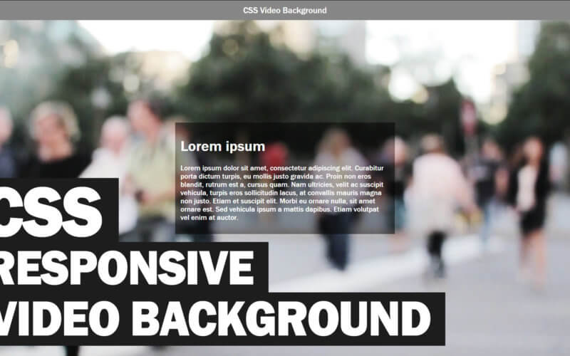
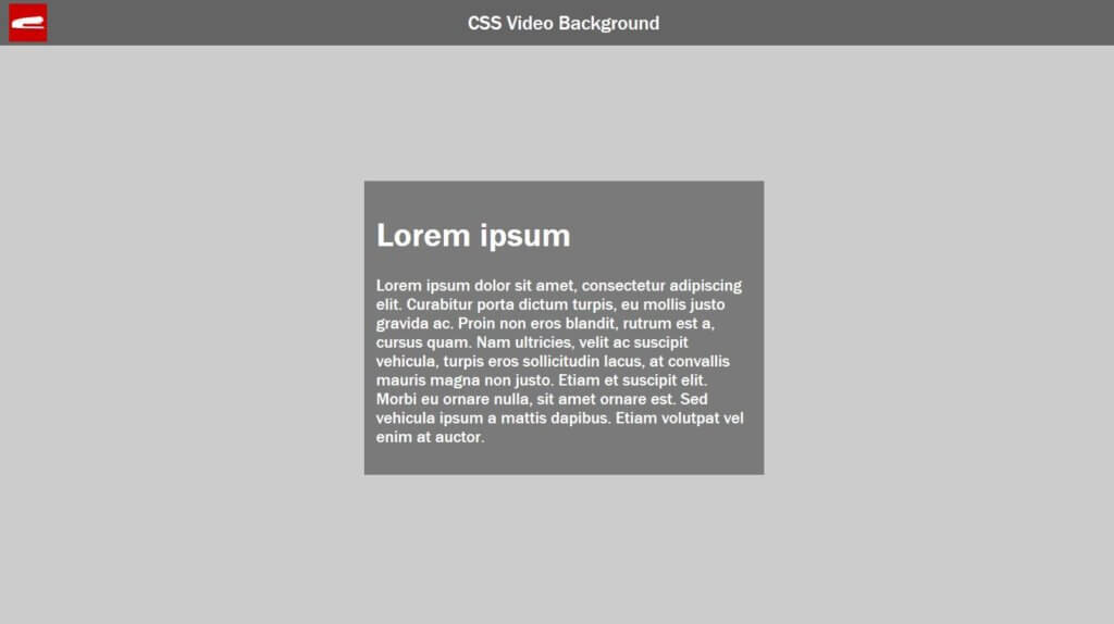
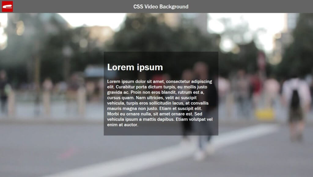
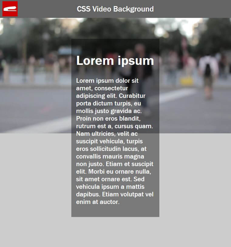
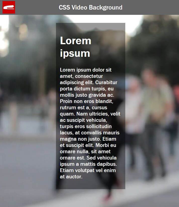
Here is the example page that we’re going to work on. I have a centered div with some text on it. This video is going to show you how to add the video background underneath it.
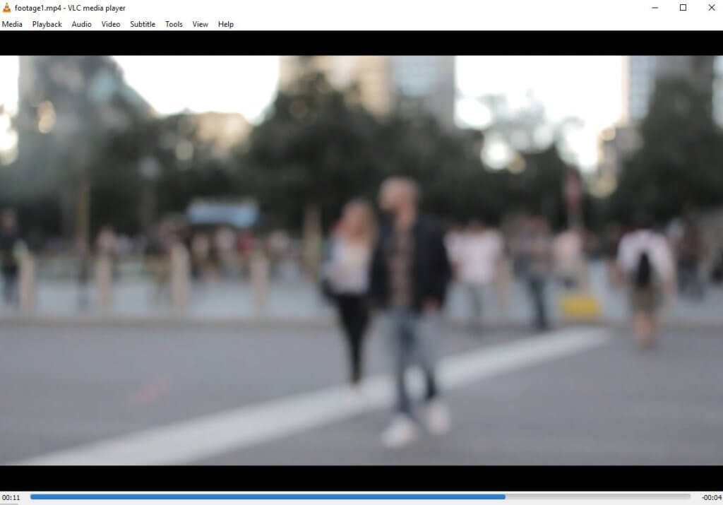
Here is the footage that I have in MP4 format with full HD quality (1920×1080) The first thing I’m going to do is to open it in full-screen mode and capture the first frame of the footage. This image will be used in poster attribute in the video tag which will be displayed when the video is loading.
The Code
Next, let’s add the video tag into our HTML page , set the poster image and add the attributes.
I want the video to start playing immediately, repeating infinite time and without any sound.
<video id="videoBG" poster="poster.JPG" autoplay muted loop>
    <source src="footage1.mp4" type="video/mp4">
</video>
For the CSS, I’m going to add position fixed and set the z-index to minus one. This will keep the video element at the back while fixing the position.
#videoBG {
    position:fixed;
    z-index: -1;
}
It seems to be working. But if you try resizing the browser, you will see that the video is not scaling at all!
If we simply set either side to 100% that’s not going to work because we need to scale the video properly according to the current browser size.
#videoBG {
    position:fixed;
    z-index: -1;

/*not work if the screen ratio is below 16/9*/
    width:100%;
    height: auto;
}
We’ll need to use media query.
The Responsive Way
The first media query I’m going to add is when the screen is too wide. We need to keep the width to 100% and scale the height. We can achieve this by using min-aspect-ratio 16/9.
@media (min-aspect-ratio: 16/9) {
    #videoBG {
        width:100%;
        height: auto;
    }
}
And we’ll do it vice versa when the screen ratio is below 16/9.
@media (max-aspect-ratio: 16/9) {
    #videoBG {
        width:auto;
        height: 100%;
    }
}
The final step is to replace the footage with a static image on mobile. We usually do not want to play the video on mobile due to high data cost. We’ll add another media query for any devices that have 767px width and below. Simply add display:none to the video tag and the poster image as background to the body.
@media (max-width: 767px) {
    #videoBG {
        display: none;
    }
    body {
        background: url('poster.jpg');
        background-size: cover;
    }
}
And that’s it. Hope this help. You can see it in action in video below.
If you love this tutorial, stay connected with us by like our Facebook and Youtube Channel. Before leaving you might want to check out our animated CSS snow effect background too!
Source Code
HTML
<!DOCTYPE html>
<html>
    <head>
    <meta http-equiv="content-type" content="text/html; charset=UTF-8" />
    <link rel="stylesheet" type="text/css" href="styles.css">
    </head>
    <body>
        <div id="textdiv">
            <h1>Lorem ipsum</h1>
            <p>Lorem ipsum dolor sit amet, consectetur adipiscing elit. Curabitur porta dictum turpis, eu mollis justo gravida ac. Proin non eros blandit, rutrum est a, cursus quam.</p>
        </div>
        <video id="videoBG" poster="poster.JPG" autoplay muted loop>
            <source src="footage1.mp4" type="video/mp4">
        </video>
    </body>
</html>
CSS
html,body {
    width:100vw;
    height: 100vh;
    margin: 0;
}
#videoBG {
    position:fixed;
    z-index: -1;
}
@media (min-aspect-ratio: 16/9) {
    #videoBG {
        width:100%;
        height: auto;
    }
}
@media (max-aspect-ratio: 16/9) {
    #videoBG {
        width:auto;
        height: 100%;
    }
}
@media (max-width: 767px) {
    #videoBG {
        display: none;
    }
    body {
        background: url('poster.jpg');
        background-size: cover;
    }
}
Mind-blowing
But can you blur any video like above ?
This was the simplest yet best answer to this question, thank you 🙂
This looks exactly like what I’m looking for. Could this somehow incorporate a browser detection script and add or remove the “muted” attribute depending on the browser and replacing it with controls or a tap to unmute button. Thank you.
Great tutorial, thanks a lot TK!
Excellent bit of code – Thank you.