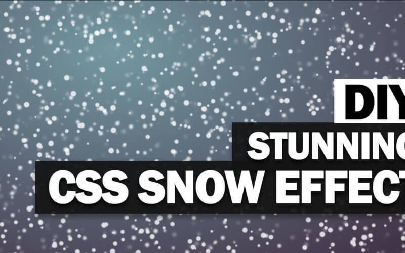
Pure CSS Snow Effect with Falling Animation
In this tutorial, I’m going to show you how to create a snow effect using CSS box-shadow from scratch and without using any background image at all! Let’s check it out! (Full source code at the end of the post)
Design concept
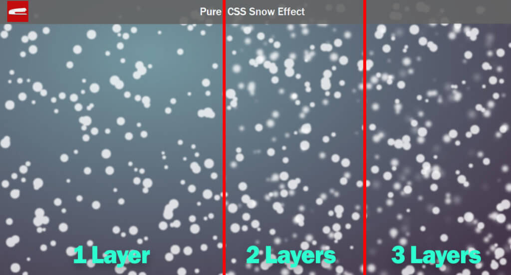
The key concept of this project is to use CSS box-shadow to create 3 snow layers. We’ll be using Sass to generate random snow position. Then apply a various blur filter on each snow layer to create depth of field effect. And finally apply the animation.
This may sounds a bit complicate but don’t worry, we’ll work on it step by step.
It’s Snow Time!
Let’s create the first layer of the snow.
<div class="snow layer1"></div>
Then apply a radial gradient background to the wrapper div.
background: radial-gradient(farthest-corner at 30vw 20vh,#7397a1 1%,#3f2c41 100%);
For all snows, set the border radius to 50% to form a circle and the opacity to 80%;
.snow {
    border-radius: 50%;
    opacity: 0.8;
}
Next we’ll define the properties of the first snow layer. Set the width and height to 1.5 rem and apply a small amount of blur filter.
.layer1 {
    width: 1.5rem;
    height: 1.5rem;
    filter:blur(1.5px);
}
And here comes the key part of this tutorial. We’ll create a loop to random the position for each snow particle. Let’s create a variable and a for loop that runs 400 times. This will be the number of snow particles for each layer.
$s1:"";
@for $i from 1 through 400 {
    $s1: $s1 + random(1000)*0.1vw + " " + random(1000)*0.1vh + " " + 0 + " " + random(50)*-0.01rem + #fff;
    @if $i < 400 {
        $s1: $s1 + ",";
    }
}
For each run, I’ll random the x and y position using viewport units (vw vh). Then concatenate with 0 blur radius and spread parameter using random negative value (to create a various snow size) and lastly with white color. The if condition is to check and stop adding the comma for the final run.
Now it’s time to apply this with the box-shadow using Sass interpolation.
.layer1 {
    width: 1.5rem;
    height: 1.5rem;
    filter:blur(1.5px);
    box-shadow: #{$s1};
}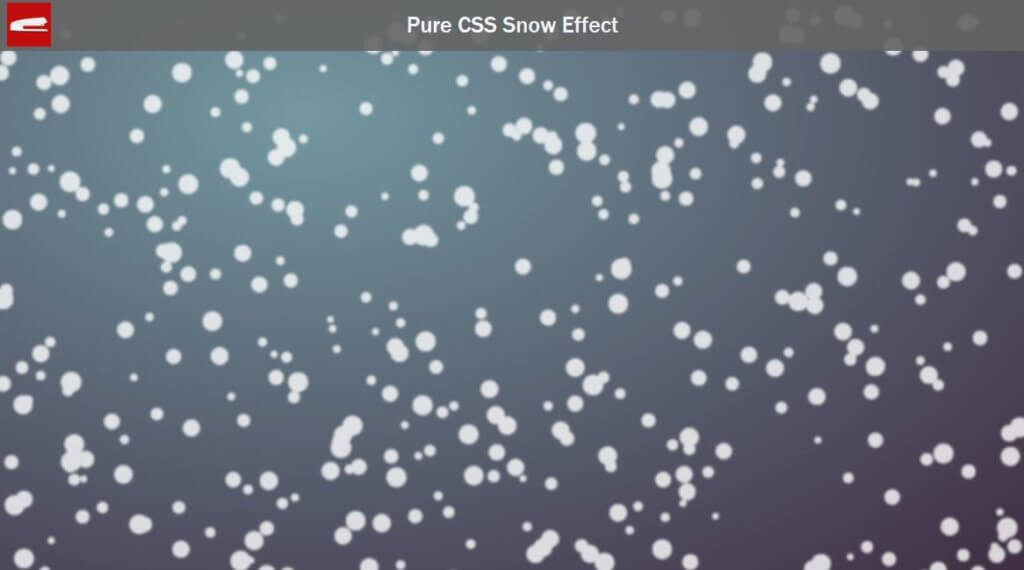
All right! that looks good. It time that we work on another layers. I’m going to create 3 layers of them. by duplicating all the code from the first layer.
$s1:"";
$s2:"";
$s3:"";
@for $i from 1 through 400 {
    $s1: $s1 + random(1000)*0.1vw + " " + random(1000)*0.1vh + " " + 0 + " " + random(50)*-0.01rem + #fff;
    $s2: $s2 + random(1000)*0.1vw + " " + random(1000)*0.1vh + " " + 0 + " " + random(50)*-0.01rem + #fff;
    $s3: $s3 + random(1000)*0.1vw + " " + random(1000)*0.1vh + " " + 0 + " " + random(50)*-0.01rem + #fff;
    @if $i < 400 {
        $s1: $s1 + ",";
        $s2: $s2 + ",";
        $s3: $s3 + ",";
    }
}
.layer2 {
    width: 1.2rem;
    height: 1.2rem;
    filter:blur(3px);
    box-shadow: #{$s2};
}
.layer3 {
    width: 0.8rem;
    height: 0.8rem;
    filter:blur(6px);
    box-shadow: #{$s3};
}
To create depth of field effect, I’m going to reduce the size and increase the blur of the second and third layers.
The Animation
I’m going to create a linear infinite animation that move the snow downward. Also set the position of the snow to the starting position.
.snow {
    border-radius: 50%;
    opacity: 0.8;
    position: absolute;
    top:-100vh;
    animation-name: fall;
    animation-timing-function: linear;
    animation-iteration-count: infinite;
}
@keyframes fall {
    100% {transform: translateY(200vh); }
}
I’m going to make the back layers move slower than the front using animation-duration to create depth of field effect. Also, I’ll duplicate each layer and set the animation delay on one of them by half of the duration with negative value. This will offset the animation to skip the part where the snow is moving into the screen and make the animation appears seamless.
layer1 {
width: 1.5rem;
height: 1.5rem;
filter:blur(1.5px);
box-shadow: #{$s1};
animation-duration: 6s;
}
.layer1.a {
animation-delay: -3s;
}
.layer2 {
width: 1.2rem;
height: 1.2rem;
filter:blur(3px);
box-shadow: #{$s2};
animation-duration: 8s;
}
.layer2.a {
animation-delay: -4s;
}
.layer3 {
width: 0.8rem;
height: 0.8rem;
filter:blur(6px);
box-shadow: #{$s3};
animation-duration: 10s;
}
.layer3.a {
animation-delay: -5s;
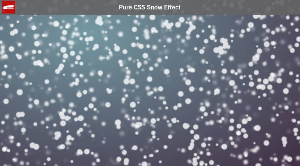
}And here is the result.
Want to see more CSS Box-shadow trick? Check out our CSS Pokeball 8-bit image tutorial!
So that’s it for this tutorial. Hope you guy enjoy. If you like it, feel free to like or subscribe to our Youtube Channel stay with us or follow the Facebook page for interesting update.
Source Code
HTML
<div class="wrapper">
     <div class="snow layer1 a"></div>
     <div class="snow layer1"></div>
     <div class="snow layer2 a"></div>
     <div class="snow layer2"></div>
     <div class="snow layer3 a"></div>
     <div class="snow layer3"></div>
</div>
CSS (SCSS)
.wrapper {
    width:100vw;
    height:100vh;
    background: radial-gradient(farthest-corner at 30vw 20vh,#7397a1 1%,#3f2c41 100%);
}
$s1:"";
$s2:"";
$s3:"";
@for $i from 1 through 400 {
    $s1: $s1 + random(1000)*0.1vw + " " + random(1000)*0.1vh + " " + 0 + " " + random(50)*-0.01rem + #fff;
    $s2: $s2 + random(1000)*0.1vw + " " + random(1000)*0.1vh + " " + 0 + " " + random(50)*-0.01rem + #fff;
    $s3: $s3 + random(1000)*0.1vw + " " + random(1000)*0.1vh + " " + 0 + " " + random(50)*-0.01rem + #fff;
    @if $i < 400 {
        $s1: $s1 + ",";
        $s2: $s2 + ",";
        $s3: $s3 + ",";
    }
}
.snow {
    border-radius: 50%;
    opacity: 0.8;
    position: absolute;
    top:-100vh;
    animation-name: fall;
    animation-timing-function: linear;
    animation-iteration-count: infinite;
}
.layer1 {
    width: 1.5rem;
    height: 1.5rem;
    filter:blur(1.5px);
    box-shadow: #{$s1};
    animation-duration: 6s;
}
.layer1.a {
    animation-delay: -3s;
}
.layer2 {
    width: 1.2rem;
    height: 1.2rem;
    filter:blur(3px);
    box-shadow: #{$s2};
    animation-duration: 8s;
}
.layer2.a {
    animation-delay: -4s;
}
.layer3 {
    width: 0.8rem;
    height: 0.8rem;
    filter:blur(6px);
    box-shadow: #{$s3};
    animation-duration: 10s;
}
.layer3.a {
    animation-delay: -5s;
}
@keyframes fall {
    100% {transform: translateY(200vh); }
}
Pure CSS 8 bit pokerball ? What for ?
hey, where is logo_small.png ???
I can’t run your program. Where is small-logo.png file & What for use 8 bit pokerball? Please send your whole code html & css to run your program.
Thank you.
I can’t run your snow fall. May be variable declaration is wrong. Please send me your correct code to run your snow fall html.
I can’t run your program. Where is small-logo.png file & What for use 8 bit pokerball? Please send your whole code html & css to run your program.
Thank you.