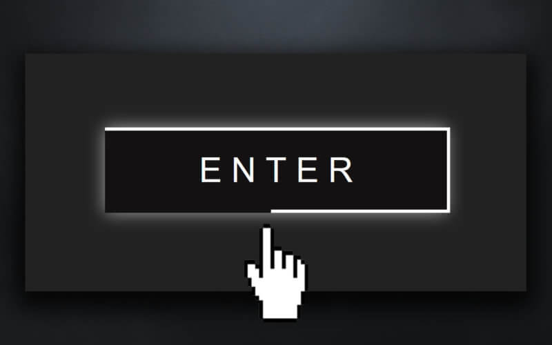
Create Border Length Animation with Pure CSS
With all the CSS feature today, you might think that animating CSS border length should be easy. Unfortunately, it is not. Many people come up with a hack, and the one that I see most often is using SVG and storke-dasharray to animation it.
However, in this post, I will show you the pure CSS method without introducing any extra div at all. Let’s check it out.
Preparing The Button
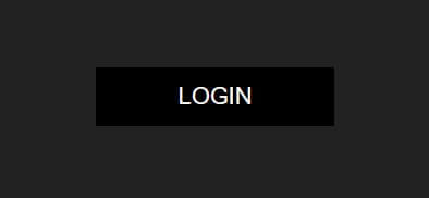
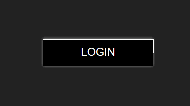
First let’s create div for our button. Just a single div with a class.
<div class="button">LOGIN</div>
For the CSS, set size, font, background etc. and using flex display to center the text.
.button {
  font-family:Arial, Helvetica, sans-serif;
  font-size: 20px;
  color:white;
  width:200px;
  height:50px;
  background:black;
  position: relative;
  display: flex;
  align-items: center;
  justify-content: center;
  cursor: pointer;
}
The button is ready to go. Next let’s work on the border animation.
CSS Border Length Animation
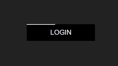
Since we couldn’t animate the border, we’ll use pseudo element instead. Set the empty content, absolute position and place it at the top left corner by setting left and top to zero. The initial width and height will be zero. Then set the white border-top.
.button:before {
  content: "";
  position: absolute;
  left:0;
  top:0;
  width: 0;
  height: 0;
  border-top: 2px solid white;
  border-right: 2px solid white;
  animation: border-top-right 3s infinite alternate;
}
In keyframe we will increase the width size to 100% of the button which is 200px. Then increase the height after the width. we’ll need to offset the top border so the final height is 48px.
@keyframes border-top-right {
  0%    {width:0px;   height:0px;}
  25%   {width:200px; height:0px;}
  50%   {width:200px; height:48px;}
  100%  {width:200px; height:48px;}
}
You’ll notice that the animation happen on the first half (0-50%) and stay the same on the second half (50%-100%) We do this to make room for the bottom and left border animation which start playing after top and right.
Now you should see border length animation for top and right side. We’ll need to do the same for the bottom and left border.
I’ll copy code from before element and change it to after then replace all left and top properties with right and bottom.
.button:after {
  content: "";
  position: absolute;
  right:0;
  bottom:0;
  width: 0;
  height: 0;
  border-bottom:2px solid white;
  border-left: 2px solid white;
  animation: border-bottom-left 3s infinite alternate;
}
@keyframes border-bottom-left {
0% {width:0px; height:0px; }
50% {width:0px; height:0px; }
75% {width:200px; height:0px; }
100% {width:200px; height:48px;}
}Now there is a slight problem. We can still see a tiny dot due to border property even though we already set the width and height to 0.
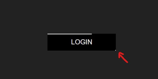
To fix this we’ll set the opacity to 0 and then change it to 1 when the border animation start. We’ll need to add a small keyframe (50% – 50.1%) to prevent the animation tween of opacity value.
@keyframes border-bottom-left {
  0%    {width:0px;   height:0px; opacity: 0;}
  50%   {width:0px;   height:0px; opacity: 0;}
  50.1% {width:0px;   height:0px; opacity: 1;}
  75%   {width:200px; height:0px; opacity: 1;}
  100%  {width:200px; height:48px;opacity: 1;}
}
And here is the final result. I also added some hover effect and box shadow. You can find the source code here.
Or watch video version of this tutorial here
And that’s all for the tutorial. If you love it. Don’t forget to subscribe our YouTube Channel and follow our Twitter to see more dev tips and tutorials 😀
