Easiest way to Create Pure CSS Parallax Tutorial
In this post, we’ll show you the quick and easiest way to create CSS parallax effect with pure CSS from scratch in just a few minutes. Ready? check it out!
Preparing the Web Page
So first let’s prepare the page we’re going to work on. There will be 2 section on this page and I’ll create a div for each with child div for text caption.
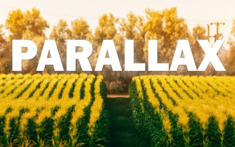
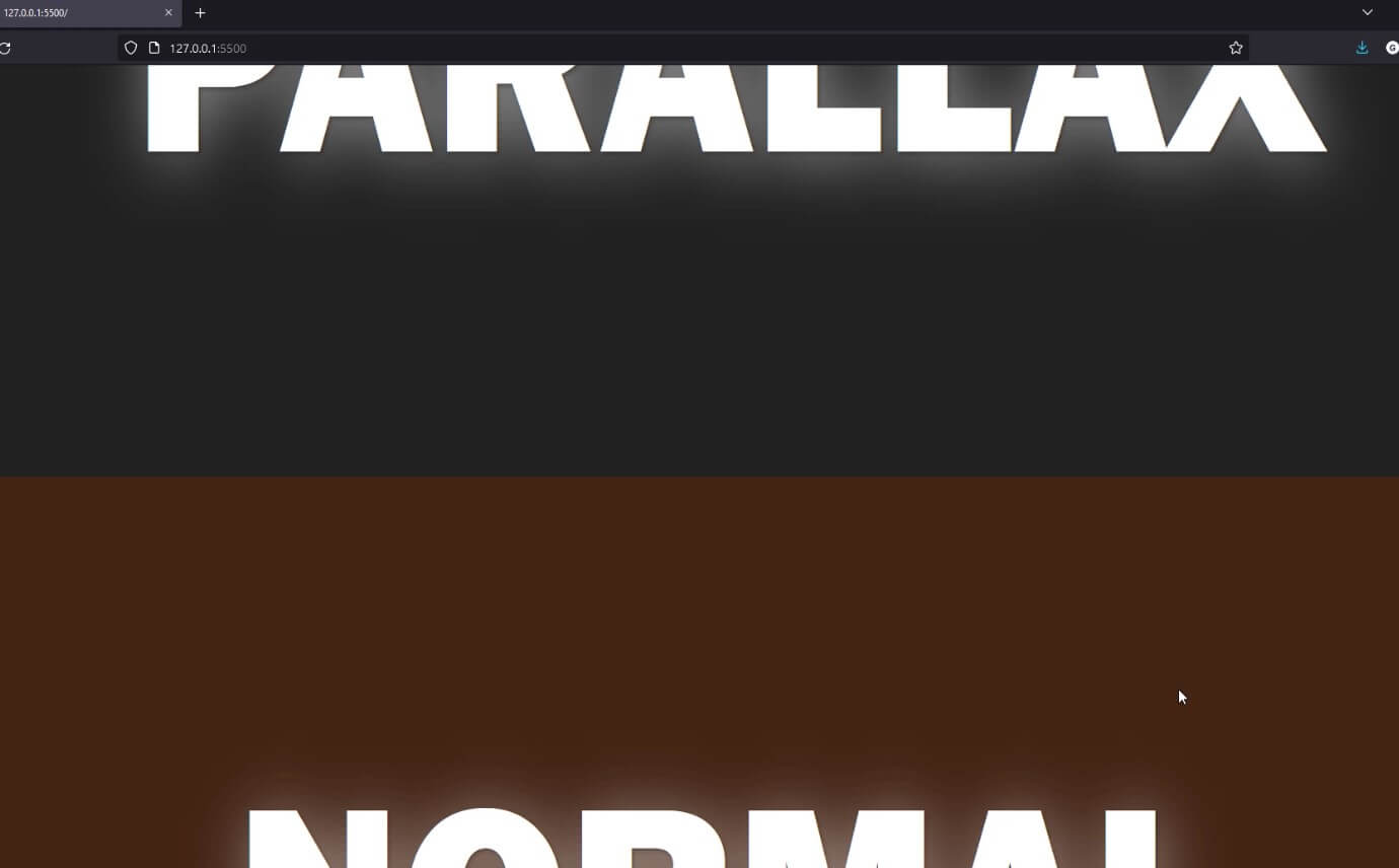
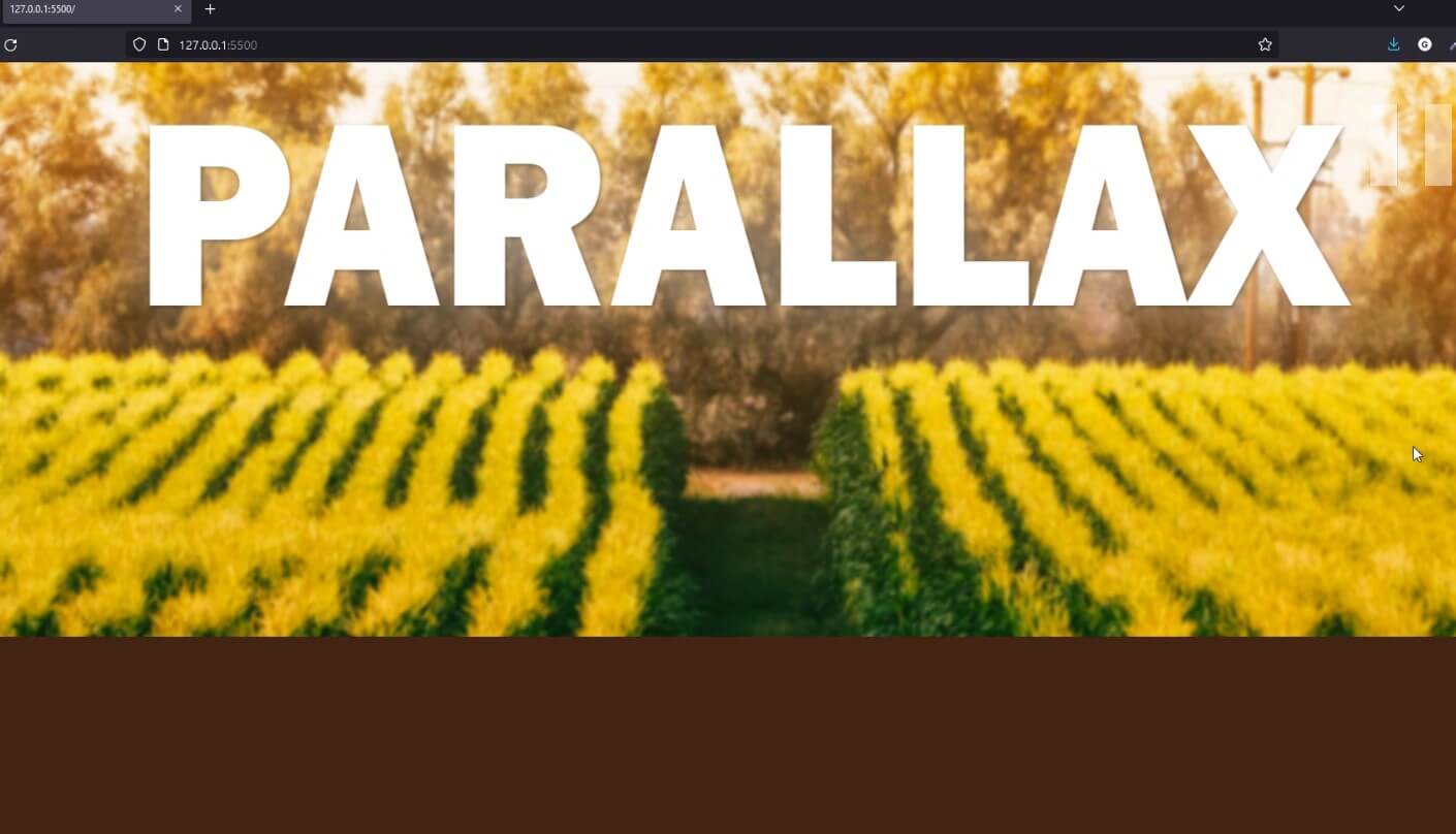
<div class="section1">
  <div class="text">PARALLAX</div>
</div>
<div class="section2">
  <div class="text">NORMAL</div>
</div>
As for CSS, set the width to 100% and minimum height to 100% of the viewport and position to relative. Also change the background color of the section 2 and text styling. (To make the font looks leaner, I’ll use transform scale and scale only Y axis. Then add translate to move the text to the center.)
.section1, .section2 {
  width:100%;
  min-height: 100vh;
  position: relative;
}
.section2 {
  background: rgb(68,35,19);
}
.text {
  top:30%;
  left:50%;
  position: absolute;
  font-family: 'Franklin Gothic Heavy';
  font-size: 15vw;
  color:white;
  text-shadow: 2px 2px 5px rgba(0,0,0,0.3),
  5px 5px 70px rgba(255,255,255,0.5);
  transform: scale(1,1.1) translate(-50%, 10%);
}
The simple 2 sections page is ready. Next let’s work on adding parallax effect.
Adding Parallax Effect
The concept of the parallax is simple, the object closer to the eye will look like it moves faster than the the one in distance.
We can recreate this easily in CSS using 3D transform.
And our simeple 2 section page is ready.
So first, the important thing we need to do is to lock the viewport and force all the scrolling to occur on the body instead. we can do this by adding overflow hidden to the html and add set overflow-x to hidden and overflow-y to scroll on body
Then set the perspective of the body to 1px and transform style preserve-3d to both sections.
html {
  height: 100vh;
  overflow: hidden;
}
body {
...
  perspective: 1px;
  transform-style: preserve-3d;
  overflow-x: hidden;
  overflow-y: scroll;
}
.section1, .section2 {
...
  transform-style: preserve-3d;
}
Next we’ll adding background image of the first section. However, instead of setting the background to the section div directly, we’ll use the pseudo-element instead
The most important part is we’ll add transform translateZ and push the background away from the viewport to create parallax effect. However, since the background is now farther away it will become smaller so we’ll need to compensate it by scaling it up.
I’ll also add some blur effect to create depth of field effect
.section1::before {
content:"";
width:100%;
height: 100%;
position: absolute;
background: url("base.png") top center;
background-size: cover;
transform: translateZ(-1px) scale(2.2);
filter: blur(2px);
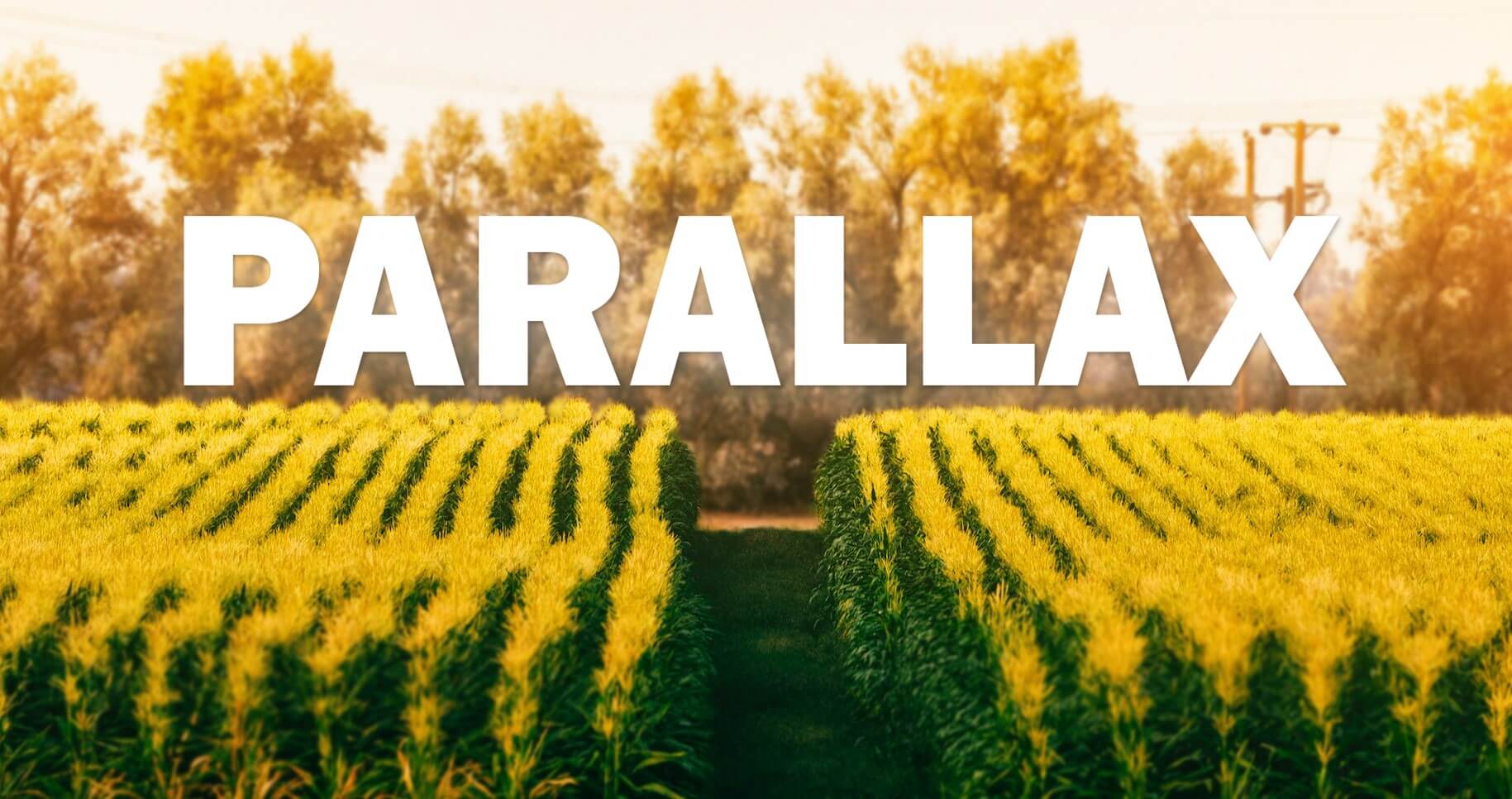
}You should see parallax effect now.
More Parallax Layers
Some of you might ok with the the result at this point but let’s add a little bit of parallax layer.
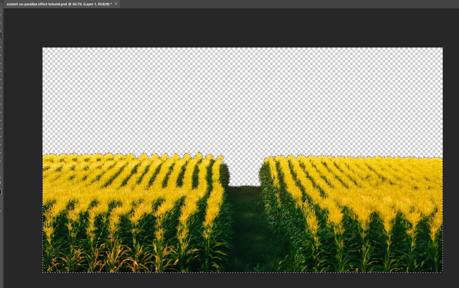
First I’ll use photoshop to extract the corn field and create a separate image.
Then add another pseudo-element to the first section but this time, we’re not adding any transform. As for the text, add translateZ to push it backward only half pixel to create another layer of parallax effect.
.section1::after {
  content:"";
  width:100%;
  height: 100%;
  position: absolute;
  background: url("outer-layer-blur.png") top center;
  background-size: cover;
}
.section1 .text {
  top:10%;
  transform: translateZ(-0.5px) scale(1.5,1.6) translate(-33%,10%);
}
Check the live video here
And that’s all for this tutorial. You can download the code here. If you love it, please subscribe our YouTube channel to stay tune for more update. Thanks for reading. See you next post. Bye!
