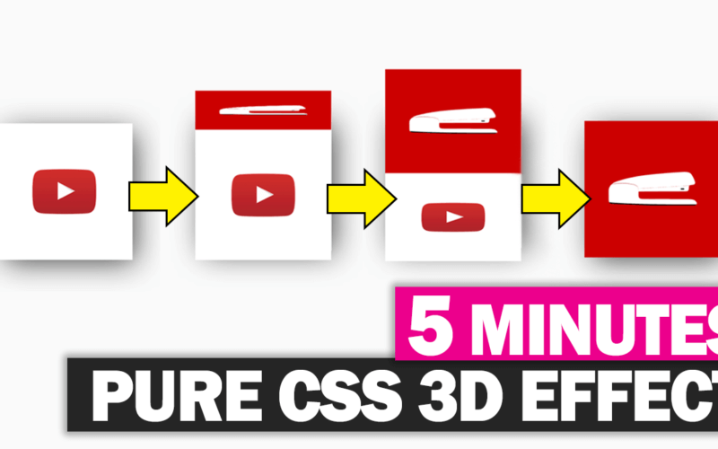
Make 3D Cube Effect with Pure CSS in 5 Minutes
With CSS transform, making 3D effect is pretty much easy with just a few lines of code. In this post, I’m going to show you how to create a simple 3D cube effect with pure CSS in just a few minutes. Let’s check it out!
HTML Structure
First Let’s start with our cube structure. I’m going to create a wrapper div which defines the size and position of the cube. Inside I will create a cube div with another 2 divs inside for top and front covers.
<div class="cube-wrapper">
     <div class="cube">
          <div class="cube-top"></div>
          <div class="cube-front"></div>
     </div>
</div>
So that’s all for HTML part. Now’s let work on the CSS.
The CSS
First, let’s define width and height and position for our cube. I’m setting top and and left to 50 percent and position to absolute to make the cube stays on the center. I’m also going to add a box shadow to create the 3D look. You can use any online CSS shadow generator like this one to help with your setting.
.cube-wrapper {
    width: 250px;
    height: 250px;
    top: 50%;
    left: 50%;
    position: absolute;
    box-shadow: 10px 10px 54px -6px rgba(0,0,0,0.75);

}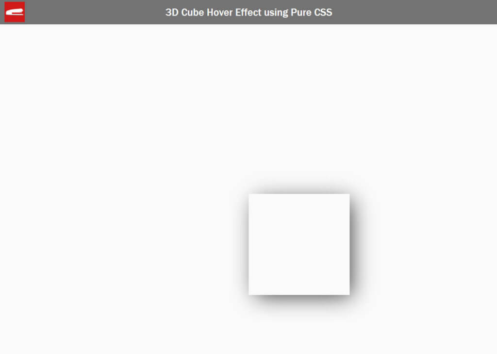
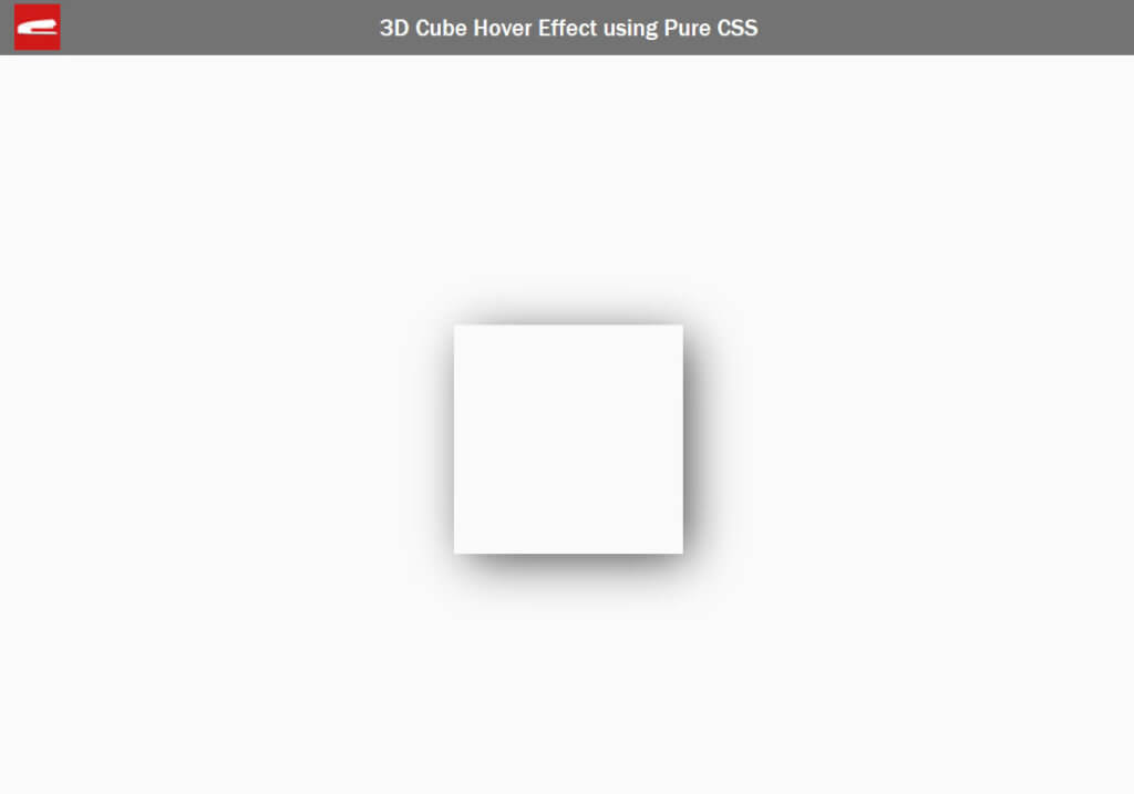
You’ll see that the top left of the cube is on the center which is technically correct since it’s the position reference point. So I’m going to add a -50 percent transform to offset that to “really” center the cube.
.cube-wrapper {
    width: 250px;
    height: 250px;
    top: 50%;
    left: 50%;
    position: absolute;
    box-shadow: 10px 10px 54px -6px rgba(0,0,0,0.75);

    transform: translate(-50%, -50%);
}
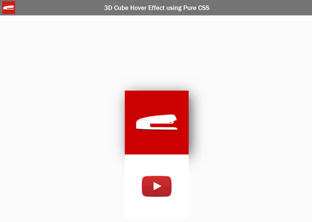
Now I’m going to set width and height of all divs except the wrapper to 100% and also assign an image background to the front and top of the cube.
.cube,.cube div {
width: 100%;
height: 100%;
}
.cube-front {
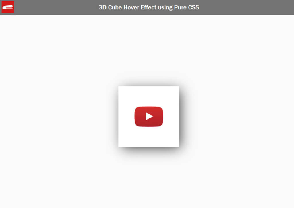
background: url("logo_youtube.png") #ffffff no-repeat center;
background-size: 100%;
}
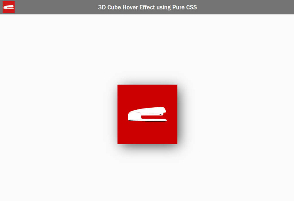
.cube-top {
background: url("logo_large.png") #cc0000 no-repeat center;
background-size: 100%;
}The top and front div will look like this… for now.
Next I’m going to set the top and left properties of each div to zero and move it backward using transform. Then rotate the top side of the cube for 90 degrees. We also need to set the transform origin to bottom as we want to use the bottom side as a rotation point/axis.
.cube,.cube div {
width: 100%;
height: 100%;
top: 0;
left: 0;
position: absolute;
}
.cube-front {
background: url("logo_youtube.png") #ffffff no-repeat center;
background-size: 100%;
}
.cube-top {
background: url("logo_large.png") #cc0000 no-repeat center;
background-size: 100%;
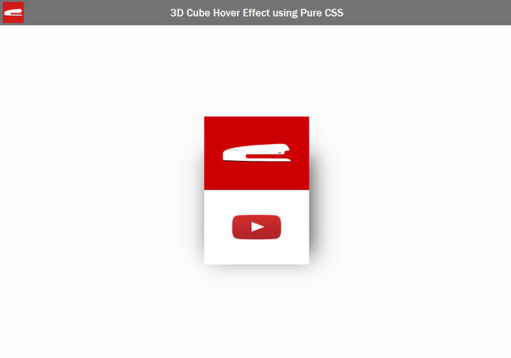
transform: translate(0, -100%) rotateX(90deg);
transform-origin: bottom;
}Now we don’t see the top side anymore since it has been rotated.
Finally add hover effect to the wrapper to rotate the cube counter-clockwise by 90 degrees. Also set the transform style to preserve-3d and transition time for a half second, ease in and out for all divs. Please note that I also move the cube wrapper back by 50% using transform when rotating.
Here is the complete CSS for the cube
.cube-wrapper {
    width: 250px;
    height: 250px;
    top: 50%;
    left: 50%;
    position: absolute;
    box-shadow: 10px 10px 54px -6px rgba(0,0,0,0.75);
    transform: translate(-50%, -50%);
}
.cube,.cube div {
    width: 100%;
    height: 100%;
    top: 0;
    left: 0;
    position: absolute;
    transform-style: preserve-3d;
    transition: transform 0.5s ease-in-out;
}
.cube-front {
    background: url("logo_youtube.png") #ffffff no-repeat center;
    background-size: 100%;
}
.cube-top {
    background: url("logo_large.png") #cc0000 no-repeat center;
    background-size: 100%;
    transform: translate(0, -100%) rotateX(90deg);
    transform-origin: bottom;
}
.cube-wrapper:hover .cube {
    transform: translate(0, 50%) rotateX(-90deg);
}
And the result..
And if you put a mouse on it, it will rotate.
So that’s all for this tutorial. Hope you guys enjoy it and feel free to like or subscribe to our Facebook and Youtube Channel to stay tune for the next tutorial!
Thank you for your excellent tutorial! I am just starting to learn html and css and you help me a lot. I really like your channel. All the best to you!