Creating 3D Cube with Pure CSS
3D cube effect can be achieved easily with CSS 3D Transform by creating div for each side of the cube. Then use rotateX, rotateY and rotateZ to put them into their places. Transform-origin is also….
Read moreCoding Tutorials and Development Tips
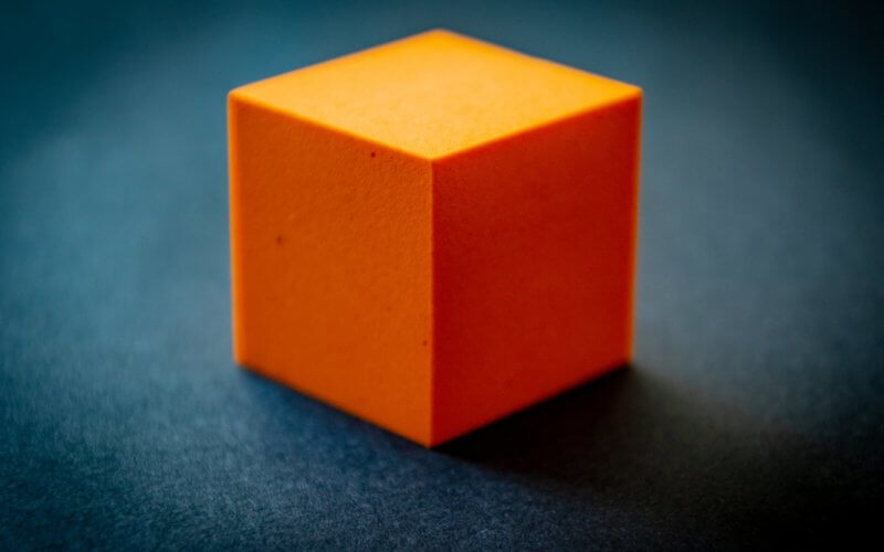
3D cube effect can be achieved easily with CSS 3D Transform by creating div for each side of the cube. Then use rotateX, rotateY and rotateZ to put them into their places. Transform-origin is also….
Read more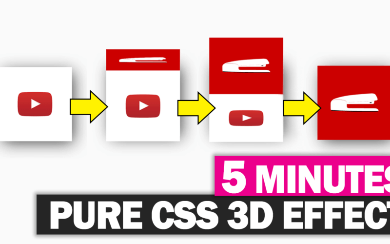
With CSS transform, making 3D effect is pretty much easy with just a few lines of code. In this post, I’m going to show you how to create a simple 3D cube effect with pure….
Read more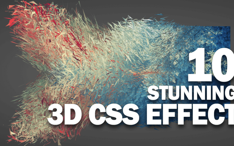
With CSS3, sophisticate things like 3D effect and transformation have never been easier. Lots of CSS3 properties allow web designers to enhance the web design and improve user experience dramatically. In this article, we’ve put….
Read more