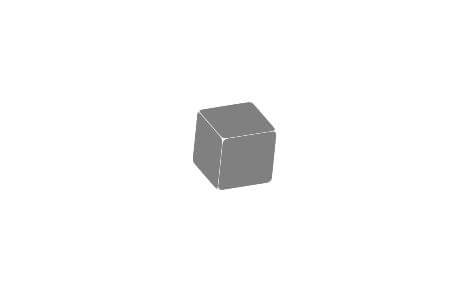
Creating 3D Cube with Pure CSS
3D cube effect can be achieved easily with CSS 3D Transform by creating div for each side of the cube. Then use rotateX, rotateY and rotateZ to put them into their places. Transform-origin is also needed to move the rotation fulcrum.
Snippet 1
This snippet creates only 3 sides of cube as the rest are not visible due to perspective view. CSS 3D Transform is used to rotate divs into places. Transform-style: preserve-3d is added to make all child divs preserve its 3D position.
HTML
<div class="cube">
   <div class="side top"></div>
   <div class="side left"></div>
   <div class="side front"></div>
</div>
CSS
.cube {
  width: 60px;
  height: 60px;
  position: absolute;
  top: 50%;
  left: 50%;
  transform-style: preserve-3d;
  transform: rotateX(240deg) rotateY(-5deg) rotateZ(-155deg);
}

.side {
  width: 100%;
  height: 100%;
  top: 0;
  left: 0;
  position: absolute;
  border-radius: 10%;
}

.top {
  transform: translateZ(-60px);
  background: grey;
}

.front {
  transform: rotateX(90deg);
  transform-origin: bottom;
  background: grey;
}

.left {
  width: 60px;
  transform: translateZ(-60px) rotateY(90deg);
  transform-origin: right;
  background: grey;
}
Live Demo – See JSFiddle
Example design tutorials using this technique together with transform animation.
CSS Chernobyl Jumping Control Rods
[su_box title=”Note” box_color=”#FFF3D4″ title_color=”#333333″]You can define how far the 3D cube is away from the screen by adding perspective property to the parent element.[/su_box]