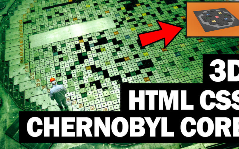
Chernobyl Jumping Control Rods HTML and CSS Tutorial
The jumping reactor control rods of is one of the most impressive yet terrifying scene in Chernobyl. In this tutorial, we’re going to recreated an animated 3D mini RBMK nuclear reactor core using only HTML and CSS. Ready? Let’s check it out!
The Control Rod
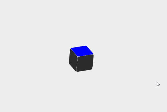
So first let’s start with the control rod. I’m going to create divs for three sides. top, front and left. The other side are not visible so I will leave them.
<div class="rod">
   <div class="side top"></div>
   <div class="side left"></div>
   <div class="side front"></div>
</div>
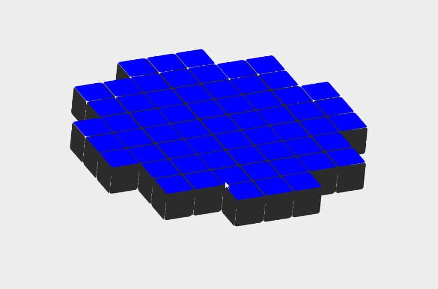
Then we’ll use the same technique with previous tutorial on how to create 3D progress bar. We’ll use CSS transform on each side to create a 3D shape. I’m going to set the top side color to blue as working in 3d can be confusing. We’ll replace it with real texture later.
Then after all sides were setup, we’ll rotate the core to create 3D perspective view.
.rod {
  width: 60px;
  height: 60px;
  transform-style: preserve-3d;
}
.side {
  width: 100%;
  height: 100%;
  top: 0;
  left: 0;
  position: absolute;
  border-radius: 10%;
}
.top {
  transform: translateZ(-60px);
  background: blue;
}
.front {
  transform: rotateX(90deg);
  transform-origin: bottom;
  background: rgb(44,44,44);
}
.left {
  width: 60px;
  transform:  translateZ(-60px) rotateY(90deg);
  transform-origin: right;
  background: rgb(44,44,44);
}
.core {
  transform-style: preserve-3d;
  transform: rotateX(240deg) rotateY(-5deg) rotateZ(-155deg);
}
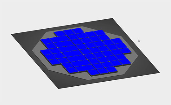
Octagon Grid Layout
Now the control rods are aligned in octagon shape. A grid layout is perfect for this job. There are lots of online tools that could dramatically save your time for creating complex grid area. In this tutorial we’ll use grid.layoutit.com
We’ll create 5 grid areas to create an octagon shape. Then for each grid area we’ll set rows and columns accordingly.
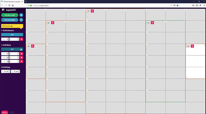
Then we’ll copy the code into our page. We’ll need to place the control rods into each grid area according to the layout we have set..
    <div class="g1">
         <div class="rod"><div class="side top"></div><div class="side left"></div><div class="side front"></div></div>
         <div class="rod"><div class="side top"></div><div class="side left"></div><div class="side front"></div></div>
         <div class="rod"><div class="side top"></div><div class="side left"></div><div class="side front"></div></div>
...
     </div>
     <div class="g3">
         <div class="rod"><div class="side top"></div><div class="side left"></div><div class="side front"></div></div>
         <div class="rod"><div class="side top"></div><div class="side left"></div><div class="side front"></div></div>
         <div class="rod"><div class="side top"></div><div class="side left"></div><div class="side front"></div></div>
...
     </div>
     <div class="g2">
         <div class="rod"><div class="side top"></div><div class="side left"></div><div class="side front"></div></div>
         <div class="rod"><div class="side top"></div><div class="side left"></div><div class="side front"></div></div>
...
      </div>
      <div class="g4">
          <div class="rod"><div class="side top"></div><div class="side left"></div><div class="side front"></div></div>
          <div class="rod"><div class="side top"></div><div class="side left"></div><div class="side front"></div></div>
          <div class="rod"><div class="side top"></div><div class="side left"></div><div class="side front"></div></div>
      </div>
      <div class="g5">
          <div class="rod"><div class="side top"></div><div class="side left"></div><div class="side front"></div></div>
          <div class="rod"><div class="side top"></div><div class="side left"></div><div class="side front"></div></div>
          <div class="rod"><div class="side top"></div><div class="side left"></div><div class="side front"></div></div>
      </div>
Next copy the CSS. We’ll also need to add preserve-3d transform-style to every grid area to keep the 3d transform effect. Also add grid gap for spacing between rods. I also replace the fraction unit with pixel (from 1fr to 60px)
.core {
  display: grid;
  grid-template-columns: 60px 60px 60px 60px 60px 60px 60px 60px 60px;
  grid-template-rows: 60px 60px 60px 60px 60px 60px 60px 60px 60px;
  grid-gap:1px;
  transform-style: preserve-3d;
  transform: rotateX(240deg) rotateY(-5deg) rotateZ(-155deg);
}
.g1 {
  display: grid;
  grid-template-columns: 60px 60px 60px;
  grid-template-rows: 60px 60px 60px 60px 60px 60px 60px 60px 60px;
  grid-area: 1 / 4 / 10 / 7;
  grid-gap:2px;
  transform-style: preserve-3d;
}
.g2 {
  display: grid;
  grid-template-columns: 60px 60px;
  grid-template-rows: 60px 60px 60px 60px 60px 60px 60px;
  grid-area: 2 / 2 / 9 / 4;
  grid-gap:2px;
  transform-style: preserve-3d;
}
.g3 {
  display: grid;
  grid-template-columns: 60px 60px;
  grid-template-rows: 60px 60px 60px 60px 60px 60px 60px;
  grid-area: 2 / 7 / 9 / 9;
  grid-gap:2px;
  transform-style: preserve-3d;
}
.g4 {
  display: grid;
  grid-template-columns: 60px;
  grid-template-rows: 60px 60px 60px;
  grid-area: 4 / 1 / 7 / 2;
  grid-gap:2px;
  transform-style: preserve-3d;
}
.g5 {
  display: grid;
  grid-template-columns: 60px;
  grid-template-rows: 60px 60px 60px;
  grid-area: 4 / 9 / 7 / 10;
  grid-gap:2px;
  transform-style: preserve-3d;
}
Core Cover
Next I’ll add the core cover and floor. We’ll use clip-path property to change the cover into an octagon shape. Again, there is a tool for this job. Clippy is one of the best clip path maker that I used pretty often. Just pick the shape and copy the code.
<div class="cover-wrap"><div class="cover"></div></div>
<div class="floor"></div>
.cover {
  width: 620px;
  height: 620px;
  background: rgb(120,120,120);
  clip-path: polygon(30% 0%, 70% 0%, 100% 30%, 100% 70%, 70% 100%, 30% 100%, 0% 70%, 0% 30%);
}
.floor {
  position: absolute;
  width: 700px;
  height: 700px;
  background: radial-gradient(#636363, #3b3b3b);
  top:50%;
  left: 50%;
  transform: translateX(-50%) translateY(-50%) translateZ(-45px);
  box-shadow: rgba(50,50,50,1) 1px 3px 0px,
              rgba(50,50,50,1) 2px 4px 0px,
              rgba(50,50,50,1) 3px 5px 0px;
}
Now you’ll see that our square shape is having some skewing effect. This because we haven’t set the perspective distance yet. So let’s it to 2000px. Also change the background color.
body {
  background: radial-gradient(#b3551f,#d67e36);
  perspective: 2000px;
}
Colored Rods
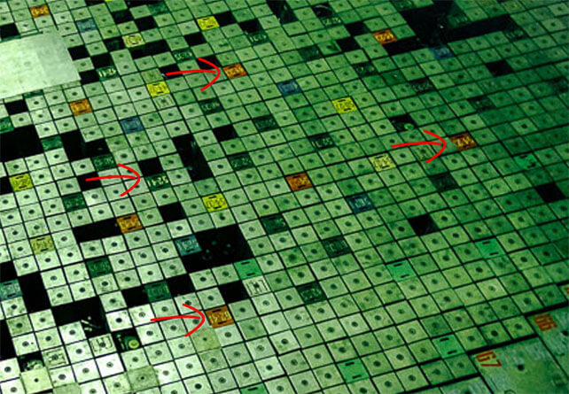
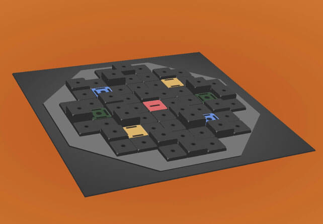
If you look at the real RMBK core, you’ll see there is some color marked rod. So I’m going to use Photoshop to create a basic texture and put them into the project.
Then create class for each color and apply them to the rods.
.top {
  background:url("rod-top.jpg");
}
.top.red {
  background:url("rod-top-red.jpg");
}
.top.blue {
  background:url("rod-top-blue.jpg");
}
.top.yellow {
  background:url("rod-top-yellow.jpg");
}
.top.green {
  background:url("rod-top-green.jpg");
}
Jumping Animation
Finally, we’ll create a jumping animation which can be done easily using translateZ. I’ll create 3 different level of shaking. Then apply them randomly to the rods.
.shake1 {
  animation: shake1 0.5s ease 1s infinite;
}
.shake2 {
  animation: shake2 0.6s ease 0.25s infinite;
}
.shake3 {
  animation: shake3 0.7s ease 0.35s infinite;
}
@keyframes shake1 {
  0% { transform: translateZ(0px); }
  50% { transform: translateZ(-20px); }
  100% { transform: translateZ(0px); }
}
@keyframes shake2 {
  0% { transform: translateZ(0px); }
  50% { transform: translateZ(-30px); }
  100% { transform: translateZ(0px); }
}
@keyframes shake3 {
  0% { transform: translateZ(0px); }
  50% { transform: translateZ(-10px); }
  100% { transform: translateZ(0px); }
}
And that’s all for this tutorial. Hope you guys enjoy. If you like it, don’t forget to like our Facebook and subscribe to our Youtube Channel. Thanks for visiting and see you next time!
Source Code – Download