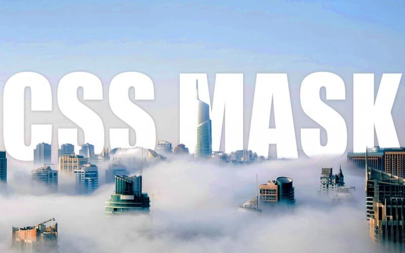
Understand CSS Mask in 4 Minutes
CSS Mask is a very useful property for hiding element partially or clipping the element. In this tutorial we’ll show you how to use CSS mask and example usage to create an effect like parallax using svg or transparent image in just a few minutes. Ready? Let’s check it out!
SVG Mask
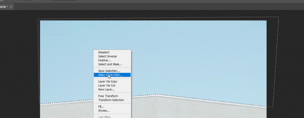
If your mask is going to be a polygonal shape, I’d recommend you to use an svg image instead of transparent png as the file size will be considerably smaller and also scalable.
To create an svg mask, open your image in Photoshop and select the area you want to it be visible. Then right click and select make work path.
Then select layer menu new fill layer and solid color
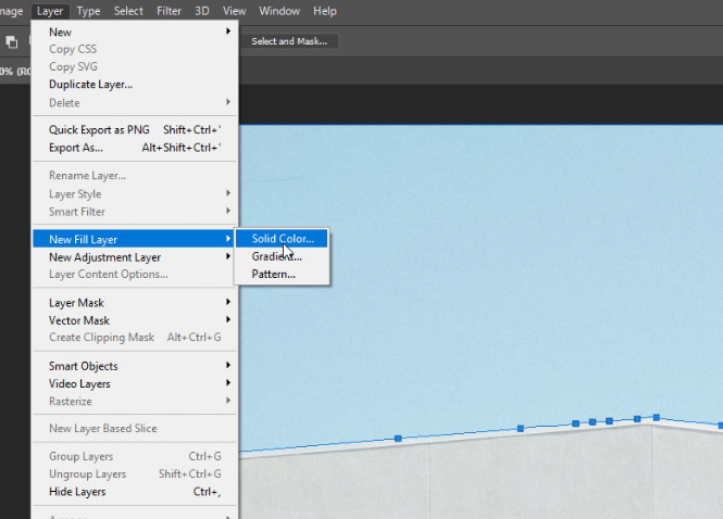
Click OK and change the color to black.

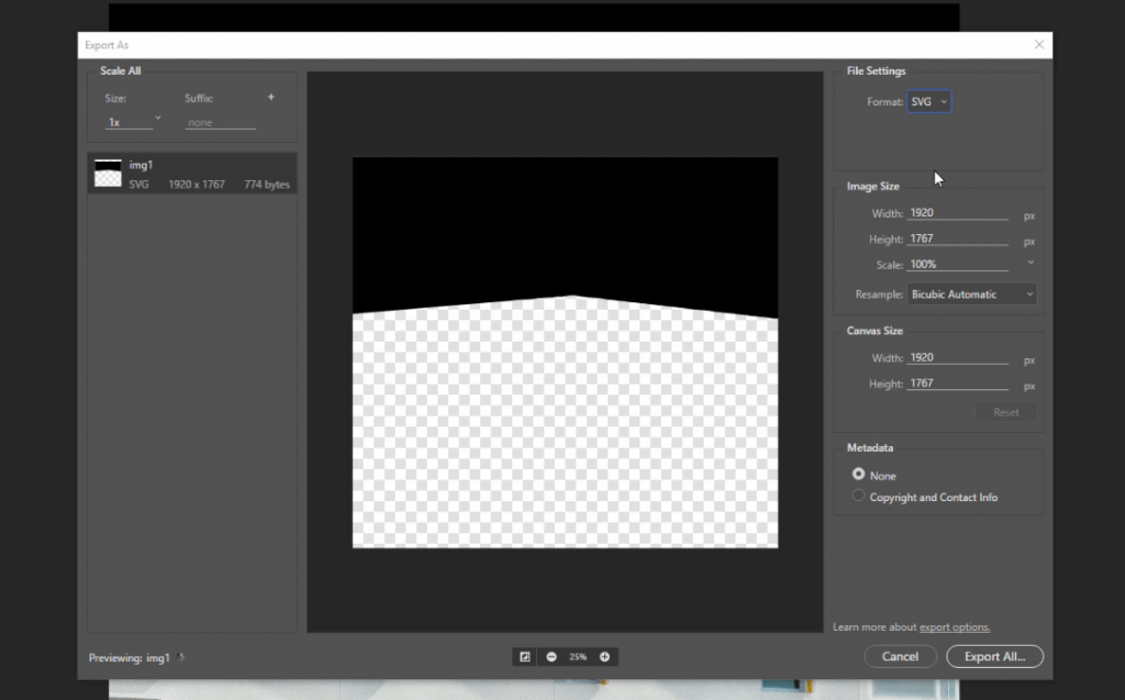
Then from file menu select export then export as

Select svg format then click export all and save the file.
Now we have the mask, next let’s create our page.
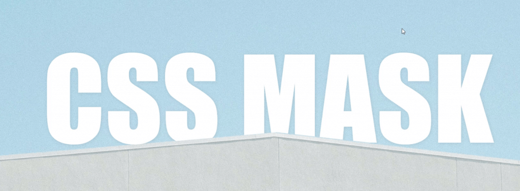
Let’s create a div for the background parallax image. Then I’ll put a headline text inside it and create a another div for the website content. You’ll see that I wrap the text with the masking div. We’ll use it later.
<div class="parallax">
  <div class="mask">
    <span class="headline">CSS MASK</span>
  </div>
</div>
<div class="content-div"></div>
Here is the starting CSS for background images. I set the width to 100% and height with 50% taller than the screen so we’ll be able scroll down. The headline position will be fixed at 20% from top with text-shadow for aesthetic.
The content-div is for spacing purpose in this tutorial so we’ll just set the size and done with it.
body {
  width:100%;
  margin:0;
}
.parallax {
  width: 100%;
  height:150vh;
  background: url("img1.jpg");
  background-size: cover;
  position: relative;
}
.content-div {
  width: 100%;
  height: 200vh;
}
.headline {
  font-family: Impact, Haettenschweiler, 'Arial Narrow Bold', sans-serif;
  font-size: 350px;
  color: white;
  position: fixed;
  top:20vh;
  width:100%;
  text-align: center;
  text-shadow: 1px 1px 10px rgba(0,0,0,0.1);
}
Our page is ready. The next step is to apply the mask using the svg we created. We’ll need to set the size to 100% to make sure it stretch over the parent. Also set the mask-size to cover.
-webkit prefix is also required to make this works on Chrome.
.mask {
  mask:url("mask.svg");
  mask-size: cover;
  -webkit-mask:url("mask.svg");
  -webkit-mask-size:cover;
  width:100%;
  height:100%;
}
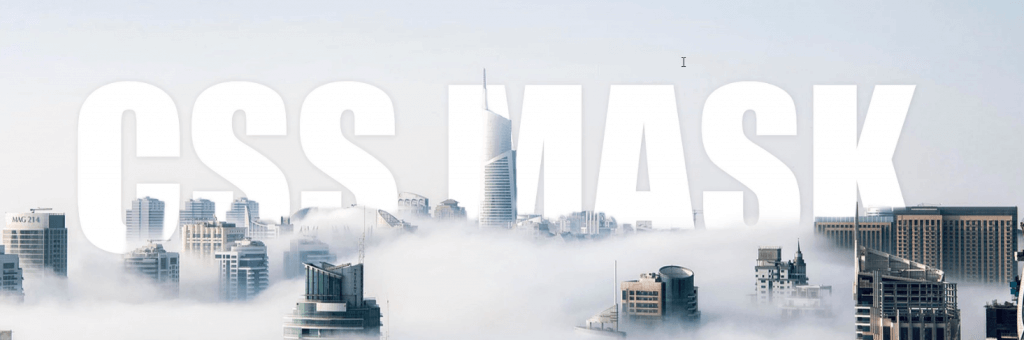
PNG Mask
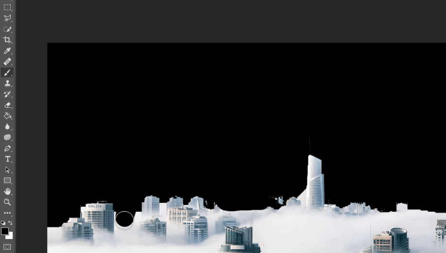
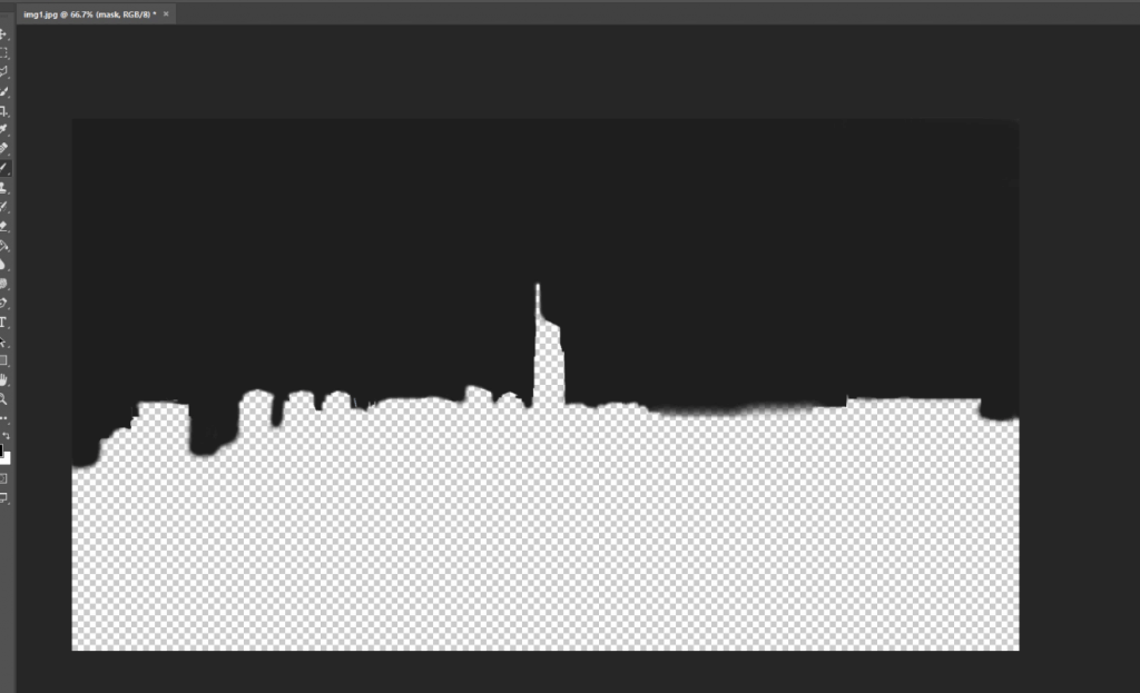
Now if your mask have a soft edge such as cloud, you’ll need to use a transparent png instead of svg.
Ppen the image and select the visible area you want using quick selection tool. Then use brush and eraser around the edge for detailing.
Once finished, save it as transparent png.
To use it, just replace the svg with the png mask and that’s it!
.mask {
  mask:url("mask.png");
  mask-size: cover;
  -webkit-mask:url("mask.png");
  -webkit-mask-size:cover;
  width:100%;
  height:100%;
}
And that’s all for this tutorial, hope you guys enjoy! Don’t forget to subscribe our YouTube channel to stay tune for dev tips and tutorials 🙂

Thank man, now this makes a lot more sense for me =).
Ce es magnifiqué. And what about the image and the source code. I have not photoshop.