Preserve Aspect Ratio of Element with CSS Padding
Padding is a CSS property that is used to generate space around html element and probably one of the most used property. But do you know that padding can be used for more than just adding space? In this tutorial, we’ll show you the CSS padding trick to create a preserved aspect ratio element for responsive web design. Let’s check it out!
The Problem with Relative Width/Height
So I have this box on the page with fixed size 4:3 aspect ratio.
<div class="box"></div>
.box {
  width:800px;
  height:600px;
  background:red;
}
If we resize the browser window, the box will stay the same because of the fixed size in pixels. This is not good for responsive design if we want the box the auto resize.
The simple solution is to define the width and height as a relative value like percentage.
.box {
  width:55%;
  height:75%;
  background:red;
}
This works fine for most of the time. But if you want the box the auto resize and still maintaining the aspect ratio. Then you will need to use padding.
The Secret
Simply set the height to zero and add a percentage padding-bottom and that’s it!
.box {
  width:55%;
  height:0;
  padding-bottom: calc(55%*3/4);
  background:red;
}
How it works? Percentage padding-bottom is always base on the width of the container.
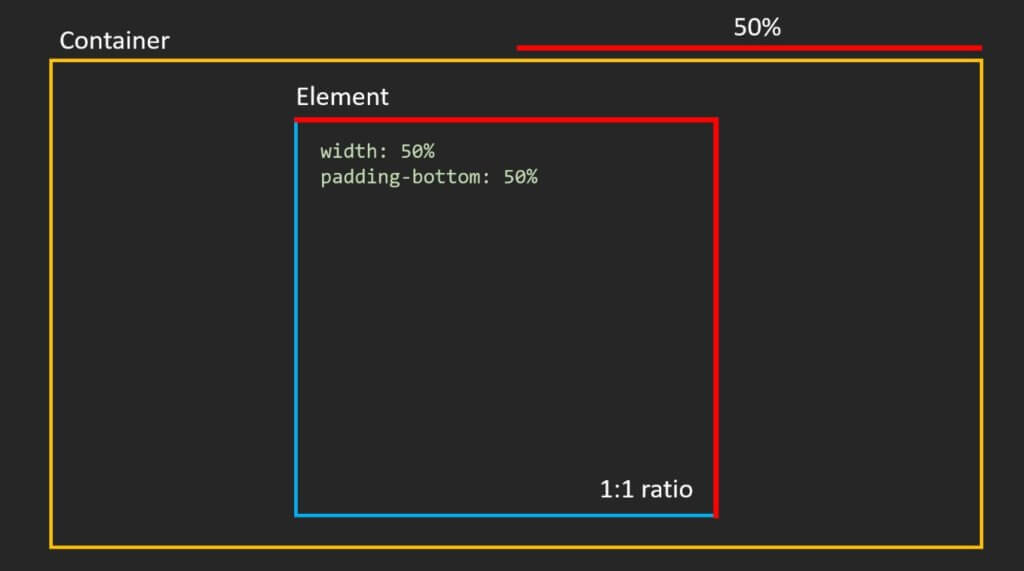
And unlike margin, the space generated from padding are also considered part of that element.
So if we set the height to zero and use only padding to define the height of the element, we’ll able to lock the aspect ratio.
If we want to create, let’s say, element with 16 to 9 aspect ratio. We will need to set the padding-bottom to the width multiplied by 9 and divided by 16.
.box {
  width:55%;
  height:0;
  padding-bottom: calc(55%*9/16);
  background:red;
}
The Catch
Now there is a minor problem with this method though. Since all the height are generated with padding, all the content will be pushed to the top. So if we use a flex layout to vertically center the content. It won’t work (see ugly result below!)
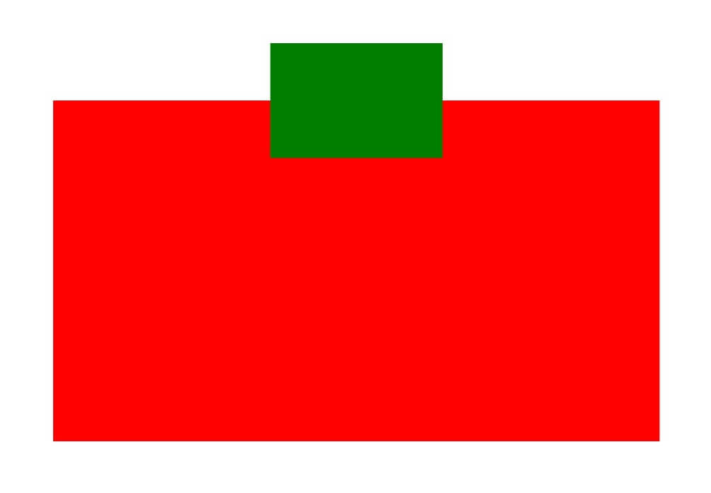
To fix this, we’ll need to create a container inside to wrap the content and use absolute position to put it back into place. Then move the flex setting to the wrapper instead. We also need to set the relative position to the main box to support the absolute position of the child element.
<div class="box">
  <div class="wrapper">
      <div class="content"></div>
  </div>
</div>
.box {
width:55%;
height:0;
padding-bottom: calc(55%*9/16);
background:red;
position: relative;
}
.wrapper {
position: absolute;
top:0;
left:0;
width:100%;
height: 100%;
display: flex;
align-items: center;
justify-content: center;
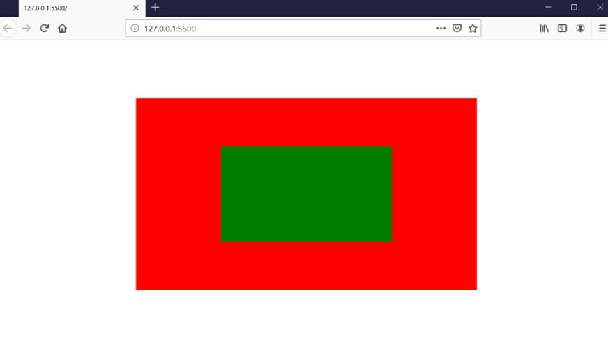
}And now if we set the child element size to percentage, we’ll also have the same aspect ratio with auto-resize.
.content {
  width:50%;
  height:50%;
  background:green;
}
Find the source code and demo on codepen!
