How to create Google Style Login Form
In this tutorial, I’m going to show you how to create a responsive Google style login form using materialize framework in just a few minutes. Ready? Let’s check it out!
The Material Design
Material Design is design principle created and designed by Google for all their products and applications.
[su_quote]Material Design defines the qualities that can be expressed by UI regions, surfaces, and components. Design and strategize how your app is built using foundations that address design from both a broad and detailed perspective. [/su_quote]
In this tutorial we’re going to use Materialize Front-end Framework that is based on Google Material Design.
The Code
To start using Materialize, you can download the files and include it to your project or you can just use the CDN. This tutorial is going to use the latter option.
<!-- Compiled and minified CSS -->
<link rel="stylesheet" href="https://cdnjs.cloudflare.com/ajax/libs/materialize/1.0.0/css/materialize.min.css">

<!-- Compiled and minified JavaScript -->
<script src="https://cdnjs.cloudflare.com/ajax/libs/materialize/1.0.0/js/materialize.min.js"></script>
Now Let’s talk about the input field structure of materialize. To utilize the framework, first you’ll need to create a wrapper for every input field with an input-field class. Then the input element itself and then a label.
<div class="input-field col s6">
  <input id="last_name" type="text" class="validate">
  <label for="last_name">Last Name</label>
</div>
You must assign an id to an input and then set the for attribute of the label to that id. The animation will not work if you do not follow this rule.
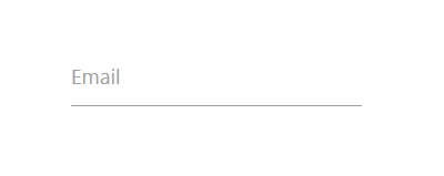
Now lets add an email input field to our example page. I’ll also add validate to the input to utilize the HTML5 validation so the field will change the color to green for valid email address or red if it’s invalid.
<div class="input-field">
  <input id="email_input" type="email" class="validate">
  <label for="email_input">Email</label>
</div>
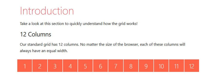
Now before we work on the rest of the fields, let’s look at the grid structure of materialize framework.
For every grid row, Materialize will divide them into 12 columns regardless of the size. Then you can specify the size of the element by adding col class then s follow by the number columns. For example, element with s6 is going to have a half size of that row.
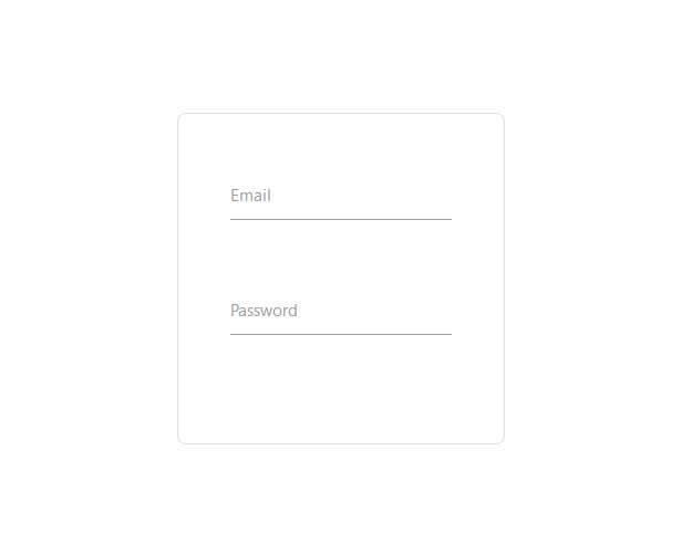
So I’m going to wrap the input inside a row and set the size to s12. Then create another input for password. Also wrap everything inside container div to create rounded border box.
<div class="login-div">
  <div class="row">
    <div class="input-field col s12">
      <input id="email_input" type="email" class="validate">
      <label for="email_input">Email</label>
    </div>
  </div>
  <div class="row">
    <div class="input-field col s12">
      <input id="password_input" type="password" class="validate">
      <label for="password_input">Password</label>
    </div>
  </div>
</div>
.login-div {
max-width: 430px;
padding: 35px;
border: 1px solid #ddd;
border-radius: 8px;
}
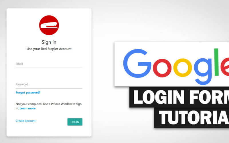
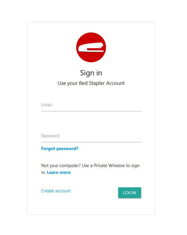
Now I’m going to start adding informative text and button on the form like Google does. Materialize already have built in button component by simply add btn class to a link. You can also add click effect by adding wave-effect and wave-light classes.
Then add CSS for circle website logo using margin: 0 auto; for center alignment.
<div class="login-div">
      <div class="row">
        <div class="logo"></div>
      </div>
      <div class="row center-align">
        <h5>Sign in</h5>
        <h6>Use your Red Stapler Account</h6>
      </div>
...
      <div class="row">
        <div class="col s12">Not your computer? Use a Private Window to sign in. <a href="#"><b>Learn more</b></a></div>
      </div>
      <div class="row"></div>
      <div class="row">
        <div class="col s6"><a href="#">Create account</a></div>
        <div class="col s6 right-align"><a class="waves-effect waves-light btn">Login</a></div>
      </div>
...
.logo {
background-image: url("Logo.png");
width:100px;
height:100px;
border-radius: 50%;
margin:0 auto;
}
This is only a little demonstration of Materialize. There are lots more features available. Check the documentation on the project page and try it yourself 🙂
And That’s it for this tutorial. Hope you guys enjoy. If you want to see more development tips and tutorial videos, don’t forget to subscribe to our Facebook and Youtube Channel to stay tune for update!
Source code – Download
