Realistic Reflection Effect with Pure CSS
In this tutorial we’ll show you how to create a reflection effect of any element using only CSS in just a few minutes!
The Concept
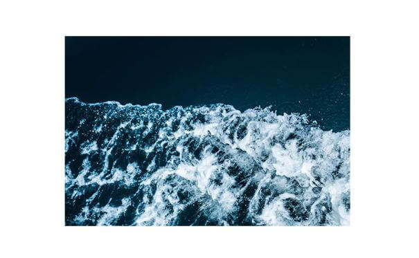
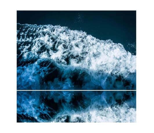
First let’s get to understand the concept by adding reflection effect to this element. This is a simple div element with assigned reflection class for the image background.
<div class="reflection"></div>
.reflection {
width: 500px;
height:333px;
position: relative;
background: url("img1.jpg");
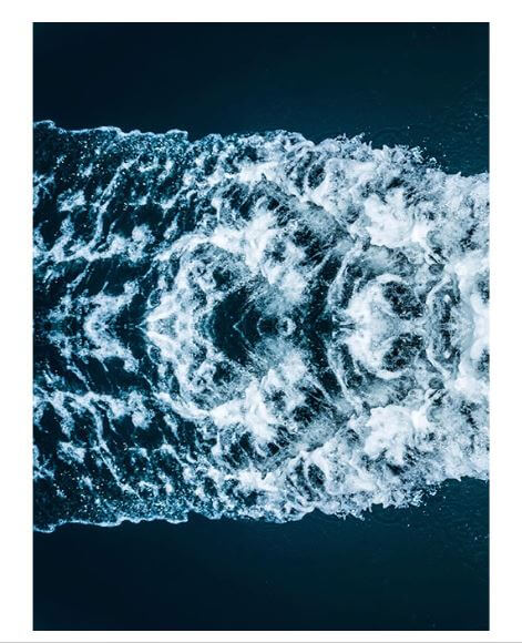
}Now I’m going to create a duplicate of the image using after pseudo-element. We’ll use the same background as the the original one. You do it by using inherit for background-image property. Same as width and height we’ll inherit that from the original. Then I’ll place it underneath using absolute position and minus percentage bottom
And to flip it vertically, you can use transform scaleY(-1)
.reflection::after {
  content:"";
  background-image: inherit;
  width:inherit;
  height:100%;
  position: absolute;
  bottom:-100%;
  transform:scaleY(-1)
}
But that’s too long. Because the reflection in reality is only around half of the height. So I’m going to reduce it to 40% and re-position it. You’ll notice that I add 1% to create a small gap between the original and the reflection.
.reflection::after {
  content:"";
  background-image: inherit;
  width:inherit;
  height:40%;
  position: absolute;
  bottom:-41%;
  transform: scaleY(-1);
}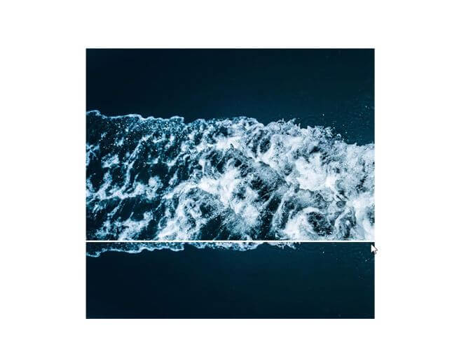
Now the problem is the background is not connected anymore because resize it. To fix this, set background-position to bottom. and background-size to cover to both of them. You may notice a shifted in background if your image file is larger than the div size (To prevent this, resize the image to match the div size)
.reflection {
...
  background-position: bottom;
  background-size: cover;
}
.reflection::after {
...
  background-position: bottom;
  background-size: cover;
}
Next I’ll create another div using pseudo element before. This time I’ll make larger than the reflection. Then create a gradient background from transparent white to opaque white. This will create a fading effect for the reflection. You’ll also need to set the z-index to put it on top.
.reflection::before {
  content:"";
  width:inherit;
  height: 42%;
  position: absolute;
  bottom: -42%;
  background: linear-gradient(to bottom, rgba(255,255,255,0.3),white);
  z-index: 1;
}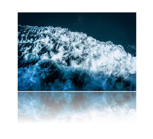
Looks good. now I’m going create a box-shadow to the original image to create depth. And then reduce the opacity of the reflection to 50%
.reflection {
...
  box-shadow: 0px 50px 70px rgba(0,0,0,0.3),
              0px 10px 10px rgba(0,0,0,0.1);
}
.reflection::after {
...
  opacity: 0.5;
}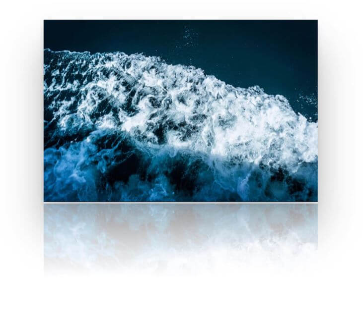
And that’s the gist of the concept!
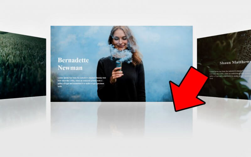
Let’s Try It!
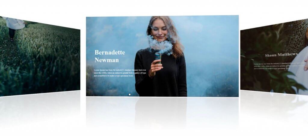
Now I found a coverflow demo on Codepen that utilize the swiper.js (A cool mobile swipe JavaScript library) A perfect usage example for our project! So I steal the code and tweak it a little bit and then add the reflection the same way we did with our first example. and here is the result.
You can find the code for all of them from the link below.
Enjoy! And don’t forget to subscribe our YouTube Channel if you want to stay tune for more dev tips and tutorial videos!

just what i was looking for