CSS Neumorphic Login Form Design Tutorial
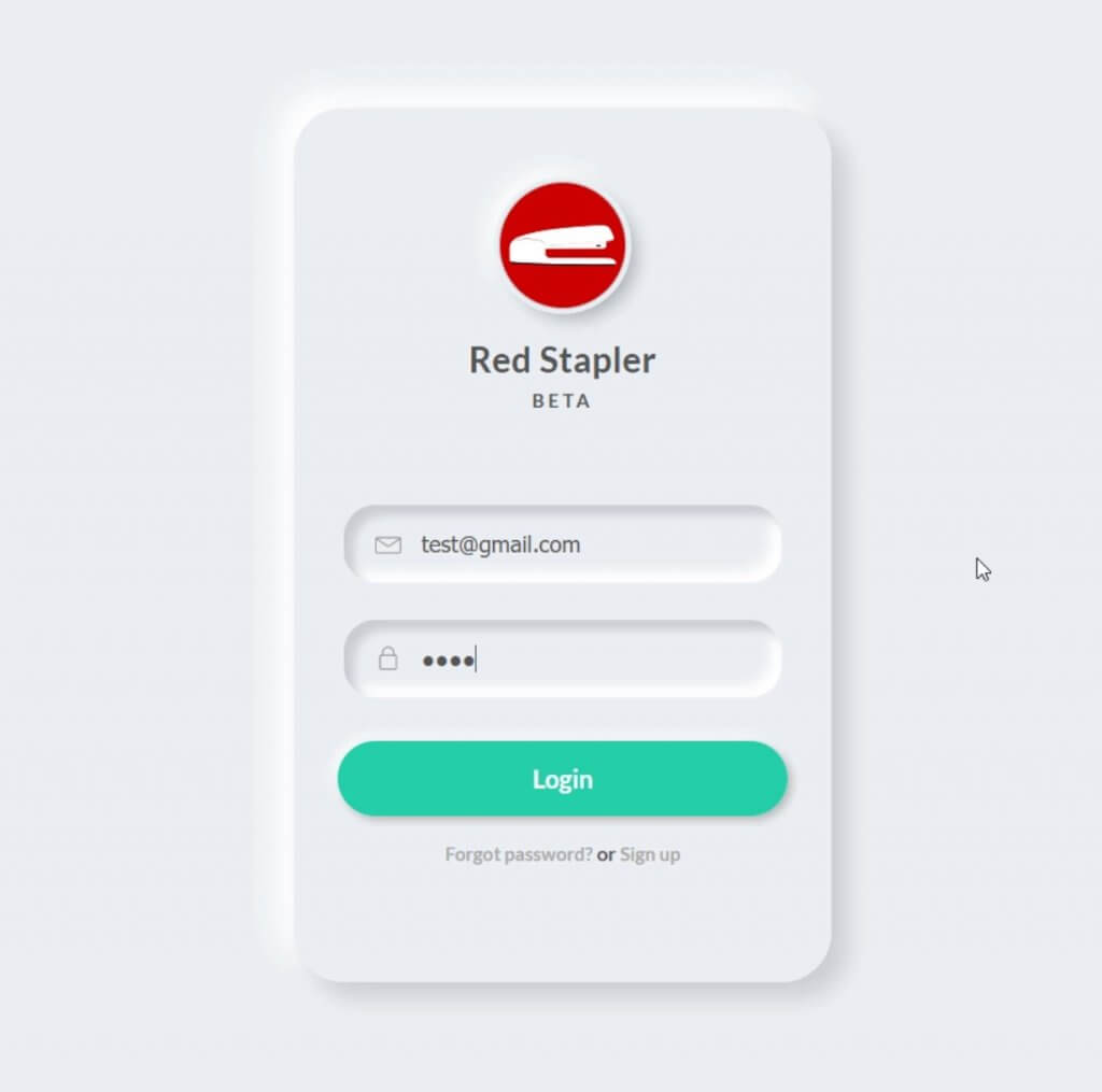
Neumorphic design is another UI design that has become popular these days. The main concept is to use the light source and shadow in a way to create a soft 3D effect that add focus to your element. Making neumorphic effect is actually pretty easy using only just CSS box-shadow. In this tutorial, we’re going to show to you how to create a neumorphic login form design using CSS. Let’s check it out!
Box Shadow Trick
First let’s create a new div for our login form body
<div class="login-div"></div>
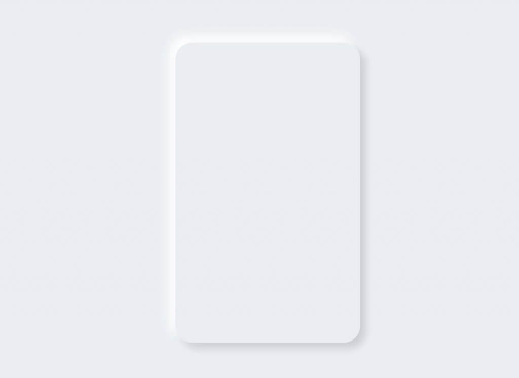
border-radius plays important role in neumorphic design to create a soft round corner effect. Since the login form is going to protrude from the body, I’m going to use the same background color.
And here is the key part. I’m going to use box-shadow to create a light effect. Add dark shadow at the bottom right side. Then add bright color shadow at the top left side. This will make the element looks like it has the light source illuminating from the top left corner of the screen.
.login-div {
  width:430px;
  height: 700px;
  padding: 60px 35px 35px 35px;
  border-radius: 40px;
  background: #ecf0f3;
  box-shadow: 13px 13px 20px #cbced1,
              -13px -13px 20px #ffffff;
}
The Login Form
Now we’re going to start adding content to the form. The structure is pretty simple. Logo, title, sub-title, input fields, button and forgot password/signup links.
<div class="login-div">
  <div class="logo"></div>
  <div class="title">Red Stapler</div>
  <div class="sub-title">BETA</div>
  <div class="fields">
    <div class="username"><input type="username" class="user-input" placeholder="username" /></div>
    <div class="password"><input type="password" class="pass-input" placeholder="password" /></div>
  </div>
  <button class="signin-button">Login</button>
  <div class="link">
    <a href="#">Forgot password?</a> or <a href="#">Sign up</a>
  </div>
</div>
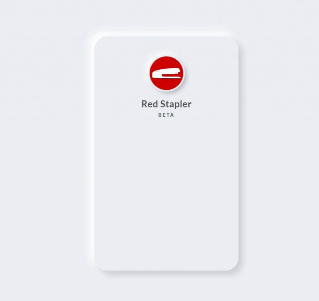
For the logo, I’m going to add a small logo shadow. Then add a 5 px offset with the same color as login form background. Then add the bottom right shadow and top left shadow like we did previously with the login form body.
.logo {
  background:url("Logo.png");
  width:100px;
  height: 100px;
  border-radius: 50%;
  margin:0 auto;
  box-shadow:
  /* logo shadow */
  0px 0px 2px #5f5f5f,
  /* offset */
  0px 0px 0px 5px #ecf0f3,
  /*bottom right */
  8px 8px 15px #a7aaaf,
  /* top left */
  -8px -8px 15px #ffffff
  ;
}
Then add some CSS for font setting of the texts
.title {
  text-align: center;
  font-size: 28px;
  padding-top: 24px;
  letter-spacing: 0.5px;
}
.sub-title {
  text-align: center;
  font-size: 15px;
  padding-top: 7px;
  letter-spacing: 3px;
}
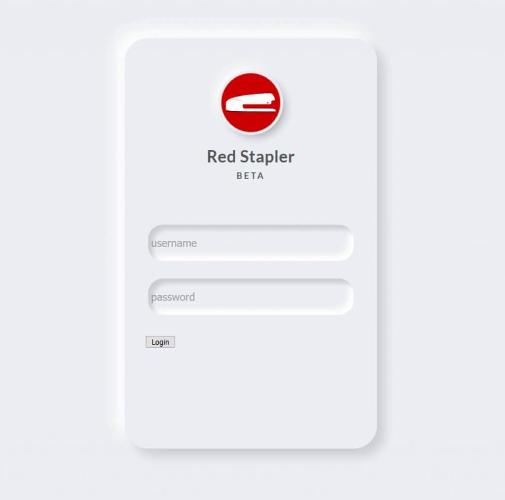
Next I’m going to add sunken effect to the input fields. Add the box-shadow like we did previously except that this time we’ll use inset instead.
.fields {
  width: 100%;
  padding: 75px 5px 5px 5px;
}
.fields input {
  border: none;
  outline:none;
  background: none;
  font-size: 18px;
  color: #555;
  padding:20px 10px 20px 5px;
}
.username, .password {
  margin-bottom: 30px;
  border-radius: 25px;
  box-shadow: inset 8px 8px 8px #cbced1,
              inset -8px -8px 8px #ffffff;
}
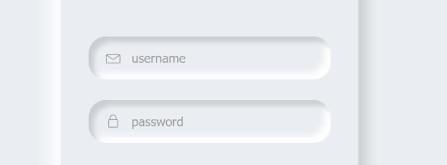
Next we’ll add small icons to the input fields. I’m going to use free svg icon. Then set the height in the CSS and add some margin.
.fields svg {
  height: 22px;
  margin:0 10px -3px 25px;
}
Then apply the CSS style for the button and links
.signin-button {
  outline: none;
  border:none;
  cursor: pointer;
  width:100%;
  height: 60px;
  border-radius: 30px;
  font-size: 20px;
  font-weight: 700;
  font-family: 'Lato', sans-serif;
  color:#fff;
  text-align: center;
  background: #24cfaa;
  box-shadow: 3px 3px 8px #b1b1b1,
              -3px -3px 8px #ffffff;
  transition: 0.5s;
}
.signin-button:hover {
  background:#2fdbb6;
}
.signin-button:active {
  background:#1da88a;
}
.link {
  padding-top: 20px;
  text-align: center;
}
.link a {
  text-decoration: none;
  color:#aaa;
  font-size: 15px;
}
You can download the source code of this project here. If you like this tutorial, don’t forget to subscribe our YouTube channel to stay tune 🙂

Thank you this is a great help for everyone
555