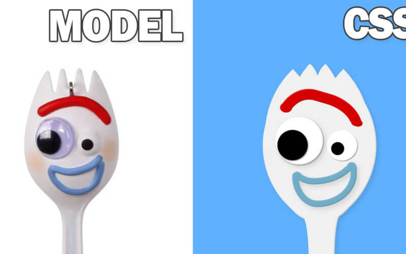
CSS Drawing Tutorial for Beginners
Hello and welcome to Red Stapler channel. In this tutorial, we’re going to show you the basic of how to use CSS to draw Forky from Toy Story 4 image step by step from scratch. Let’s check it out!
The Face
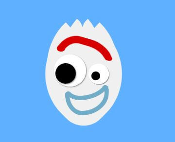
Here is the model image for this tutorial. 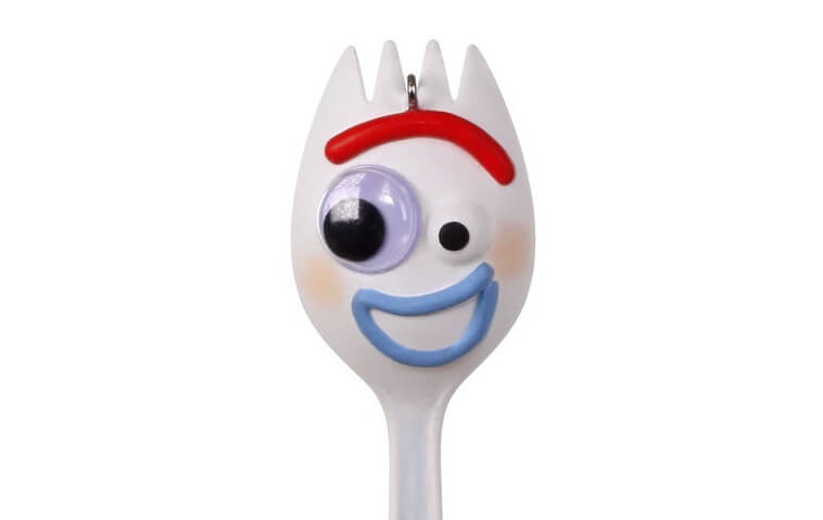
First, let’s create a wrapper and div for the face.
<div class="forky">
  <div class="face"></div>
</div>
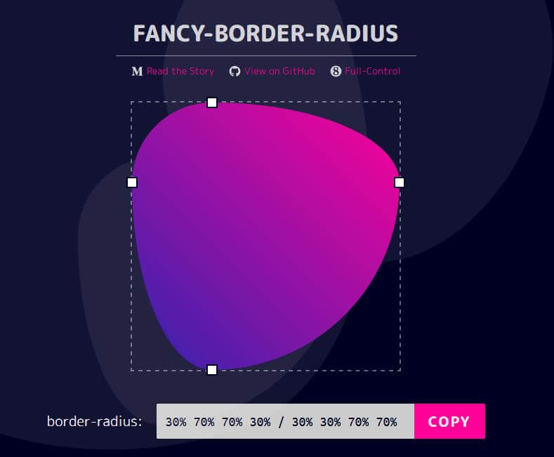
The key concept of CSS drawing is to creatively use border-radius to create curves and shapes. Then rotate and place it on the right position. My favorite helper tool for this job is border-radius generator. I also made a tutorial about this not long ago and you might want to check it out.
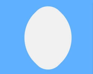
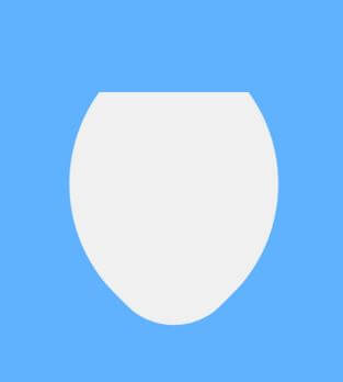
I’m going to place the image at the center of the screen using absolute position and 50% top/left. Then for the face, I’ll set the size to 300px, set background to almost white. Also add top/left offset and -45deg rotation.
When use CSS to draw image, for me I’d prefer to use absolute position as it’s easier to control and fix the element position.
.forky {
position: absolute;
top: 50%;
left: 50%;
transform: translate(-50%,-50%);
}
.face {
width: 300px;
height: 300px;
background: #f0f0f0;
position: absolute;
border-radius: 65% 30% 65% 28%;
transform: rotate(-45deg);
top: -135px;
left: -147px;
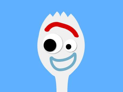
}Here is how looks like. How do I know how many degrees or pixel to put in? My trick is to use browser dev tools to help you for a live adjustment. Then copy the CSS back to the source file when you got the correct value.
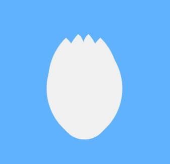
The Hair
I’m going to create a rectangle div with the same color as background to mask the top of the face. Also add 4 divs for each of his hair.
<div class="forky">
...
  <div class="face-mask1"></div>
  <div class="fork1"></div>
  <div class="fork2"></div>
  <div class="fork3"></div>
  <div class="fork4"></div>
...
The mask div will mask the unwanted part from the face div.
.face-mask1 {
  width: 300px;
  height: 60px;
  background: rgb(95, 177, 255);
  position: absolute;
  top: -160px;
  left: -147px;
}
Now I’m going to work on his hair. Again we’ll can create something similar with border-radius.
.fork1, .fork4 {
  width: 193px;
  height: 189px;
  background: #f0f0f0;
  border-radius: 100% 0% 97% 3% / 91% 0% 99% 3%;
  transform: rotate(-44deg);
  position: absolute;
  top: -121px;
  left: -159px;
}
.fork2, .fork3 {
  width: 122px;
  height: 77px;
  background: #f0f0f0;
  border-radius: 100% 0% 86% 14% / 98% 0% 100% 2%;
  transform: rotate(128deg);
  position: absolute;
  top: -141px;
  left: -88px;
}
.fork3 {
  left: -34px;
  transform: rotate(50deg) rotateY(180deg);
}
.fork4 {
  left: -37px;
  transform: rotate(45deg) rotateY(180deg);
}
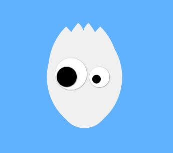
The Eyes
Again same technique. Only this time I’ll add some box-shadow to create depth.
.eye1 {
  width: 110px;
  height: 110px;
  background: white;
  border-radius: 50%;
  position: absolute;
  top: -51px;
  left: -99px;
  box-shadow: 1px 1px 3px #888787;
}
.pupil1 {
  width: 70px;
  height: 70px;
  background: black;
  border-radius: 50%;
  position: absolute;
  top: 30px;
  left: 5px;
  box-shadow: 1px 1px 3px #888787;
}
.eye2 {
  width: 70px;
  height: 70px;
  background: white;
  border-radius: 50%;
  position: absolute;
  top: -20px;
  left: 20px;
  box-shadow: 1px 1px 1px #888787;
}
.pupil2 {
  width: 30px;
  height: 30px;
  background: black;
  border-radius: 50%;
  position: absolute;
  top: 27px;
  left: 10px;
}
The Mouth and Brow
This time, we’ll use actual border to create lips and brow. We’ll remove the unwanted part by using clip-path property. My favorite helper tool to generate the right amount clip is Clippy.
.mouth1 {
  width: 120px;
  height: 81px;
  border: 15px solid #71acc8;
  border-radius: 42% 17% 70% 44% / 32% 26% 80% 73%;
  position: absolute;
  top: 46px;
  left: -60px;
  clip-path: polygon(0 33%, 100% 11%, 99% 100%, 0% 100%);
}
.mouth2 {
  width: 144px;
  height: 81px;
  border: 15px solid #71acc8;
  border-radius: 42% 17% 70% 44% / 32% 26% 80% 73%;
  position: absolute;
  top: -6px;
  left: -78px;
  clip-path: polygon(0 83%, 100% 56%, 99% 100%, 0% 100%);
}
.brow {
  width: 150px;
  height: 51px;
  border: 25px solid #d70000;
  border-radius: 32% 43% 39% 52% / 28% 21% 86% 72%;
  position: absolute;
  top: -107px;
  left: -91px;
  clip-path: polygon(0 54%, 100% 39%, 99% 100%, 0% 100%);
  transform: rotate(196deg);
}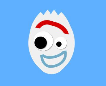
Now we’re going to work on the detail by creating mask to create curve on the eyebrow and mouth where the border line has been cut off.
.brow-mask1 {
  width: 28px;
  height: 23px;
  background: #d70000;
  border-radius: 50%;
  position: absolute;
  top: -84px;
  left: -88px;
}
.brow-mask2 {
  width: 27px;
  height: 17px;
  background: #d70000;
  border-radius: 50%;
  position: absolute;
  top: -46px;
  left: 75px;
  transform: rotate(13deg);
}
.mouth-mask1 {
  width: 22px;
  height: 22px;
  background: #71acc8;
  border-radius: 50%;
  position: absolute;
  top: 75px;
  left: -60px;
}
.mouth-mask2 {
  width: 22px;
  height: 22px;
  background: #71acc8;
  border-radius: 50%;
  position: absolute;
  top: 53px;
  left: 66px;
}
The Handle
Next I’ll create the handle with a simple rectangle. Then mask it with curved rectangle with the same color as background and put them on both sides.
.handle {
  width: 80px;
  height: 100px;
  background: #f0f0f0;
  position: absolute;
  top: 171px;
  left: -32px;
}
.handle-mask1, .handle-mask2  {
  border-radius: 87% 13% 100% 0% / 0% 100% 0% 100%;
  width: 100px;
  height: 100px;
  background: rgb(95, 177, 255);
  position: absolute;
  top: 183px;
  left: -122px;
}
.handle-mask2 {
  left: 38px;
  transform: rotateY(180deg);
  top: 178px;
}
You can download source code for this project here or see the video version of this tutorial.
Hope this should give you some ideas on how to start drawing image with pure CSS. If you want to see more development tips and tutorial, please subscribe to our channel for weekly update. Bye 🙂
