Create Neumorphic Vertical Timeline with CSS only
In this post, we’ll create a vertical timeline on webpage in neumorphic style using only CSS. It will be responsive with click-to-expand event description without using Javascript.
The HTML
So let’s walkthrought the current html structure of the example page.
<body>
<h1>CSS Vertical Timeline Tutorial</h1>
<div class="wrapper">
<ul class="timeline">
<li>
<details class="panel">
<summary>Event 1</summary>
<p>Lorem ipsum dolor sit...</p>
</details>
</li>
<li>
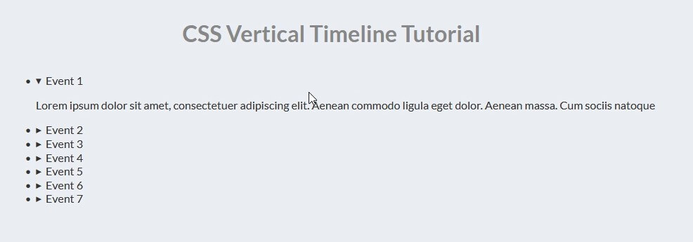
...First we have a wrapper div which will contain the whole timeline and inside we’ll use a list tag.
For each list item, we’ll use HTML <details> tag. The event headline will be in <summary> tag and the description will be in the detail’s body
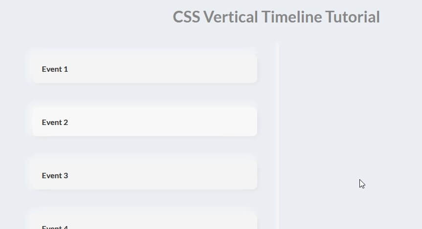
So here is what it looks like currently. Just a simple list item with expandable details.
That’s all. Let’s work on the CSS!
The CSS
First I’ll set the width and max width. and then set the display to flex and center all the element inside. I’ll remove the list bullet point by setting list-style to none.
.wrapper {
  width:100%;
  max-width: 1000px;
  display: flex;
  justify-content: center;
}
.timeline {
  list-style: none;
  padding: 20px 0 20px;
  position: relative;
  width: 100%;
}
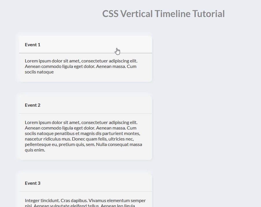
For each list item (panel container), I’ll set the margin bottom to 50px and flex display. For each panel (child). set the width to 46%. (I don’t set it to 50% so that we’ll have some spacing)
The key of neumorphic design is box-shadow. I’ll set the bright color at the top left side and darker color at bottom right to create a neumorphic effect.
.timeline li {
  margin-bottom: 50px;
  position: relative;
  display: flex;
}
.timeline .panel {
  width: 46%;
  border-radius: 10px;
  overflow: hidden;
  position: relative;
  background: #f5f5f5;
  box-shadow: 3px 3px 12px #dee1e4,
  -3px -3px 12px #ffffff;
}
Then for the each summary tag. I’ll set the display to block and remove the default decoration style by setting user-select and outline to none. Also set the cursor to pointer.
I’ll use cublic-bezier function to add smooth transition when user click the item to expand.
.timeline p {
  padding: 0 20px 10px 20px;
}
.timeline summary {
  display:block;
  user-select: none;
  cursor: pointer;
  outline: none;
  padding:20px;
  margin-bottom: 0px;
  transition: all 600ms cubic-bezier(0.2,1,0.3,1);
  font-weight: 600;
}
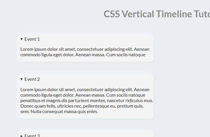
Then add margin and padding when the details and summary tag is in expanded state (using CSS [open] selector) Also create hover effect by changing background color.
.timeline .panel[open] summary {
  margin-bottom: 20px;
  padding-bottom: 20px;
  border-bottom: 1px solid rgba(0,0,0,0.1);
}
.timeline summary:hover {
  background: #f8f8f8;
}
Looks much better now 🙂 Next I’ll create the actual timeline line.
I’ll use :before pseudo-element, set both top and bottom to zero and place it in the center by setting left to 50% and position:absolute. Also set the background and box-shadow to create neumorphic effect
.timeline:before {
  top:0;
  bottom:0;
  left: 50%;
  position: absolute;
  content: "";
  width: 5px;
  background-color: #f5f5f5;
  box-shadow: 1px 1px 5px #dee1e4,
  -1px -1px 5px #ffffff;
}
Finally, we’ll work on the point on the timeline. Again, I’ll use pseudo-element.
I will place it on the timeline by setting position:absolute, top, left and margin. Also set the z-index to make this element appears on top. Then add box-shadow.
.timeline li:before {
content: "";
width: 25px;
height: 25px;
border-radius: 50%;
position: absolute;
top: 18px;
left: 50%;
background: #f8f8f8;
margin-left:-11px;
z-index: 99;
box-shadow: 2px 2px 5px #dee1e4,
-2px -2px 5px #ffffff;
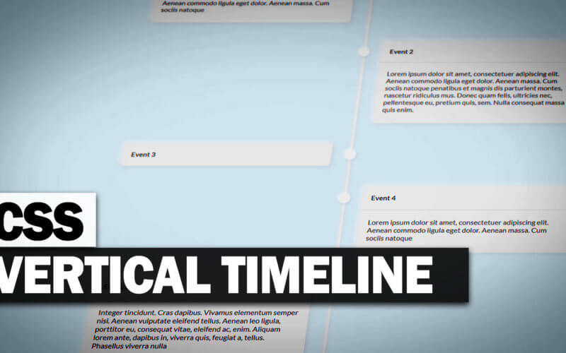
}We’ll put every even items on the side side of the timeline by setting justfiy-content to flex-end.
.timeline li:nth-child(even) { justify-content: flex-end; }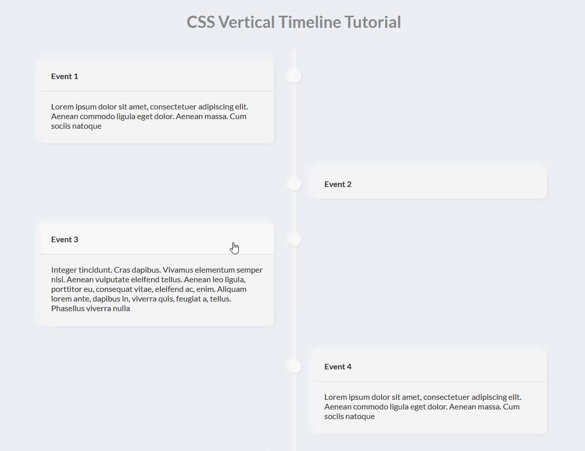
You can download source code of this tutorial here.
So that’s all for this tutorial. Hope you guys enjoy. If you love it don’t forget to subscribe our Youtube channel and like our Facebook page.
