
Create a 3D Text with RGB Animation using CSS
In this tutorial we’ll show you how to create a 3D text effect with RGB color animation using pure CSS in just a few minutes. Let’s check it out! (Download source code at the end of this post)
Setup
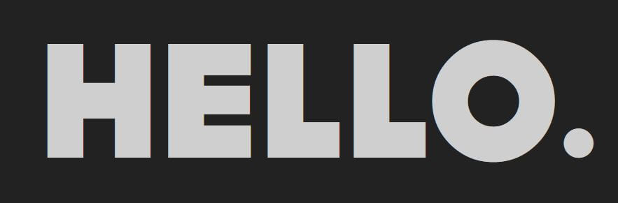
Let’s start with creating a text div. I’ll also assign a class for it too.
<div class="emboss-txt">HELLO.</div>
Then we’re going to find a suitable font. For this tutorial, I’m going to use font Dock11 which has a nice bold text style. Once you have downloaded and placed the font in the web folder, let’s work on the CSS.
I’m going import our custom font using font-face rule.
@font-face {
  font-family: dock11;
  src:url(heavy_dock11.otf);
}
Then set the font size and family and add letter spacing. Also change to color to almost white.
.emboss-txt {
  position: relative;
  font-size: 180px;
  font-family: dock11;
  letter-spacing: 5px;
  color:rgb(207,207,207);
}
Now you should see something like this (I use flex layout on body to center the div and set the background color to grey)
The Fake 3D
And here is the key step. Since we can’t create an actual 3D text with CSS, we’re going to apply a multiple layers of text-shadow to imitate the 3D effect instead.
First I’m going to create the text body using 3 layers of white smoke color. With this technique it will look like the text is actually have depth.
.emboss-txt {
...
  text-shadow:
  /*3d layers*/
  0px 0px 1px rgb(167,167,167),
  0px 1px 1px rgb(167,167,167),
  0px 2px 1px rgb(167,167,167);
}
We can repeat it as many times as you like depend on how much depth you need. For this tutorial I’ll do it three times (3×3 layers). Don’t forget to increase the offset of each layer too.
.emboss-txt {
...
  text-shadow:
  /*3D layers*/
  0px 0px 1px rgb(167,167,167),
  0px 1px 1px rgb(167,167,167),
  0px 2px 1px rgb(167,167,167),

  1px 1px 1px rgb(167,167,167),
  1px 2px 1px rgb(167,167,167),
  1px 3px 1px rgb(167,167,167),

  2px 2px 1px rgb(167,167,167),
  2px 3px 1px rgb(167,167,167),
  2px 4px 1px rgb(167,167,167);
}

Next we’ll create the actual shadow. First let’s start with long soft bottom shadow. we’ll use two layers of high blur amount transparent black shadow. Then we’ll create a short bottom shadow to emphasize the 3D depth. And finally add left and right side shadow with moderate blur amount.
...

/*long soft bottom*/
1px 10px 30px rgba(0,0,0,0.8),
1px 10px 70px rgba(0,0,0,0.8),

/*short soft bottom*/
0px 5px 5px rgba(0,0,0,0.8),

/*left shadow*/
-5px 5px 20px rgba(0,0,0,0.8),
/*right shadow*/
5px 5px 20px rgba(0,0,0,0.8);

Then add a white shinning light to the text using very high blur amount of white shadow.
/*white light*/
1px 1px 120px rgba(255,255,255,0.5);

At this point, many of you might happy with the result already. But for this tutorial, we’ll try to add RGB light cycle effect to the text.
The RGB Animation
First let’s create a pseudo-element. I’ll duplicate all the text properties from the original. Then use absolute position and zero top/left (we’ll place it directly over the it’s parent)
.emboss-txt::after {
  content: "HELLO.";
  font-size: 180px;
  letter-spacing: 5px;
  font-family: dock11;
  position: absolute;
  top:0;
  left:0;
}
Now you’ll see that the text has jump to top left corner instead of overlapping the original text. This because we haven’t set position for the parent yet.
Let’s set position to the parent and add the blue light effect.
.emboss-txt {
  position: relative;
...
}
.emboss-txt::after {
...
  text-shadow: 0px 0px 100px rgba(11,124,199,0.5);
}
Next, let’s define the animation. We’ll use the @keyframes to cycle through 5 colors by changing the text-shadow. (It’s doesn’t have to be 5. You can use less or add more colors as you like)
@keyframes cycle {
  0% { text-shadow: 0px 0px 100px rgba(11,124,199,0.5);}
  20% { text-shadow: 0px 0px 100px rgba(168,11,199,0.5);}
  40% { text-shadow: 0px 0px 100px rgba(11,199,96,0.5);}
  60% { text-shadow: 0px 0px 100px rgba(199,11,11,0.5);}
  80% { text-shadow: 0px 0px 100px rgba(199,96,11,0.5);}
}
Then set the the animation timing function and repeat it.
.emboss-txt::after {
...
  animation: cycle 10s linear infinite;
}
And that’s it! Check the live tutorial from our YouTube Channel (video below) or download the source code to try it yourself 🙂
