
Realistic CSS Bokeh Effect Tutorial
In this tutorial, I’m going to show you how to create a CSS bokeh effect with moving animation in just a few minutes. Let’s check it out! (Full source code at the end)
The Concept
The key concept of this tutorial is very simple. Create circle color div elements then use various CSS box-shadow radius and rotation to create the animation. But manually coding CSS style and animation for each div is quite impractical. So in this tutorial, I’m going to code in SCSS then use the compiler to generate the final CSS.
The HTML
Let’s start with the HTML. We only need a wrapper and the particle divs. you can add as many divs as you like.
<div class="bokeh">
        <div></div>
        <div></div>
...
...
        <div></div>
        <div></div>
        <div></div>
</div>
The CSS (SCSS)
For the SCSS file. First I’m going to define the size/position and background color of the wrapper div. We also need to add overflow hidden to hide any off screen bokeh particles.
.bokeh {
  width: 100%;
  height: 100%;
  position: relative;
  background: #1d0302;
  overflow: hidden;
}
Next we’re going to define constant variables for this project.
- Number of the particles – This should be equaled to the number of div elements you have.
- Particle size – As big as you like.
- Base Opacity – Create transparent effect. We’ll add this with random value later
- Base Brightness – Again, we’ll add this with random value later.
- Color set – These are colors that will be used to generate the particles randomly. I suggest using three but you can add more if needed.
$bokehCount: 25;
$bokehBaseSize: 11rem;
$bokehBaseOpacity: 0.45;
$bokehBaseBrightness: 200;
$bokehBaseDuration: 16s;
$colorSet: (
  #ffa6007c,
  #fe000060,
  #ec6b025b
);
Now for each div, set the position to absolute and border-radius to 50% to create a circle.
.bokeh div {
  position: absolute;
  border-radius: 50%;
}
Then create a loop to iterate through each div. Here we’re going to start adding randomized value. First I’m going to create a randomizedSize which is the base size plus the random value Then use it to set width and height. Next set top and left to random value within 0 to 100% boundary.
@for $i from 1 through $bokehCount {
    &:nth-child(#{$i}) {
      $randomizedSize: random() + $bokehBaseSize;
      width: $randomizedSize;
      height: $randomizedSize;
      top: random(100) * 1%;
      left: random(100) * 1%;
    }
  }
Next is color. We’re going to pick one from the colorSet using nth function and random value within the colorSet length.
color: nth($colorSet, random(length($colorSet)));
The opacity. Same as above. We’ll add the base with some random value.
opacity: $bokehBaseOpacity + random(4) * 0.15;
Now the box-shadow, this will be a bit tricky. Instead of using background-color, we’re going to use the box-shadow to represent the entire particle. So we need to offset the shadow with a value a bit larger than the particle size. Then use a random value for the blur radius and set the shadow color using currentColor.
box-shadow: ($randomizedSize + 5rem) 0 (0.2rem + random()*0.5rem) currentColor;
And finally add a brightness filter with randomized value.
filter: brightness($bokehBaseBrightness + random(150)*1%);
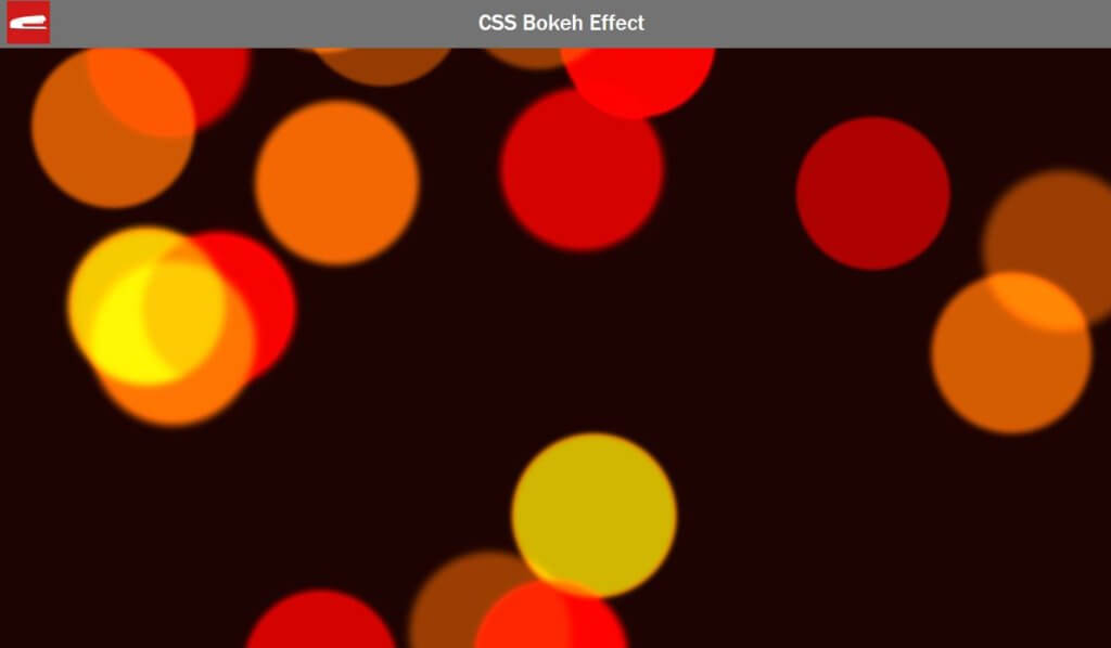
Here is what it looks like so far.
.bokeh div {
  position: absolute;
  border-radius: 50%;

  @for $i from 1 through $bokehCount {
    &:nth-child(#{$i}) {
      $randomizedSize: random() + $bokehBaseSize;
      width: $randomizedSize;
      height: $randomizedSize;
      top: random(100) * 1%;
      left: random(100) * 1%;
      color: nth($colorSet, random(length($colorSet)));
      opacity: $bokehBaseOpacity + random(4) * 0.15;
      box-shadow: ($randomizedSize + 5rem) 0 (0.2rem + random()*0.5rem) currentColor;
      filter: brightness($bokehBaseBrightness + random(150)*1%);
    }
  }
}
The Animation
Now let’s work on the animation. Create a linear infinite animation to rotate the divs 360 degrees.
The trick is we need to random a transform origin so the particles are rotating from various point and appear to look like they are actually moving.
.bokeh div {
  animation-name: bokeh;
  animation-iteration-count: infinite;
  animation-timing-function: linear;
..
}
@keyframes bokeh {
100% {transform: rotate(360deg); }
}Then set the animation duration. this will be the movement speed so I’m going to add a random value as well.
@for $i from 1 through $bokehCount {
&:nth-child(#{$i}) {
...
...
animation-duration: $bokehBaseDuration + random(30) * 1s;
}
}Then we’re all set! See the result in video below. Full source code at the end of this post.
That’s all for this tutorial. Feel free to like or subscribe to our Facebook and Youtube Channel to stay tune. Before leaving you might want to check out our CSS Neon Text Effect 🙂
Source Code
HTML
<html>
<head>
<meta http-equiv="content-type" content="text/html; charset=UTF-8" />
<link rel="stylesheet" type="text/css" href="styles.css">
</head>
<body>
<div class="bokeh">
<div></div>
<div></div>
<div></div>
<div></div>
<div></div>
<div></div>
<div></div>
<div></div>
<div></div>
<div></div>
<div></div>
<div></div>
<div></div>
<div></div>
<div></div>
<div></div>
<div></div>
<div></div>
<div></div>
<div></div>
</div>
</body>
</html>SCSS/CSS
html,body {
margin: 0;
padding: 0;
width:100%;
height: 100%;
}
.bokeh {
width: 100%;
height: 100%;
position: relative;
background: #1d0302;
overflow: hidden;
}
$bokehCount: 20;
$bokehBaseSize: 11rem;
$bokehBaseOpacity: 0.45;
$bokehBaseBrightness: 200;
$bokehBaseDuration: 16s;
$colorSet: (
#ffa6007c,
#fe000060,
#ec6b025b
);
.bokeh div {
position: absolute;
border-radius: 50%;
animation-name: bokeh;
animation-iteration-count: infinite;
animation-timing-function: linear;
@for $i from 1 through $bokehCount {
&:nth-child(#{$i}) {
$randomizedSize: random() + $bokehBaseSize;
width: $randomizedSize;
height: $randomizedSize;
top: random(100) * 1%;
left: random(100) * 1%;
color: nth($colorSet, random(length($colorSet)));
opacity: $bokehBaseOpacity + random(4) * 0.15;
box-shadow: ($randomizedSize + 5rem) 0 (0.2rem + random()*0.5rem) currentColor;
filter: brightness($bokehBaseBrightness + random(150)*1%);
transform-origin: (random(40)-20) * 1rem (random(40)-20) * 1rem;
animation-duration: $bokehBaseDuration + random(30) * 1s;
}
}
}
@keyframes bokeh {
  100% {transform: rotate(360deg); }
}
Hi, I follow your CSS Bokeh Effect Tutorial. just say that is awesome. But when i copy your code and execute file then bokeh effect not work. I show your video and try to again again but its not work. why its not work i don’t understand,Would you like to help me?
Well not sure if I can help without much info but here is the check list:
1) Did you used SCSS compiler and make sure that the css file was generated? (in this video: https://www.youtube.com/watch?v=0MWmv1Gvv5w)
2) Have you used the inspect element and see if the CSS is loaded up properly?
nice blog
nice animate css
Awesome ! Thank you.