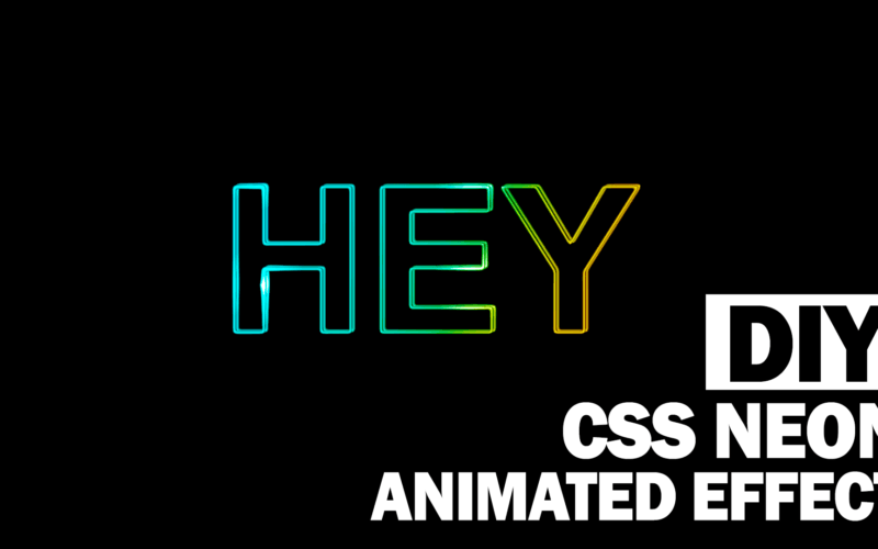
DIY CSS Neon Glow Text Effect Tutorial
In this tutorial, I’m going to show you how to create a CSS animated text with neon light effect in just a few minutes. (Full Source code at the end of this post)
The Text
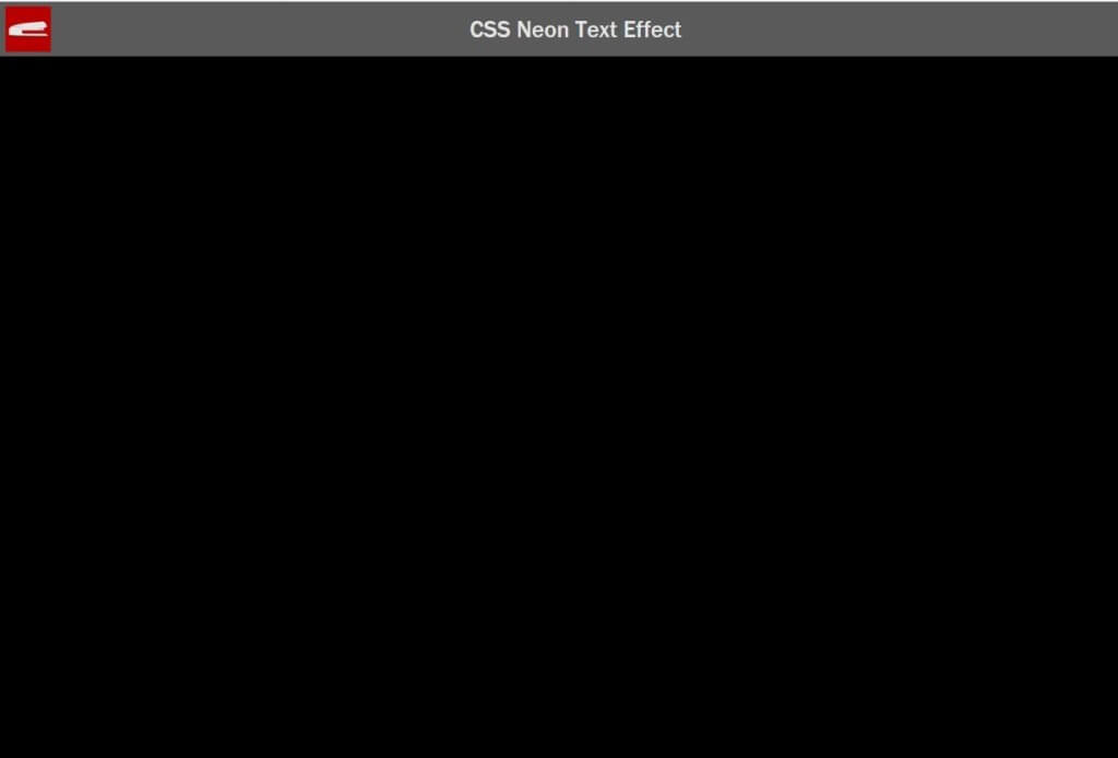
So here is the blank page that I’m going to work on. I already set the background to black and set all the justification and alignment to center on a flex display.
.wrapper {
    height: 800px;
    display: flex;
    align-items: center;
    justify-content: center;
    background: #000000;
}
First, let’s start with the html structure. I’m going to create a wrapper div with a span inside and assign a class to it.
<div class="neon-wrapper">
<span class="txt">hey</span>
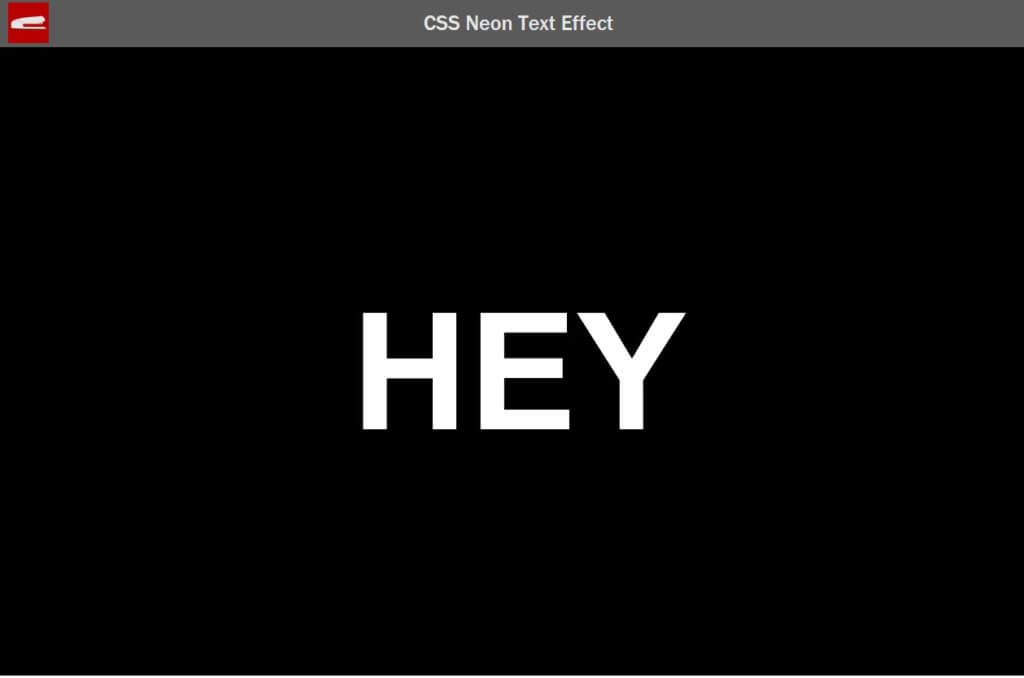
</div>Next, set the text color to white and background to black. Then set the size, font weight, family and style as you like. I’ll also add an inline-flex display to the wrapper div to make the it fit all the child elements inside.
.txt {
    color: #ffffff;
    background:#000000;
    font-size:200px;
    font-weight: bold;
    font-family: Arial;
    text-transform: uppercase;
}
.neon wrapper {
    display: inline-flex;
}
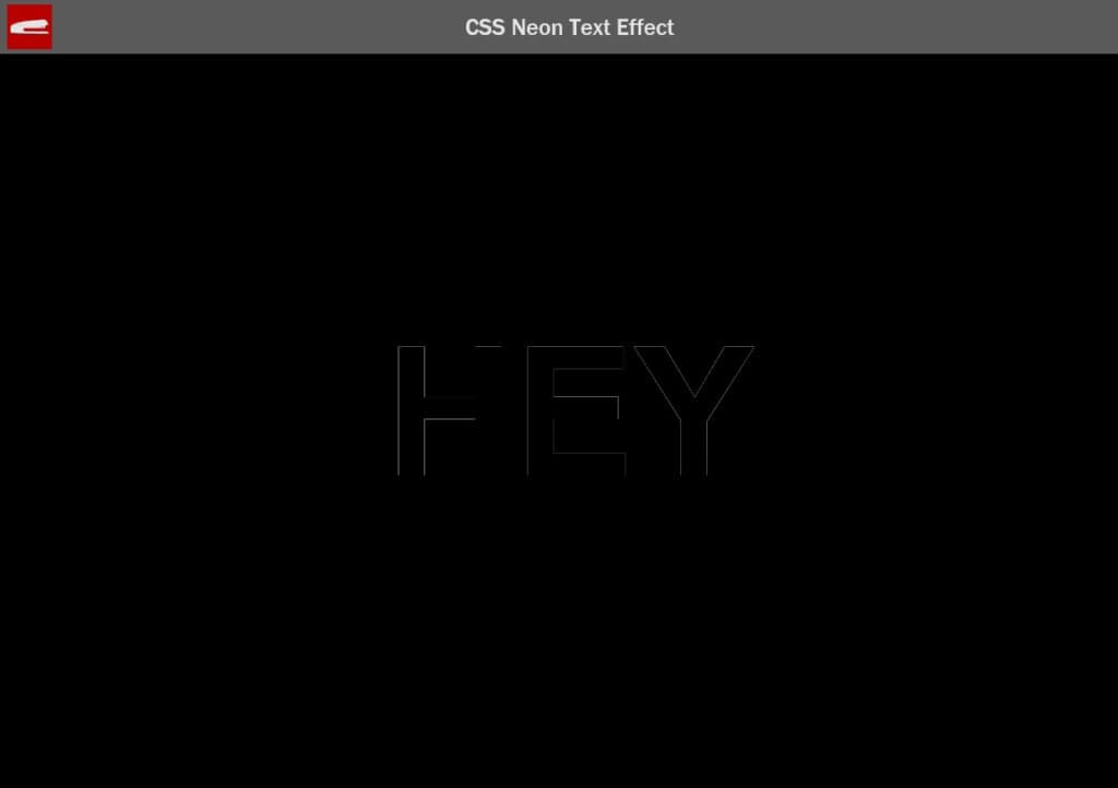
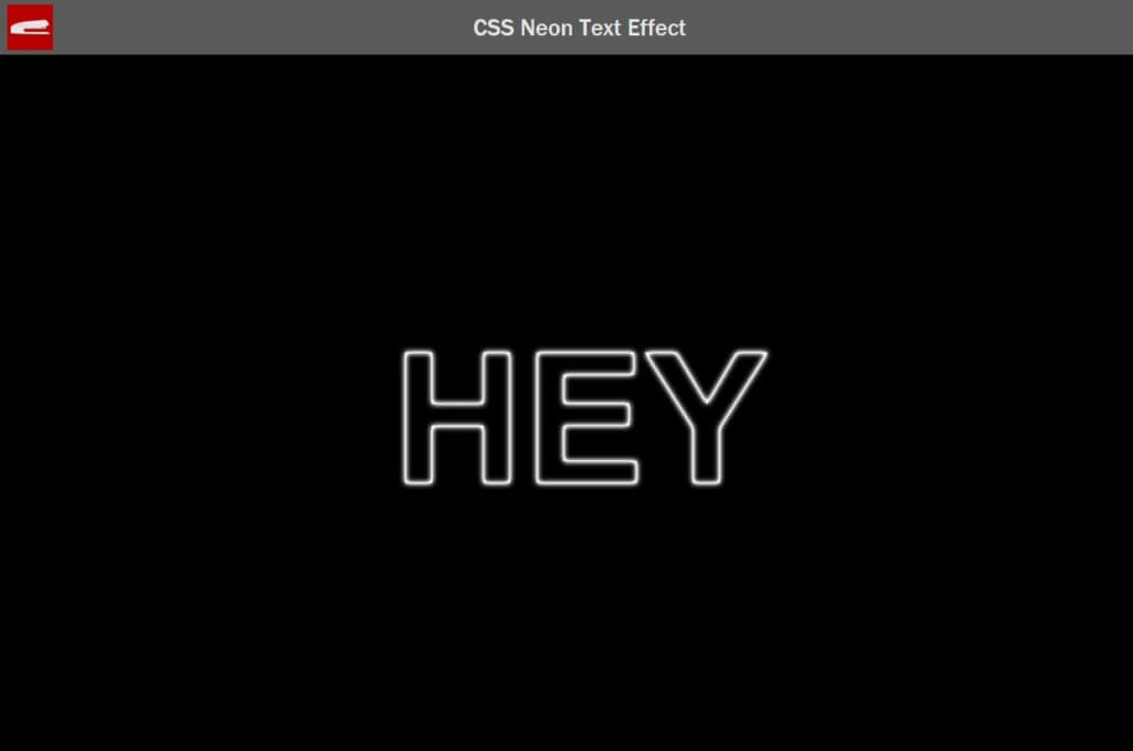
Next I’m going add a pseudo-element to the span with the same text. Let’s set the position to absolute to make the the pseudo-element overlay the span and then we’ll add a mix-blend-mode and set it to difference. This will get us the outline of the text
.txt::before {
    content: 'hey';
    position: absolute;
    mix-blend-mode: difference;
}
Then add a small blur filter to create a light effect. Let’s bump up the brightness also. You will start to see a neon effect now.
.txt::before {
    content: 'hey';
    position: absolute;
    mix-blend-mode: difference;

    filter: blur(3px);
}
.neon-wrapper {
    display:inline-flex;

    filter: brightness(200%);
}
The Gradient
Next let’s work on a color gradient. Create a new span with a class then add a linear gradient with any color that you like. For me, I’m going to use GradPad to generate the CSS code.Then set the position to absolute, width and height to 100% and top/left to zero.
<div class="neon-wrapper">
     <span class="txt">hey</span>
     <span class="gradient"></span>
</div>
.gradient{
background: linear-gradient(114.5793141156962deg, rgba(6, 227, 250,1) 4.927083333333334%,rgba(229, 151, 64,1) 97.84374999999999%);
position: absolute;
top: 0;
left:0;
width: 100%;
height:100%;
}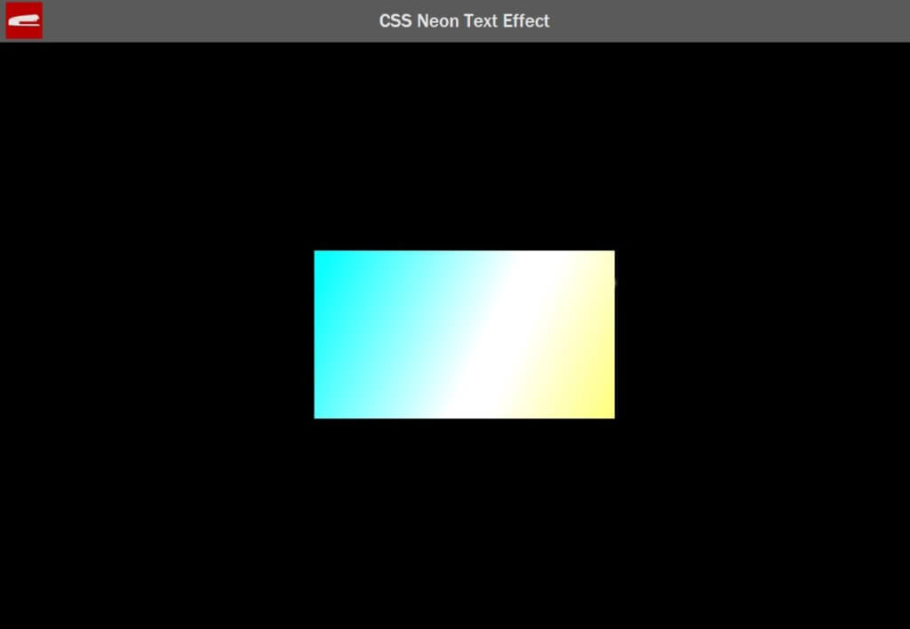
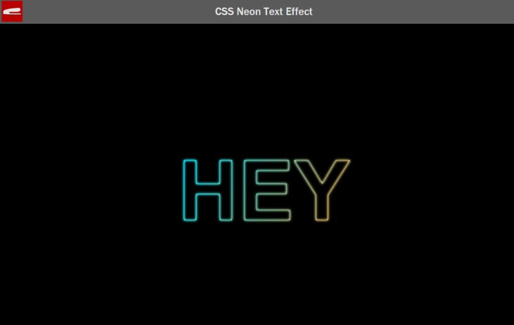
You’ll see that the gradient span is overlaying the text. The trick is to add a multiply blend effect and that’s it.
.gradient{
    background: linear-gradient(114.5793141156962deg, rgba(6, 227, 250,1) 4.927083333333334%,rgba(229, 151, 64,1) 97.84374999999999%);
    position: absolute;
    top: 0;
    left:0;
    width: 100%;
    height:100%;

    mix-blend-mode: multiply;
}
The Animation
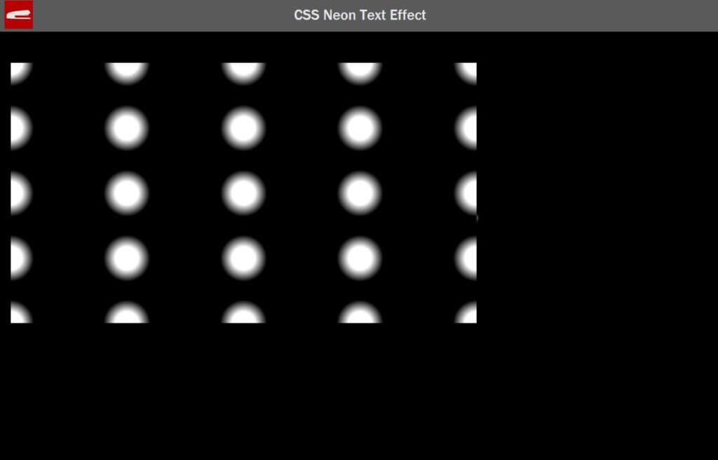
Now for the animation effect, we can achieve that by creating another span with a class. Then add a repeated radial-gradient with a color-dodge blend effect.
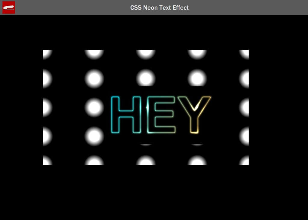
I’m going to use a background shorthand properties with radial-gradient to create a black and white circle background. Also set the the starting position to -100% and maximize the size by setting right and bottom to zero.
<div class="neon-wrapper">
     <span class="txt" >hey</span>
     <span class="gradient"></span>
     <span class="dodge"></span>
</div>
.dodge {
background: radial-gradient(circle,white,black 35%) center / 25% 25%;
position: absolute;
top:-100%;
left:-100%;
right:0;
bottom:0;
}Here is what it looks like.
Let’s add a color-dodge blend effect and animation loop.
.dodge {
    background: radial-gradient(circle,white,black 35%) center / 25% 25%;
    position: absolute;
    top:-100%;
    left:-100%;
    right:0;
    bottom:0;

    mix-blend-mode: color-dodge;
    animation: dodge-area 3s linear infinite;
}
@keyframes dodge-area {
    to {
        transform: translate(50%,50%);
    }
}
Finally, we’ll add overflow: hidden to the wrapper div to hide the excess dodge background
.neon-wrapper {
    display:inline-flex;
    filter: brightness(200%);

    overflow: hidden;
}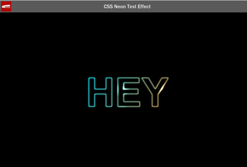
Easy right? 🙂 See it in action in this video.
That’s all for this tutorial. Feel free to like or subscribe to our Facebook and Youtube Channel to stay tune. And you might want to check out our CSS 3D Cube effect as well!
Source Code
<html>
    <head>
    <meta http-equiv="content-type" content="text/html; charset=UTF-8" />
    <link rel="stylesheet" type="text/css" href="styles.css">
    </head>
    <body>
    <div class="wrapper">
        <div class="neon-wrapper">
            <span class="txt" >hey</span>
            <span class="gradient"></span>
            <span class="dodge"></span>
        </div>
    </div>
    </body>
</html>
body {
margin: 0;
padding: 0;
background:#000000;
}
.wrapper {
height: 800px;
display: flex;
align-items: center;
justify-content: center;
background: #000000;
}
.txt {
color: #ffffff;
background:#000000;
font-size:200px;
font-weight: bold;
font-family: Arial;
text-transform: uppercase;
}
.txt::before {
content: 'hey';
position: absolute;
mix-blend-mode: difference;
filter: blur(3px);
}
.neon-wrapper {
display:inline-flex;
filter: brightness(200%);
overflow: hidden;
}
.gradient{
background: linear-gradient(114.5793141156962deg, rgba(6, 227, 250,1) 4.927083333333334%,rgba(229, 151, 64,1) 97.84374999999999%);
position: absolute;
top: 0;
left:0;
width: 100%;
height:100%;
mix-blend-mode: multiply;
}
.dodge {
background: radial-gradient(circle,white,black 35%) center / 25% 25%;
position: absolute;
top:-100%;
left:-100%;
right:0;
bottom:0;
mix-blend-mode: color-dodge;
animation: dodge-area 3s linear infinite;
}
@keyframes dodge-area {
to {
transform: translate(50%,50%);
}
}
code not working properly, only the dodge section is working
HI is it possible to do it on a gradient background?