How to Change Scroll Speed with CSS
Changing scroll speed on website can be tricky. As the speed is controlled by the web browser setting and not the website. The most popular workaround is to use JavaScript to detect mouse event then calculate the new scroll speed and move the content to the new position. However, in this post, we’ll show you how to use CSS to change scroll speed without JavaScript at all. Let’s check it out!
The Concept
We’ll be using the same concept as my previous pure CSS parallax scrolling tutorial
“The parallax is the effect that the object in the distance appears to move more slowly than the object close to the eye”
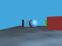
So if we push the existing div deeper into the back (along the z-axis) and then scroll, we should see it move slower as you can see in the image above.
But pushing the div back will cause it to appear smaller (of course it’s farther!) So we’ll fix this by scaling it back using CSS transform.
And that’s it. Should be easy. No?
The Code
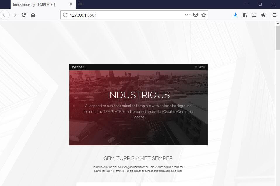
First, let get a website template since I’m too lazy to setup one. I’m going to download it from templated.co Using a full-site responsive template like this is also a good way of testing if our method is going to cause any problem.

First let’s add 2 wrappers to wrap everything under <body> tag
<body>
   <div class="scroll-wrapper">
       <div class="scroll-wrapper2">
...
       </div>
   </div>
Now the CSS. First, I’ll remove any padding set by the template and add overflow:hidden to the body. This will disable all scrollbars as we want to use the scrollbar on the wrapper instead.
body {
  padding: 0;
  overflow: hidden;
}
For the first wrapper, we’ll fix the size to 100% of viewport and enable the vertical scrollbar while disable the horizontal one. Then add 1px perspective. This is to set the perspective scale to 1px. So when you push the div back by 1px, it will appear smaller by half.
.scroll-wrapper {
  width: 100vw;
  height: 100vh;
  overflow-y: auto;
  overflow-x: hidden;
  perspective: 1px;
  transform-style: preserve-3d
}
Now let’s try push the second wrapper back by 1px;
.scroll-wrapper2 {
  transform: translateZ(-1px);
}
You’ll see that, the whole site appears at half size. Now let’s scale it back. Also set the position to absolute to fix it’s position. You’ll notice that I set left property to -10px left. This is to remove a small gap resulted from scaling.
.scroll-wrapper2 {
position: absolute;
top: 0;
right: 0;
bottom: 0;
left: -10px;
margin:0;
padding:0;
transform: translateZ(-1px) scale(2);
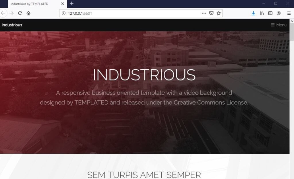
}And here is the final result, looks the same but scroll much slower! Also it’s still responsive!
That’s all for this tutorial. Feel free to like or subscribe to our Facebook and Youtube Channel to stay tune for our weekly dev tips and tutorials. Thanks for visiting 🙂

Apakah cara ini dapat digunakan di blog? kalau bisa bagaimana caranya?