Stunning Pure CSS Parallax Scrolling Effect Tutorial
Parallax scrolling effect is becoming popular for quite a while. Most of them are implemented with JavaScript to listen closely to the scroll event and then translate all the elements accordingly. This can sometimes cause performance issue such as stuttering or dropped framerate if implemented poorly.
So in this tutorial, I’m going to show you how to create pure CSS parallax scrolling effect that makes the element appears that they’re scrolling at a different speed. Also with a bonus code that I have combined this with an animated snow background from our previous tutorial to create a stunning effect for your website! Ready? Let’s check it out! (Full Source Code at the end)
The Physics (Yuk!)
Let’s talk about the key concept that creates the parallax effect first. The parallax is the effect that the object in the distance appears to move more slowly than the object close to the eye.
Image Credit: Nathaniel Domek
So base on this. If we create two divs with one of them pushed into the back for some distance, we’ll also see the parallax effect when scrolling through the website!
The Structure
Let’s create 2 wrapper divs. One for parallax and one for regular. Also added some content inside too.
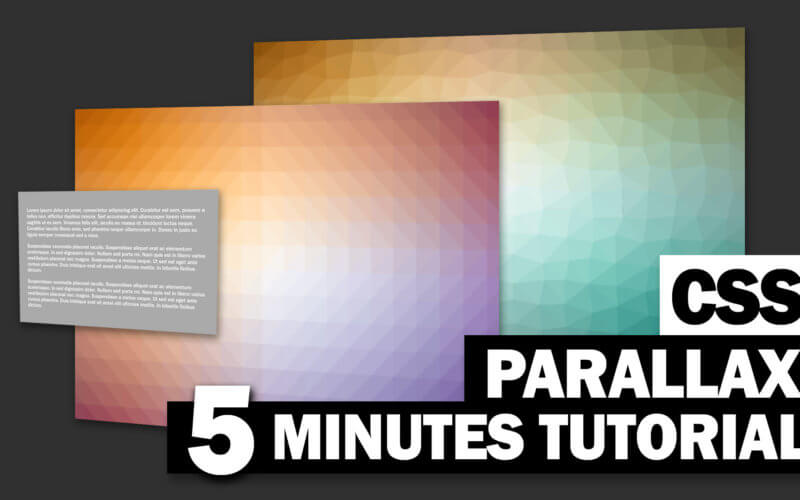
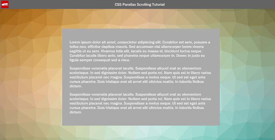
<body>
        <div class="navbar"><span>CSS Parallax Scrolling Tutorial</span></div>
        <div class="parallax-wrapper">
            <div class="content">
                <p>Lorem ipsum dolor sit amet, consectetur adipiscing elit.
                   ....
                   ....
                   Donec in justo eu ligula semper consequat sed a risus.</p>
            </div>
        </div>
        <div class="regular-wrapper">
            <div class="content">
                <p>Lorem ipsum dolor sit amet, consectetur adipiscing elit.
                   ....
                   ....
                   Donec in justo eu ligula semper consequat sed a risus.</p>
            </div>
        </div>
</body>
For the CSS, first, I’m going to set all width and height to 100% of the viewport (100vw and100vh) and added some padding and background for aesthetic purpose. I also set box-sizing to border-box. This will include the padding into the width and height and make our wrapper size exactly at 100% of the viewport.
.parallax-wrapper {
    width: 100vw;
    height:100vh;
    padding-top:20vh;
    box-sizing: border-box;
}
.regular-wrapper {
    width: 100vw;
    height:100vh;
    padding-top:20vh;
    background-image: url("/your-bkg.png");
}
.content {
    margin: 0 auto;
    padding: 50px;
    width: 50%;
    background: #aaa;
}
Next I’m going add a pseudo element to the parallax wrapper. This element will be served as a background so we’re going to add a transform to it later. but for now let’s set the size/position and background image first.
.parallax-wrapper::before {
    content:"";
    width: 100vw;
    height: 100vh;
    top:0;
    left:0;
    background-image: url("/your-bkg.png");
    position: absolute;
    z-index: -1;
}
Note: Adding position absolute is important since we want this element to be in background and out of the way for the content. (Absolute positioned element is removed from the normal document flow)
OK, the structure is complete. Let’s work on the parallax!
The Parallax
First set the overflow hidden to the root element and height of the body to 100% of viewport to fix the viewing area (or we won’t see the parallax effect) Then add a perspective to instruct the browser to display in 3D perspective mode. Also add a preserve-3d transform style to the body and to the parallax wrapper.
html {
    overflow: hidden;
}
body {
    height: 100vh;
    perspective: 1px;
    transform-style: preserve-3d;
    overflow-x:hidden;
    overflow-y:auto;
}
.parallax-wrapper {
    transform-style: preserve-3d;
}
I set overflow-x to hidden and overflow-y to auto. This because we’re working in 3D mode and we do not want the horizontal scrollbar to appear for the off screen content.
Next we’re going to push the background div to the back by adding translateZ for -1px. By adding this, the distance between the viewing area and this element becomes farther. As a result, you’ll see this div smaller. Since we set the perspective value to 1px and we also moved the div back for 1px, you’ll see the div at half of the original size. To counter this, we’ll scale the div by 2 times.
.parallax-wrapper::before {
    transform:translateZ(-1px) scale(2);
}
If you try scrolling now you’ll see that the regular-wrapper is being overlay by the parallax-wrapper. we can fix this by setting the z-index of the parallax-wrapper to negative and regular to positive. since z-index only works on positioned element, I’m going to also add position relative to the regular wrapper.
.parallax-wrapper::before {
    z-index: -1;
}
.regular-wrapper {
    z-index: 2;
    position: relative;
}
And we’re all set. See the live result in the video below!
Adding more content is very easy. You can just duplicate both wrappers’s HTML (parallax and regular) and it’s done.
Let’s Mix it!
With this concept you can combine it with any CSS background effect that you like to create an awesome user experience. For example, here is the combination of parallax effect with the snow from our previous tutorial. Try this pen.
So that’s all for this tutorial. Feel free to like or subscribe to our Facebook and Youtube Channel to stay tune. Before leaving you might want to check out our animated CSS snow effect background too!
Source Code
HTML
<body>
        <div class="navbar"><span>CSS Parallax Scrolling Tutorial</span></div>
        <div class="parallax-wrapper">
            <div class="content">
                <p>Lorem ipsum dolor sit amet, consectetur adipiscing elit.
                   ....
                   ....
                   Donec in justo eu ligula semper consequat sed a risus.</p>
            </div>
        </div>
        <div class="regular-wrapper">
            <div class="content">
                <p>Lorem ipsum dolor sit amet, consectetur adipiscing elit.
                   ....
                   ....
                   Donec in justo eu ligula semper consequat sed a risus.</p>
            </div>
        </div>
</body>
CSS
html {
    overflow: hidden;
}
body {
    margin: 0;
    font-size: 26px;
    font-family: 'Franklin Gothic Medium', 'Arial Narrow', Arial, sans-serif;
    color: #ffffff;
    height: 100vh;
    perspective: 1px;
    transform-style: preserve-3d;
    overflow-x:hidden;
    overflow-y:auto;
}
.parallax-wrapper {
    width: 100vw;
    height:100vh;
    padding-top:20vh;
    box-sizing: border-box;
    transform-style: preserve-3d;
}
.parallax-wrapper::before {
    content:"";
    width: 100vw;
    height: 100vh;
    top:0;
    left:0;
    background-image: url("/trianglify.png");
    position: absolute;
    z-index: -1;
    transform:translateZ(-1px) scale(2);
}
.regular-wrapper {
    width: 100vw;
    height:100vh;
    padding-top:20vh;
    background-image: url("/trianglify2.png");
    z-index: 2;
    position: relative;
}
.content {
    margin: 0 auto;
    padding: 50px;
    width: 50%;
    background: #aaa;
}

Hello, I really liked the parallax but when I try to place elements with the fixed property they remain static, some solution? Thanks