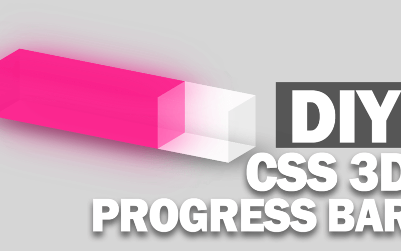
DIY 3D CSS Progress Bar
In this tutorial, I’m going to show you how to create a 3D transparent progress bar with CSS transform in just a few minutes.
The Concept
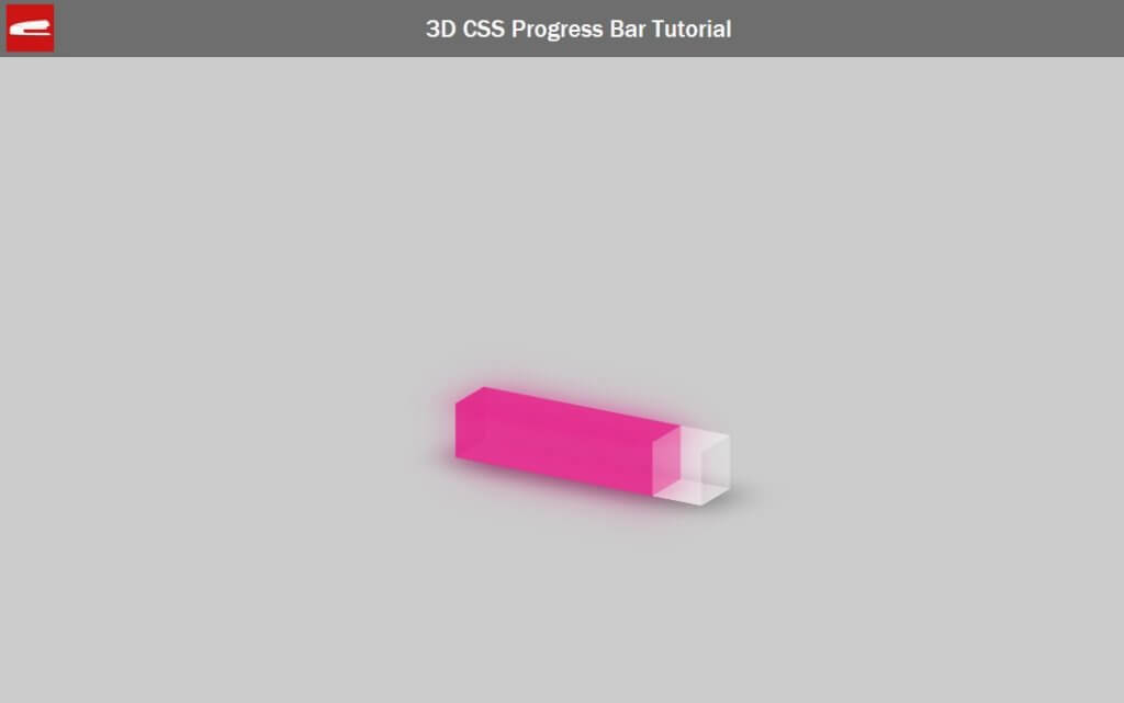
Here is the progress bar we’re going make. It looks pretty nice but actually it’s simply built from rectangle divs on each side. So the key concept is to create divs and use CSS 3D transform to rotate them into the right angle and position.
HTML Structure
First we’ll create a wrapper div to define a size and position. Then create another div for the progress bar which, inside we’ll create divs for each side. (front,back,top, bottom and left)
<div class="progressbar-wrapper">
       <div class="progressbar">
            <div class="side front"></div>
            <div class="side back"></div>
            <div class="side top"></div>
            <div class="side bottom"></div>
            <div class="side left"></div>
       </div>
 </div>
You’ll see that I didn’t create the right side because the bar will be transparent anyway so the right side is unnecessary.
That’s the HTML part for now. Let’s work on the CSS next.
The Progress Bar (Outer)
I’m going to define the width and height of the progress bar and place it in the middle of the screen using 50% top and left and -50% translate.
.progressbar-wrapper {
    width: 300px;
    height: 60px;
    top: 50%;
    left: 50%;
    position: absolute;
    transform: translate(-50%, -50%);
}
For the inner div I’m going to set the width and height to 100% and set the transform style to preserve-3d.
.progressbar {
    width: 100%;
    height: 100%;
    transform-style: preserve-3d;
}
For each side I’m going to set the width and height to 100% as well and put a transparent background color.
side {
width: 100%;
height: 100%;
background-color: rgba(254, 254, 254, 0.3);
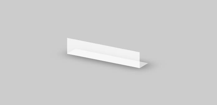
}Here is the result so far. All side divs are displayed consecutively (block)

Next I’m going to move all of these divs to be on the same spot by setting top and left to 0 and position to absolute.
.side {
width: 100%;
height: 100%;
background-color: rgba(254, 254, 254, 0.3);
top: 0;
left: 0;
position: absolute;
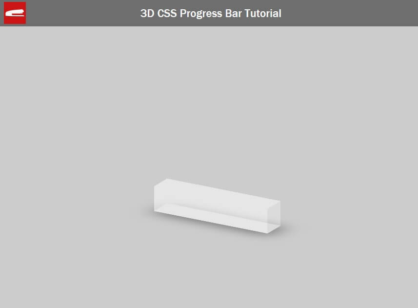
}The next step is to rotate each side to create a rectangular tube. Since we’re going to work with 3D, I’m going to add some rotation to the bar so we can see it in perspective view.
.progressbar {
    width: 100%;
    height: 100%;
    transform-style: preserve-3d;

    transform: rotateX(-20deg) rotateY(-30deg);
}
Let’s rotate the bottom side first by adding translate and 90 degrees rotation. Also set a transform origin which is a rotation point to bottom. I’m going to add a box shadow as well.
.bottom {
    box-shadow: 10px 10px 50px 5px rgba(90, 90, 90, 0.7);
    transform: rotateX(90deg);
    transform-origin: bottom;
}
I’m going to apply the same concept to all sides.
.top {
    transform: translate(0, -100%) rotateX(90deg);
    transform-origin: bottom;

}
.back {
    transform: translateZ(-60px);
}
.left {
    width: 60px;
    transform: rotateY(90deg);
    transform-origin: left;
}
So here is the bar.
The Progress Bar (Filler)
The next step is to add a progress filler. Let’s go back to HTML and create a div inside each side except the left one which we’ll just set the background color to be the same as the filler.
<div class="progressbar-wrapper">
     <div class="progressbar">
          <div class="side front">
               <div class="bar"></div>
          </div>
          <div class="side back">
               <div class="bar"></div>
          </div>
          <div class="side top">
               <div class="bar"></div>
          </div>
          <div class="side bottom">
               <div class="bar"></div>
          </div>
          <div class="side left"></div>
     </div>
</div>
.left {
width: 60px;
transform: rotateY(90deg);
transform-origin: left;
background-color: rgba(225, 0, 120, 0.6);
}Then set the height to 100% and the background color. I’m also going to add a box shadow with the same color as well to create a glow effect. The width of this class will represent the progress. Let’s set it to 70% for now.
.bar {
height:100%;
background-color: rgba(225, 0, 120, 0.6);
box-shadow: 5px 5px 50px 5px rgba(225, 0, 120, 0.3);
width:70%;
}And here is the result.
Now the bar is completed. You can use control the progress value by using a simple jQuery class selector to set the width like this.
$('.bar').width('30%');So that’s all for this tutorial. Hope you guys enjoy it. Stay with us for more tutorial like this by following our Facebook and subscribe to our Youtube Channel.
Don’t forget to check out DIY Tutorial to Create an Animated 3D cube as well 🙂
Source Code
HTML
<html>
<head>
<meta http-equiv="content-type" content="text/html; charset=UTF-8" />
<script src="jquery-2.1.4.js"></script>
<link rel="stylesheet" type="text/css" href="styles.css">
</head>
<body>
<div class="wrapper">
<div class="progressbar-wrapper">
<div class="progressbar">
<div class="side front">
<div class="bar"></div>
</div>
<div class="side back">
<div class="bar"></div>
</div>
<div class="side top">
<div class="bar"></div>
</div>
<div class="side bottom">
<div class="bar"></div>
</div>
<div class="side left"></div>
</div>
</div>
</div>
<script>
$('.bar').width('80%');
</script>
</body>
</html>CSS
body {
margin: 0;
padding: 0;
background:#ccc;
}
.wrapper {
width: 100%;
min-height: 800px;
position: absolute;
display: block;
}
.progressbar-wrapper {
width: 300px;
height: 60px;
top: 50%;
left: 50%;
position: absolute;
transform: translate(-50%, -50%);
}
.progressbar {
width: 100%;
height: 100%;
transform-style: preserve-3d;
transform: rotateX(-20deg) rotateY(-30deg);
}
.side {
width: 100%;
height: 100%;
background-color: rgba(254, 254, 254, 0.3);
top: 0;
left: 0;
position: absolute;
}
.bottom {
box-shadow: 10px 10px 50px 5px rgba(90, 90, 90, 0.7);
transform: rotateX(90deg);
transform-origin: bottom;
}
.top {
transform: translate(0, -100%) rotateX(90deg);
transform-origin: bottom;
}
.back {
transform: translateZ(-60px);
}
.left {
    width: 60px;
    transform: rotateY(90deg);
    transform-origin: left;

    background-color: rgba(225, 0, 120, 0.6);
}
.bar {
    height:100%;
    background-color: rgba(225, 0, 120, 0.6);
    box-shadow: 5px 5px 50px 5px rgba(225, 0, 120, 0.3);
    width:70%;
}
very impressive way of teaching …..