CSS 3D Card Design with RGB Effect Tutorial
In this tutorial, we’re going to show you how to design and create CSS card with animating RGB and 3D tilt effect in just a few minutes. Ready? Let’s check it out!
The Card Layout
I’m going to start with the code from previous tutorials. The first tutorial is how to setup the card layout from scratch using CSS. And the second tutorial is how to add 3d tilt effect using tilt.js.
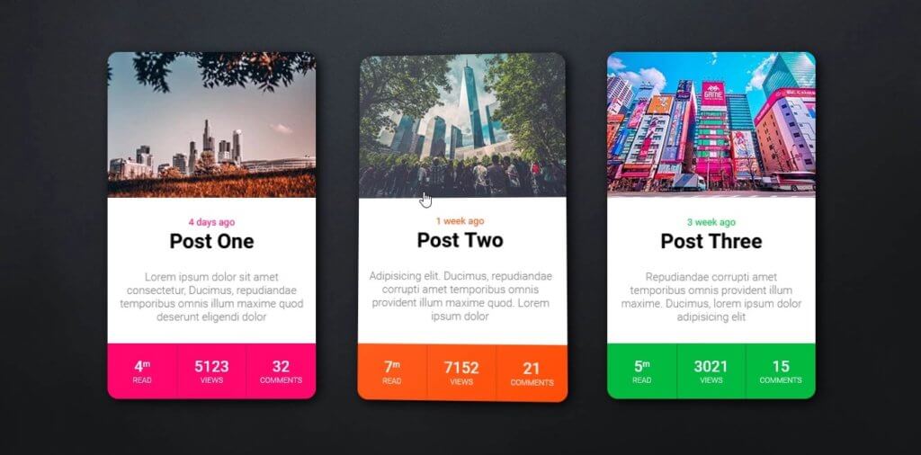
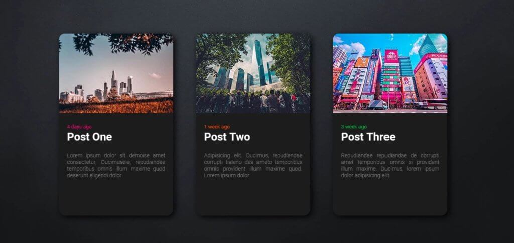
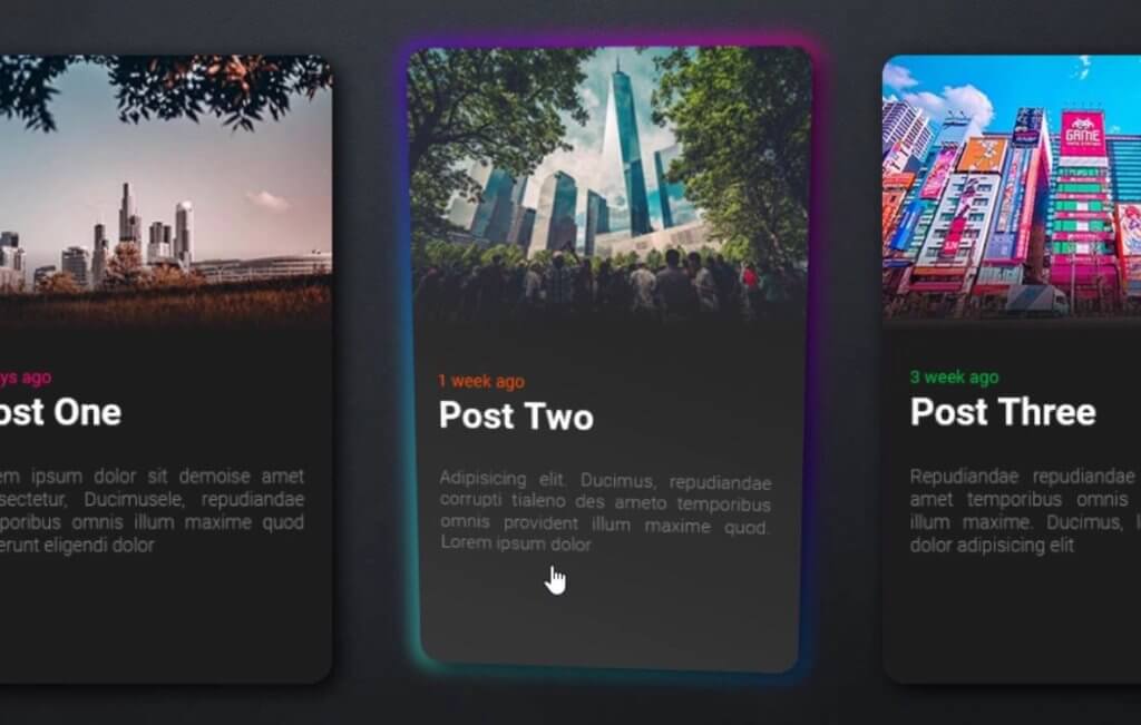
Here is the current card design.
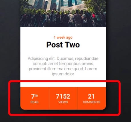
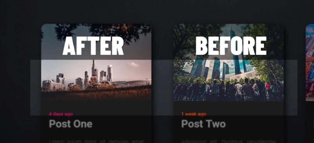
The first thing I’m going to do is to remove the lower section of the card by removing HTML
Then I’m going to adjust the grid layout, changing background color to dark grey and default text color to white. Also change the text align to justify and reduce the font-size
.card {
...
  grid-template-rows: 210px 250px 20px;
  background: #1d1d1d;
  color:white;
  text-align: justify;
}
.card-text p {
...
  font-size:14px;
}
Next I’m going to add the gradient fading effect to the image. You can do that easily by adding linear gradient on top of the background image. I’ll start the fading effect after 70% from the top of image.
.card-image {
...
  background: linear-gradient(#fff0 0%, #fff0 70%, #1d1d1d 100%),url("img1.jpg");
}
And here is the result.
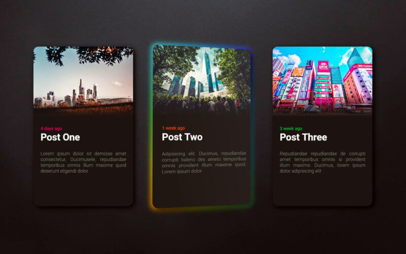
The RGB Effect
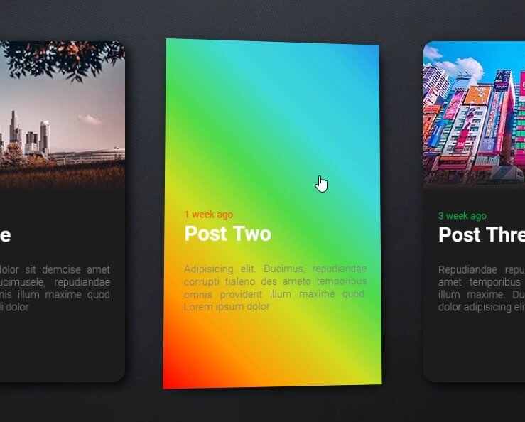
Next we’re going to work on the RGB light effect. First I’m going to create CSS for RGB class as a pseudo-element. Then set the linear-gradient background color using RGB color. we’ll repeat the background and set the horizontal background size to 300%.
.rgb::after {
content:"";
background: linear-gradient(45deg,
#ff0000 0%,
#ff9a00 10%,
#d0de21 20%,
#4fdc4a 30%,
#3fdad8 40%,
#2fc9e2 50%,
#1c7fee 60%,
#5f15f2 70%,
#ba0cf8 80%,
#fb07d9 90%,
#ff0000 100% )
repeat 0% 0% / 300% 100%;
position: absolute;
inset: -3px;
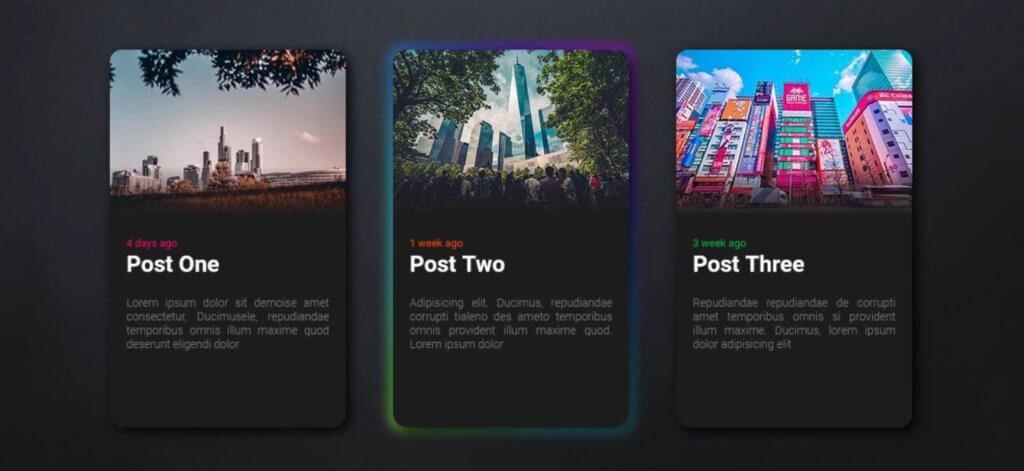
}We’ll set the position to absolute and inset to minus 3px to make this element larger than the card by 3 pixels on all dimensions. Then add rgb class to the card in HTML
<div class="card rgb">
Next we’ll add the animation. I’m going to create keyframes to animate the background position by moving it horizontally.
@keyframes rgb {
  0% {background-position: 0% 50%;}
  50% {background-position: 100% 50%;}
  100% {background-position: 0% 50%;}
}
Next add the animation to the rgb class, set the border radius and add blur filter.
Then I’ll move the RGB layer behind the card using translateZ. (I’m using translateZ because this example is in 3D transform mode from using tilt.js to create tilt effect. But if you’re not using CSS 3D transform, you can use z-index instead of translateZ)
.rgb::after {
...
  border-radius: 16px;
  filter: blur(8px);
  transform: translateZ(-1px); /*or z-index */
  animation: rgb 6s linear infinite;
}
And here is the final result
So that’s all for this tutorial. hope you guys enjoy. You can download the code of this project here. If you love this and want to see more development tips and tutorials, subscribe our YouTube Channel to stay tune

555