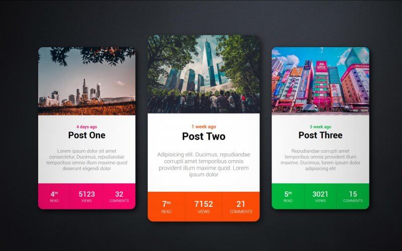
RPG Style Card Design with Hover Effect – HTML/CSS Tutorial
In this tutorial, we’re going to show you how to create a RPG style card design to show each post statistic for your website in just a few minutes with CSS. Ready Let’s check it out
The HTML
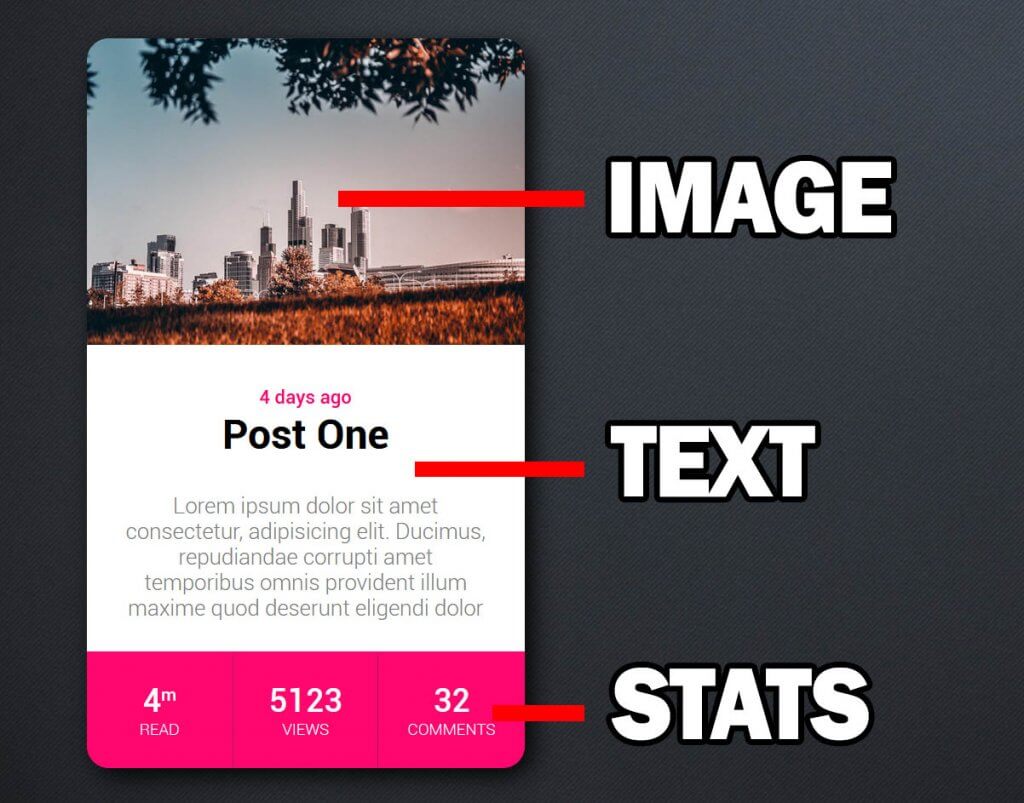
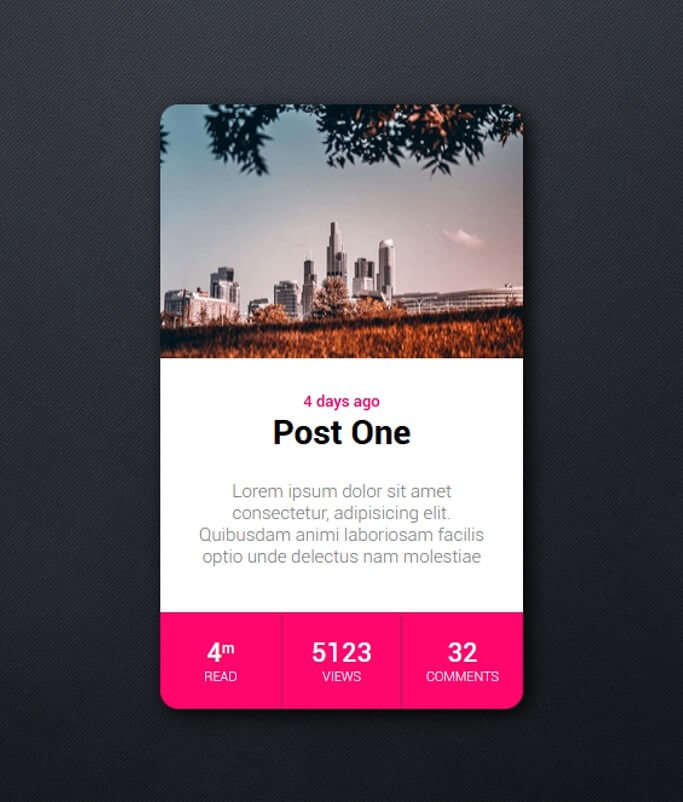
So let’s start with the card structure. The card will have three sections. Image, text and stats (showing post comments, total views and approximate reading time).
I also added some dummy content to each section.
<div class="card">
  <div class="card-image"></div>
  <div class="card-text">
    <span class="date">4 days ago</span>
    <h2>Post One</h2>
    <p>Lorem ipsum dolor sit amet consectetur, Ducimus, repudiandae temporibus omnis illum maxime quod deserunt eligendi dolor</p>
  </div>
  <div class="card-stats">
    <div class="stat">
      <div class="value">4<sup>m</sup></div>
      <div class="type">read</div>
    </div>
    <div class="stat border">
      <div class="value">5123</div>
      <div class="type">views</div>
    </div>
    <div class="stat">
      <div class="value">32</div>
      <div class="type">comments</div>
    </div>
  </div>
</div>
The CSS
Now let’s use the grid layout to allocate the space for each section. Also set the font, background color, border-radius and shadow.
.card {
  display: grid;
  grid-template-columns: 300px;
  grid-template-rows: 210px 210px 80px;
  grid-template-areas: "image" "text" "stats";

  border-radius: 18px;
  background: white;
  box-shadow: 5px 5px 15px rgba(0,0,0,0.9);
  font-family: roboto;
  text-align: center;
}
Then assign each section into the grid areas we’ve just defined.
.card-image {
  grid-area: image;
}
.card-text {
  grid-area: text;
}
.card-stats {
  grid-area: stats;
}
I’m going to set the background of the image section. Also set the top left right border-radius and set the background size to cover to fit the image
.card-image {
  grid-area: image;
  background: url("img1.jpg");
  border-top-left-radius: 15px;
  border-top-right-radius: 15px;
  background-size: cover;
}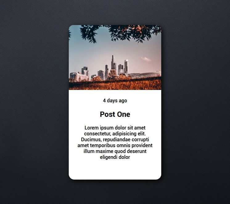
Then some typography styling for the text section.
.card-text {
  grid-area: text;
  margin: 25px;
}
.card-text .date {
  color: rgb(255, 7, 110);
  font-size:13px;
}
.card-text p {
  color: grey;
  font-size:15px;
  font-weight: 300;
}
.card-text h2 {
  margin-top:0px;
  font-size:28px;
}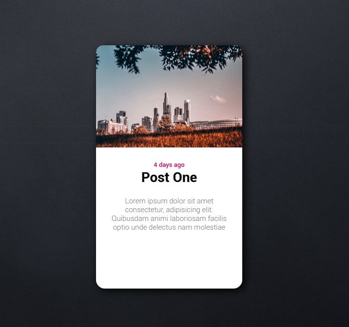
Next work on the stats section. We’ll use grid layout again to equally allocate the space for each number (notice how I use fraction unit). Also set the bottom border radius and background color.
.card-stats {
  grid-area: stats;
  display: grid;
  grid-template-columns: 1fr 1fr 1fr;
  grid-template-rows: 1fr;

  border-bottom-left-radius: 15px;
  border-bottom-right-radius: 15px;
  background: rgb(255, 7, 110);
}
Next, let’s use flex layout to vertically center the text. Also add some padding and adjust the font styles
.card-stats .stat {
  display: flex;
  align-items: center;
  justify-content: center;
  flex-direction: column;

  color: white;
  padding:10px;
}
The Animation
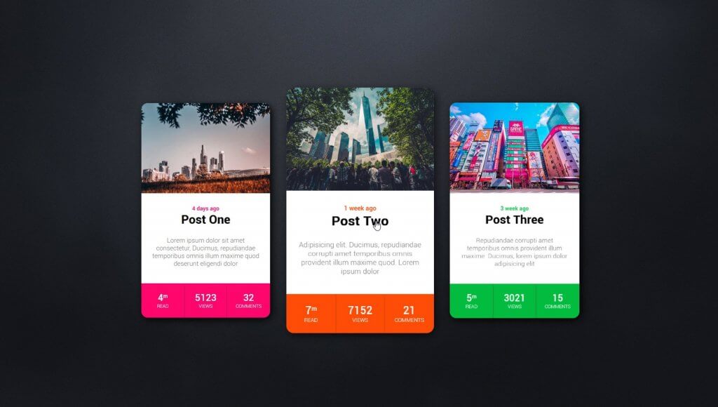
The design is finished. Next we’ll work on the hover effect to zoom out the card.
It’s really easy, just add transform scale to the wrapper using pseudoclass then add transition property. I’ll also reduce the box-shadow intensity when the card is floating.
.card:hover {
  transform: scale(1.15);
  box-shadow: 5px 5px 15px rgba(0,0,0,0.6);
}
.card {

...
  transition: 0.5s ease;
  cursor: pointer;
  margin:30px;
}
You download the source code of this project here. Hope you guys enjoy. If you love this and want to see more dev tips and tutorials, don’t forget to sub our YouTube Channel to stay tuned!

Made an Holo Effect to the pics (Copied from Codepen).
Add them to your CSS style properties:
.card
/* Copy to the Card property*/
background-repeat: no-repeat;
box-shadow: 0 0 6px 2px rgba(255, 230, 0, 0.75), 0 35px 25px -15px rgba(0, 0, 0, 0.5);
position: relative;
.card:before,
.card:after {
content: “”;
position: absolute;
left: 0;
right: 0;
bottom: 0;
top: 0;
background-image: linear-gradient(115deg, transparent 0%, #00e7ff 30%, #ff00e7 70%, transparent 100%);
background-position: 0% 0%;
background-repeat: no-repeat;
background-size: 300% 300%;
mix-blend-mode: color-dodge;
opacity: 0;
z-index: 1;
-webkit-animation: holoGradient 15s ease infinite;
animation: holoGradient 15s ease infinite;
}
.card:after {
background-image: url(“https://s3-us-west-2.amazonaws.com/s.cdpn.io/13471/sparkles.gif”);
background-position: center;
background-size: 180%;
mix-blend-mode: color-dodge;
opacity: 0;
z-index: 2;
-webkit-animation: holoSparkle 20s ease infinite;
animation: holoSparkle 20s ease infinite;
}
@-webkit-keyframes holoSparkle {
0% {
opacity: 0;
}
12% {
opacity: 1;
}
70% {
opacity: 0.5;
}
95% {
opacity: 0.2;
}
}
@keyframes holoSparkle {
0% {
opacity: 0;
}
12% {
opacity: 1;
}
70% {
opacity: 0.5;
}
95% {
opacity: 0.2;
}
}
@-webkit-keyframes holoGradient {
3% {
opacity: 0;
}
5% {
background-position: 0% 0%;
}
7% {
opacity: 0.5;
}
9% {
background-position: 100% 100%;
}
11% {
opacity: 0;
}
50% {
opacity: 0;
background-position: 100% 100%;
}
55% {
opacity: 0.3;
}
70% {
opacity: 0;
background-position: 0% 0%;
}
}
@keyframes holoGradient {
3% {
opacity: 0;
}
5% {
background-position: 0% 0%;
}
7% {
opacity: 0.5;
}
9% {
background-position: 100% 100%;
}
11% {
opacity: 0;
}
50% {
opacity: 0;
background-position: 100% 100%;
}
55% {
opacity: 0.3;
}
70% {
opacity: 0;
background-position: 0% 0%;
}
}
Thanks for the article, it’s really helpful
To Make Auto Responsive just add 1fr; code is :
.card {
display: grid;
grid-template-columns: 1fr;
grid-template-rows: 210px 210px 80px;
grid-template-areas: “image” “text” “stats”;
border-radius: 18px;
background: white;
box-shadow: 5px 5px 15px rgba(0,0,0,0.9);
font-family: roboto;
text-align: center;
}