How to create a Stunning CSS Social Media Button
In this tutorial, I’m going to show you how to create a cool 3D CSS social media button that could be used on your website in just a few minutes! Let’s check it out! Full source code at the end of this post.

The Structure
First we’re going to create a wrapper and assign a twitter-button class name to it.
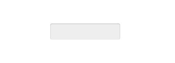
Then we will set the size, padding, background color and border-radius of the button. Also add an inset box shadow to create a 3D depth effect.
Note: I used flex layout to center the button on the screen.
<div class="twitter-button"></div>
.twitter-button {
    width: 11.5rem;
    height:2.1rem;
    padding: 0.375rem 0.375rem 0;
    background: #eee;
    border-radius: 0.25rem;
    box-shadow: inset 0 1px 2px rgba(0,0,0,0.3);
}
The inset will look like this.
The Cover
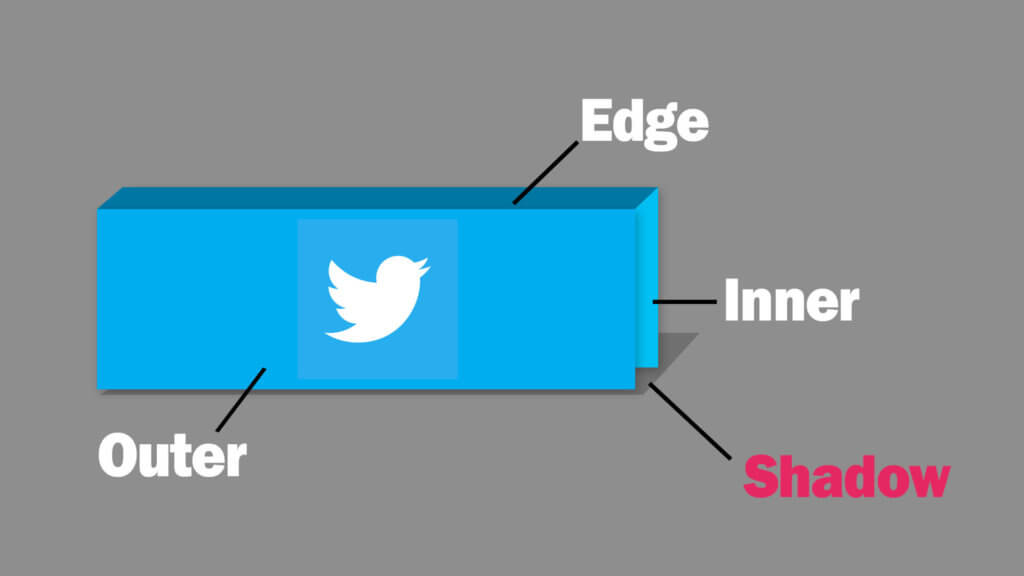
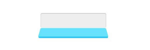
Next, we’re going to create a cover div that will be opened on mouse hover. The structure of the cover will be consist of three divs. Outer, edge and inner. We’ll use translateZ to create a gap between outer and inner. Then use rotateX to rotate the edge. Also add another div as a shadow of the cover. The final result should looks like this figure.
<div class="twitter-button">
     <div class="cover">
          <div class="inner">
          <div class="edge"></div>
          <div class="outer">
      </div>
      <div class="shadow"></div>
</div>
Now let’s set the cover and all it’s direct children size to 100%, position to absolute and top and left to zero. Then set the background color for each one. The outer and edge should have a little bit darker color to simulate a light effect. Also translate/rotate each div position/angle to match the figure.
.cover, .cover > * {
    position: absolute;
    top:0;
    left:0;
    width:100%;
    height:100%;
}
.inner {
    background-color: #67e2fe;
}
.outer {
    background-color: #2ec8fa;
    transform:translateZ(0.25rem);
}
.edge {
    background-color: #20c7f3;
    top:0.25rem;
    height:0.25rem;
    transform:rotateX(90deg);
    transform-origin: center top;
}
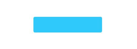
Since we’re now positioning element in 3D mode, we need to set the perspective distance on the parent div. And also add a border-radius of both inner and outer.
.twitter-button {
    perspective: 30rem;
}
.inner,.outer {
    border-radius: 0.25rem;
    background-image: linear-gradient(to bottom, transparent 0%, rgba(0,0,0,0.1) 100%);
}
Now what you won’t see anything much until we add a rotate hover effect. Let’s do it by adding 120 degrees rotation to the cover. Then set the transition duration and timing function to ease.
.twitter-button:hover .cover {
    transform:rotateX(-120deg);
}
.twitter-button, .twitter-button div {
    transition-duration: 0.7s;
    transition-timing-function: ease;
}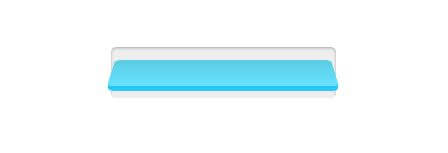
Now it’s rotating on the incorrect axis, let’s change the transform origin of the cover and set the transform style to preserve-3d. Also add small, transparent gradient to the inner and outer to create an emboss effect so the button is not too bland.
.cover {
    transform-origin: center bottom;
    transform-style: preserve-3d;
}
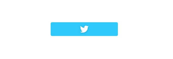
OK looking good. The next step is to add a twitter logo using svg path. I’m going to add this to both inner and outer. (You can change this image to anything you like)
<div class="inner">
     <svg class="twitter-logo" viewBox="0 0 400 400" xmlns="http://www.w3.org/2000/svg"><path fill="white" d="M153.6 301.6c94.3 0 145.9-78.2 145.9-145.9 0-2.2 0-4.4-.1-6.6 10-7.2 18.7-16.3 25.6-26.6-9.2 4.1-19.1 6.8-29.5 8.1 10.6-6.3 18.7-16.4 22.6-28.4-9.9 5.9-20.9 10.1-32.6 12.4-9.4-10-22.7-16.2-37.4-16.2-28.3 0-51.3 23-51.3 51.3 0 4 .5 7.9 1.3 11.7-42.6-2.1-80.4-22.6-105.7-53.6-4.4 7.6-6.9 16.4-6.9 25.8 0 17.8 9.1 33.5 22.8 42.7-8.4-.3-16.3-2.6-23.2-6.4v.7c0 24.8 17.7 45.6 41.1 50.3-4.3 1.2-8.8 1.8-13.5 1.8-3.3 0-6.5-.3-9.6-.9 6.5 20.4 25.5 35.2 47.9 35.6-17.6 13.8-39.7 22-63.7 22-4.1 0-8.2-.2-12.2-.7 22.6 14.4 49.6 22.9 78.5 22.9"></path></svg>
</div>
<div class="edge"></div>
<div class="outer">
     <svg class="twitter-logo" viewBox="0 0 400 400" xmlns="http://www.w3.org/2000/svg"><path fill="white" d="M153.6 301.6c94.3 0 145.9-78.2 145.9-145.9 0-2.2 0-4.4-.1-6.6 10-7.2 18.7-16.3 25.6-26.6-9.2 4.1-19.1 6.8-29.5 8.1 10.6-6.3 18.7-16.4 22.6-28.4-9.9 5.9-20.9 10.1-32.6 12.4-9.4-10-22.7-16.2-37.4-16.2-28.3 0-51.3 23-51.3 51.3 0 4 .5 7.9 1.3 11.7-42.6-2.1-80.4-22.6-105.7-53.6-4.4 7.6-6.9 16.4-6.9 25.8 0 17.8 9.1 33.5 22.8 42.7-8.4-.3-16.3-2.6-23.2-6.4v.7c0 24.8 17.7 45.6 41.1 50.3-4.3 1.2-8.8 1.8-13.5 1.8-3.3 0-6.5-.3-9.6-.9 6.5 20.4 25.5 35.2 47.9 35.6-17.6 13.8-39.7 22-63.7 22-4.1 0-8.2-.2-12.2-.7 22.6 14.4 49.6 22.9 78.5 22.9"></path></svg>
</div>
Then I’m going to set the size of it to 40px and add a little touch of drop-shadow. Then add text-align center to cover div to keep the logo at the center of the button and z-index: 99 to keep the cover on top of any divs.
.cover {
    text-align: center;
    z-index: 99;
}
.cover svg{
    width: 40px;
    height:40px;
    filter: drop-shadow(0 1px 2px rgba(0,0,0,0.25));
}
The Shadow
Almost there, now let’s work on the shadow. I’m going to set the position to absolute, 100% width and top and zero left. We’ll use a transparent linear gradient to create a shadow. You can change the height of this div to adjust the shadow distance. Also add the border radius and 90 degrees rotateX using center top transform origin.
The trick is to add opacity 0. This will make the shadow not visible. We’ll add opacity 1 in the hover pseudo class so the shadow appear on hover only.
.shadow {
    position: absolute;
    top:100%;
    left:0;
    width:100%;
    height:3.2rem;
    border-radius: 0.5rem;
    background-image: linear-gradient(to bottom, rgba(0,0,0,0.3) 0%, transparent 100%);
    transform:rotateX(90deg);
    transform-origin: center top;
    opacity: 0;
}
Let’s add a small rotation and scale for the hover effect.
.twitter-button:hover .shadow {
    transform: rotateX(45deg) scale(0.95);
    opacity: 1;
}
Embedding Follow Button
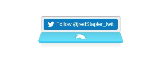
Now it’s time to add the actual follow button inside the cover. Just create a new div outside the cover and copy over your follow, subscribe or like button code inside and remove the width we set on the wrapper.
<div class="twitter-button">
     <div>
            <!-- Put your follow button code here -->
      </div>
      <div class="cover">
....
See the final result in this video!
And that’s it! You can use the same concept to create another social media button like Facebook or Youtube as well!

Source Code – Grab it from this pen
If you love this or interested in CSS design tutorial, check our Youtube channel for weekly tutorial videos or Follow our Facebook page to stay connected. Thanks for keep reading until the end 🙂

how to set this Stunning CSS Social Media Button
on blogger
i ma try but not set plz help sir