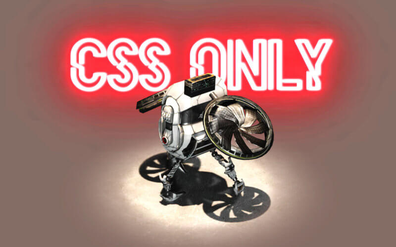
Create 3D Effect on Website using Transparent Video Background
In this tutorial, we’re going to talk about a trick to create 3D effect on website using CSS and transparent video background without using JavaScript at all.
Normally if want to put a 3D model website, then using three.js is usually the way to go. However, three.js requires some work with JavaScript and experience with the library. So the alternative trick is we’re going to render the 3D model into video with with transparent background and then embed it to the website.
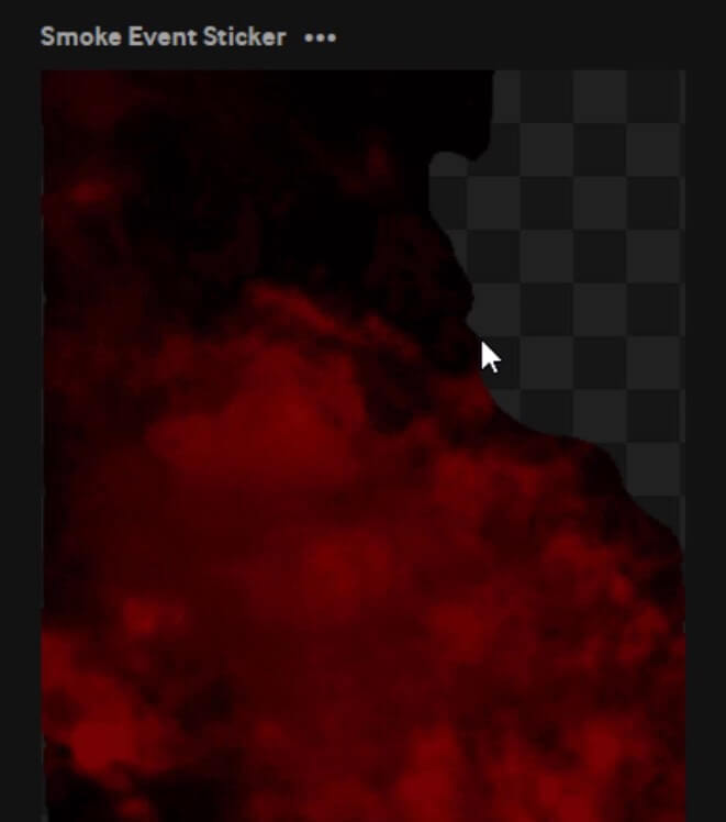
But why not using GIF?
This is very different from using GIF image as GIF doesn’t support alpha channel which means you can either have a fully transparent or opaque pixel. So effect like fading light or shadow is out of question (see figure below) Not to mention GIF only works with low resolution/framerate. Plus using video will let you able to control the animation with JavaScript if needed.
Rendering Transparent Video
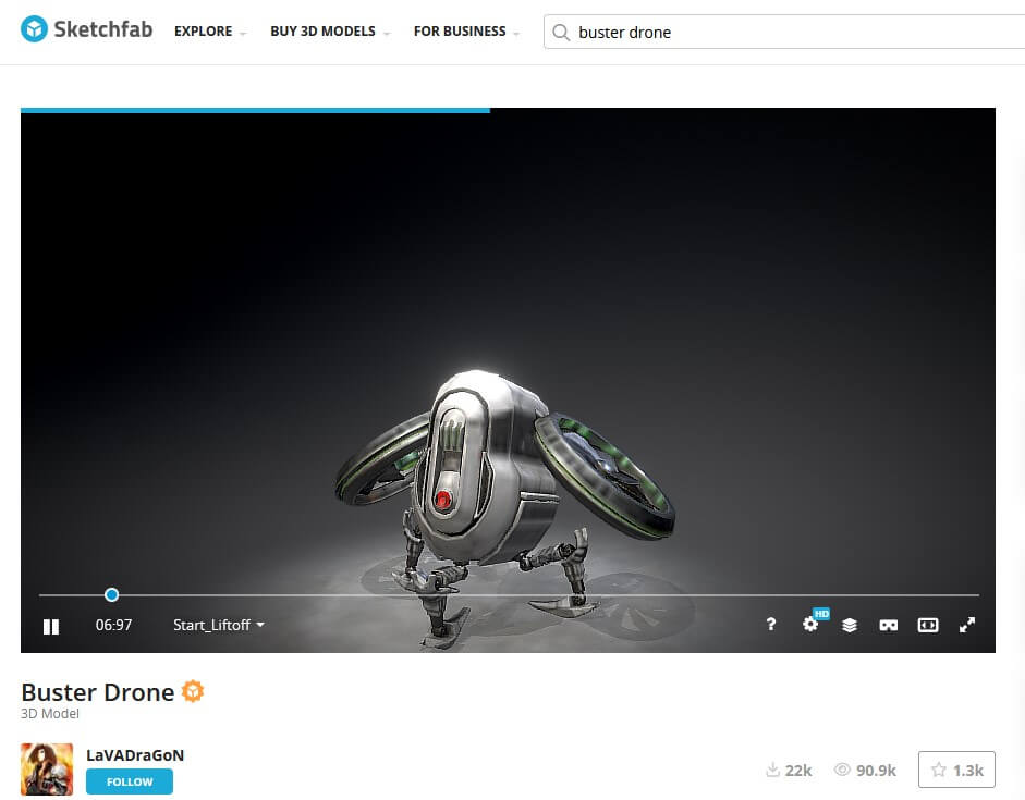
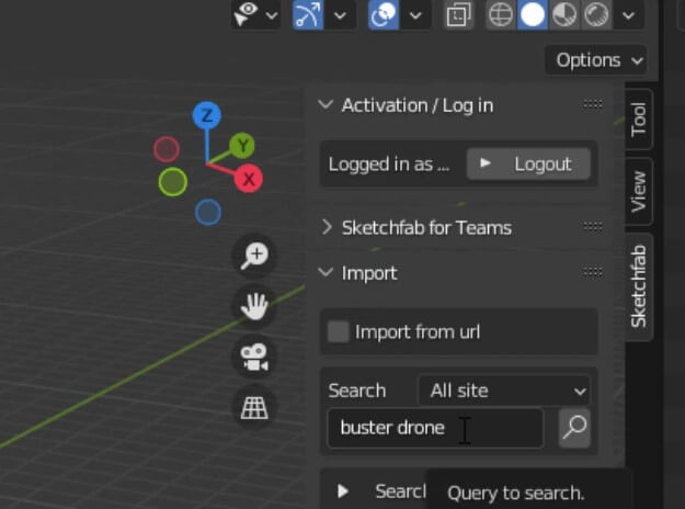
So let’s start the tutorial. First, we need a 3D model. If you haven’t got one already, you can find a free model on sketchfab website and import it to blender. For this tutorial I’ll use a blender addon to import the model directly to the scene.
open the sketchfab add on from the menu, type the model you need and click import
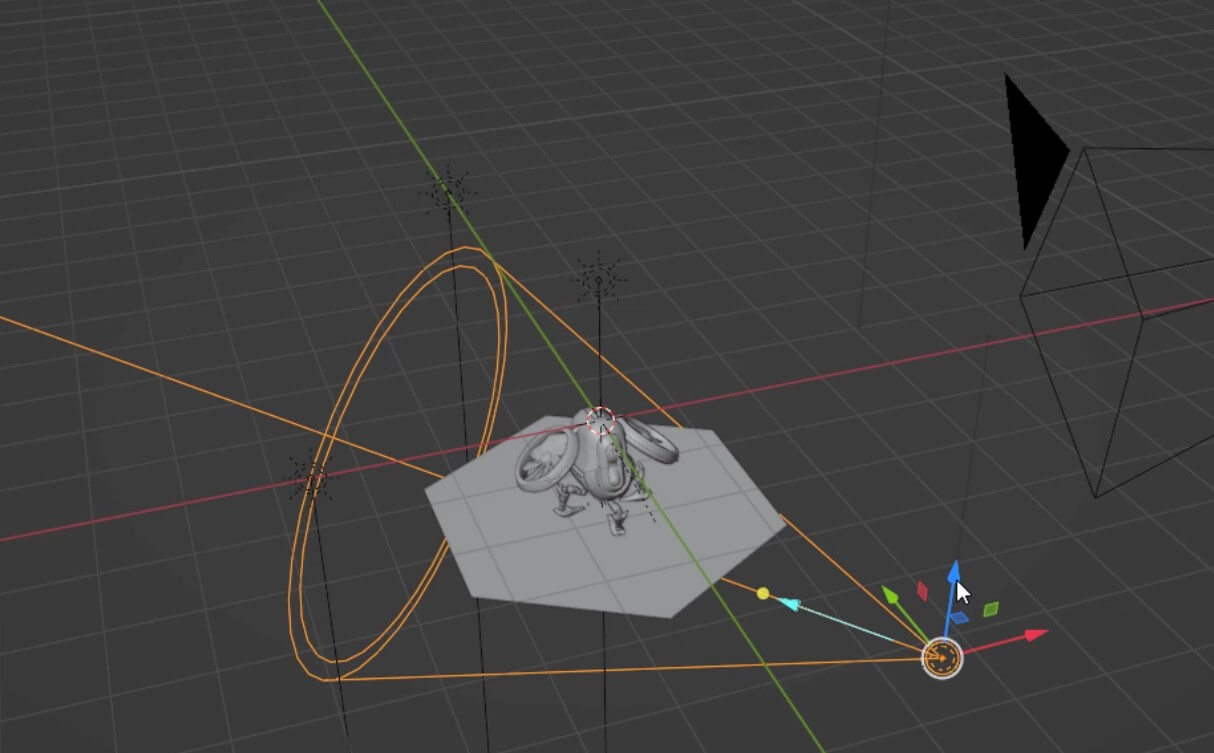
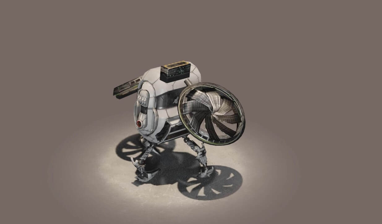
Then make sure the model is in the view of the scene camera. then press F12 to render.
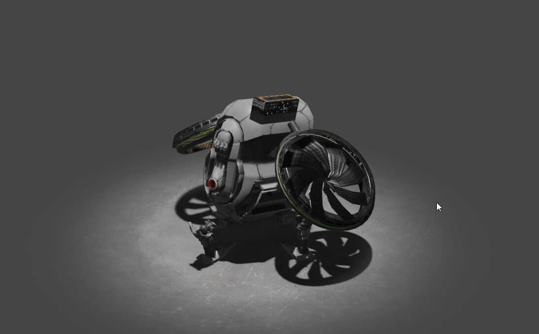
As you can see, it’s too dark. So I will add some light to the scene. For this tutorial I’ll add a combination of spotlight and sunlight.
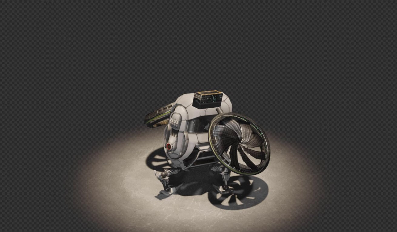
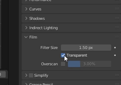
Ok this looks good. Next we’ll work on the animation rendering. Go to the render properties and check transparent in film section.
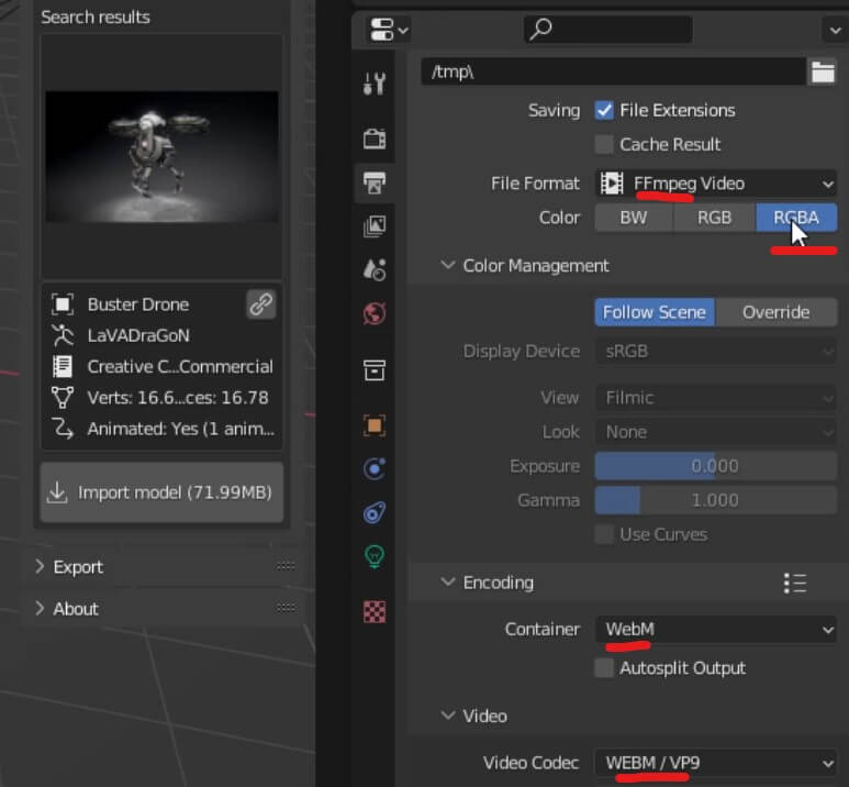
Next go to output setting and select FFmpeg video file format. Then select webm container and webm video codec. And then select RGBA color.
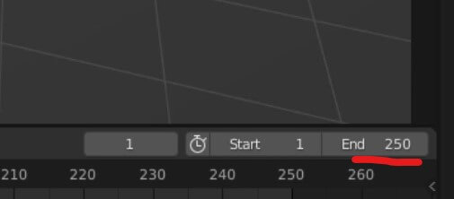
That’s all need. You can start the animation render from the menu or press Ctrl+F12. You can change the the “end” frame to control the video length.
(Optional) To support Safari. We’ll also need to render the video in mov format browser. Change both container and codec to quicktime and render again.
Now you should have two videos as the result. copy them to your website directory.
Embedding Transparent Video into Website
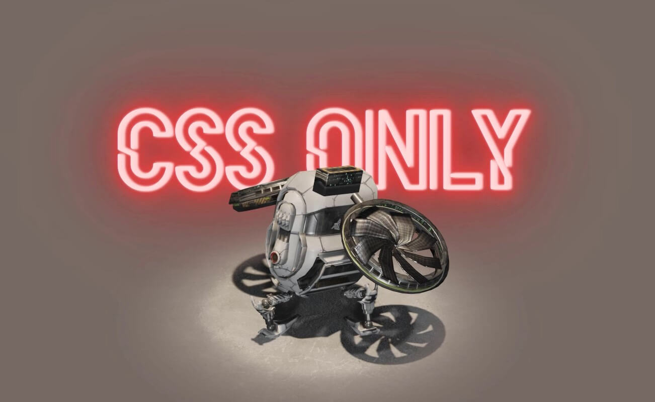
In HTML, we’ll just use the video tag with autoplay, muted, loop and playsinline option and link to the video source of both files.
<video autoplay muted loop playsinline>
  <source src="bot.mov" type='video/mp4; codecs="hvc1"'>
  <source src="bot.webm" type="video/webm">
</video>
Now I’m going combine this example with the CSS neon text effect from my previous tutorial.
<div class="neon-wrapper">
  <div class="neon-text">CSS ONLY</div>
</div>
Then I’ll copy CSS from previous example. Then set the z-index so that the video is in front of the neon text and add some keyframes to create the flickering effect.
@font-face {
  font-family: neon;
  src: url(hellodenverdisplayregular_v1.6.ttf);
}
.neon-text {
  font-family:neon;
  font-size: 14rem;
  color: #ffd8d8;
  padding: 0 3.5rem 0 3.5rem;
  text-shadow:
  .1vw 0vw .25vw #ffd8d8, .2vw 0vw .25vw #ffd8d8, .4vw 0vw .25vw #ffd8d8,
  .1vw 0vw   0vw #f25757, .2vw 0vw   0vw #f25757, .4vw 0vw   0vw #f25757,
  .1vw 0vw  .1vw #f25757, .2vw 0vw  .1vw #f25757, .4vw 0vw  .1vw #f25757,
  .1vw 0vw   2vw #f25757, .2vw 0vw   2vw #f25757, .4vw 0vw   2vw #f25757,
  .1vw 0vw   1vw #e50b0b, .2vw 0vw   1vw #e50b0b, .4vw 0vw   5vw #e50b0b,
  .1vw 0vw   5vw #e50b0b, .2vw 0vw  20vw #e50b0b, .4vw 0vw  10vw #e50b0b;
  animation: blink 3s infinite;
}
.neon-wrapper {
  position: absolute;
  top:30%;
}
video {
  z-index: 2;
}
div {
  z-index: 1;
}
@keyframes blink {
  69% {filter:brightness(1);}
  70% {filter:brightness(0.7);}
  71% {filter:brightness(1);}
}
And that’s all for this tutorial. You can download the code here (videos not included)
That’s all for this tutorial. If you like it, check out our YouTube channel our Facebook page to stay tune for more dev tips and tutorials
