Realistic CSS Neon Text Effect Tutorial
In this tutorial, I’m going to show you how to create a realistic neon text effect with pure CSS in just a few minutes!
HTML Structure
So here is the example page with black background. I already have a wrapper div with flex layout to center everything on the screen.
First let’s create another wrapper for our neon text. We’ll add border to this div later. And another div for the actual neon text. I’ll use a line break tag to separate the text into 2 lines.
<div class="neon-wrapper">
     <div class="neon-text">NEON <br> TEXT</div>
</div>
Really, that’s all for HTML structure. Let’s work on the CSS!
The CSS
First we’ll find the font that is suitable for making neon effect. For me I just searched a word “neon” in free fonts website and pick one.
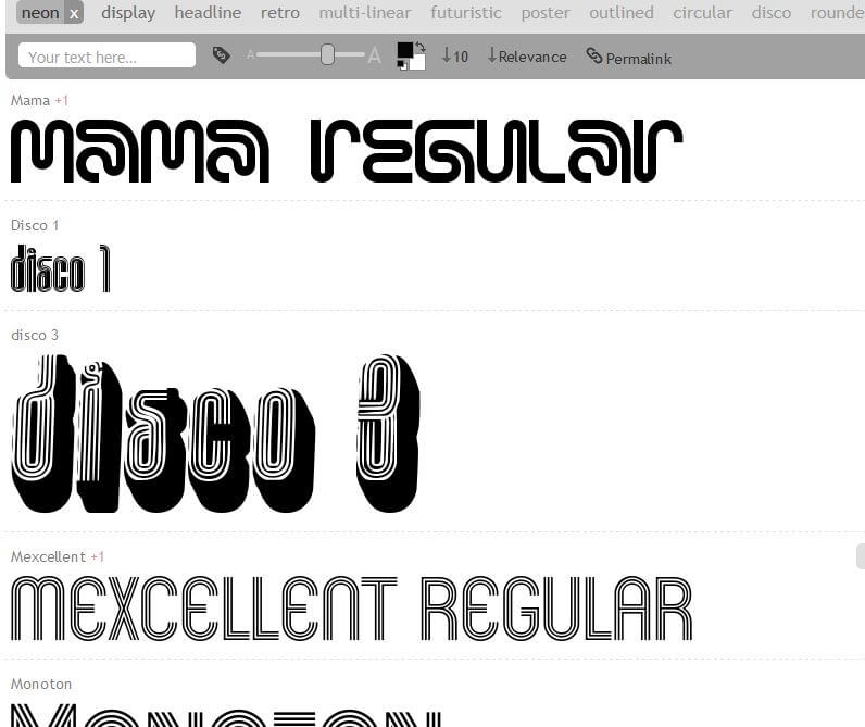
Once you have the font file, put it to web directory and use font-face to load it. (I use Hello Denver Display font) Then set the font, size and color.
@font-face {
font-family: neon;
src: url(hellodenverdisplayregular_v1.6.ttf);
}
.neon-text {
font-family:neon;
font-size: 14rem;
color: #ffd8d8;
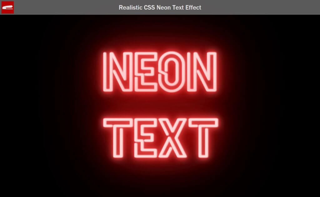
}Now we’re going create a glowing effect using text-shadow. This is the same technique as previous video to create a 3D Text Hover Effect.
.neon-text {
text-shadow:
.1vw 0vw .25vw #ffd8d8, .2vw 0vw .25vw #ffd8d8, .4vw 0vw .25vw #ffd8d8,
.1vw 0vw 0vw #f25757, .2vw 0vw 0vw #f25757, .4vw 0vw 0vw #f25757,
.1vw 0vw .1vw #f25757, .2vw 0vw .1vw #f25757, .4vw 0vw .1vw #f25757,
.1vw 0vw 2vw #f25757, .2vw 0vw 2vw #f25757, .4vw 0vw 2vw #f25757,
.1vw 0vw 1vw #e50b0b, .2vw 0vw 1vw #e50b0b, .4vw 0vw 5vw #e50b0b,
.1vw 0vw 5vw #e50b0b, .2vw 0vw 20vw #e50b0b, .4vw 0vw 10vw #e50b0b,
.1vw 0vw 10vw #e50b0b, .2vw 0vw 30vw #e50b0b, .4vw 0vw 10vw #e50b0b;
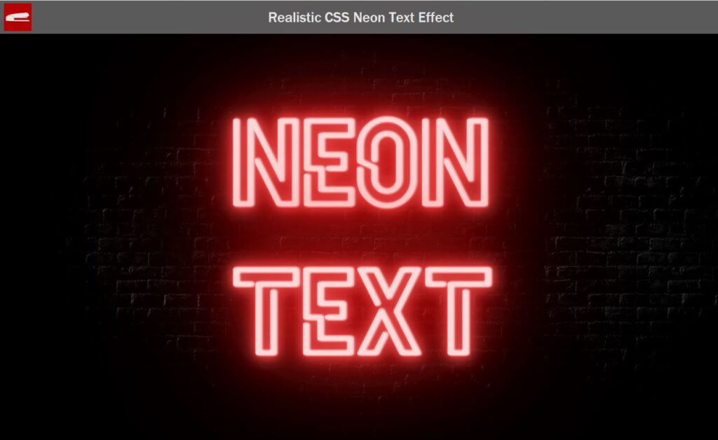
}Basically, These are multiple layers of shadow with different blur radius and color intensity. For example, the light closest to the text should be the brightest so we’ll set a very pale red and small amount of offset and blur radius.
For those far away from the text, we’ll set it to darker color with more blur radius and offset. You can try adjusting these values to suit your project design. And here is the result.
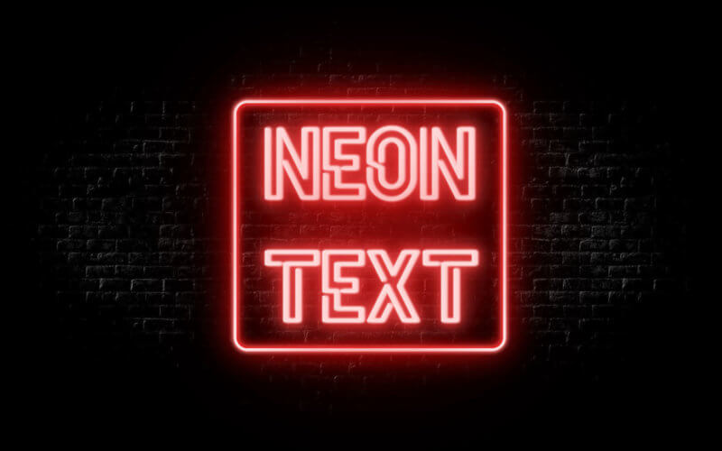
To make it more realistic, I’m going to add a dark brick wall as background image of the main wrapper.
.wrapper {
  background-image: url(wall.jpg);
  background-size: auto 100%;
}
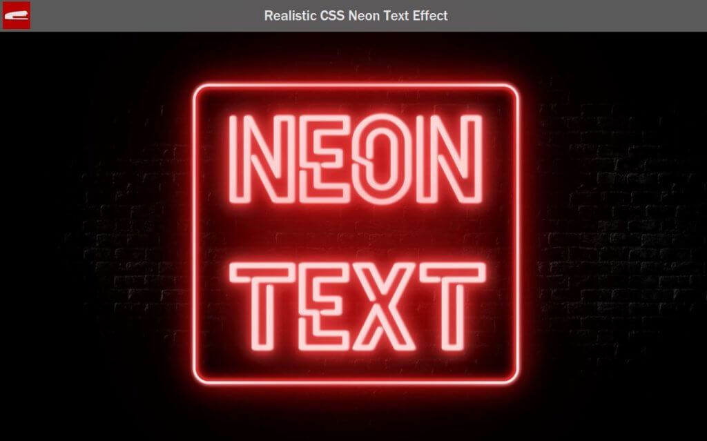
Adding Border
Now here is optional, I’m going to add a border. We can do that easily using the same technique. but since border is not a text, we’ll have to use box-shadow instead of text-shadow. I’ll also add left and right padding and border-radius as well.
.neon-wrapper {
  box-shadow:
  0 0 0.1vw  0.4vw #fff7f7,
  0 0 0.4vw  0.6vw #e97272,
  0 0   4vw  0.4vw #e50b0b,

  inset 0 0 1.5vw  0.4vw #e50b0b,
  inset 0 0 0.4vw  0.2vw #e97272,
  inset 0 0 0.5vw  0.2vw #fff7f7;
  border-radius: 1.5rem;
}
.neon-text {
  padding: 0 3.5rem 0 3.5rem;
}
You’ll see that I have a set of shadows with inset property. This is to make the box-shadow radius appears on both side. Here is the final result
That’s all for this tutorial. Any feedback, drop a comment to let me know. And if you love to see more of these, don’t forget to like or subscribe to our Facebook and Youtube Channel to stay tune 
Final CSS
.wrapper {
  width: 100vw;
  height: 100vh;
  display: flex;
  align-items: center;
  justify-content: center;
  background-image: url(wall.jpg);
  background-size: auto 100%;
}
@font-face {
  font-family: neon;
  src: url(hellodenverdisplayregular_v1.6.ttf);
}
.neon-wrapper {
  box-shadow:
  0 0 0.1vw  0.4vw #fff7f7,
  0 0 0.4vw  0.6vw #e97272,
  0 0   4vw  0.4vw #e50b0b,

  inset 0 0 1.5vw  0.4vw #e50b0b,
  inset 0 0 0.4vw  0.2vw #e97272,
  inset 0 0 0.5vw  0.2vw #fff7f7;
  border-radius: 1.5rem;
}
.neon-text {
  font-family:neon;
  font-size: 14rem;
  color: #ffd8d8;
  padding: 0 3.5rem 0 3.5rem;
  text-shadow:
  .1vw 0vw .25vw #ffd8d8, .2vw 0vw .25vw #ffd8d8, .4vw 0vw .25vw #ffd8d8,

  .1vw 0vw   0vw #f25757, .2vw 0vw   0vw #f25757, .4vw 0vw   0vw #f25757,
  .1vw 0vw  .1vw #f25757, .2vw 0vw  .1vw #f25757, .4vw 0vw  .1vw #f25757,
  .1vw 0vw   2vw #f25757, .2vw 0vw   2vw #f25757, .4vw 0vw   2vw #f25757,

  .1vw 0vw   1vw #e50b0b, .2vw 0vw   1vw #e50b0b, .4vw 0vw   5vw #e50b0b,
  .1vw 0vw   5vw #e50b0b, .2vw 0vw  20vw #e50b0b, .4vw 0vw  10vw #e50b0b,
  .1vw 0vw  10vw #e50b0b, .2vw 0vw  30vw #e50b0b, .4vw 0vw  10vw #e50b0b;
}
Great! Thank you.