How to Create Film Grain Effect with Pure CSS
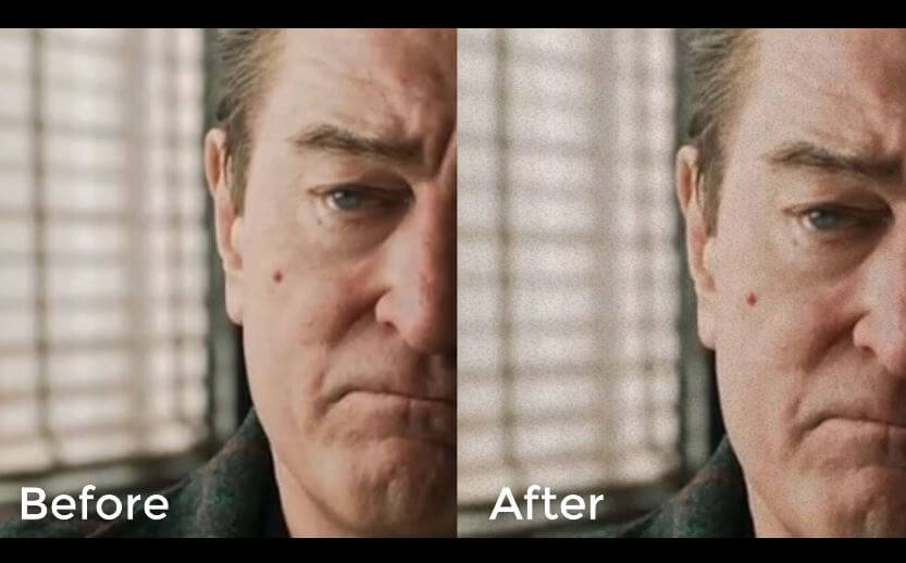
In this tutorial, we’re going to show you how to create an animated film grain effect with pure CSS in just a few minutes. Let’s check it out!
Create a Grain/Noise Texture
The concept of this tutorial is to create a grain noise texture. Then apply it to our page and use CSS transform to animate it.
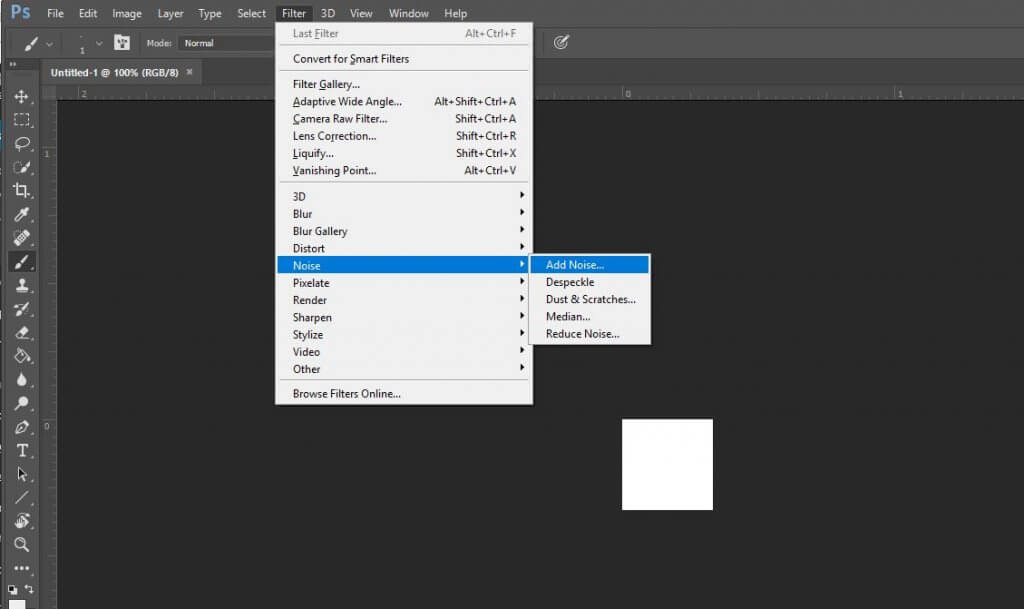
First create a new image with 100×100 pixels size in Photoshop. Then create a noise using add noise filter
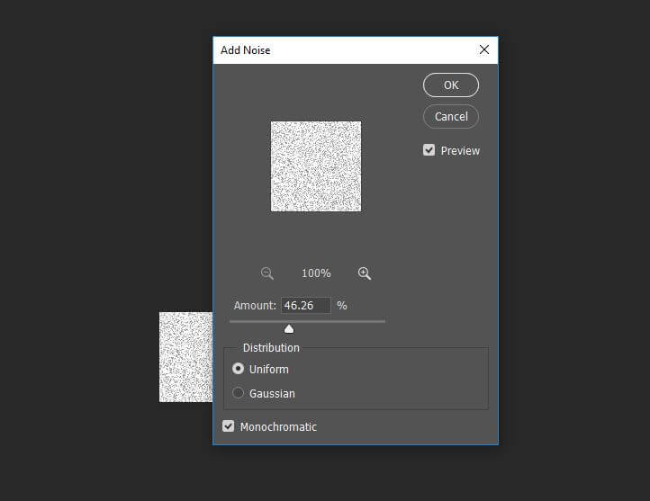
Increase the amount as much as you like but don’t forget to select mono chromatic
Now we need to remove the white background to create a transparent texture. First invert the image color by press Ctrl+I
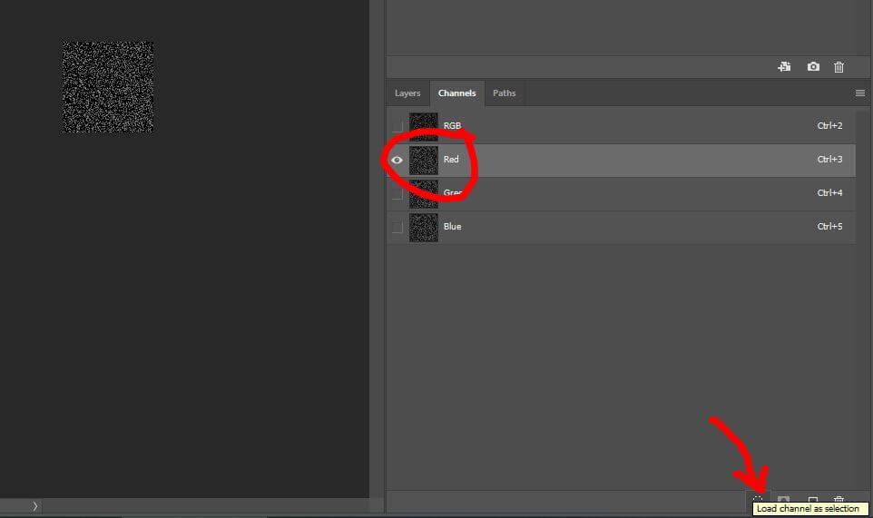
Then we’re going to open a color channel window and select any channel. Then click load channel as a selection at the bottom. This will select all the grain noise. Photoshop will tell you that since each grain is so small, the selection highlight won’t be displayed
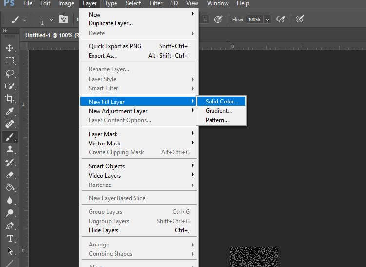
Then create a new fill layer from the selection with black color
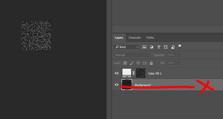
Now we have the grain noise layer. Let’s delete the original white background layer and save it as transparent PNG
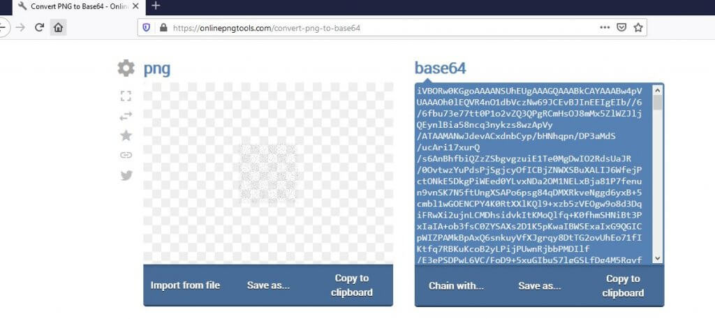
(Optional) I’m going to convert the texture into base64 in order to embed it into the CSS. There are lots of online tool for this. Just upload the image and you’ll get the encoded text. Let’s keep it for now.
HTML/CSS
Let’s work on the HTML. First create a background div (You can apply this directly to the body. It’s up to you)
<div class="background"></div>
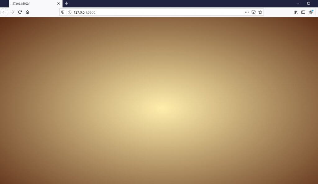
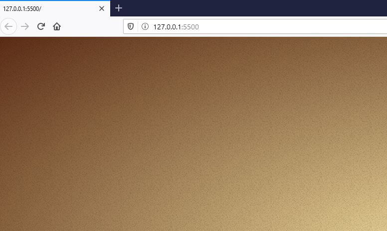
Then in CSS, set the position to absolute and overflow:hidden to disable the scrollbar. I’m also going to create a yellow gradient background to create an old looking.
.background {
  position: absolute;
  width: 100vw;
  height: 100vh;
  overflow: hidden;
  background: radial-gradient(ellipse at center, #ffeeac 0%, #5b2c15 100%);
}
Now I’m going to create a pseudo-element and use our grain texture as background. Put your encoded base64 as image data URL. I’ll double the size and move it’s position to make it cover the background div.
.background::after {
  content:"";
  position: absolute;
  width:200vw;
  height: 200vh;
  left: -50%;
  top: -50%;
  background-image: url(data:image/png;base64,iVBORw0KGgoAAAANSUhEUgAAAGQAAABk
...
...
...
0h3x10Knx7u8R/N/zoJhKaqY2qsAAAAASUVORK5CYII=);
}
Now I’m going to animate the noise layer to create a film grain effect. It’s pretty simple, just use CSS transform and translate the element position. I’m going to create six keyframes and translate it randomly. Also use steps() to remove the tween between keyframes when adding animation.
.background::after {
...
  animation:grain 1.5s steps(6) infinite;
}
@keyframes grain {
  0%, 100% {transform: translate(0,0);}
  10% {transform: translate(-5%,-10%);}
  30% {transform: translate(3%,-15%);}
  50% {transform: translate(12%,9%);}
  70% {transform: translate(9%,4%);}
  90% {transform: translate(-1%,7%);}
}
And that’s it! But if you want to apply the film grain to other elements like div or images, you do it easily by setting z-index to minus 1. For example…
<div class="background">
  <img src="bkg.jpg" class="grain-img">
</div>
.grain-img {
  z-index: -1;
}
And that’s all for this tutorial. You can download the source code here. If you enjoy it and want to see more. Subscribe our YouTube Channel or follow our Facebook to stay tune for weekly update 🙂
