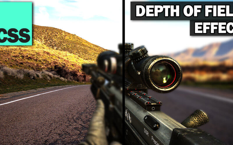
Pure CSS Depth of Field Effect
Hello and welcome to Red Stapler Channel. In this tutorial, we’re going to show you how to create depth of field effect, which could be useful for creating stunning background on your website. This technique use only CSS and can be done in just a few minutes. Let’s check it out!
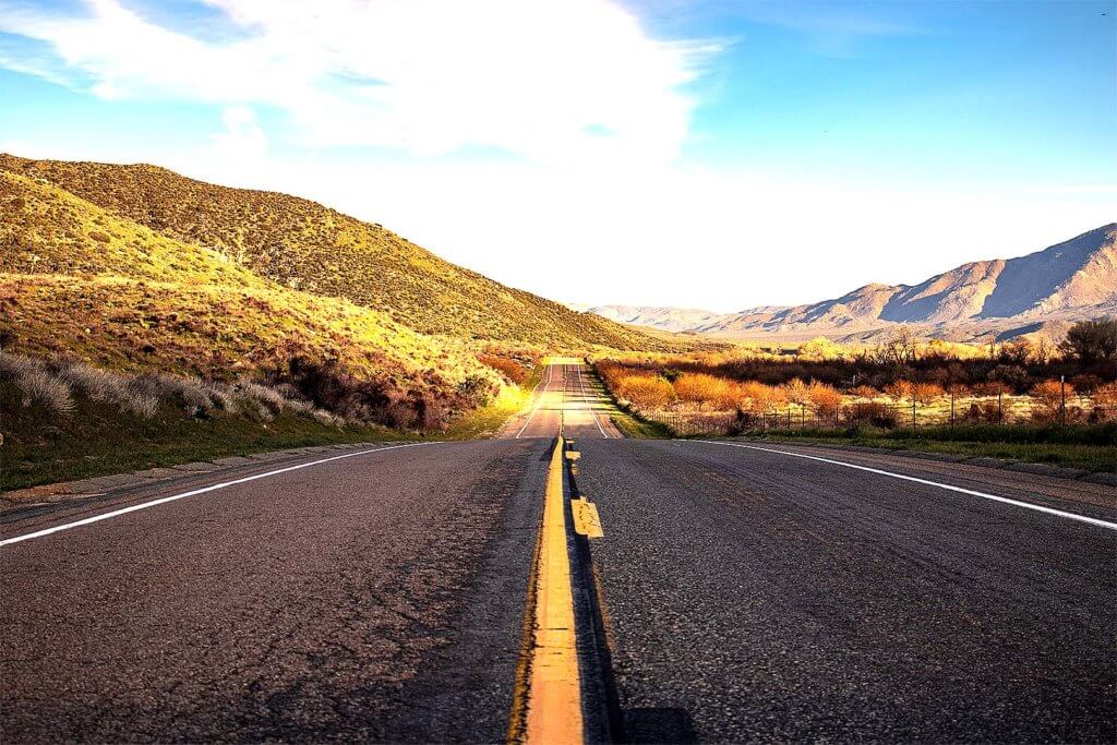
So we will need two separate images. First is background like this one.
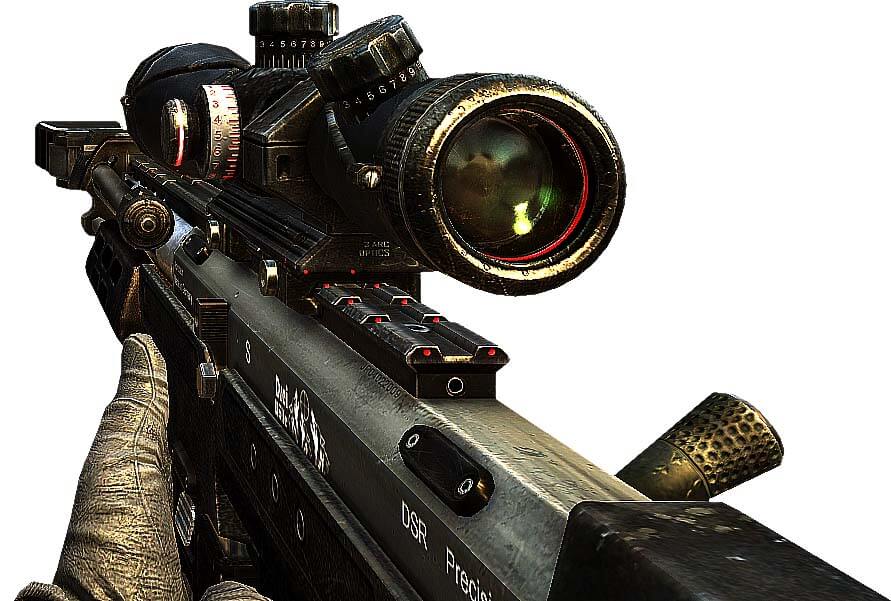
And another is object that closer to your eyes. In this case, I’ll use a rifle image captured from call of duty game.
Next I’ll create divs for both images.
<div class="back"></div>
<div class="front"></div>
For the CSS, First let’s set the background image. I’ll set the position to absolute and set the image size a little bit larger then the viewport. If we don’t do this, you will see the white area around the edges when we apply the blur filter. Also add overflow hidden to the body to remove the scrollbar.
body {
  margin: 0;
  padding: 0;
  overflow:hidden;
}
.back {
  background:url("dof-back.png");
  background-size: cover;
  position: absolute;
  top:-1vh;
  left:-1vw;
  width:102vw;
  height:102vh;
}
.front {
  background: url("dof-front.png");
  background-size: cover;
  position: absolute;
  bottom: -1vh;
  right: 3vw;
  width: 50vw;
  padding-bottom: 30%;
}
You’ll notice that I used percentage padding-bottom instead of height. This is to preserve the div aspect ratio if user resize the window.
Then, we’ll create a hover pseudo class for both divs to remove the blur filter. Also add 1 second transition.
.back, .front {
filter: blur(4px);
transition: filter 1s;
}
.back:hover, .front:hover {
filter: blur(0px);
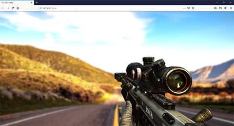
}See the result in this video and download the demo code here
This is the easiest way to do it with pure CSS method. But if you don’t mind to add a small JavaScript, then we can capture the mouse position and adjust the depth dynamically.
So let’s remove the blur filter and hover class we just added. Then in JavaScript, we’ll set the focus point for each div. I’ll set the focus point of the background to 50px from top and 1000px for the rifle.
let focusBack = 50;
let focusFront = 1000;
Then create a new style element and add it to the body. so if we want to add any CSS in the future, we can inject them to this element .
let editCSS = document.createElement('style');
document.body.appendChild(editCSS);
Then we’ll add mousemove event listener to calculate the blur amount from the current mouse vertical position. The more cursor distance from the focus point, the more blur amount should be applied.
window.addEventListener('mousemove', e => {
  let blurBack   = Math.abs(focusBack-e.clientY)/150;
  let blurFront  = Math.abs(focusFront-e.clientY)/200;
Finally, we’ll apply the blur filter to the style element we added. To make it more realistic, we’ll add a small scale transform to the background.
editCSS.innerHTML = '.back { filter: blur('+ (blurBack) +'px); '  +
                    'transform: scale('+ (1.00+blurFront/300) +'); }' +
                    '.front{ filter: blur('+ (blurFront) +'px); }' ;
Download the code here
And that’s it for this tutorial. Hope you guys enjoy! If you love to see more development tips and tutorials, don’t forget to subscribe to our channel to stay tune 🙂
