5 Stunning CSS Filter Tricks You Must See
CSS filter is a quick and convenient way to apply effects like blur, brightness and contrast to any HTML element. But do you know that it can also be used to create awesome effects. In this post, we’re to talk about 5 stunning CSS filter tricks that you might not know. Ready? Let’s check it out!
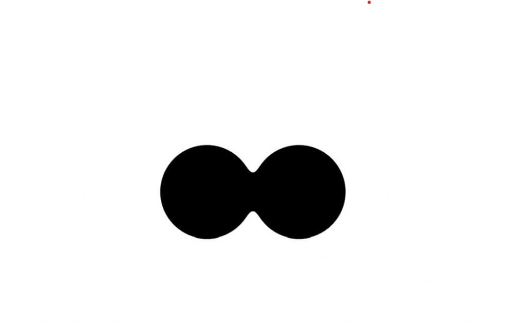
Gooey Effect
This trick is a combination of CSS contrast filter and blur. The concept is very simple. when you blur two objects to a certain point, they will start to overlapping each other. that’s when we add contrast to counter the blur. And that’s it. Both of them will merge with each other in a sticky gooey way (Read the full tutorial here)
So if we combine this trick with color, border radius and rotation animation. You will achieve this stunning effect like this example from co0kie on Codepen
You can also animate the blur filter itself to create a gooey text animation like one below. When you increase the letter spacing and blur to the point that the letters are not overlapping. The contrast will make them disappear. (see the demo here)
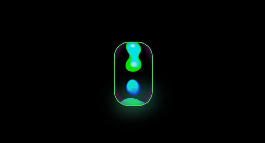
Light Effect
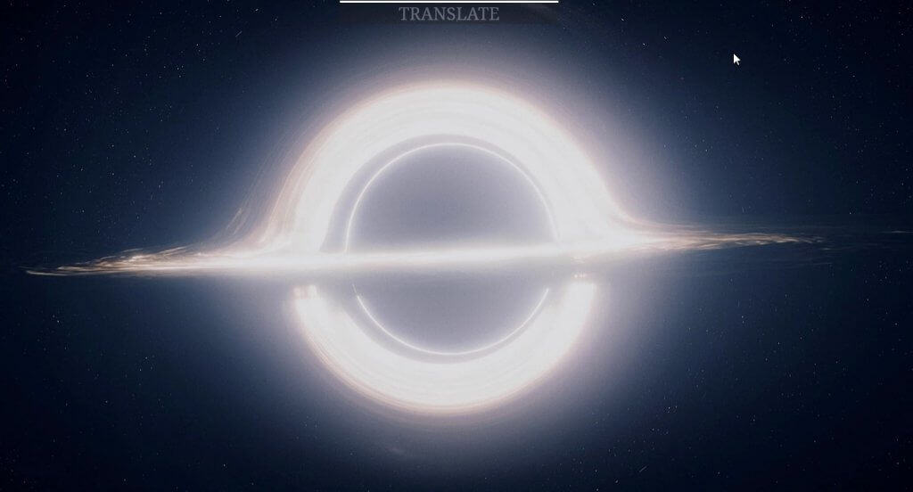
Next trick is again, simple but awesome. You can animate the brightness of the element which can be used to simulate the dimming light effect like this example from Paul
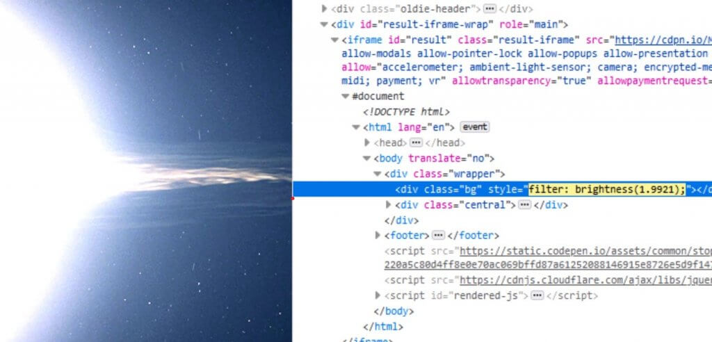
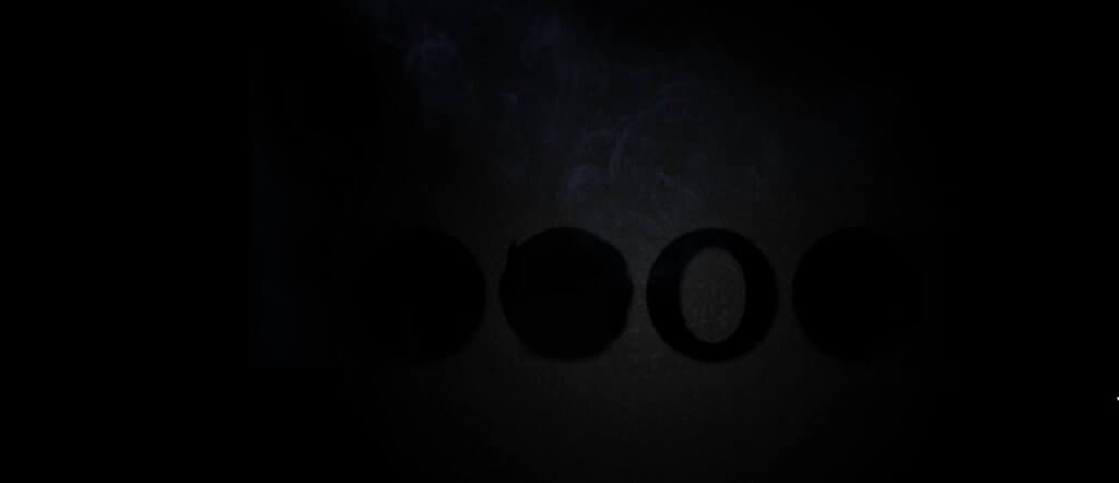
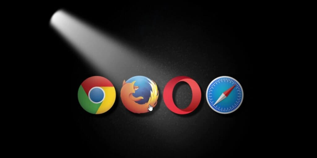
And this example from Noel Delgado use linear gradient background and blur filter to create a light beam. Then use brightness filter to create a light effect on the these logos. Simple as that.
Or you can combine it with opacity animation to create movie style quote like this example from Justin Castaneda. The first one is a combination of brightness filter of the background and text opacity. And the last one is with sepia filter.
Hover DOF Effect
Next trick is simple yet effective. When you want to create a hover effect to highlight a certain area. You can use blur and saturation filters to remove the color and blur the non essential part. This will bring the attention to the highlighted item which works really well with menu (see demo here from Steve Meredith)
Or you can create a Depth of field effect on your website. See full tutorial here.
CSS x SVG Filter
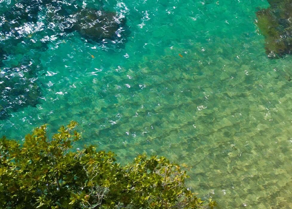
If you watched my previous video, you knew this trick already. You can create a custom SVG filter and apply it with CSS filter using url. This allows us to create many stunning effects using SVG capabilities. For example, you use SVG turbulence to create a realistic water without any JavaScript at all (See tutorial here) or create a heat wave effect, or squiggly text or use Gaussian blur to create a smoke effect
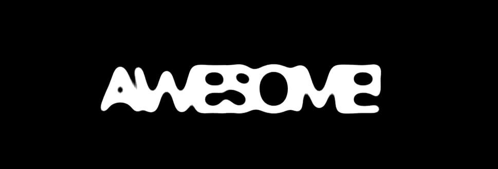
Glitch Effect
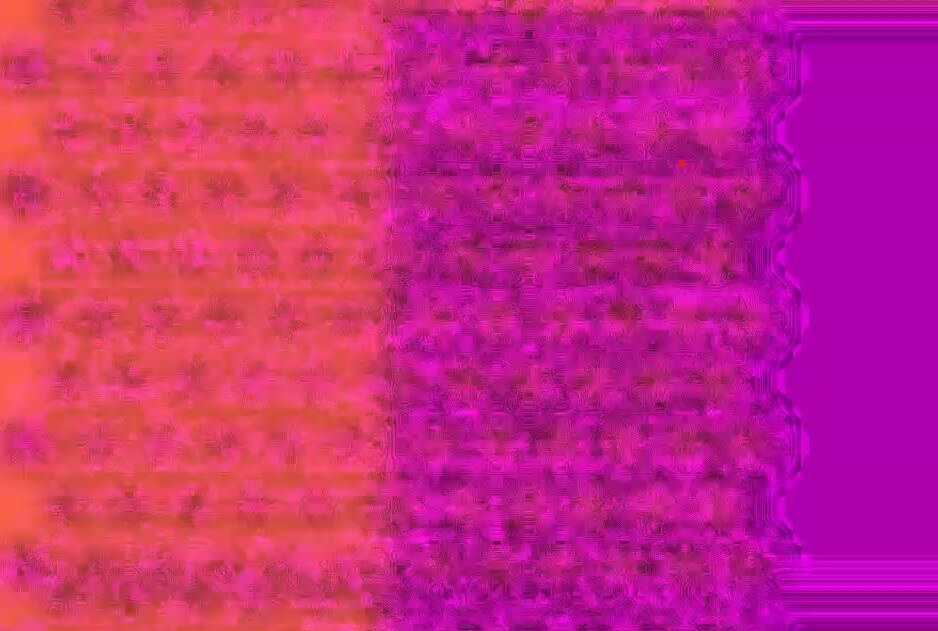
The last trick is pretty cool and genius. Remember the first trick that us used to create a gooey effect? This trick use it to combine with typography. There are some interesting characters in Arial font (ex. ░ ▒ ▓ █ ) so this example from Gerhard Bliedung use it to create patterns and switch between them using CSS animation. Then add a blur and contrast filter which resulted in glitch effect.
The catch is you can only use colors that are not too contrast like pink and purple or dark blue and Indigo
And that’s for this post! If you love this and want to see more development tips and tutorials, subscribe our YouTube Channel to stay tune 🙂

Justin Caneda LInk is dead. Here you go:
https://codepen.io/DagorathUryens/pen/YyBjzW