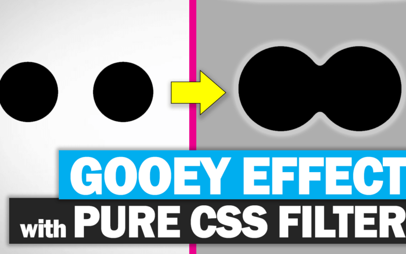
Create Gooey Effect with CSS Filter
In this post, I’m going to show you how to easily create a gooey animation effect using just CSS filter and transform in a just a few minutes. Let’s check it out!
The Concept
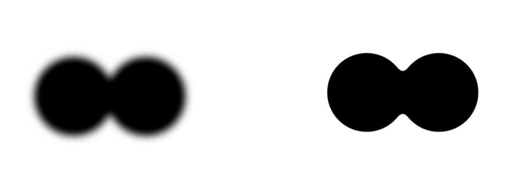
The key concept of this method is to use a blur and contrast CSS filter.
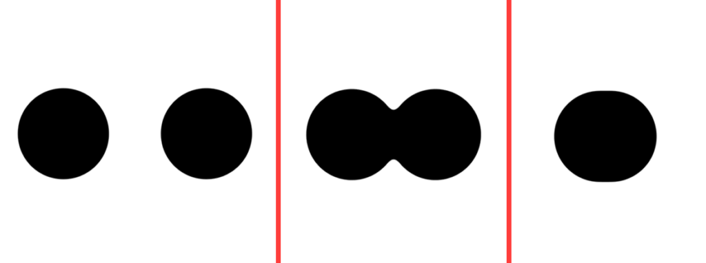
If you have two objects and blur them enough, you’ll see that they start to overlap. And If we also add a contrast to counter the blur, the objects will appear to look connected.
The trick is we need to pick the background color that is very contrast to the object color to make it works.
The Code
Let’s start with creating two black circles on white background.
.stage-wrapper{
  width:800px;
  height:600px;
  position:absolute;
  top:50%;
  left:50%;
        background:#fff;
        transform:translate(-50%,-50%);
        filter: blur(10px) contrast(20);
}
.obj-1,.obj-2{
  width:200px;
  height:200px;
  position:absolute;
  background:#000;
  border-radius:50%;
  top:50%;left:50%;
  transform:translate(-50%,-50%);
}
Let’s make them move using keyframe and animation properties.
.obj-1{
  left:30%;
  animation:ani-1 3s ease infinite;
}
.obj-2{
  left:70%;
  animation:ani-2 3s ease infinite;
}
@keyframes ani-1{
  0%{left:30%; }
  50%{left:50%; }
  100%{left:30%; }
}
@keyframes ani-2{
  0%{left:70%;}
  50%{left:50%;}
  100%{left:70%;}
}
Now I’m going to add a blur and a contrast filter to the wrapper div. If you change the color, you might have to adjust them a little bit the get right combination.
And here is the result
See it in action in video below
Well, there are couple of drawbacks of this method. The first one is since we’re using blur filter, if you happen to have any content inside the circle div, they will also be blurred and unreadable. And another one is this method require background with contrasty background to make it work so it’s not transparent.
Feel free to like or subscribe to our Facebook and Youtube Channel to stay tune. And you might want to check out our 14 Amazing CSS Creation Collection as well!
Source Code
<div class = "stage-wrapper">
     <div class = "obj-1"></div>
     <div class = "obj-2"></div>
</div>
.stage-wrapper{
width:800px;
height:600px;
top:50%;
left:50%;
position:absolute;
transform:translate(-50%,-50%);
background:#fff;
filter: blur(10px) contrast(20);
}
.obj-1,.obj-2{
width:200px;
height:200px;
top:50%;left:50%;
position:absolute;
border-radius:50%;
background:#000;
transform:translate(-50%,-50%);
}
.obj-1{
left:30%;
animation:ani-1 3s ease infinite;
}
.obj-2{
left:70%;
animation:ani-2 3s ease infinite;
}
@keyframes ani-1{
0%{left:30%; }
50%{left:50%; }
100%{left:30%; }
}
@keyframes ani-2{
0%{left:70%;}
50%{left:50%;}
100%{left:70%;}
}
Very nice Tutorial but how can i put some text on the circle?