Split.js Tutorial – Create Split Screen Effect on your Website
Today we’re going to talk about split.js. An awesome JavaScript that can help you create split screen effect on your webpage or any HTML element and create a resizable partition in just a few minutes. Let’s check it out!
Installation
There are 2 versions of split.js. A standard version which supports float and flex layout and a new version for grid layout. For this tutorial, we’ll use the original one.
You can install from npm or just include it from CDN. It’s up to you. This tutorial going to use CDN for simplicity.
$ npm install --save split.js
<script src="https://unpkg.com/split.js/dist/split.min.js"></script>
Implementation
So here is the example page. I added just three boxes to the page and centered them using flex layout. The current CSS I have is only just a basic styling with background color, border and padding.
<div class="content">
    <div class="cell a">A</div>
    <div class="cell b">B</div>
    <div class="cell c">C</div>
</div>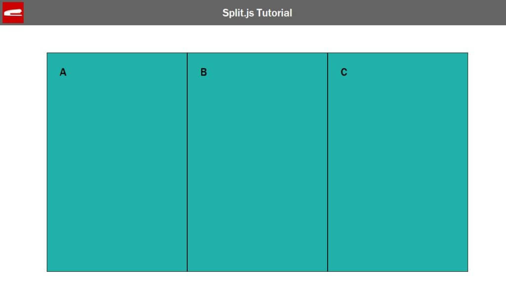
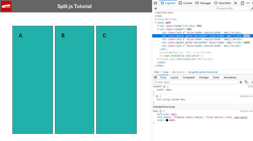
Now we can use the library by calling split and pass the array of element selector that you want to split. In this case I’ll just pass the class name of each box.
Split(['.a', '.b','.c']});
You’ll see that the boxes are separated. If you use the inspector you’ll see that the library already added the invisible gutter line for you.
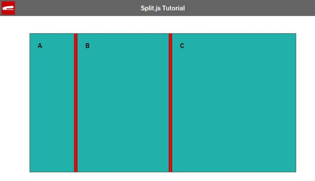
Now we can show the gutter line and create a resizable partition by setting the height to anything. The reason why split.js let you do this manually because they didn’t want to interfere with your layout. They only compute the size and insert the invisible gutter and the rest is up to you.
So we’ll just set gutter height to 100% and color to red. Also we should change the cursor to double arrows on hover to let user know this is resizable.
.gutter {
  cursor: s-resize;
  height:100%;
  background: red;
}
Looks good, now there are some options that you’re going to use pretty often in split.js. First is the gutter size, pretty straightforward. You can change this to control the gutter line size.
Split(['.a', '.b'], {
    gutterSize: 5,
});
Next is the starting size of each partition. You can pass an array of percentage value like this.
Split(['.a', '.b'], {
    gutterSize: 5,
    sizes: [20,80],

});
the last one is minSize. this is where you’ll limit the minimum size of each partition before the gutter line will stop.
Split(['.a', '.b'], {
    gutterSize: 5,
    sizes: [20,80]
    minSize: [200, 200]
});
Vertical Mode
Split.js also work in vertical mode. Just add direction vertical to the option.
Split(['.a', '.b','.c'], {
    gutterSize: 5,
    sizes: [25,25,50],
    minSize: [300, 300, 300],
    direction: "vertical"
});
Then adjust your page layout accordingly. Since I used flex layout in this tutorial, we’ll just change the flex direction to column mode. Then remove the gutter height setting and change the cursor direction to vertical double arrows.
.content {
  display: flex;
  flex-direction: column;
}
.gutter {
  cursor: s-resize;
  background: red;
}
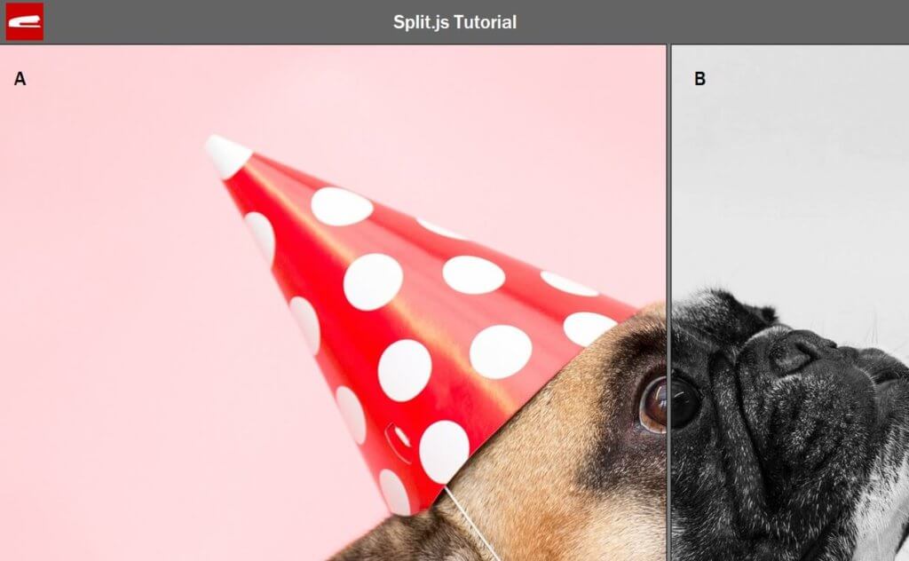
With split.js you can now easily create amazing effect for your website. Here is the example using just split.js and CSS fixed background. (Source code at the end of this post)
So that’s all for this tutorial. If you love it, be sure to like our Facebook page and subscribe to our Youtube Channel to stay tune. thanks for visiting and see you next time 🙂
Source Code (Doggy Example)
HTML
<!DOCTYPE html>
<html>
    <head>
    <meta http-equiv="content-type" content="text/html; charset=UTF-8" />
    <link rel="stylesheet" type="text/css" href="styles.css">
    </head>
    <body>
    <div class="content">
        <div class="split a">A</div>
        <div class="split b">B</div>
    </div>
    <script src="https://unpkg.com/split.js/dist/split.min.js"></script>
    <script>
      Split(['.a', '.b'], {
        gutterSize: 5,
        sizes: [20,80]
      });
    </script>
    </body>
</html>
CSS
* {
  box-sizing: border-box;
}
body {
  margin: 0;
  height: 100vh;
  font-size: 26px;
}
.content {
  width: 100%;
  height: 100%;
  display: flex;
  justify-items: center;
  align-items: center;
}
.split {
  width:100%;
  height:100%;
  padding: 30px;
  border: 1px solid;
}
.a {
  background: url("dog1.jpg");
  background-attachment: fixed;
}
.b {
  background: url("dog2.jpg");
  background-attachment: fixed;
}
.gutter {
  cursor: e-resize;
  height: 100%;
  background: grey;
}

You are really amazing …..