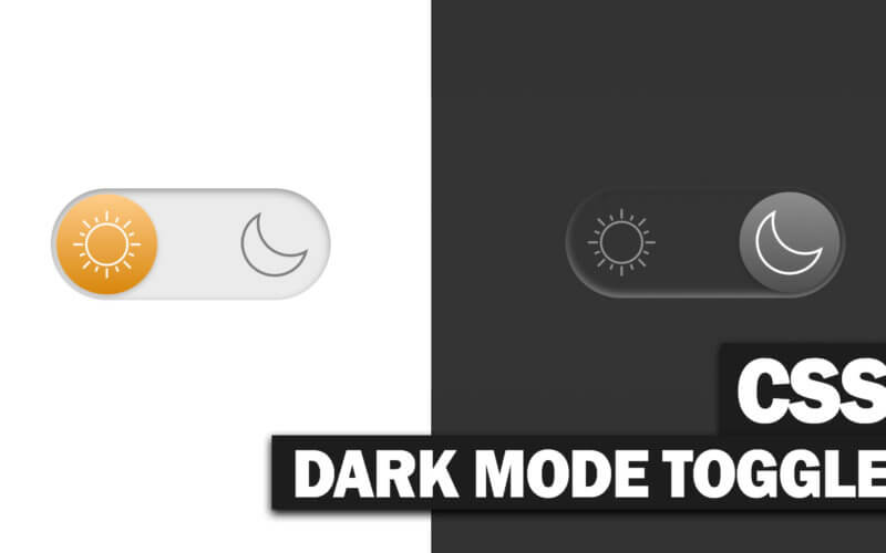
CSS Minimal Dark Mode Toggle Button
In this post, we will work on a minimal CSS dark mode toggle switch with gooey effect. No JavaScript, just CSS. Ready? Let’s check it out!
The HTML
We’ll use checkbox input type accompanied by the empty Label tag. We’ll mostly work on CSS of the label and hide the checkbox later.
<input type="checkbox" id="darkmode-toggle"/>
<label for="darkmode-toggle">
And that’s essentially it for the HTML. Let’s work on the CSS
Transforming Checkbox
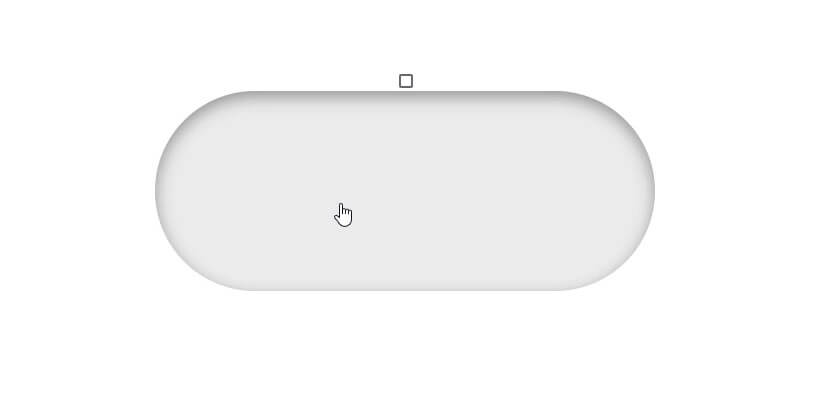
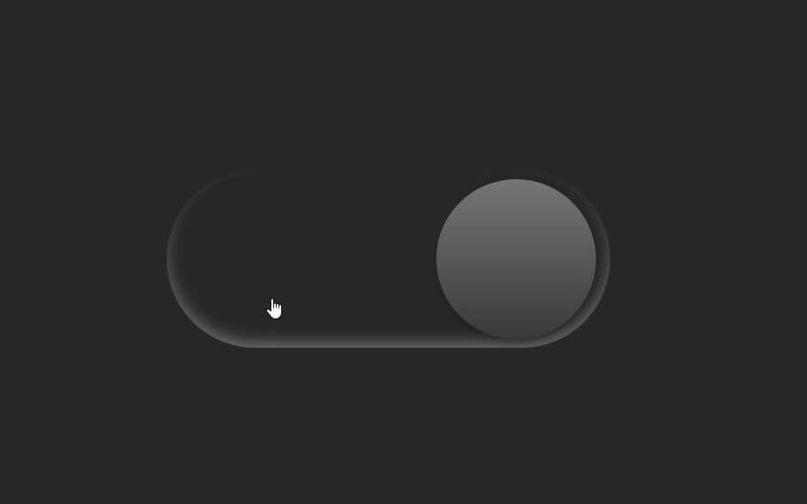
First we’ll set the basic properties for the label such as width, height relative position, block display, background color, border-radius. I’ll create inset box-shadow with dark color on top and bright one at the bottom to create a neumorphic effect.
label {
  width:500px;
  height:200px;
  position: relative;
  display: block;
  background: #ebebeb;
  border-radius: 200px;
  box-shadow: inset 0px 5px 15px rgba(0,0,0,0.4), inset 0px -5px 15px rgba(255,255,255,0.4);
  cursor: pointer;
}
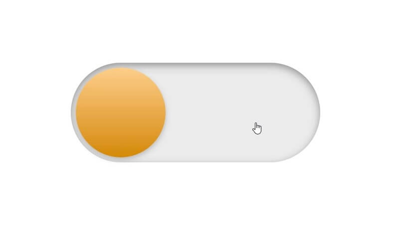
Look good. Next we’ll create the button using pseudoelement and also hide the checkbox by setting zero width/height and hidden visibility.
Notice that I used a fixed pixel value of border-radius to create a circle shape instead of using 50%. This because we’ll work on the toggle animation later which involved width manipulation.
label:after {
  content: "";
  width:180px;
  height: 180px;
  position: absolute;
  top:10px;
  left:10px;
  background: linear-gradient(180deg,#ffcc89,#d8860b);
  border-radius: 180px;
  box-shadow: 0px 5px 10px rgba(0,0,0,0.2);
}
input {
  width: 0;
  height: 0;
  visibility: hidden;
}
The Toggle Animation
Next we’ll work on creating the toggle animation.
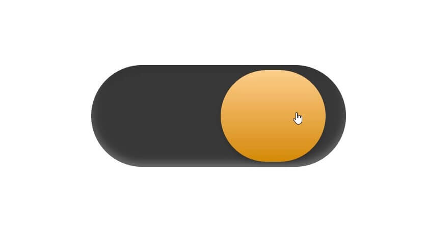
First we’ll change the label background color and move the toggle button to the right when the checkbox is in the checked state (clicked) by using the adjacent CSS selector. Don’t forget to add the transition time to both elements to create the animation.
input:checked + label {
  background: #242424;
}
input:checked + label:after {
  left:490px;
  transform: translateX(-100%);
  background: linear-gradient(180deg,#777,#3a3a3a);
}
label, label:after {
  transition: 0.3s
}
For the gooey effect we’ll just change the width of the button when clicked using active CSS selector.
label:active:after{
  width: 260px;
}
Changing Website Color
Now to make the toggle change the website background color, most likely you’ll need to use JavaScript but for this tutorial I’ll just create another div serve as a background
<div class="background"></div>
I’ll set the background div to have 100% size of the viewport with absolute position and minus z-index
.background {
  width:100vw;
  height: 100vh;
  background: #fff;
  z-index: -1;
  position: absolute;
  transition: 0.3s;
}
And change the background color when the input is in the checked state.
input:checked + label + .background {
  background:#242424;
}
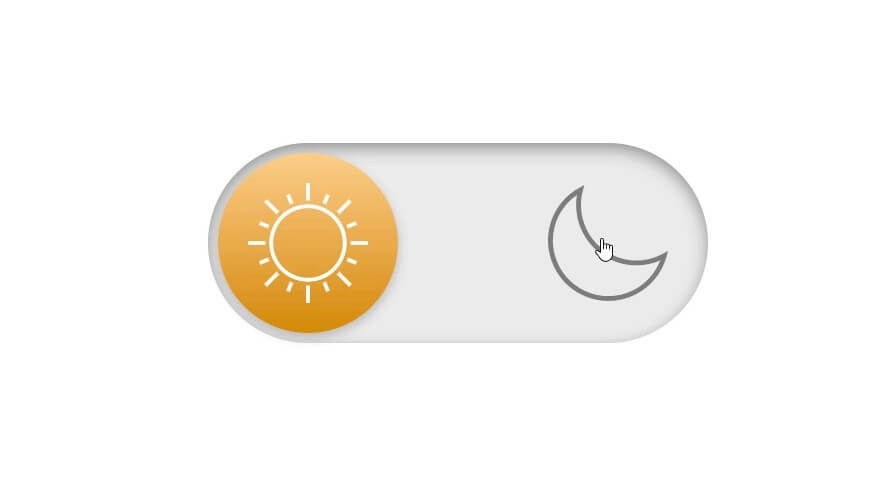
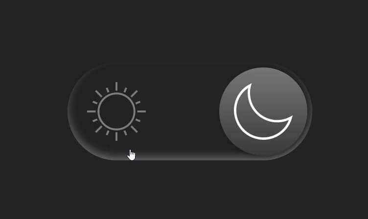
Adding Icons
Finally I’ll add some sun and moon icon. I’ll use free images on SVG Repo. Download the file and open it with text editor, then copy the SVG code and place it in the label tag.
I’ll also assign a class to each image so that we can select it in CSS.
<input type="checkbox" id="darkmode-toggle"/>
<label for="darkmode-toggle">
   <svg version="1.1" class="sun" ...
   <svg version="1.1" class="moon" ...
</label>
Then add CSS to set the fill color of each. Sun to white and moon to grey. Then switch the color when the input is in checked state.
label svg {
  position: absolute;
  width: 120px;
  top:40px;
  z-index: 100;
}
label svg.sun {
  left:40px;
  fill:#fff;
  transition: 0.3s;
}
label svg.moon {
  left:340px;
  fill:#7e7e7e;
  transition: 0.3s;
}
input:checked + label svg.sun {
  fill:#7e7e7e;
}
input:checked + label svg.moon {
  fill:#fff;
}
You can download the source code here.
So that’s all for this episode if you love it please subscribe our YouTube channel and checkout live tutorial or follow our Facebook page.
