
How to Create CSS Horizontal Scrolling Website
Horizontal scrolling has been around for quite a while and can be often seen on personal portfolio and resume website. So In this tutorial we’ll show you how to create it with pure CSS using double transform technique in just a few minutes. Let’s check it out!
The Concept
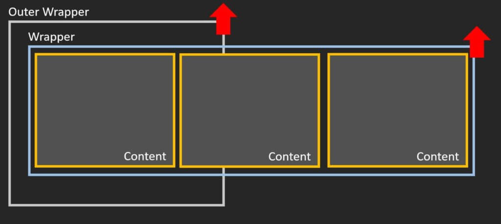
The concept of this tutorial is to use double CSS transform. First we will create a content blocks and put them under two layers of wrapper.
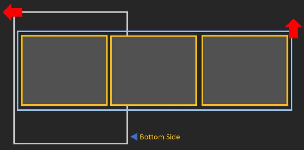
Then we’ll rotate the outer wrapper so that the top side is on the left and the bottom is on the right. This way we turn the vertical scroll into horizontal one.
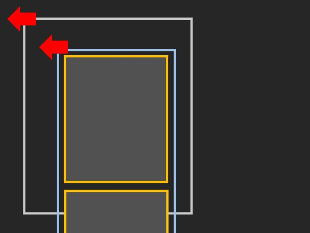
Then we rotate the inner wrapper back so the content is in the right position.
The Code
Now let’s start with the HTML structure by creating double layer of wrapper and the content. It’s not necessary to create multiple content divs like this. You can create a single long content element if you like.
<div class="outer-wrapper">
<div class="wrapper">
<div class="slide one"></div>
<div class="slide two"></div>
<div class="slide three"></div>
<div class="slide four"></div>
</div>
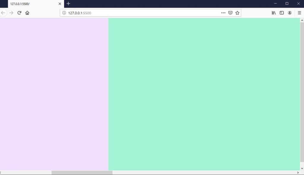
</div>For CSS, first, I’m going to set width and height of each content div or “slide” to 100% of viewport (It’s not necessary for the width of each slide to be equal)
Then set the layout of the inner wrapper to flex with flex-direction: row. This will put all the slide next to each other on a single line. Also set the width to 400% of viewport. We need make sure that the value is equal to total width of content divs. Then set different colors for each slide.
.slide {
  width: 100vw;
  height: 100vh;
}
.wrapper {
  display: flex;
  flex-direction: row;
  width: 400vw;
}
.one {
  background: #efdefe;
}
.two {
  background: #a3f3d3;
}
.three {
  background: #0bbaa0;
}
.four {
  background: #00dfdf;
}
Now all divs are in place but we cannot use mouse wheel to scroll through. Let’s work on the outer wrapper.
I’ll set the outer-wrapper size to 100% of viewport. Because we’ll need to rotate this wrapper, the trick is to set the width to 100% of the viewport height and height to 100% of viewport width.
Then use transform to rotate it by 90 degrees and set transform-origin to top left. Also disable the x-axis scroll. Finally, we’ll apply the opposite rotation to the inner wrapper.
We also need to add translateY and translateX to move both wrappers into position. (Their position were shifted due to the rotation)
.wrapper {
...
  transform: rotate(90deg) translateY(-100vh);
  transform-origin: top left;
}
.outer-wrapper {
  width: 100vh;
  height: 100vw;
  transform: rotate(-90deg) translateX(-100vh);
  transform-origin: top left;
  overflow-y: scroll;
  overflow-x: hidden;
  position: absolute;
}
Now we can use the mouse wheel to scroll horizontally. But the scrollbar is taking up the content space and it doesn’t look nice so we’ll hide it. Unfortunately, there is no direct CSS property to hide the scrollbar and we need to apply different methods for each browser.
For Firefox, we can set scroll-bar-width to none. For IE family, we can use MS prefix ms-overflow-style. Lastly, for Chrome and Safari we’ll need to use webkit scrollbar selector and set the display to none.
.outer-wrapper {
...
  scrollbar-width: none;
  -ms-overflow-style: none;
}
::-webkit-scrollbar {
  display:none;
}
You can load the source code of this example here.
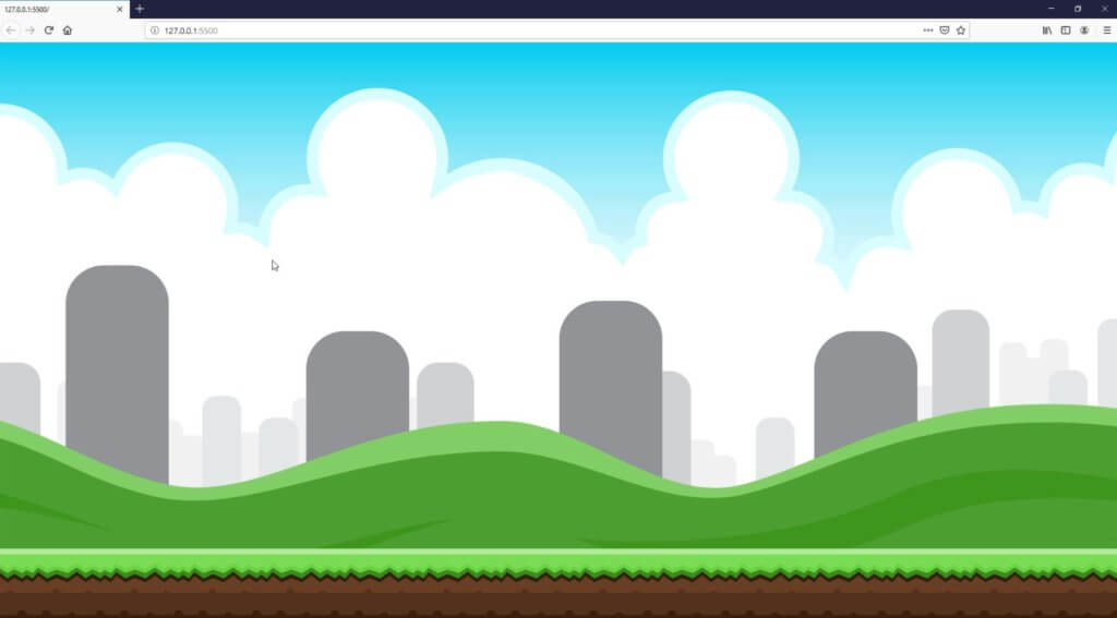
With this technique we can create an interactive website by simply load a seamless background image.
You can also download the source code for above example here.
That’s all for this tutorial. Hope you guys enjoy. If you want to see more development tips and tutorials. Subscribe to our channel for weekly video. Thanks for visiting 🙂

Awesome tutorial, I always use a solution with JS for fix scroll wheel horizontal, but your trick is beautiful 🙂
Hi, I trying to do a little trick here. I added some other div that is outside of the “outer-wrapper” with class “vertical” and want first four div will scroll horizontal and last three div scroll vertical. It worked but I saw that there is a horizontal scroll bar appear in the bottom of firefox and other browser. Any suggestion? here is my Code.
body{
margin: 0;
padding: 0;
}
.slide {
width: 100vw;
height: 100vh;
}
.wrapper {
display: flex;
flex-direction: row;
width: 400vw;
}
.one {
background: #efdefe;
}
.two {
background: #a3f3d3;
}
.three {
background: #0bbaa0;
}
.four {
background: #00dfdf;
}
.five {
background: #dbd80e;
}
.six {
background: #0f0cd4;
}
.seven {
background: #df00df;
}
.wrapper {
transform: rotate(90deg) translateY(-100vh);
transform-origin: top left;
}
.outer-wrapper {
width: 100vh;
height: 100vw;
transform: rotate(-90deg) translateX(-100vh);
transform-origin: top left;
overflow-y: scroll;
overflow-x: hidden;
position: absolute;
}
.outer-wrapper {
scrollbar-width: none;
-ms-overflow-style: none;
}
::-webkit-scrollbar {
display:none;
}
Also watching your YT channel! original, amazing stuff!
Though I miss a link at the end of each tutorial with a working live-demo. Think it would add value to the overall user experience with your site! 🙂
Paul