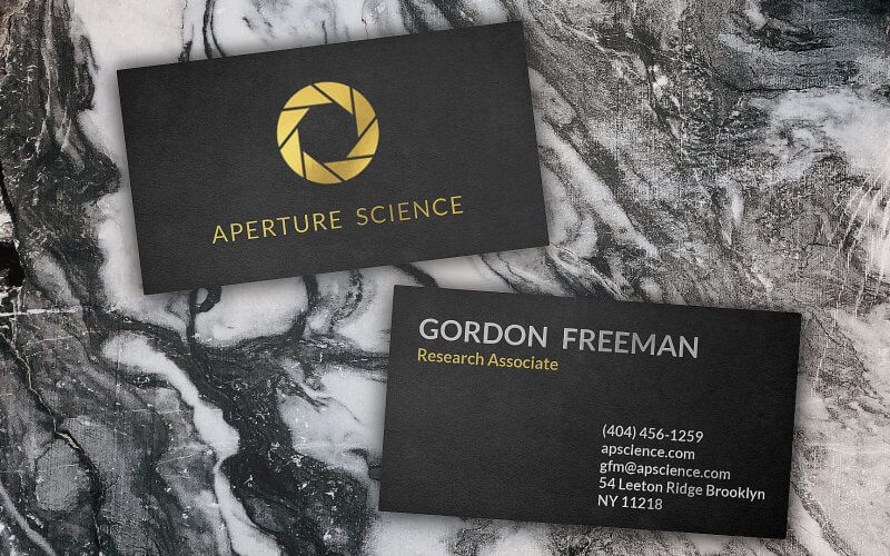
How to make Photorealistic CSS Design
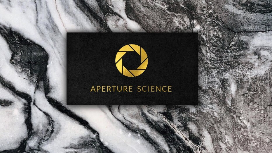
In this tutorial we’ll show you how to use HTML/CSS to create a photorealistic effect on your website. We’ll walk-through steps to create this business card from scratch in a few minutes
Basic Setup
The concept of this design is to create luxury online business card and to make it looks real, so we need to use hi-resolution texture as background. I’ll use a free marble texture from pexels.
First I’ll set the width and height of the wrapper to 10% larger than the viewport. We’ll use this to create a camera movement effect later. Then use flex layout to center all the content in a column format and set the marble texture as background
.wrapper {
  position: absolute;
  width: 110vw;
  height: 110vh;
  display: flex;
  align-items: center;
  justify-content: center;
  flex-direction: column;
  background: url("bkg.jpg");
  background-size: 100% auto;
}
Card Structure
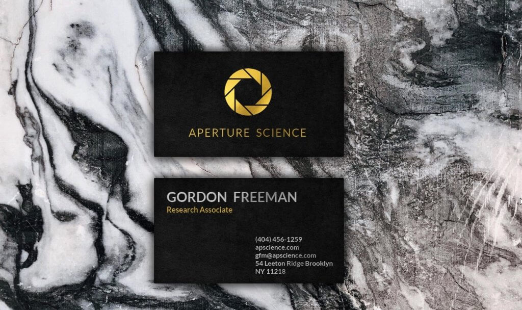
On the front-side, we’ll have the company logo and company text right below. For the back-side we’ll have the name and the job title on the left and contact information (phone, email, etc.) on the right.
<div class="wrapper">
<div class="card front">
<div class="logo"></div>
<div class="company-text">APERTURE SCIENCE</div>
</div>
<div class="card back">
<div class="left">
<div class="name-text">GORDON FREEMAN</div>
<div class="role-text">Research Associate</div>
</div>
<div class="right">
<div>(404) 456-1259</div>
<div>apscience.com</div>
<div>[email protected]</div>
<div>54 Leeton Ridge Brooklyn NY 11218</div>
</div>
</div>
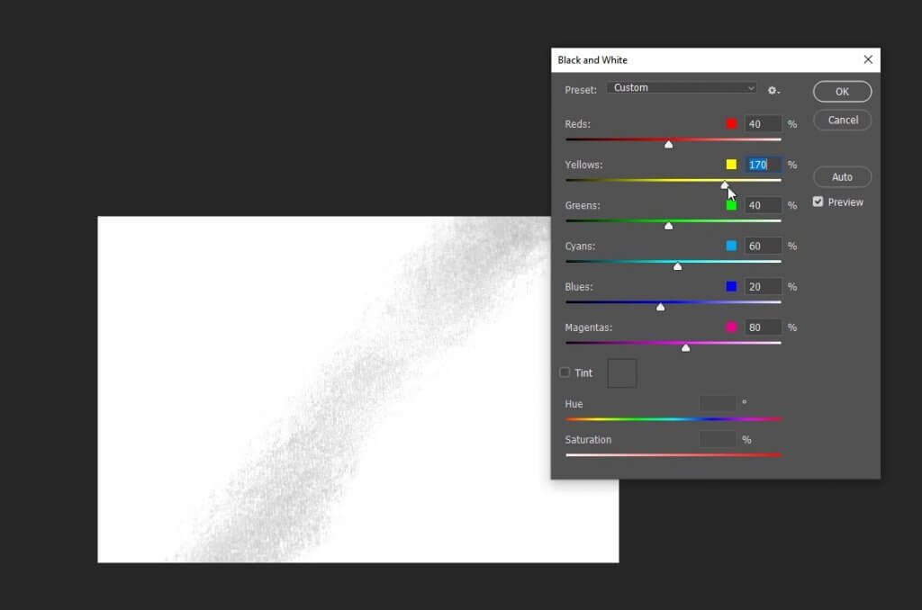
</div>Next we’re going to find texture for the card that gives the matte black feeling. I find the this wall picture quite usable so I’ll use Photoshop to crop it, convert to black and white, reduce the brightness and increase contrast. Here is the final result.
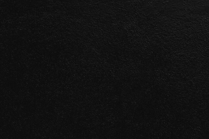
Now back to the CSS, first set the position to relative, width and height, add some side padding and margin top. I’ll also add a very small amount of border-radius to chamfer the corner and make it look more realistic. For shadows, we’ll use multiple layers of box-shadow. I’ll also add an inner shadow to create light effect on the card by using inset box-shadow.
.card {
  position: relative;
  width: 450px;
  height:250px;
  padding:10px 15px 15px 10px;
  margin-top:50px;
  border-radius: 2px;
  background: url("texture.jpg");
  background-size: cover;
  box-shadow:
  /* top shadow */
  0px -10px 10px rgba(0,0,0,0.2),
  /* bottom shadow */
  0px 10px 20px rgba(0,0,0,0.4),
  /* left shadow */
  -10px 0px 20px rgba(0,0,0,0.4),
  /*right shadow */
  10px 0px 20px rgba(0,0,0,0.4),
  /* inner shadow */
  inset 1px 1px 20px rgba(0,0,0,0.4);
  display: flex;
  align-items: center;
  justify-content: center;
  flex-direction: column;
}
Look good, Next let’s work on the logo and the text. I want to use a gold color to create a premium look. I find this gold texture a perfect match for our example. We’ll set the texture as background and use the company logo (Aperture Science) as CSS mask.
As for the company name, we’ll use the same trick except using background-clip: text instead of mask property (since we’re using text as mask)
And finally add a very small amount of text-shadow to create depth effect.
.logo {
  width: 120px;
  height: 120px;
  background: url("gold-texture.jpg");
  background-size: cover;
  mask: url("logo.png");
  -webkit-mask: url("logo.png");
}
.company-text {
  font-size: 26px;
  letter-spacing: 2px;
  word-spacing: 6px;
  padding-top:20px;
  color: transparent;
  background: url("gold-texture.jpg");
  background-size: cover;
  background-clip: text;
  -webkit-background-clip: text;
  text-shadow: -1px -1px 1px rgba(0,0,0,0.1);
}
Next we’ll work on the back side of the card. Similar to front side, except I’m going to use a silver texture instead of gold for the name. I use Photoshop Black and White menu to transform the gold texture into silver.
.card.back .left {
  position: absolute;
  left: 30px;
  top: 25px;
  color:transparent;
  font-weight: 700;
  text-shadow: 1px 1px 1px rgba(0,0,0,0.2);
}
.name-text {
  font-size: 32px;
  word-spacing: 8px;
  background:url("silver-texture.jpg");
  background-clip: text;
  -webkit-background-clip: text;
  background-size: cover;
}
.role-text {
  font-size: 18px;
  background:url("gold-texture.jpg");
  background-clip: text;
  -webkit-background-clip: text;
  background-size: cover;
}
.card.back .right {
  position: absolute;
  width: 200px;
  right: 10px;
  bottom: 20px;
  font-size: 16px;
  font-weight: 700;
  color:transparent;
  text-shadow: 1px 1px 1px rgba(0,0,0,0.2);
  background:url("silver-texture.jpg");
  background-clip: text;
  -webkit-background-clip: text;
  background-size: cover;
}
Light and 3D Effect
First I’ll add some rotation and re-position the card. Also add scaling effect on mouse hover.
.card.front {
  transform: rotateZ(-7deg);
  left: -15%;
}
.card.back {
  transform: rotateZ(4deg);
  left: 5%;
  top: -2%;
}
.card:hover {
  transform: scale(1.07);
}
.card {
  ...
  cursor:pointer;
  transition: 0.5s;
}
Next we’re going to add a light effect. I’ll create a new div with a transparent white gradient and put it on top of the cards using z-index. Also set the pointer event to none so it does’t block the mouse event of the divs underneath.
<div class="light"></div>
.light {
  position: absolute;
  width: 110vw;
  height: 110vh;
  border-radius: 50%;
  background: radial-gradient(circle, rgba(255,255,255,0.5) 20%,rgba(255,255,255,0) 60%);
  opacity: 0.4;
  z-index: 9;
  pointer-events: none;
}
Finally I’m going to add a small JavaScript to create camera movement effect.
<script>
  document.onmousemove = e => {
    document.querySelector(".wrapper").style.transform = `translate(-${e.clientX * 0.04}px, -${e.clientY * 0.04}px)`;
    document.querySelector(".light").style.transform = `translate(-${e.clientX * 0.1}px, -${e.clientY * 0.1}px)`;
  }
</script>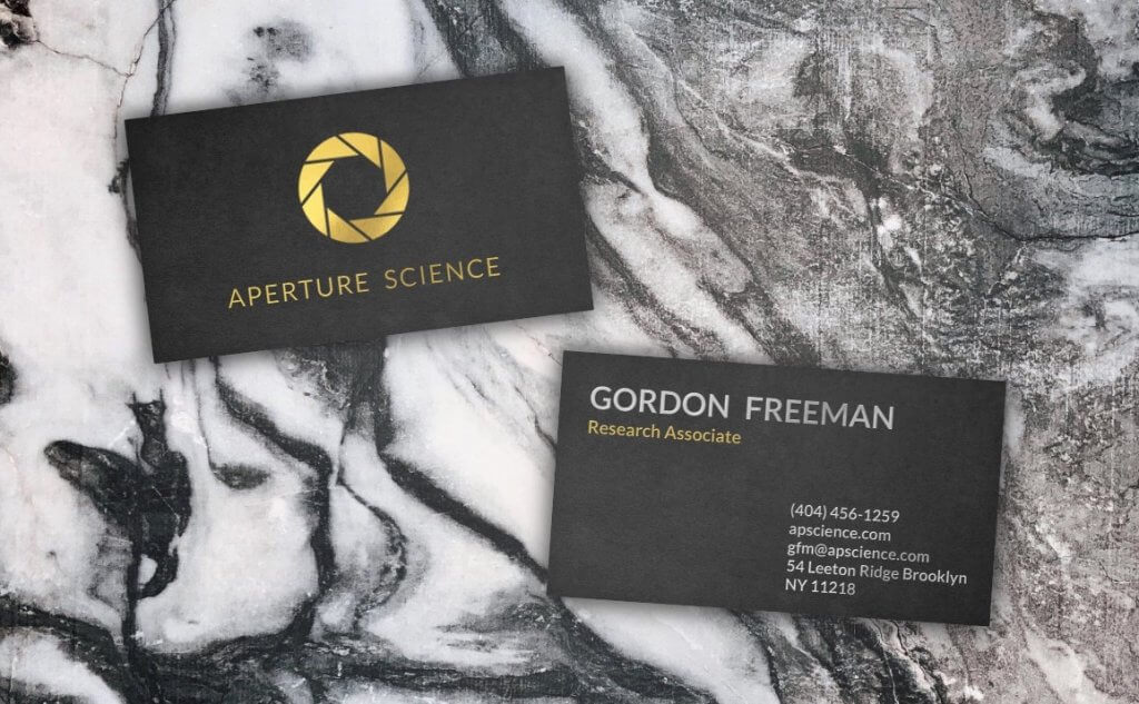
You can download the source code of this project here or see the live demo below
So that’s all for this tutorial! Hope you guys enjoy. If you want to see more web development tips and tutorials! Subscribe our channel to stay tune!
