
Minimalist CSS Image Carousel Tutorial
Image carousel (or some would call “image slider”) is an awesome way to display set of images on your website. In this tutorial, I’m going to show you how to create a minimalist design image carousel with pure CSS in just a few minutes. Let’s check it out! (Full source code at the end of this post)
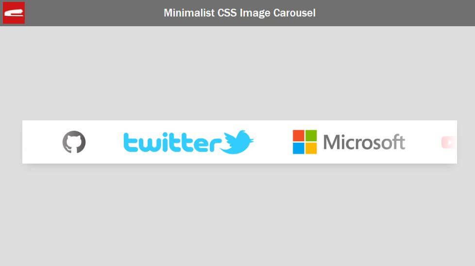
The Carousel
I already prepared some images that I’m going to put into the carousel. For this this tutorial, you don’t have to resize the image at all. We’ll do that with CSS.
And here is the example page for this tutorial. I already have a container div with flex layout to center the content the screen.
<div class="wrapper">
</div>
.wrapper {
  width: 100vw;
  height: 100vh;
  display: flex;
  align-items: center;
  justify-content: center;
}
First I’m going to create the carousel body. Then set width and height, position, background color and add a box shadow.
<div class="wrapper">
     <div class="slider">
     </div>
</div>
.slider {
width: 1000px;
height: 100px;
position: relative;
background: white;
box-shadow: 0 10px 20px -10px rgba(0,0,0,0.2);
overflow:hidden;
}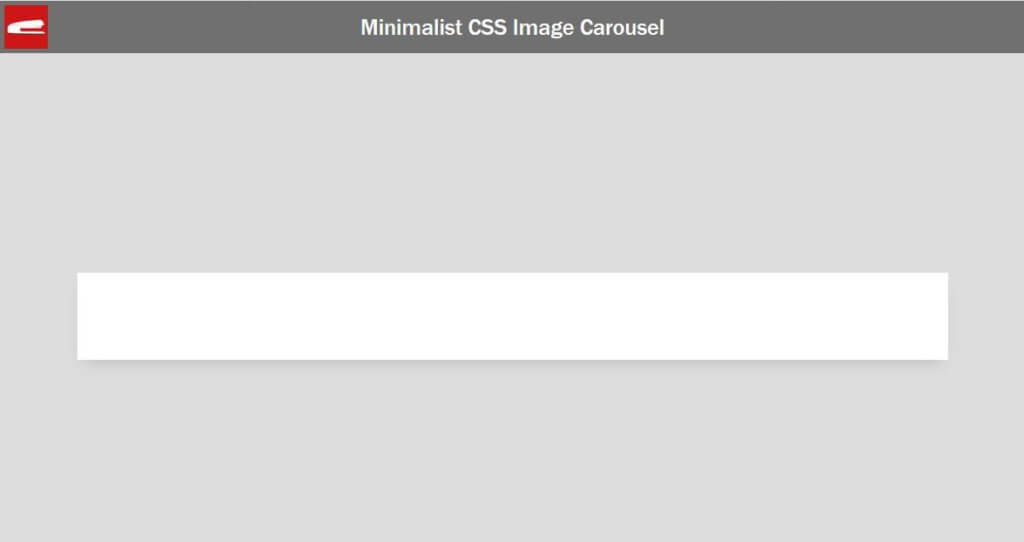
Looks good. Now let’s add some images. I’m going to create a wrapper div to contain the images.
<div class="wrapper">
     <div class="slider">
          <div class="slide">
              <img src="logo1.png" />
              <img src="logo2.png" />
              <img src="logo3.png" />
              <img src="logo4.png" />
              <img src="logo5.png" />
              <img src="logo6.png" />
              <img src="logo7.png" />
           </div>
     </div>
</div>
.slide {
height: 100px;
display: flex;
align-items: center;
}
.slide img {
height: 70px;
padding: 0 30px 0 30px;
}Now it’s a little bit messy since we didn’t resize any image.
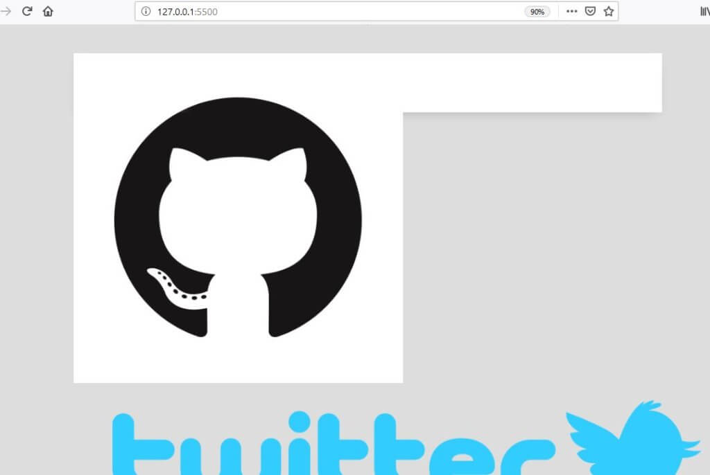
I’m going to set the image container height to 100px and use flex layout to center them vertically. Then I’ll reduce the image height a little bit by setting to 70px and also add some side padding as well.
The Animation
Then I’ll add the animation. A very simple trick using just translateX.
.slide {
  height: 100px;
  display: flex;
  align-items: center;
  animation: slideshow 8s linear infinite;
}
@keyframes slideshow {
  0% {transform: translateX(0);}
  100% {transform: translateX(-100%);}
}
To make the animation repeat seamlessly, first we’ll need to duplicate the entire slide and place it next to itself. Then we’ll add display flex to to the main container div to keep both of them on the same line.
<div class="wrapper">
     <div class="slider">
          <div class="slide">
              <img src="logo1.png" />
              <img src="logo2.png" />
              <img src="logo3.png" />
              <img src="logo4.png" />
              <img src="logo5.png" />
              <img src="logo6.png" />
              <img src="logo7.png" />
          </div>
      </div>
</div>
.slider {
width: 1000px;
height: 100px;
position: relative;
background: white;
box-shadow: 0 10px 20px -10px rgba(0,0,0,0.2);
display: flex;
overflow: hidden;
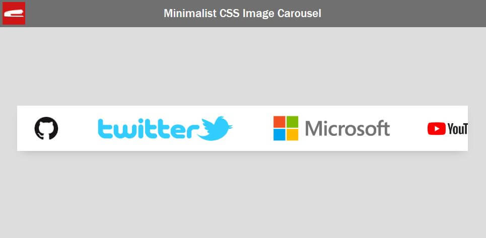
}Gradient Blur Effect
Almost there. Now we’re going to create gradient blur effect on both end of the carousel.
Let’s create pseudo elements. The before element will be used for left side and after for right side. I’ll set the width, height, absolute position and content to empty. Then I’m going to add a linear gradient from solid white to transparent.
We’ll place them to both end of the carousel. Also flip the one on the right using 180 degrees rotateZ. And finally increase the z-index to keep them on top of other divs.
.slider::before, .slider::after {
height: 100px;
width: 200px;
position: absolute;
content: "";
background: linear-gradient(to right, white 0%, rgba(255,255,255,0) 100%);
z-index: 2;
}
.slider::before {
left: 0;
top: 0;
}
.slider::after {
right:0;
top:0;
transform: rotateZ(180deg);
}
See the final result in action in this video below
And that’s it for this tutorial! If you have any comments or feedbacks, let me know. And if you love these, don’t forget to Like our Facebook page and subscribe to our Youtube Channel to stay connected 
Source Code
HTML
<!DOCTYPE html>
<html>
<head>
<meta http-equiv="content-type" content="text/html; charset=UTF-8" />
<link rel="stylesheet" type="text/css" href="styles.css">
</head>
<body>
<div class="wrapper">
<div class="slider">
<div class="slide">
<img src="logo1.png" />
<img src="logo2.png" />
<img src="logo3.png" />
<img src="logo4.png" />
<img src="logo5.png" />
<img src="logo6.png" />
<img src="logo7.png" />
</div>
<div class="slide">
<img src="logo1.png" />
<img src="logo2.png" />
<img src="logo3.png" />
<img src="logo4.png" />
<img src="logo5.png" />
<img src="logo6.png" />
<img src="logo7.png" />
</div>
</div>
</div>
</body>
</html>CSS
html,body {
margin: 0;
width: 100%;
height: 100%;
}
body {
background: #ddd;
}
.wrapper {
width: 100vw;
height: 100vh;
display: flex;
align-items: center;
justify-content: center;
}
.slider {
  width: 1000px;
  height: 100px;
  position: relative;
  background: white;
  box-shadow: 0 10px 20px -10px rgba(0,0,0,0.2);
  display: flex;
  overflow: hidden;
}
.slide {
height: 100px;
display: flex;
align-items: center;
animation: slideshow 8s linear infinite;
}
.slide img {
height: 70px;
padding: 0 30px 0 30px;
}
@keyframes slideshow {
0% {transform: translateX(0);}
100% {transform: translateX(-100%);}
}
.slider::before, .slider::after {
  height: 100px;
  width: 200px;
  position: absolute;
  content: "";
  background: linear-gradient(to right, white 0%, rgba(255,255,255,0) 100%);
  z-index: 2;
}
.slider::before {
  left: 0;
  top: 0;
}
.slider::after {
  right:0;
  top:0;
  transform: rotateZ(180deg);
}
That’s great. But can you make handles like next, prev, … ?
❤️❤️❤️❤️❤️❤️❤️❤️❤️❤️❤️❤️❤️❤️❤️❤️❤️❤️❤️❤️❤️
Спасибо тебе. Интересные у тебя видео.
Спасибо!
its very nice