Minimalist CSS Text Sliding Animation
In this tutorial, I’m going to show you how to create a minimalist text sliding animation with CSS only in just a few minutes. Ready? Let’s check it out! (Full source code at the end of this post)
The Code
Now here is the example page. I already have a content wrapper div with flex layout to put everything on the center of the page.
<body>
   <div class="content">

   </div>
</body>
.content {
  width: 100vw;
  height: 100vh;
  display: flex;
  align-items: center;
  justify-content: center;
}
The concept is to create a stacking text. Then use animation to increase the margin and masking div to create a sliding effect.
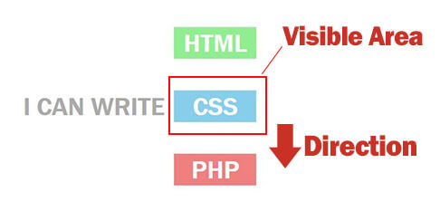
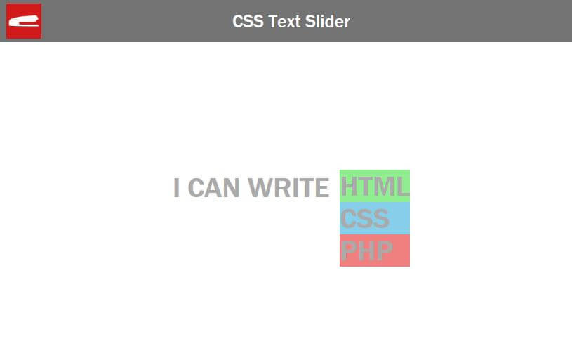
Let’s create a wrapper for our text slider and put some text into it. This will be a static text in front of the slider. Then create a slider div which inside will have children divs for each text you want to have in the list.
<div class="slider-wrapper">
     I can write
     <div class="slider">
          <div class="slider-text1">HTML</div>
          <div class="slider-text2">CSS</div>
          <div class="slider-text3">PHP</div>
     </div>
</div>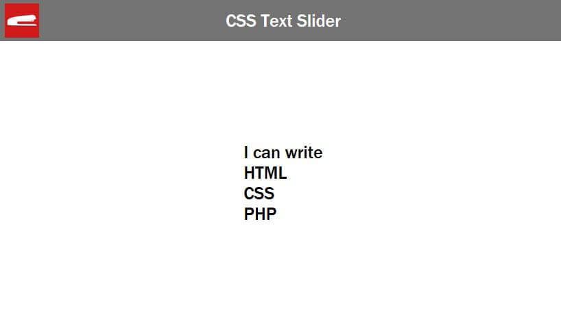
Now let’s set the font size/weight color and uppercase transform. Also use flex layout to center everything.
.slider-wrapper {
  font-size: 40px;
  color:#aaa;
  font-weight: bold;
  text-transform: uppercase;
  display: flex;
  align-items: center;
  justify-content: center;
}
We’ll set the height of the slider div which will be the masking div. For this example I’m going to use 50 pixel height. Also add padding for spacing and set the background color for each text.
.slider{
  height: 50px;
  padding-left:15px;
}
.slider-text1 {
  background: lightgreen;
  animation: slide 5s linear infinite;
}
.slider-text2 {
  background: skyblue;
}
.slider-text3 {
  background: lightcoral;
}
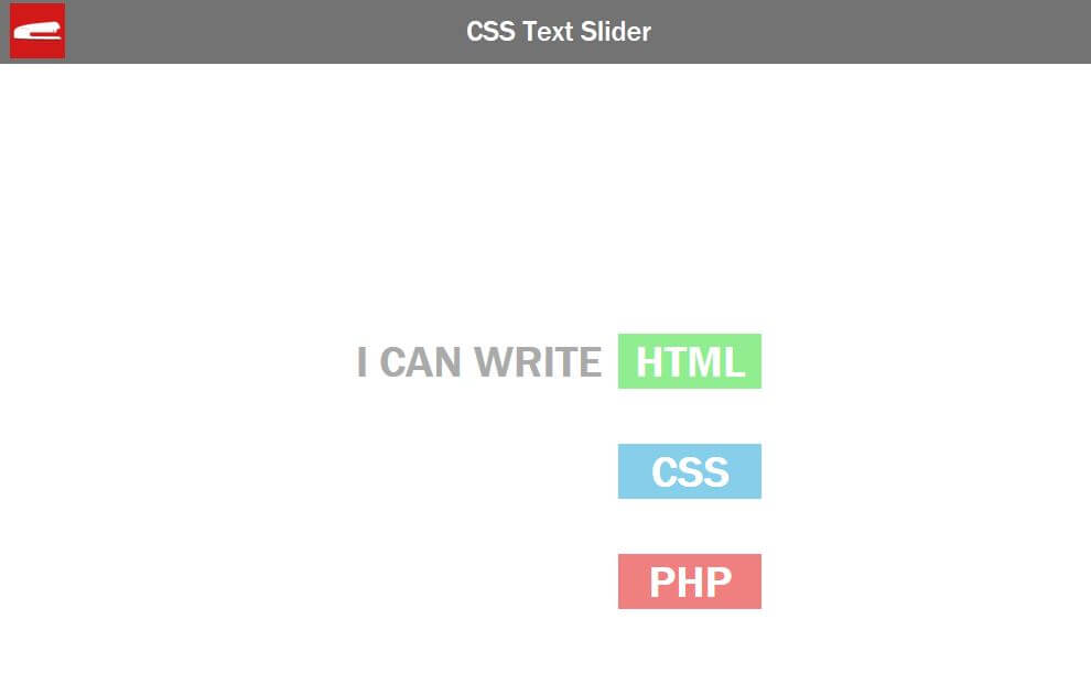
Now I’m going to set the height for each one to 50px to match with the masking div.
Also add margin-bottom to add spacing between them. Then add some padding and text-align center.
.slider div {
  color:#fff;
  height: 50px;
  margin-bottom: 50px;
  padding: 2px 15px;
  text-align: center;
  box-sizing: border-box;
}
You’ll see that I also set the box-sizing to border-box. This is to include the margin into the height to make sure each div is exactly at 50px height.
.slider{
  height: 50px;
  padding-left:15px;
  overflow: hidden;   /* hide the text outside the slider div area */
}
And finally we’ll hide the extra text by add overflow hidden to our masking div.
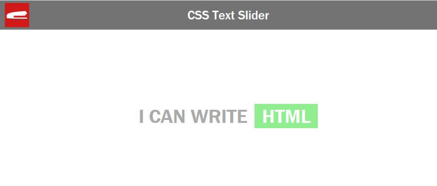
The Animation
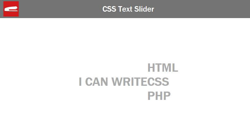
Now let’s add the animation. Since each text has 50px height and 50px margin-bottom, we’ll have to slide it 100px at a time.
@keyframes slide {
  0% {margin-top:-300px;}
  33% {margin-top:-200px;}
  66% {margin-top:-100px;}
  100% {margin-top:0px;}
}
Now here is the problem. With this code, the text will continuously slide without stopping. We can fix this in our animation by adding a small delay between each position.
@keyframes slide {
  0% {margin-top:-300px;}
  5% {margin-top:-200px;}  /* 5% delay */
  33% {margin-top:-200px;}
  38% {margin-top:-100px;} /* 5% delay */
  66% {margin-top:-100px;}
  71% {margin-top:0px;} /* 5% delay */
  100% {margin-top:0px;}
}
And that’s it! See the result in video below or this pen
Any comments or questions, let me know. And if you want to see more of these, don’t forget to Like our Facebook page and subscribe to our Youtube Channel to stay tune 
Source Code
HTML
<!DOCTYPE html>
<html>
    <head>
    <meta http-equiv="content-type" content="text/html; charset=UTF-8" />
    <link rel="stylesheet" type="text/css" href="styles.css">
    </head>
    <body>
      <div class="content">
        <div class="slider-wrapper">
          I can write
          <div class="slider">
              <div class="slider-text1">HTML</div>
              <div class="slider-text2">CSS</div>
              <div class="slider-text3">PHP</div>
          </div>
        </div>
      </div>
    </body>
</html>
CSS
html,body {
  margin: 0;
  width: 100%;
  height: 100%;
  font-family: "Franklin Gothic Medium", "Arial Narrow", Arial, sans-serif;
}
.content {
  width: 100vw;
  height: 100vh;
  display: flex;
  align-items: center;
  justify-content: center;
}
.slider-wrapper {
  font-size: 40px;
  color:#aaa;
  font-weight: bold;
  text-transform: uppercase;
  display: flex;
  align-items: center;
  justify-content: center;
}
.slider{
  height: 50px;
  padding-left:15px;
  overflow: hidden;
}
.slider div {
  color:#fff;
  height: 50px;
  margin-bottom: 50px;
  padding: 2px 15px;
  text-align: center;
  box-sizing: border-box;
}
.slider-text1 {
  background: lightgreen;
  animation: slide 5s linear infinite;
}
.slider-text2 {
  background: skyblue;
}
.slider-text3 {
  background: lightcoral;
}
@keyframes slide {
  0% {margin-top:-300px;}
  5% {margin-top:-200px;}
  33% {margin-top:-200px;}
  38% {margin-top:-100px;}
  66% {margin-top:-100px;}
  71% {margin-top:0px;}
  100% {margin-top:0px;}
}
Hello,
I really like this text animation. But, can’t put it to my website slider maybe because the margin. Can you help me to add it to my website ?
thanks