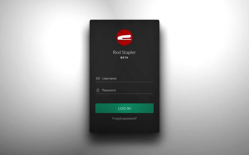
How to create 3D Loft Style Login Form with CSS
In this tutorial, I’m going to show you how to create a loft style login form with 3D shadow effect using only HTML and CSS in just few minutes! Ready? Let’s check it out!
The HTML
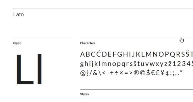
First let pick up the font. I usually browse Google font for interesting font for the design. For this tutorial, we’re going to use Lato.
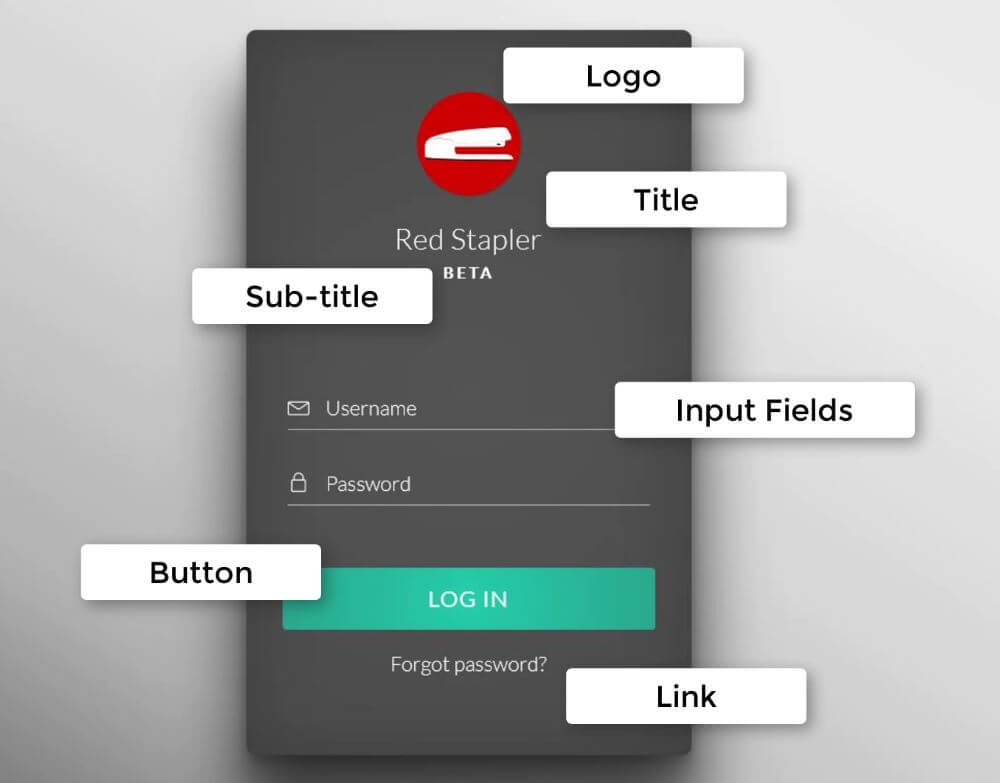
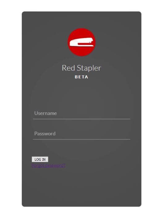
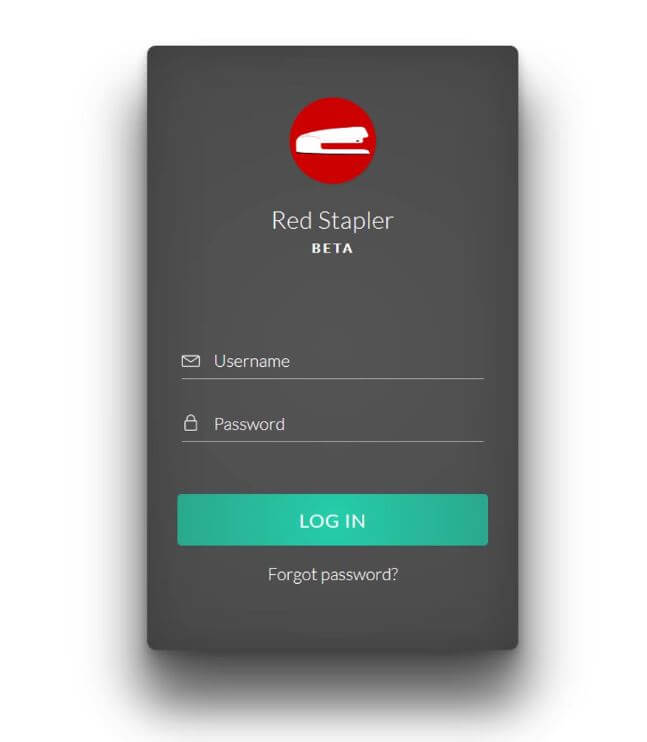
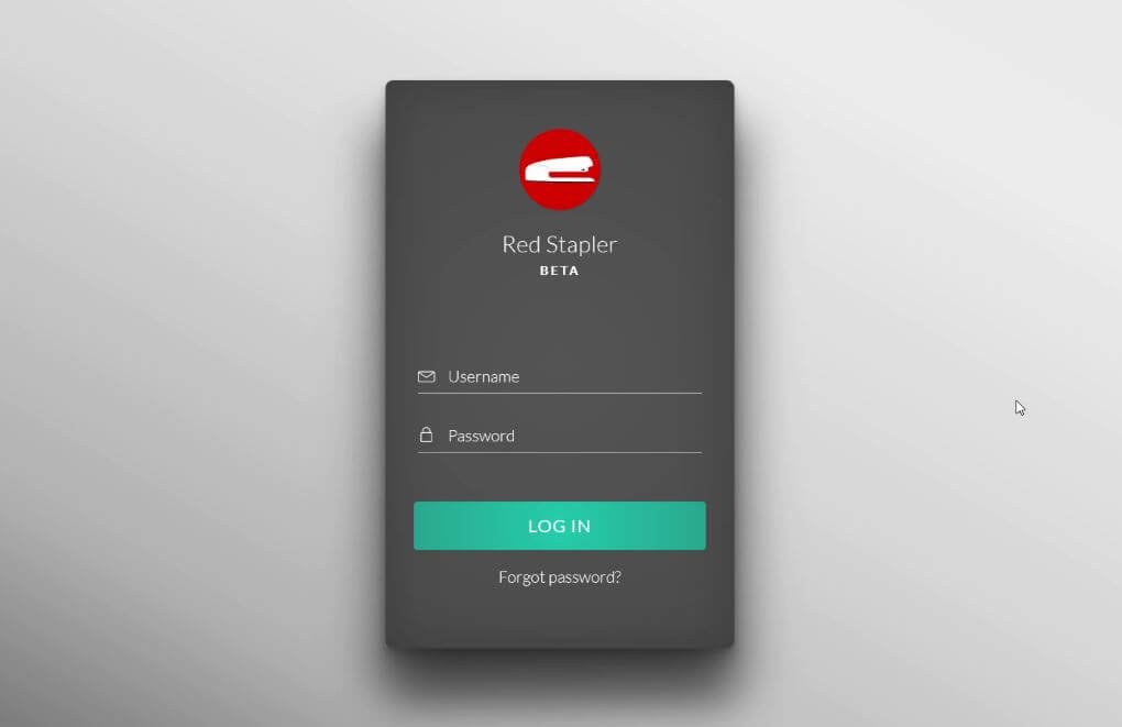
Here is the design structure. We’ll have the logo on top follow by a title and subtitle if needed. Then the two input fields and login button and a forgot password link.
So let’s code the HTML according to the design.
<div class="login-div">
  <div class="logo"></div>
  <div class="title">Red Stapler</div>
  <div class="sub-title">Beta</div>
  <div class="fields">
    <div class="username"><input type="username" class="user-input" placeholder="Username" /></div>
    <div class="password"><input type="password" class="pass-input" placeholder="Password" /></div>
  </div>
  <button class="signin-button">LOG IN</button>
  <div class="link"><a href="#">Forgot password?</a></div>
</div>
Alright the HTML is almost complete. Next is CSS works.
The CSS
First set font styles and background of the wrapper and titles. We’ll use a radial-gradient background to imitate the light effect. How I got these colors setting? Just use any online gradient generator that you like!
login-div {
  width:430px;
  height: 700px;
  padding: 60px 35px 35px 35px;
  border-radius: 10px;
  background: radial-gradient(circle, #555555, #535353, #505050, #4e4e4e, #4c4c4c);
}
.logo {
  background-image:url("Logo.png");
  width:100px;
  height:100px;
  border-radius: 50%;
  margin: 0 auto;
  box-shadow: 1px 1px 2px rgba(0,0,0,0.1);
}
.title {
  text-align: center;
  font-size: 28px;
  padding-top:24px;
  letter-spacing: 0.5px;
}
.sub-title {
  text-align: center;
  font-size:15px;
  padding-top: 7px;
  letter-spacing: 3px;
  text-transform: uppercase;
  font-weight: bold;
}
Also set the padding for the input fields wrapper for spacing.
.fields{
  width: 100%;
  padding: 100px 5px 30px 5px;
}
Now I’m going to remove the all default input border, outline and background. Also set the font styles again as the input does not inherit the setting from the body. Also add underline to the input fields using border-bottom.
.fields input {
  border: none;
  outline: none;
  background: none;
  font-size: 18px;
  font-family: 'Lato', sans-serif;
  color: white;
  padding: 10px 10px 10px 5px;
}
.username, .password {
  display: block;
  border-bottom: 1px solid #b3b3b3;
  margin-bottom: 30px;
}
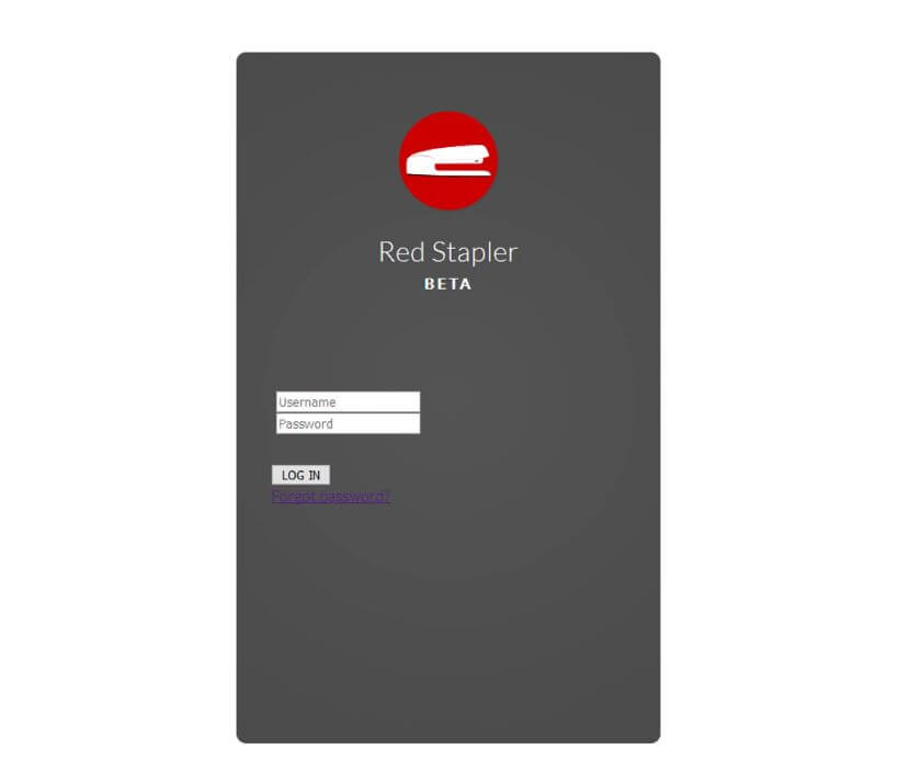
Now here is the problem, the font CSS we applied on the input are not being used for the placeholder text. If I open this in Chrome, you’ll see the difference.
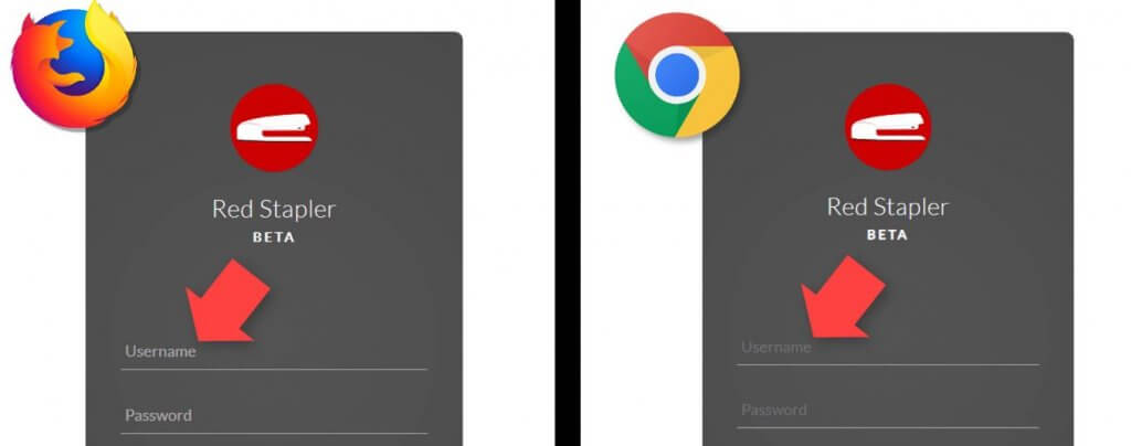
The only way apply the CSS to the placeholder is to use the pseudo-class. Unfortunately, the solution is different between browsers. You can use ::placeholder pseduo-class for Chrome, firefox, Safari. (while opacity 1 is an extra setting needed for firefox) As for IE and Edge, you’ll need to use ::ms-input-placeholder class instead.
::placeholder  { /* Chrome, Firefox, Opera, Safari 10.1+ */
  opacity: 1; /* Firefox */
  color: white;
  font-size: 20px;
  font-weight: 300;
}
::-ms-input-placeholder { /* Microsoft Edge */
  color: white;
  font-size: 20px;
  font-weight: 300;
}
************
next let’s work on the button. First, remove the default button styles and set the cursor to pointer. Then set the size, border radius and font styles (same as input field, the button doesn’t inherit the setting from body)
.signin-button {
outline: none;
border: none;
cursor: pointer;
width: 100%;
height: 60px;
border-radius: 5px;
font-size: 22px;
font-family: 'Lato', sans-serif;
color:white;
text-align: center;
letter-spacing: 1px;
background: radial-gradient(circle, #24cfaa, #26c5a3, #28bb9c, #29b294, #2aa88d);
box-shadow: 1px 1px 2px rgba(0,0,0,0.1);
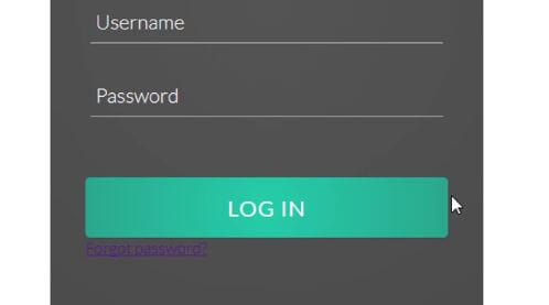
}Then change the background to a lighter color on mouse hover and to darker when clicked.
.signin-button:hover {
  background: radial-gradient(circle, #2fdbb6, #32d6b3, #32c9a8, #36c7a7, #38bb9f);
}
.signin-button:active {
  background: radial-gradient(circle, #1da88a, #1ea084, #229c82, #23947b, #238d76);
}
Next, let’s work on the forgot password link. I’ll set the top padding for spacing and text-align center. Then remove the link underline and set the font color and size.
.link {
  padding-top: 20px;
  text-align: center;
}
.link a {
  text-decoration: none;
  color: white;
  font-size: 20px;
}
Next, I’m going to add icons in front of the input fields. for this tutorial, I’m going to use a free svg image that can be added directly into the HTML for the convenience sake.
After placed the svg code before each input field, adjust the size in the CSS.
.fields svg {
height: 22px;
margin-bottom: -3px;
margin-right: 10px;
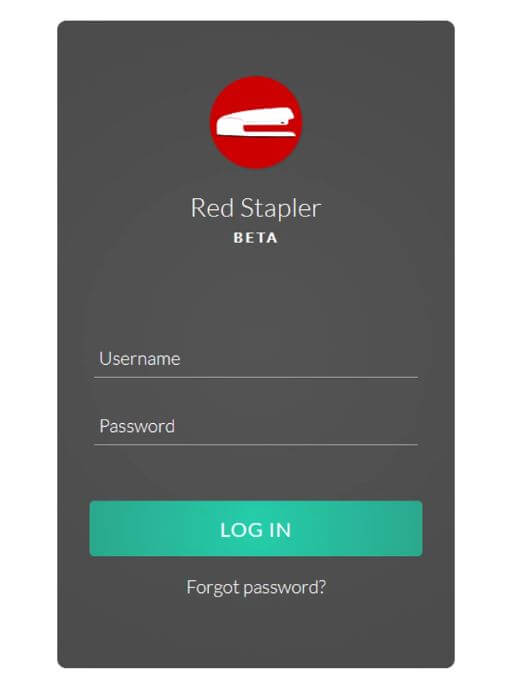
}The 3D Effect
We’ll use multiple layers of box-shadow to imitate the 3D lighting.
We’ll create a bottom, right and left shadow. Then create a long and soft bottom shadow by using high blur amount. I’ll also create an side inset shadow to create depth effect and add a small blur filter to the form to increase the smoothness.
.login-div {
...
  filter: blur(0.4px);
  box-shadow:
  /*bottom shadow*/
  0px 20px 20px rgba(0,0,0,0.2),
  0px 5px 10px rgba(0,0,0,0.2),
  /*long bottom shadow*/
  0px 70px 50px rgba(0,0,0,0.4),
  /*right shadow*/
  30px 50px 50px rgba(0,0,0,0.2),
  /*left shadow*/
  -30px 50px 50px rgba(0,0,0,0.2),
  /*right inset*/
  inset 20px 0px 60px rgba(0,0,0,0.1),
  /*left inset*/
  inset -20px 0px 60px rgba(0,0,0,0.1);
}
Finally, apply linear gradient background to the body.
body {
...
  background:linear-gradient(to left bottom, #e9e9e9, #ebebeb, #d6d6d6, #b1b1b1, #505050);
}
And that’s all for this tutorial, hope you guys enjoy. Don’t forget to subscribe our YouTube channel to stay tune for dev tips and tutorials. You can download the source code of this project here.

Hii
I am Nitin from India, I really appreciate your work and I was so good.
Can we become friends.
My WhatsApp no 9879905639