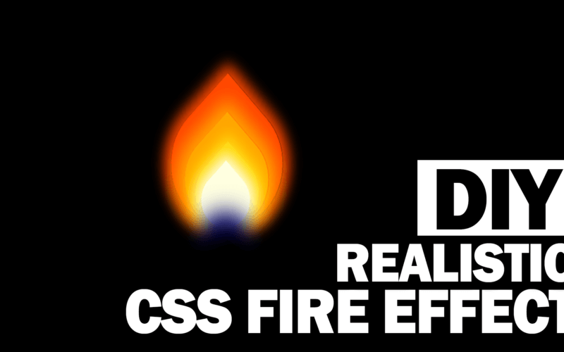
Easy Realistic CSS Fire Effect
In this tutorial, I’m going to show you how to create an easy pure CSS Fire effect with flickering animation in just a few minutes.
The key concept of this tutorial is to create multiple color div layers from red to blue and using border-radius and rotation to create a flame shape. Then add an animation loop to create a flickering effect.
The Structure
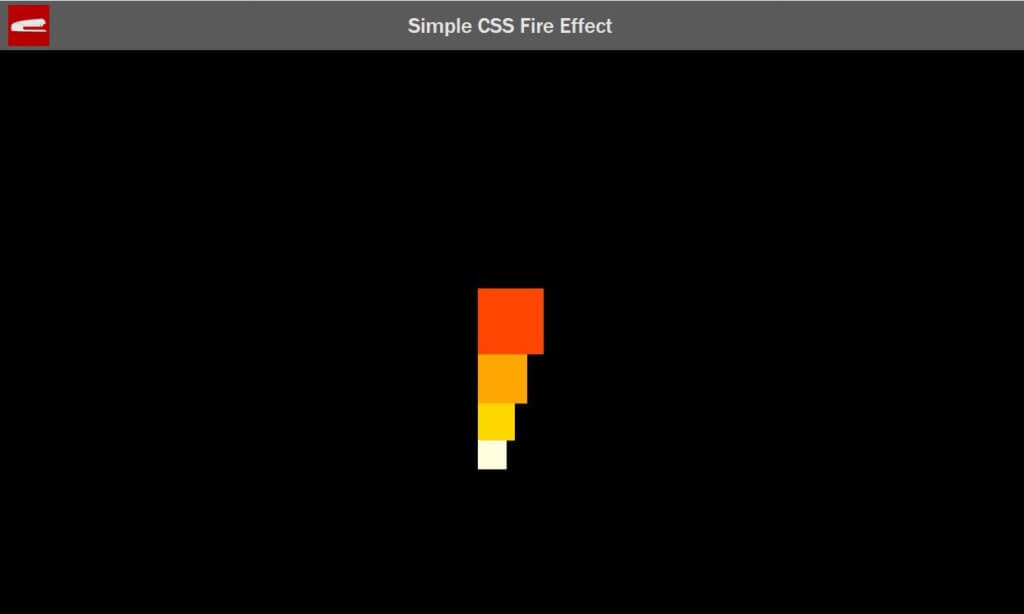
So let’s start with HTML structure. First create a wrapper div and add several div layers inside. I’m going to use 4 divs for the flame using Red, orange, gold and white color respectively.
<div class="flame-wrapper">
     <div class="flame red"></div>
     <div class="flame orange"></div>
     <div class="flame gold"></div>
     <div class="flame white"></div>
</div>
Next, let’s work on the CSS. For each div layer, I’m going to set the width, height and background color. Red will be the biggest and white will be the smallest. Also add position relative to the wrapper.
.red {
    width: 80px;
    height: 80px;
    background: orangered;
}
.orange {
    width: 60px;
    height: 60px;
    background: orange;
}
.gold {
    width: 45px;
    height: 45px;
    background: gold;
}
.white {
    width: 35px;
    height: 35px;
    background: lightyellow;
}
.flame-wrapper {
    position: relative;
}
And here is what it looks like
Then set position to absolute and set the bottom the zero.
.flame {
    bottom: 0;
    position: absolute;
}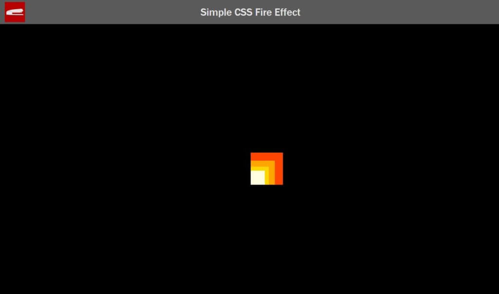
Add 50% border radius to all divs except the top right corner.
.flame {
    bottom: 0;
    position: absolute;
    border-radius: 50% 0% 50% 50%;
}
Then rotate the divs by -45 degrees and set the left position to center all the divs.
.orange {
    left:10px;
}
.gold {
    left:18px;
}
.white {
    left:22px;
}
.flame {
    transform: rotate(-45deg);
}
Now Let’s work on the base the flame. I’m going to create two circle divs with blue and black color using the similar CSS pattern except this time we will use 50% border radius. Also add box shadow to all divs to create a light effect.
.red {
    box-shadow: 0px 0px 10px 5px orangered;
}
.orange {
    box-shadow: 0px 0px 12px 6px orange;
}
.gold {
    box-shadow: 0px 0px 9px 4px gold;
}
.white {
    box-shadow: 0px 0px 9px 4px lightyellow;
}
.blue {
    box-shadow: 0px 0px 15px 10px darkblue;
}
.black {
    box-shadow: 0px 0px 15px 10px black;
}
.base {
    border-radius: 50%;
    position: absolute;
}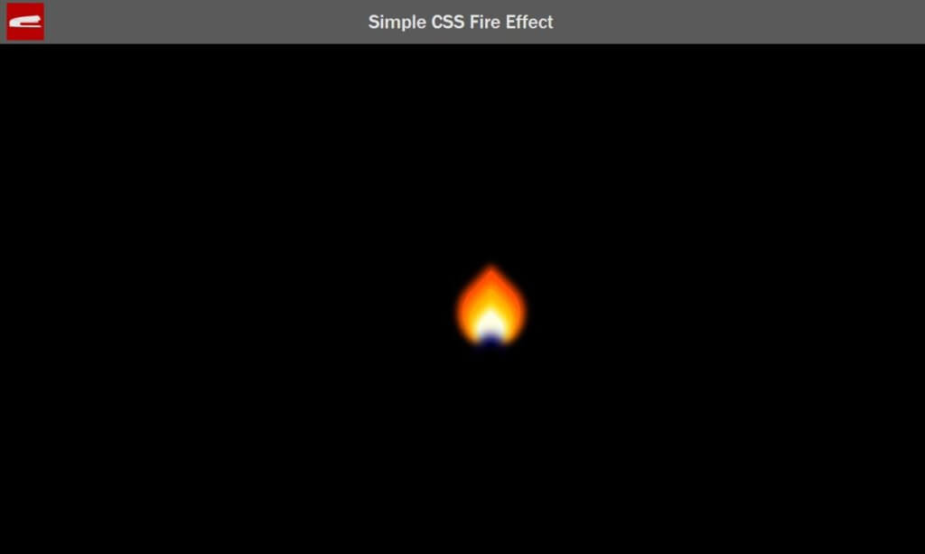
The Animation
I’m going to create an animation loop that rotate the entire flame shape back and forth. I’m going to randomly add a scaleY to simulate the flickering effect and make it looks more realistic.
.flame-wrapper {
    animation: flicker 3ms ease-in infinite;
}
@keyframes flicker {
    0% {transform: rotate(-1deg);}
    20% {transform: rotate(2deg) scaleY(1.05);}
    40% {transform: rotate(-1deg);}
    60% {transform: rotate(1deg);}
    80% {transform: rotate(-1deg) scaleY(0.90);}
    100% {transform: rotate(1deg);}
}
See the result in this video! Full source code below.
And that’s all for this tutorial. Hope you guys enjoy. Stay with us for more tutorial like this by following our Facebook and subscribe to our Youtube Channel.
Don’t forget to check out our collection of 14 Amazing CSS Creations
14 Amazing CSS Creation You Shouldn’t Miss
Full Source Code
HTML
<html>
    <head>
    <meta http-equiv="content-type" content="text/html; charset=UTF-8" />
    <link rel="stylesheet" type="text/css" href="styles.css">
    </head>
    <body>
    <div class="wrapper">
        <div class="flame-wrapper">
            <div class="flame red"></div>
            <div class="flame orange"></div>
            <div class="flame gold"></div>
            <div class="flame white"></div>
            <div class="base blue"></div>
            <div class="base black"></div>
        </div>
    </div>
    </body>
</html>
CSS
body {
    margin: 0;
    padding: 0;
    background:#ccc;
}
.wrapper {
    width: 100%;
    min-height: 800px;
    position: absolute;
    display: block;
}
.red {
    width: 80px;
    height: 80px;
    background: orangered;
    box-shadow: 0px 0px 10px 5px orangered;
}
.orange {
    left:10px;
    width: 60px;
    height: 60px;
    background: orange;
    box-shadow: 0px 0px 12px 6px orange;
}
.gold {
    left:18px;
    width: 45px;
    height: 45px;
    background: gold;
    box-shadow: 0px 0px 9px 4px gold;
}
.white {
    left:22px;
    width: 35px;
    height: 35px;
    background: lightyellow;
    box-shadow: 0px 0px 9px 4px lightyellow;
}
.blue {
    left:32px;
    width: 15px;
    height: 15px;
    background: darkblue;
    box-shadow: 0px 0px 15px 10px darkblue;
}
.black {
    left:20px;
    width: 40px;
    height: 40px;
    bottom:-50px;
    background: black;
    box-shadow: 0px 0px 15px 10px black;
}
.base {
    border-radius: 50%;
    position: absolute;
}
.flame-wrapper {
    position: relative;
    animation: flicker 3ms ease-in infinite;
}
.flame {
    bottom: 0;
    position: absolute;
    border-radius: 50% 0% 50% 50%;
    transform: rotate(-45deg);
}
@keyframes flicker {
    0% {transform: rotate(-1deg);}
    20% {transform: rotate(2deg) scaleY(1.05);}
    40% {transform: rotate(-1deg);}
    60% {transform: rotate(1deg);}
    80% {transform: rotate(-1deg) scaleY(0.90);}
    100% {transform: rotate(1deg);}
}