
Easiest CSS 3D Text Hover Effect Tutorial
When talking about CSS 3D effect, most of us are going to think about CSS transform since it’s easy and robust. Well, maybe not this tutorial because I’m going to show you a very easy trick that let you create a 3D text hover effect in a couple minutes using just text-shadow! (Full source code at the end)
The Text
Let’s start with adding radial gradient to our body background. When working on things like this, it’s much easier to use online generator tools like this one.
background-image: radial-gradient(circle, #cfcfcf, #bcb9bc, #aba3a8, #9c8e91, #8c7979);
Then I’m going to create text span and assign a class to it.
<span class="text-3d">Hello World!</span>
For the CSS, I’ll transform the text to uppercase and increase the font size and set the text color. If you also want to change font family, here is the place. Then move the text to the center by setting 50% top and left and -50% translate
.text-3d {
    text-transform: uppercase;
    font-size: 130px;
    color:#eee;

    position: absolute;
    top:50%;
    left:50%;
    transform: translate(-50% ,-50%);
}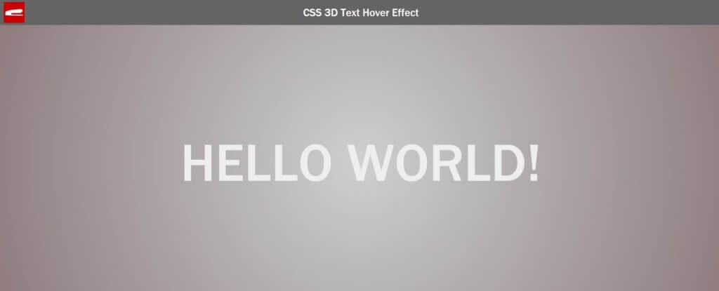
The Base 3D Effect
The concept is to add two sets of layers of text-shadow to simulate a 3D effect.
The first set of layers is going to simulate the depth of the text. I’m going set the x-offset and blur radius to zero and set y-offset to 1px. For the color I’m going to edit it in RGB mode. This because when we add the next shadow layer, we’re going to increase the y-offset and decrease the RGB value to make the color darker.
.text-3d {
    text-shadow:    /* first set */
                    0 1px 0 rgb(190,190,190),
                    0 2px 0 rgb(185,185,185),
                    0 3px 0 rgb(180,180,180),
                    0 4px 0 rgb(175,175,175),
                    0 5px 0 rgb(170,170,170),
                    0 6px 0 rgb(165,165,165),
                    0 7px 0 rgb(160,160,160),

                    /* second set */
                    0 1px 5px rgba(0,0,0,.05),
                    0 3px 5px rgba(0,0,0,.10),
                    0 5px 10px rgba(0,0,0,.15),
                    0 7px 10px rgba(0,0,0,.20),
                    0 10px 15px rgba(0,0,0,.25);
}
And the second set of layers is going to be the actual shadow of the text so we’re using black color. Similar to the first set except adding the blur radius and using less layers this time.
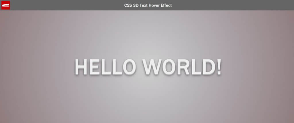
The Hover Effect
Now we have the base 3D effect. The next step is to add the hover effect using CSS pseudo class. We’ll keep the text-shadow from above but add a few more layers to the first set and increase the shadow offset of the second set. Also add a little translate add a transition to make the text appears to be moving.
.text-3d {
    transition: all 0.3s ease-in-out;
}
.text-3d:hover {
    text-shadow:
                    0 1px 0 rgb(190,190,190),
                    0 2px 0 rgb(185,185,185),
                    0 3px 0 rgb(180,180,180),
                    0 4px 0 rgb(175,175,175),
                    0 5px 0 rgb(170,170,170),
                    0 6px 0 rgb(165,165,165),
                    0 7px 0 rgb(160,160,160),
                    0 8px 0 rgb(155,155,155),
                    0 9px 0 rgb(150,150,150),

                    0 1px 5px rgba(0,0,0,.05),
                    0 5px 5px rgba(0,0,0,.10),
                    0 10px 10px rgba(0,0,0,.15),
                    0 15px 10px rgba(0,0,0,.20),
                    0 20px 15px rgba(0,0,0,.25);

    transform: translate(-51%,-51%);
    transition: all 0.3s ease-in-out;
}
Add a little final touch for aesthetic purpose by setting the cursor to pointer.
.text-3d{
    cursor: pointer;
}
We’re all set. See the result below.
So that’s all for this tutorial. Any comments or feedback, let me know. And if you love this tutorial. don’t forget to like or subscribe to our Facebook and Youtube Channel to stay tune 🙂
Source Code
HTML
<span class="text-3d">Hello World!</span>
CSS
body {
    background-image: radial-gradient(circle, #cfcfcf, #bcb9bc, #aba3a8, #9c8e91, #8c7979);
}
.text-3d {
    text-transform: uppercase;
    font-size: 130px;
    color:#eee;
    position: absolute;
    top:50%;
    left:50%;
    transform: translate(-50% ,-50%);
    text-shadow:
                    0 1px 0 rgb(190,190,190),
                    0 2px 0 rgb(185,185,185),
                    0 3px 0 rgb(180,180,180),
                    0 4px 0 rgb(175,175,175),
                    0 5px 0 rgb(170,170,170),
                    0 6px 0 rgb(165,165,165),
                    0 7px 0 rgb(160,160,160),

                    0 1px 5px rgba(0,0,0,.05),
                    0 3px 5px rgba(0,0,0,.10),
                    0 5px 10px rgba(0,0,0,.15),
                    0 7px 10px rgba(0,0,0,.20),
                    0 10px 15px rgba(0,0,0,.25);
    transition: all 0.3s ease-in-out;
    cursor: pointer;
}
.text-3d:hover {
    text-shadow:
                    0 1px 0 rgb(190,190,190),
                    0 2px 0 rgb(185,185,185),
                    0 3px 0 rgb(180,180,180),
                    0 4px 0 rgb(175,175,175),
                    0 5px 0 rgb(170,170,170),
                    0 6px 0 rgb(165,165,165),
                    0 7px 0 rgb(160,160,160),
                    0 8px 0 rgb(155,155,155),
                    0 9px 0 rgb(150,150,150),

                    0 1px 5px rgba(0,0,0,.05),
                    0 5px 5px rgba(0,0,0,.10),
                    0 10px 10px rgba(0,0,0,.15),
                    0 15px 10px rgba(0,0,0,.20),
                    0 20px 15px rgba(0,0,0,.25);
    transform: translate(-51%,-51%);
    transition: all 0.3s ease-in-out;
}