Detect Mobile Device with Javascript
In this article, I’m going to show you how to use mobile-detect.js to detect user mobile device with just a few lines of javascript. mobile-detect.js can also detect the operating system and the current web browser that the visitor’s using. Let’s check it out!
UserAgent String
The basic and easy way to detect user mobile device is to look at userAgent string and write a conditional checking expression to extract the information like this.
if( navigator.userAgent.match(/Android/i)
 || navigator.userAgent.match(/webOS/i)
 || navigator.userAgent.match(/iPhone/i)
 || navigator.userAgent.match(/iPad/i)
 || navigator.userAgent.match(/iPod/i)
 || navigator.userAgent.match(/BlackBerry/i)
 || navigator.userAgent.match(/Windows Phone/i)

alert("You're using Mobile Device!!")
Mobile-detect.js is using the same method but also provide API functions to retrieve those information easily.
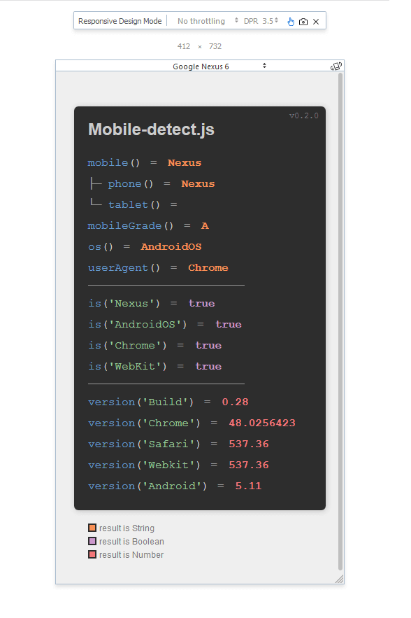
Here is official demo that I use developer console to emulate the mobile devices.
How to Use
Implementing mobile-detect.js is very easy. Just import the library to your page, then pass the userAgent string to the constructor.
var detector = new MobileDetect(window.navigator.userAgent)
From the mobile-detect object, you can use various methods to retrieve the information like this. You can also detect operating systems using os() and detect web browser using userAgent().
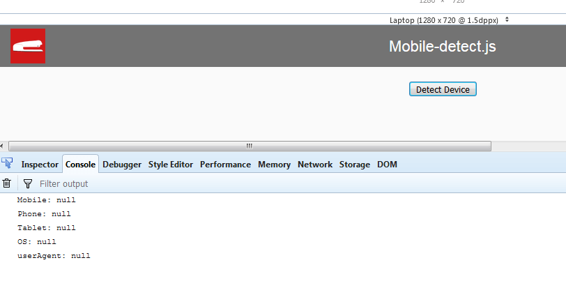
console.log( "Mobile: " + detector.mobile());
console.log( "Phone: " + detector.phone());
console.log( "Tablet: " + detector.tablet());
console.log( "OS: " + detector.os());
console.log( "userAgent: " + detector.userAgent());
The phone() method will return null if user is using tablet.
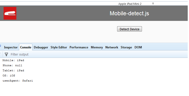
Likewise, the tablet() method will return null if user is using mobile phone.
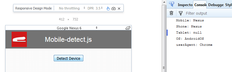
The mobile() method is showing result either from phone() or tablet() method. All of them will be null if user is using Desktop.
See it in action in our video below
And that’s the basic of mobile-detect.js. Hope you guys enjoy this tutorial. And please follow us on our Facebook and Youtube Channel to stay tune if you love this tutorial.
Source Code
<html>
  <head>
  <meta http-equiv="content-type" content="text/html; charset=UTF-8" />
  <script src="jquery-2.1.4.js"></script>
  <script src="mobile-detect.js"></script>
  <link rel="stylesheet" type="text/css" href="styles.css">
  </head>
  <body>
  <div id="navbar"><span>Mobile-detect.js</span></div>
  <div id="wrapper">
    <button id="detect-button">Detect Device</button>
  </div>

  <script>
          $('#detect-button').click(function(){

            var detector = new MobileDetect(window.navigator.userAgent)

            console.log( "Mobile: " + detector.mobile());
            console.log( "Phone: " + detector.phone());
            console.log( "Tablet: " + detector.tablet());
            console.log( "OS: " + detector.os());
            console.log( "userAgent: " + detector.userAgent());

          });
  </script>
  </body>
</html>
How to redirect my website to mobile
Like m.freecanto.com
My website is WordPress Website.
I make my website elementor.
Where to paste this code.
How change freecanto.com to m.freecanto.com
Please tell us.