
How to Create Curved CSS Animation Path
Creating CSS animation is very easy using keyframes. But there is some limitation. You can’t move the element along the curved path (Well might be possible using rotation and transform-origin but it’s not very practical)
So in this CSS hack post, I’m going to talk about the limitation of the CSS animation and the workaround to create the curved animation path. Ready? Let’s check it out!
CSS Animation Engine
The reason why we can’t create a custom curve animation path is because CSS animation will always take the shortest path between the keyframe position.
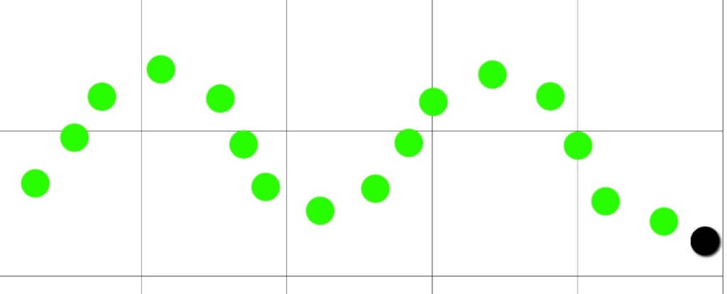
Let’s take a look at this example.
If we try to recreate the movement using keyframe to move the element between the peak spot, here is what we get.
.circle {
...
  animation: wave 4s infinite alternate;
}

@keyframes wave {
  0% {
    transform: translate(0px,10px);
  }
    20% {
    transform: translate(40px,90px);
  }
    40% {
    transform: translate(80px,10px);
  }
    60% {
    transform: translate(120px,90px);
  }
    80% {
    transform: translate(160px,10px);
  }
    100% {
    transform: translate(200px,90px);
  }
}
You’ll see that the CSS engine will try to move the element directly between each keyframe position resulting in zig zag movement instead of wave
Well, It’s not impossible though. You can also create as much keyframe as possible to move the element along the path. But that’s going to take lots of effort and running with poor performance.
The CSS Hack
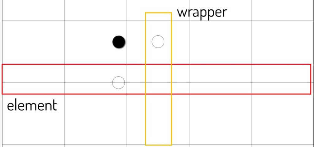
So this is when we’re going to start our hack. Here is what it looks like if we separate the movement between x and y axis.
You’ll see that the key concept of the wave movement is that the animation speed between x and y axis are asynchronous.
The problem is since our element can have only 1 animation property so we can’t separate the animation between x and y axis.
So the workaround is very simple. Since we can’t add two animation properties. Then we’re going to create an invisible wrapper around our element then add the animation to the wrapper instead.
<div class="wrapper">
    <div class="circle"></div>
</div>
.circle {
  background: black;
  width: 20px;
  height: 20px;
  border-radius: 50%;
  animation: x-axis 4s infinite linear;
}
.wrapper {
  animation: y-axis 1s infinite ease-in-out;
}

@keyframes x-axis {
  50% {
    transform: translateX(200px);
  }
}
@keyframes y-axis {
  50% {
    transform: translateY(90px);
  }
}
Now if we want to emphasize the wave movement or create a spring like effect, you can change the animation timing function using Bezier curves. Here is the generator tool that I usually used. Bend the curve as you like and paste it into the CSS code.
animation: y-axis 1s infinite cubic-bezier(.73,0,.33,1);
Since this method has no limit to how many layers of wrapper we can have. We can create more complicate movement by adding more 😀
You can download source code of this project here
One final note before we end this hack. Actually there is already a CSS motion-path modules that let you move the element along a custom path. But the problem is it’s still an experimental module. And Safari does not support it yet. So until that time we’ll have to rely on this hack.
So that’s all for this CSS hack episode. If you like it and want to see more development tips and tutorials, subscribe our YouTube Channel to stay tune 🙂
