CSS Text with Background Animation
In this post we will show you a quick tutorial on how to create text background animation using CSS without JavaScript in just a few minutes. Let’s check it out.
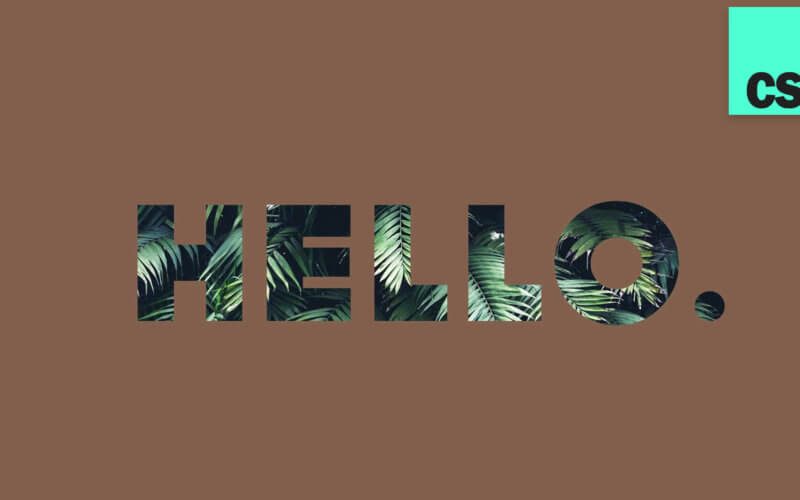
So here is the example page we’re going to work on. Just a simple text on center of the screen using flex display.
<div class="background-text">HELLO.</div>
body {
  margin:0;
  width:100vw;
  height: 100vh;
  display: flex;
  align-items: center;
  justify-content: center;
  background-color:#332720;
  color:white;
}
First set the font family and font size and letter spacing. (I’m using dock11 font)
.background-text {
  font-family: dock11;
  font-size: 300px;
  letter-spacing: 20px;
}
Next we will set the text color to transparent and set the background-clip to text. However, this won’t work with Chrome and edge. So we’ll need to also add webkit properties to support it.
.background-text {
color:transparent;
background-clip: text;
-webkit-text-fill-color: transparent;
-webkit-background-clip: text;
background-image: url("background.jpg");
background-size: 120%;
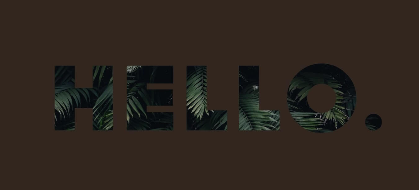
}Here is the background image that we’re going to use for this tutorial. (It’s recommended to have the image size larger than the text area since we’ll add the animation later)

Here is the result.
Looks good. And finally we’ll add the animation.
Create a keyframes rule to animate the background-position. We’ll set the position to 0% (top and left) then move to 100% at the middle of animation and move back to 0 at the end. Then add animation property to the text.
For this tutorial, I’ll use cubic bezier function for a smoother animation. Here is the online tool that I usually use to adjust the function. Move the curve as you like and test it before adding it to the CSS.
.background-text {
...
  animation: bg-animation 30s cubic-bezier(0.3,0,0.7,1) infinite;
}
@keyframes bg-animation {
  0% {background-position: 0% 0%;}
  50% {background-position: 100% 100%;}
  100% {background-position: 0% 0%;}
}
That’s it. You should now have a text with background animation (check the video below for live tutorial + result) You can download source code for this project here.
So that’s all for this tutorial. If this helped you, subscribe our Youtube channel for to stay tune for more tips and updates. Bye 🙂
