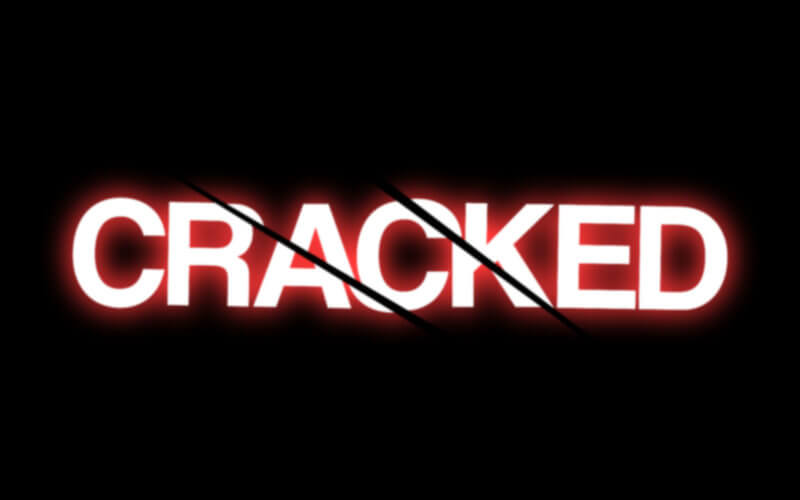
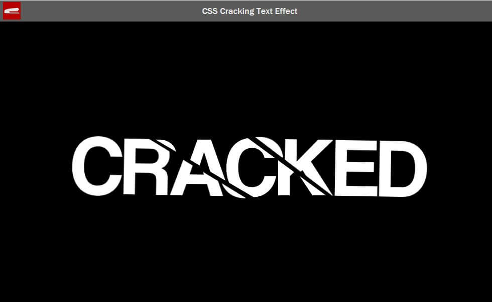
CSS Text Cracking Effect Tutorial
In this tutorial, I’m going to show you how to create a cracking text effect with breathing animation using just pure CSS in couple minutes. Let’s check it out! (Source code at the end of this post)
The HTML
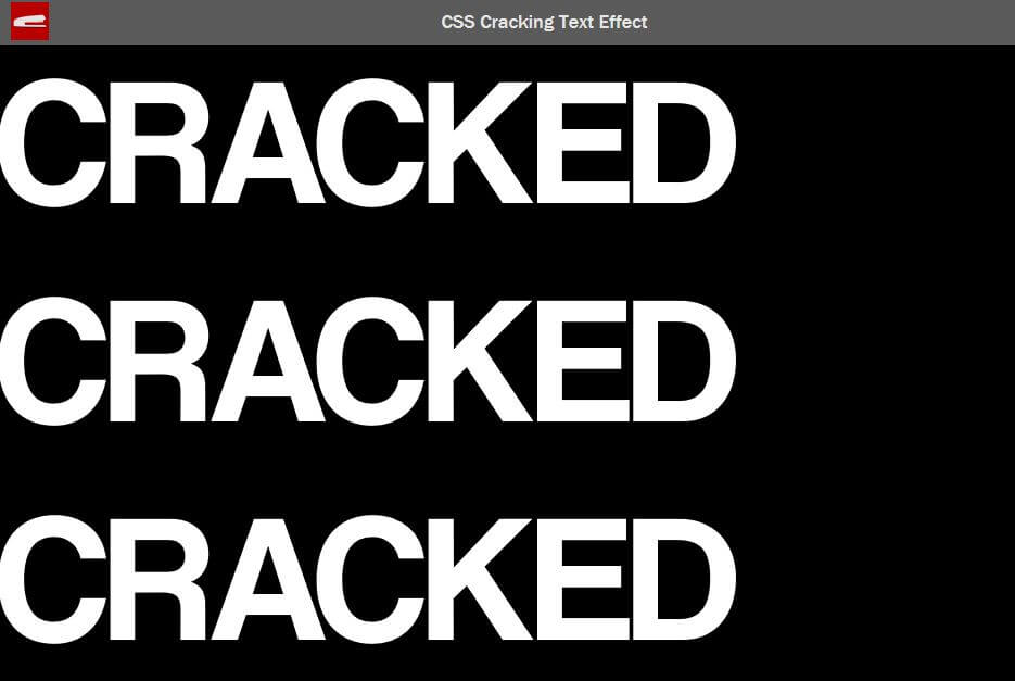
In this tutorial we’ll need to duplicate the text three times for each broken part. So let’s create a container and three span containing our text.
<div class="cracked">
     <span>cracked</span>
     <span>cracked</span>
     <span>cracked</span>
</div>
And that’s it for the HTML part. Let’s work on the CSS.
The CSS
For this tutorial, I already have the main wrapper with flex layout to center everything on the screen. So we’ll start working on our cracking text by setting the font family, size, color and uppercase transform. Also set the position to relative.
.cracked {
  font-family: Coolvetica, Arial;
  font-size: 15rem;
  color:#fff;
  text-transform: uppercase;
  position: relative;
}
Next i’m going to put the all of them together at the same position. Basically we’ll just set the position of the first and the third one to absolute and top/left to zero. We’ll do this by using nth-child selector.
.cracked span:nth-child(1) ,
.cracked span:nth-child(3) {
  position: absolute;
  top:0;
  left:0;
}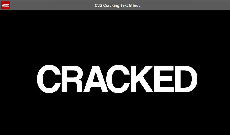
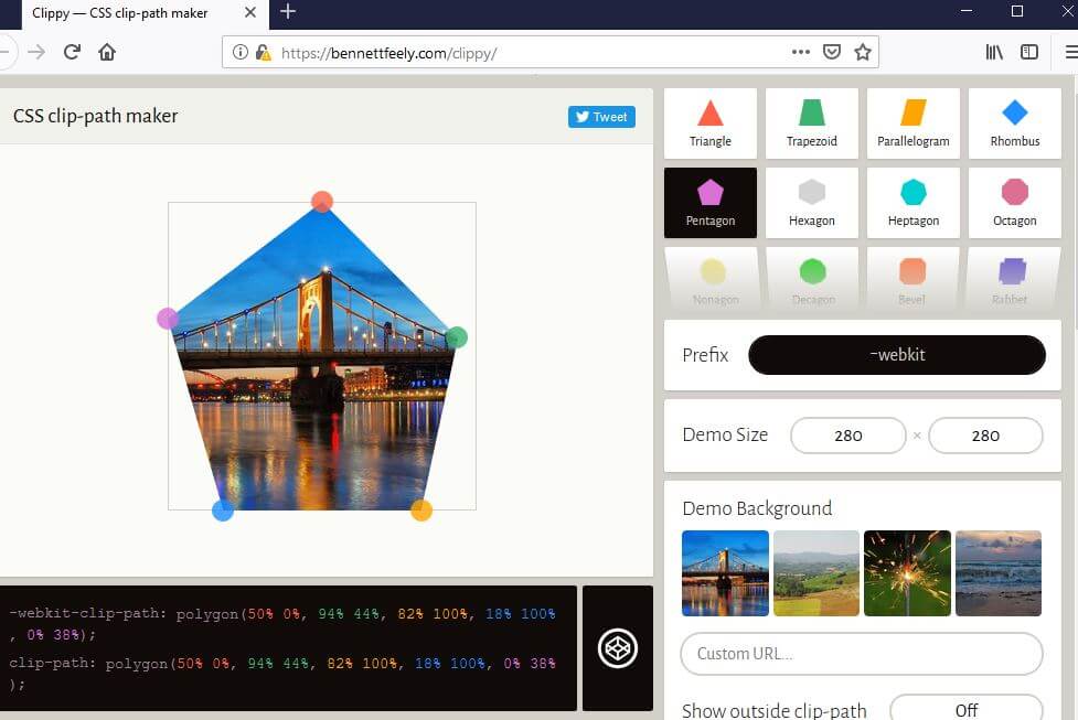
Now all of them are on the same place. The next step is to break them apart using clip-path property.
clip-path allows you to specify the area of the element that you want to display. Below is the example of clip path generator tool to let you easily create your own shape.
Now let’s try adding path to each of our text span. You can try change these number to create different cracking effect. Then move them apart using translate. I’ll also add a small rotation as well.
.cracked span:nth-child(1)  {
  clip-path: polygon(-10% 0%, 10% 0%, 60% 100%, -10% 100%);
  transform: translate(-2%, 1%) rotateZ(1deg);
}
.cracked span:nth-child(2)  {
  clip-path: polygon(10% 0%, 40% 0%, 80% 100%, 60% 100%);
}
.cracked span:nth-child(3) {
  clip-path: polygon(40% 0%, 110% 0%, 110% 100%, 80% 100%);
  transform: translate(2%, -1%) rotateZ(1deg);
}
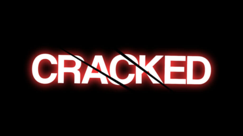
The Animation
The hard part is over. Now I’m going to try animating the cracking effect. Basically We’ll just move the transform above into the keyframes rule. I’ll also add the breathing effect using text shadow, brightness and blur filter.
@keyframes crack1 {
  0% {transform: translate(0%,0%); }
  100% {transform: translate(-2%, 1%) rotateZ(1deg); }
}
@keyframes crack2 {
  0% {transform: translate(0%,0%); }
  100% {transform: translate(2%, -1%) rotateZ(1deg); }
}
@keyframes glow {
  0% {
    text-shadow: 0 0 3rem #c98686;
    filter: brightness(150%) blur(0.12rem);
  }
  100% {
    text-shadow: 0 0 3rem #ff2525;
    filter: brightness(150%) blur(0.07rem);
  }
}
Then I’ll set animation property accordingly. For the breathing effect, I’ll set the animation-direction to alternate to make the animation play forward and backward alternatively.
.cracked {
  animation: glow 2s linear infinite;
  animation-direction: alternate;
}
.cracked span:nth-child(1)  {
  animation: crack1 0.2s linear forwards;
}
.cracked span:nth-child(3) {
  animation: crack2 0.2s linear forwards;
}
See animated result in this video below
And that’s it. If you love this tutorial and would like to see more. Don’t forget to subscribe our Youtube Channel to stay connected. Also don’t forget to give us thump up for our video as well. Thanks for visiting and see you next time. Bye!
Full Source Code
HTML
<!DOCTYPE html>
<html>
    <head>
    <meta http-equiv="content-type" content="text/html; charset=UTF-8" />
    <link rel="stylesheet" type="text/css" href="styles.css">
    </head>
    <body>
      <div class="wrapper">
        <div class="cracked">
          <span>cracked</span>
          <span>cracked</span>
          <span>cracked</span>
        </div>
      </div>
    </body>
</html>
CSS
html,body {
  margin: 0;
  padding: 0;
  width: 100vw;
  height: 100vh;
}
body {
  background: #000;
}
.wrapper {
  width: 100vw;
  height: 100vh;
  display: flex;
  align-items: center;
  justify-content: center;
}
.cracked {
  font-family: Coolvetica, Arial;
  font-size: 15rem;
  color:#fff;
  text-transform: uppercase;
  position: relative;
  animation: glow 2s linear infinite;
  animation-direction: alternate;
}
.cracked span:nth-child(1) ,
.cracked span:nth-child(3) {
  position: absolute;
  top:0;
  left:0;
}
.cracked span:nth-child(1)  {
  clip-path: polygon(-10% 0%, 10% 0%, 60% 100%, -10% 100%);
  animation: crack1 0.2s linear forwards;
}
.cracked span:nth-child(2)  {
  clip-path: polygon(10% 0%, 40% 0%, 80% 100%, 60% 100%);
}
.cracked span:nth-child(3) {
  clip-path: polygon(40% 0%, 110% 0%, 110% 100%, 80% 100%);
  animation: crack2 0.2s linear forwards;
}
@keyframes crack1 {
  0% {transform: translate(0%,0%); }
  100% {transform: translate(-2%, 1%) rotateZ(1deg); }
}
@keyframes crack2 {
  0% {transform: translate(0%,0%); }
  100% {transform: translate(2%, -1%) rotateZ(1deg); }
}
@keyframes glow {
  0% {
    text-shadow: 0 0 3rem #c98686;
    filter: brightness(150%) blur(0.12rem);
  }
  100% {
    text-shadow: 0 0 3rem #ff2525;
    filter: brightness(150%) blur(0.07rem);
  }
}
nice documented type tut bro
??? Your creativity is great ! ???