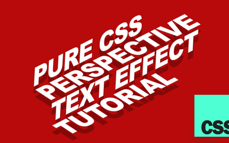
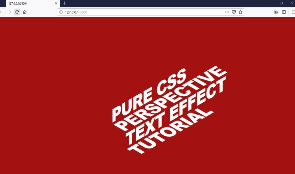
CSS Perspective Text Hover Effect Tutorial
Sliding perspective text effect has been around for some time and many of you might have seen it already . So in this tutorial, we’re going to show you how to make CSS perspective text effect from scratch in just a few minutes (and it’s pure CSS too!) Let’s check it out!
The Concept
Let’s talk about the concept first. We’re going to create separated div for each text line. And for each line. it will also have the text from the next line but remain hidden until you put the mouse on it.
Then we’ll use CSS transform to skew them. And apply the mouse hover transition to the entire paragraph to create an illusion that the text is sliding upward.
Talking is cheap. Let’s code!
The HTML
First, I’m going to create a wrapper for the entire text. Then, as I mentioned earlier, for each line we’ll create a separated div and also put in the text from the next line. We’ll leave the first and last line as blank.
<div class="perspective-text">
  <div class="perspective-line">
    <p></p>
    <p>Pure CSS</p>
  </div>
  <div class="perspective-line">
    <p>Pure CSS</p>
    <p>Perspective</p>
  </div>
  <div class="perspective-line">
    <p>Perspective</p>
    <p>Text Effect</p>
  </div>
  <div class="perspective-line">
    <p>Text Effect</p>
    <p>Tutorial</p>
  </div>
  <div class="perspective-line">
    <p>Tutorial</p>
    <p></p>
  </div>
And that’s all we need for HTML part.
The CSS
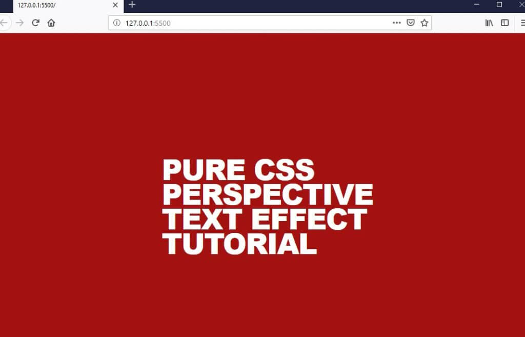
Next, I’ll set the text color and all font properties. Also reduce the letter spacing and add uppercase transform.
.perspective-text {
  color: white;
  font-family: Arial;
  font-size: 58px;
  font-weight: 900;
  letter-spacing: -2px;
  text-transform: uppercase;
}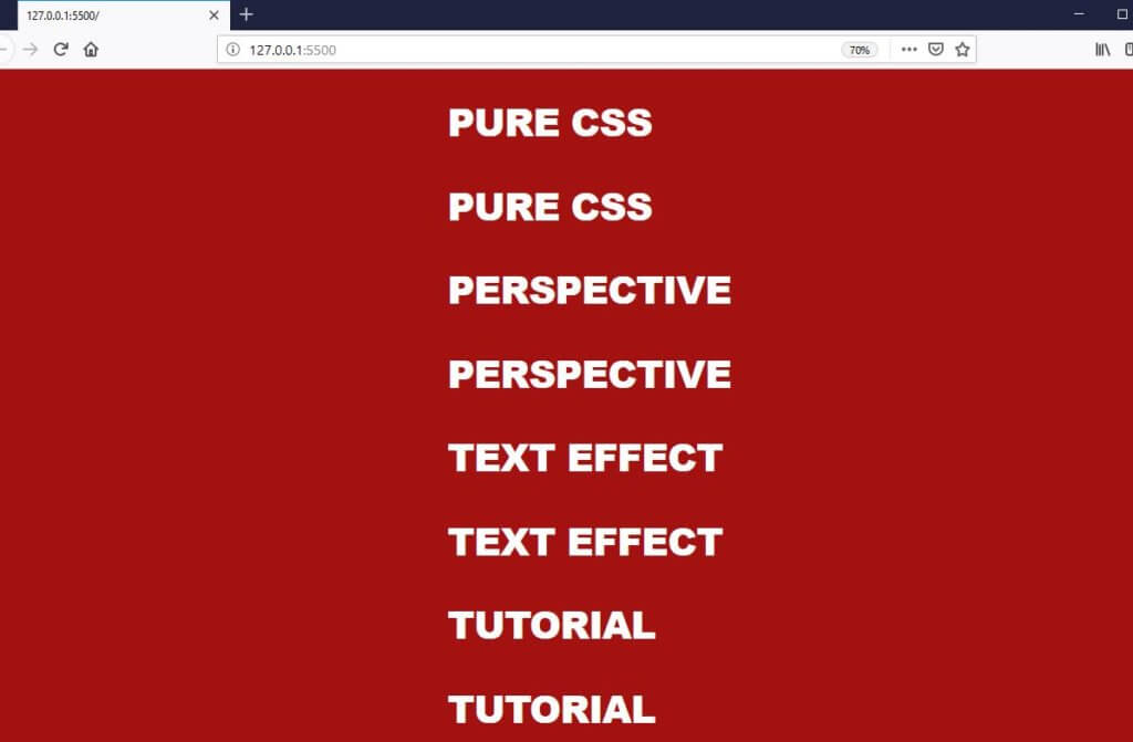
Now we’re going to set the height of each text to 50px. We’ll also do the same for the each line div. This will create a space only for just 1 text line. And once we add overflow hidden, we’ll see only just the first text line while the second is hidden.
.perspective-line {
  height: 50px;
  overflow: hidden;
  position: relative;
}
p {
  margin: 0;
  height: 50px;
  line-height: 50px;
  transition: all 0.5s ease-in-out;
}
Now we’ll start skewing the text. The trick is we’ll skew both x and y axis for every odd line and only y axis for even line. Now skewing will cause the line size to be out of proportion. We need to fix this by downscaling the odd lines and upscaling the even lines.
.perspective-line:nth-child(odd) {
  transform: skew(60deg, -30deg) scaleY(0.667);
}
.perspective-line:nth-child(even) {
  transform: skew(0deg, -30deg) scaleY(1.333);
}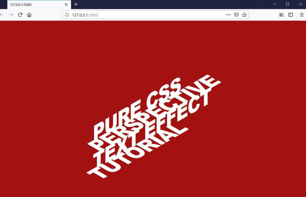
Almost there, now we need to move each text line to the right to make them aligned. We can do that easily by setting the position to relative and add the left property.
.perspective-line {
  position: relative;
}
.perspective-line:hover p{
  transform: translate(0, -50px);
}
.perspective-line:nth-child(1) {
  left: 29px;
}
.perspective-line:nth-child(2) {
  left: 58px;
}
.perspective-line:nth-child(3) {
  left: 87px;
}
.perspective-line:nth-child(4) {
  left: 116px;
}
.perspective-line:nth-child(5) {
  left: 145px;
}
The Hover Effect
Now remember that each line has the hidden text? Let’s try adding hover property to show them. Just use -50px translate and then add the transition properties.
.perspective-line:hover p{
  transform: translate(0, -50px);
}
p {
  transition: all 0.5s ease-in-out;
}
See the result in video below
And that’s it! that’s how we achieve the sliding perspective text simply by creating an illusion. Hope you guys enjoy. If you love this tutorial don’t forget to like or subscribe to our Youtube Channel to stay connected. Thanks for visiting and see you next time!
Can you upload the whole html and css code complete?
I know it is in parts. But i tell ya if i am copying this to notepad++ and
open it in my browser its either showing no text or its vanishing
just change the body background color