
How to Create Glass Blur Effect with CSS
CSS Glass blur effect is very popular on web page that want the div to be transparent and see through background or create a glass cover on another element. The snippet below uses masking trick, blur filter and box-shadow to achieve the glass blur effect.
Snippet 1
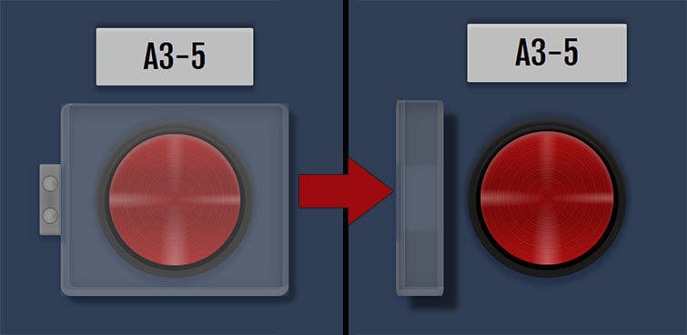
Below is a rectangle glass cover with 300px width and height. The blur filter is applied to the child div while the parent act as a mask with overflow:hidden. Transparency can be controlled via background alpha. Box-shadow is added to create floating effect.
HTML
<div class="glass-wrap">
  <div class="glass"></div>
</div>
CSS
.glass-wrap {
  width: 300px;
  height: 300px;
  overflow: hidden;
  box-shadow: 8px 8px 5px rgba(0, 0, 0, 0.3), inset 5px -5px 0px 5px rgba(200, 200, 200, 0.15), inset -2px -2px 0px 5px rgba(195, 195, 195, 0.15);
}

.glass {
  width: 100%;
  height: 100%;
  left: 4px;
  top: 4px;
  background: rgba(180, 180, 180, 0.3);
  filter: blur(2px);
  z-index:999;
}
Live Demo – See on JSFiddle
Related Tutorial
Below is a tutorial video how to create a button glass cover with snippet above.
आकाश पाटिल सूरत .
👋🥹👋