How to create Vertical Timeline from Pure CSS
HTML detail tag is one of the most useful features of HTML5. You can create an interactive toggle widget without using JavaScript at all. But do you know with the right CSS hack, it can create a lots of cool things. So in this episode, we’ll show you how to make a vertical timeline from CSS and HTML5 Details tag in just a few minutes.
The HTML5 Details Tag
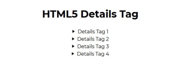
Let’s work on a basic example to get the gist of how details tag works first. Here is what details tag looks like without any CSS. There is a summary tag which is the headline and then you can click at it to expand the details.
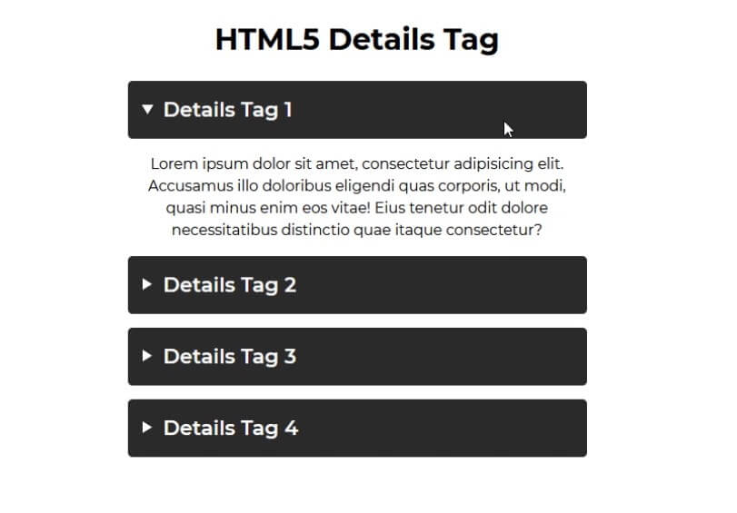
I know it looks ugly but with a few CSS setup, you can turn it into this
summary {
  font-size: 22px;
  font-weight: 600;
  background-color: rgb(43, 43, 43);
  color: white;
  padding: 15px;
  margin-bottom: 15px;
  border-radius: 5px;
  text-align: left;
  cursor: pointer;
  transition: all 0.5s ease-in-out;
}
details[open] summary  {margin-bottom: 25px; } /* Add a sliding animation when clicked */
You can download the source code of this example here
The Vertical Timeline
I got an inspiration from this codepen challenge but I rewrite some CSS to use flex layout instead of float since it’s easier to understand.
Here is our HTML structure. First I’m going to add a wrapper to wrap each of the details tag.
<h1>HTML5 Details Tag</h1>
<div class="wrapper">
<div class="detail-wrapper">
<details>
<summary>Details Tag 1</summary>
<p>Lorem ipsum ...</p>
</details>
</div>
...
...
<div class="detail-wrapper">
<details>
<summary>Details Tag 4</summary>
<p>Lorem ipsum ...</p>
</details>
</div>
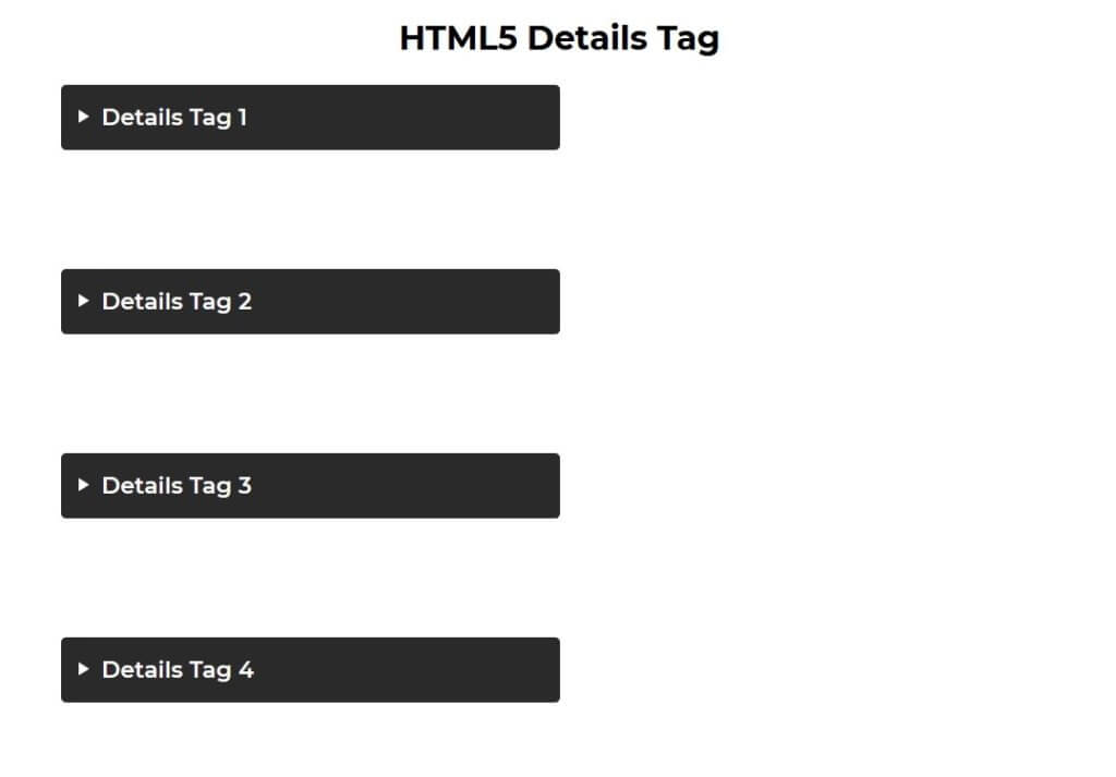
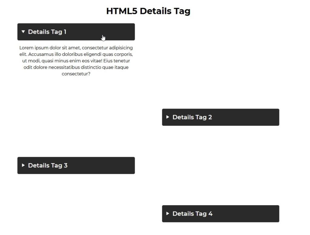
</div>Then for the CSS I’ll set the main wrapper width to half of the viewport. For the detail-wrapper, set width to 100% add some margin bottom and set display to flex. And for the details tag itself we’ll set the width to 50%.
.wrapper {
  width: 50vw;
  margin: 0 auto;
  position: relative;
}
.detail-wrapper {
  width:100%;
  margin-bottom: 100px;
  display: flex;
}
details {
  width:50%;
}
Here is what it looks like so far.
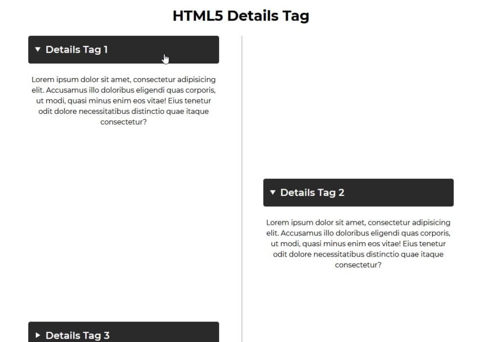
Then we’ll use nth-child selector to set justify-content to right and padding left for the even details. And do the opposite for the odd one
.wrapper > .detail-wrapper:nth-child(even) {
  justify-content: right;
  padding-left: 100px;
}
.wrapper > .detail-wrapper:not(:nth-child(even)) {
  justify-content: left;
  padding-right: 100px;
}
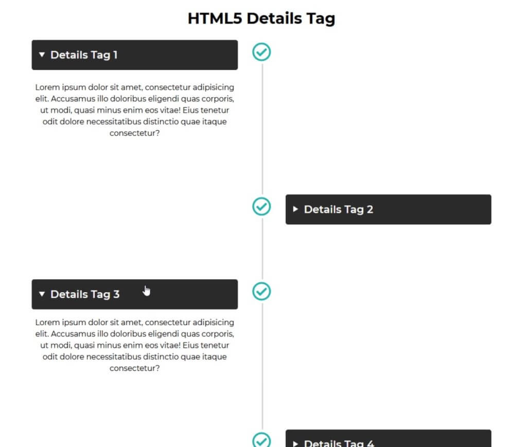
Next, the center line. We’ll use before pseudo element then set the width to 3 pixels and grey background to create a line Then set the position to absolute and set both top and bottom to zero to expand the line and set left to 50% to place it at the center.
.detail-wrapper::before {
  content:"";
  width: 3px;
  background-color: #d9d9d9;
  position: absolute;
  top:0;
  bottom: 0;
  left: 50%;
}
Next we’ll work on the icon. I’ll use font awesome free font. we’ll include it to our project using CSS file from CDN.
<link rel="stylesheet" type="text/css" href="https://use.fontawesome.com/releases/v5.0.13/css/all.css" />
Then I’ll use after pseudo element to add the icon. After setting font-family and content to the checkmark character Unicode. Set the background to white and increase z-index to bring the icon on top of the line
.detail-wrapper::after {
  font-family: Font Awesome\ 5 Free;
  content:"\f058";
  font-size: 40px;
  color:#23b5af;
  width:50px;
  height: 50px;
  line-height: 50px;
  position: absolute;
  left:50%;
  background: white;
  z-index: 999;
  margin-left: -25px;
  border-radius: 50%;
}
You can download the source code here
And that’s all for this HTML5/CSS hack. If you like this tutorial. If you want to see more development tips and tutorial, like our Facebook and subscribe our Youtube Channel to stay connected 🙂
