
CSS Circle Image Tutorial
In this tutorial, we’ll show you how to use CSS3 to make circle image which has been popularly implemented for profile picture or avatar. Learn how to use border-radius and background-image technique to apply the circle effect to an image without having to crop it!
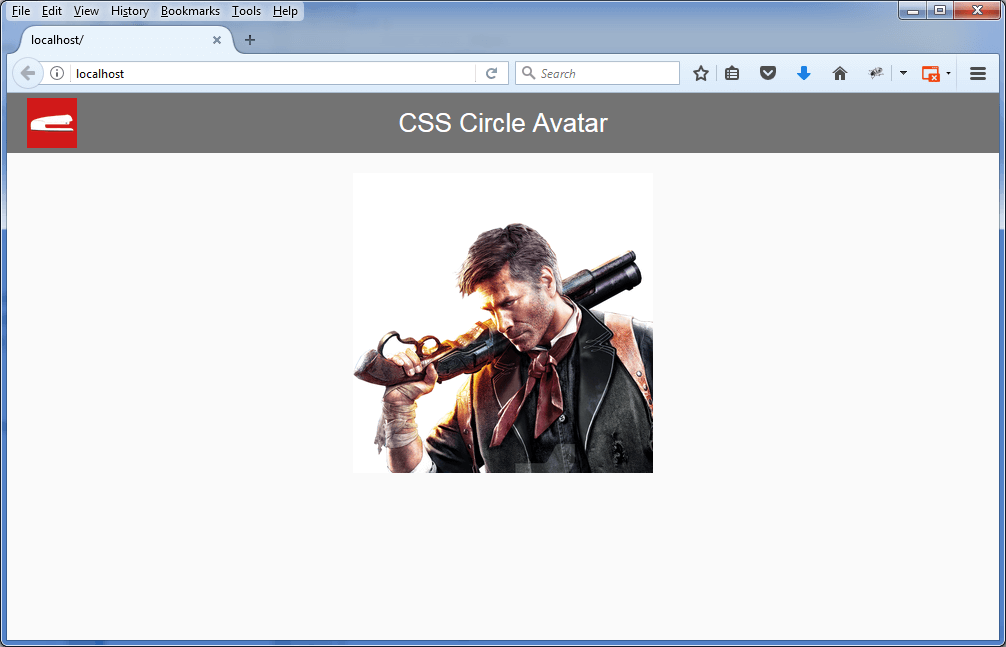
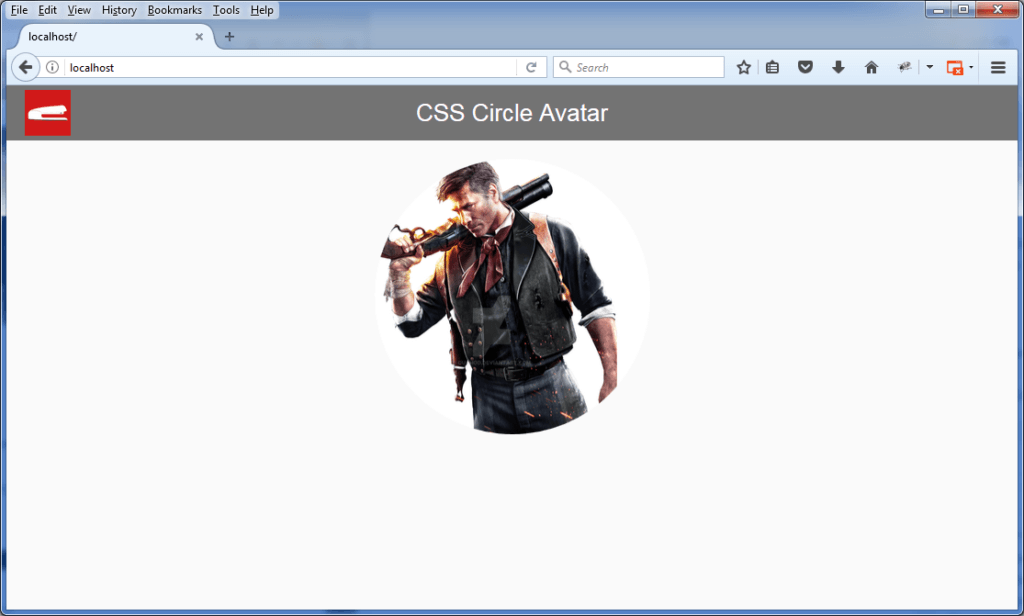
Let’s start with our original image.
If you already have a square image, that’s very easy. You only need to apply a border-radius of 50% to it and it’s done!
#yourImg {
   border-radius: 50%;
}
However, in real world scenario, you can’t manage to have square 1:1 ratio of all incoming image right? And things will turn ugly if that happen. The circle will turn into ellipse!
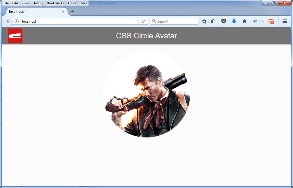
The solution is quite simple, you need to apply the image as a div background instead. The magic is background-size: cover. This will scale the background image to be as large as possible so that the background area of the div is completely covered by the background image. We’ll keep the 50% background-radius and also add width and height properties.
#imgDiv {
  width: 300px;
  height: 300px;
  background-image: url("path_to_your_profile.png");
  border-radius: 50%;
  background-size: cover;
}
And here is the result. Now you don’t have to worry about the image ratio anymore.
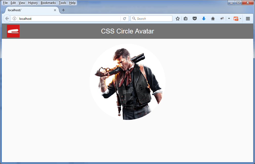
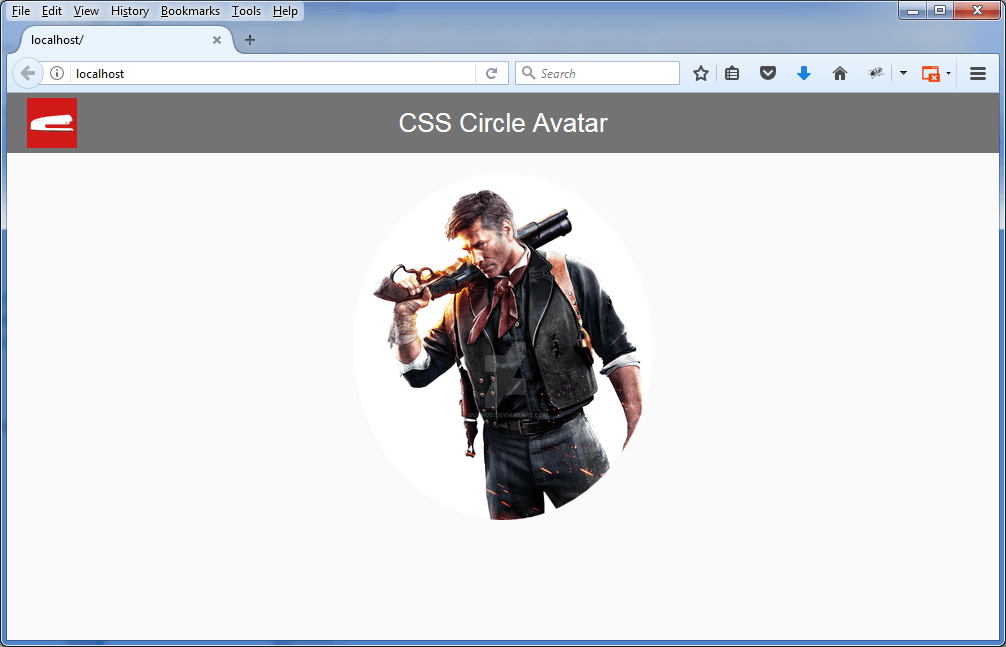
If you want to change the background position of the avatar, that’s easy too. Just play with background-position.
#imgDiv{
  width: 300px;
  height: 300px;
  background-image: url("path_to_your_profile.png");
  background-position: -25px -20px;
  border-radius: 50%;
  background-size: cover;

}
Watch the live version of this tutorial in our video. Feel free to subscribe to our channel for more ?
Red Stapler Channel: https://www.youtube.com/c/RedStapler_channel