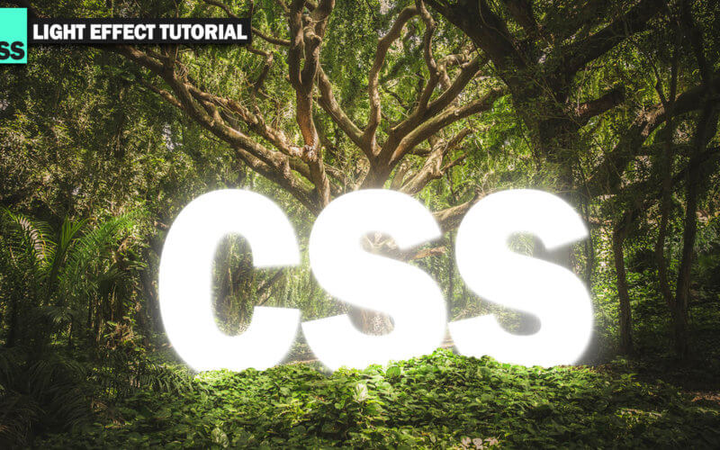
Cool CSS Text Light Effect 5 Minutes Tutorial
In this post, we’re back for CSS effect tutorial. We’ll show you how to create a light effect using CSS combine with transparent images trick to make it look realistic.
Ready? let’s check it out.
The Layer Tricks
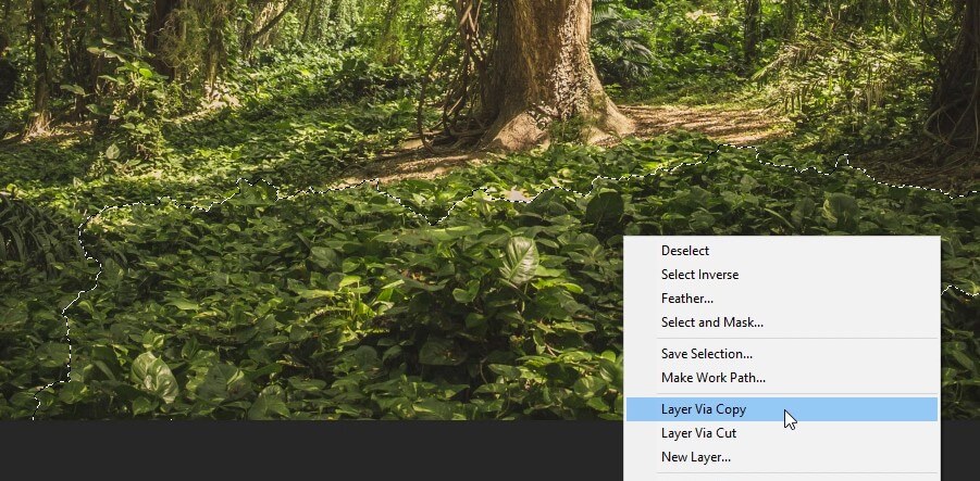
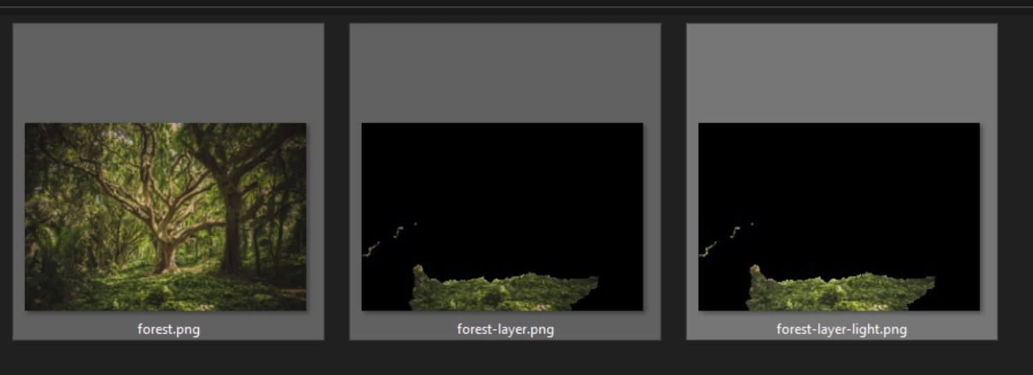
So here is the image we’re going to use as background. First I’m going to use a quick selector tool in photoshop to select the area we want to bring it in front of the text. Once finish, create a copy into a new layer.
Next create a text layer with white outer glow. (Note that we’re just using it as a reference since the real text will be added in HTML)
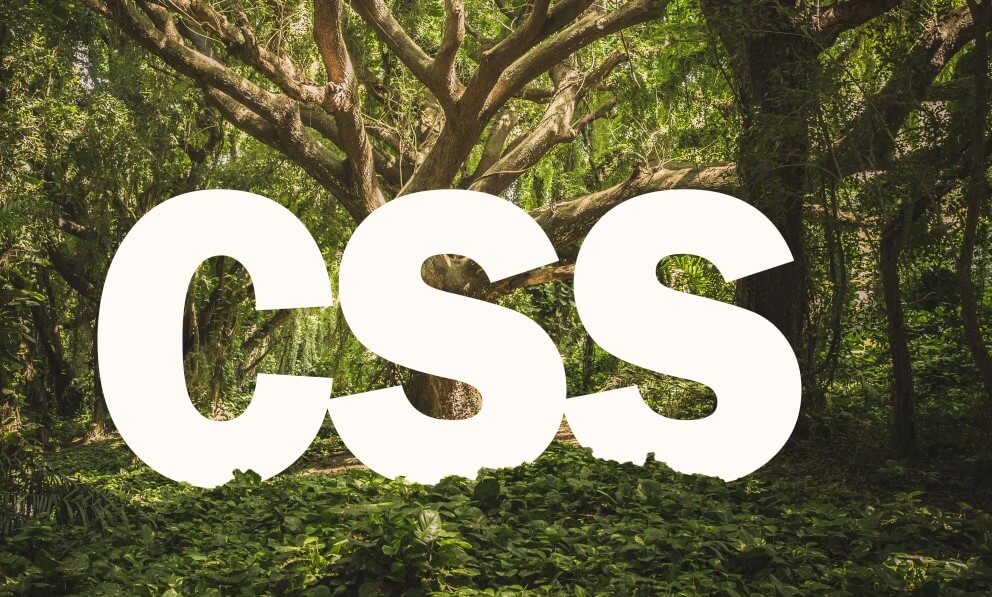
At this point you might want to review the outer layer again and use the eraser to clean up any unnecessary area.

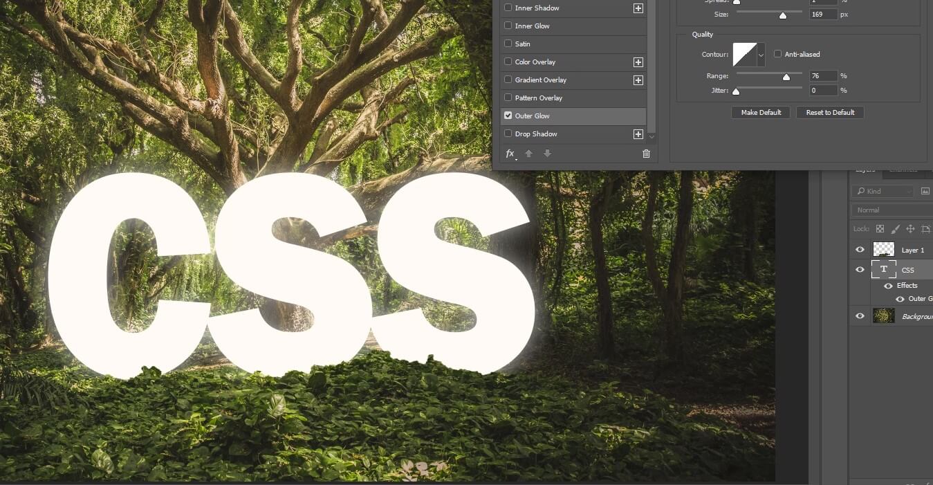
Once finished, copy the layer into another new layer. Use dodge tool to create light effect.

Once you’re ok with the final result, save each layer into separate PNG image along with the original one. At this point you should have three images. Original, outer layer. and outer layer with light effect.
Adding Light Effect with CSS
Next we’ll work on the HTML. I’ll create a container div with 3 child divs inside for each image and text div. between the base and other layers..
<div class="container">
  <div class="base"></div>
  <div class="text">CSS</div>
  <div class="layer"></div>
  <div class="layer-light"></div>
</div>
For the CSS, I’ll set the width and height to 100% for all child divs (except text) with absolute position. If you want to recap the different between absolute and relative position, check out the my explanation here.
We’ll set the layer order by setting the z-index. Also set the each layer with their corresponding image background.
.container {
  width: 1500px;
  height: 1000px;
  position: relative;
}
.base,.layer,.layer-light {
  width:100%;
  height: 100%;
  position: absolute;
}
.base {
  background: url("forest.png");
}
.layer {
  background: url("forest-layer.png");
  z-index: 2;
}
.layer-light {
  background: url("forest-layer-light.png");
  z-index: 3;
}
For the text div, set the font-family and font-size. My trick is to use transform scale to adjust the text height. The important part is text shadow, I’ll create 3 layers of text shadow to make the light effect more realistic. Start low with the first layer and keep expanding.
.text {
  top:420px;
  left:360px;
  position: absolute;
  font-family: 'Franklin Gothic Heavy';
  font-size: 450px;
  color: white;
  transform: scale(1,1.15);
  transition: 1s;
  text-shadow:
    2px 2px 5px rgba(255,255,255,0.5),
    3px 3px 10px rgba(255,255,255,0.5),
    5px 5px 70px rgba(255,255,255,0.5);
}
Next let’s add some hover effect. So when we move mouse over, the text will be brighter. We’ll increase the text shadow opacity to 90%. Also adjust the opacity of the light effect layer at the same time. 100% on mouse over and reduce it to 30% when it’s not.
.container:hover .text {
text-shadow:
2px 2px 5px rgba(255,255,255,0.9),
3px 3px 10px rgba(255,255,255,0.9),
5px 5px 70px rgba(255,255,255,0.9);
}
.container:hover .layer-light {
opacity: 1;
}
.layer-light {
opacity: 0.3;
transition: 1s;
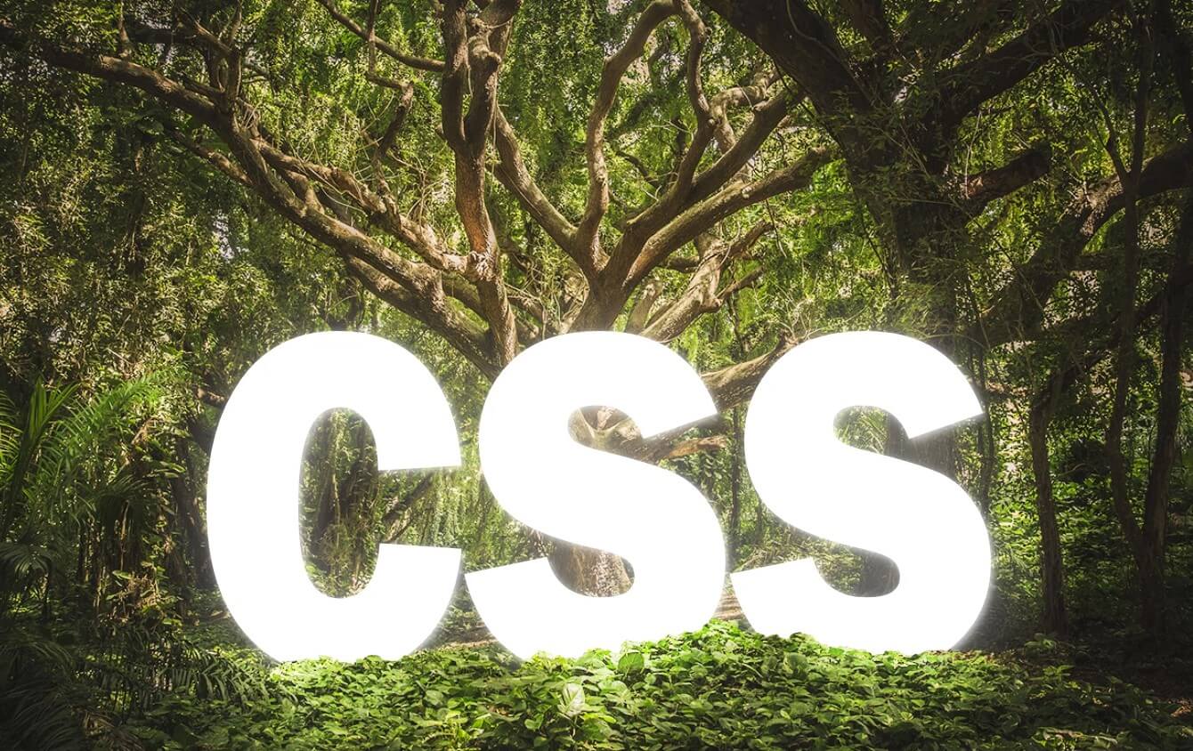
}Here is the result.
Here is the live video
And that’s all for this tutorial, if you love it, don’t forget to like and subscribe our channel. You can download the source code here.
