
Cool CSS 3D Text Effect in 3 Minutes
In this tutorial, I’m going to show you how to create a simple CSS 3D Text effect that can be done in couple minutes using only CSS transform and text-shadow. Let’s check it out!
The Text Body
So let’s start with setting background color to green.
body {
    background: #1edad0;
}
Then add a div to put our text on. I’m not using span because span is an inline element so some transform properties won’t work on it.
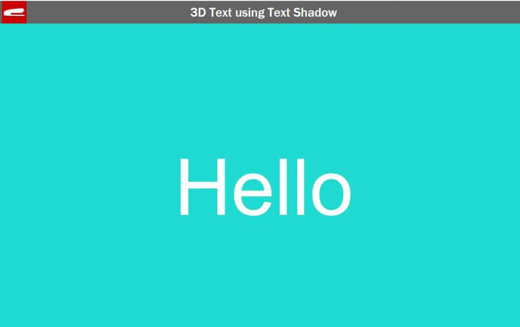
<div class="text-3d">Hello</div>
Next I’m going to set the font size, absolute position and -50% translate to center the text on the screen. Then add a little skewY to create a 3D like effect using bottom/left transform origin.
.text-3d {
    font-size: 8rem;
    position: absolute;
    top: 50%;
    left: 50%;
    transform: translate(-50%, -50%) skewY(-6deg);
    transform-origin: bottom left;
}
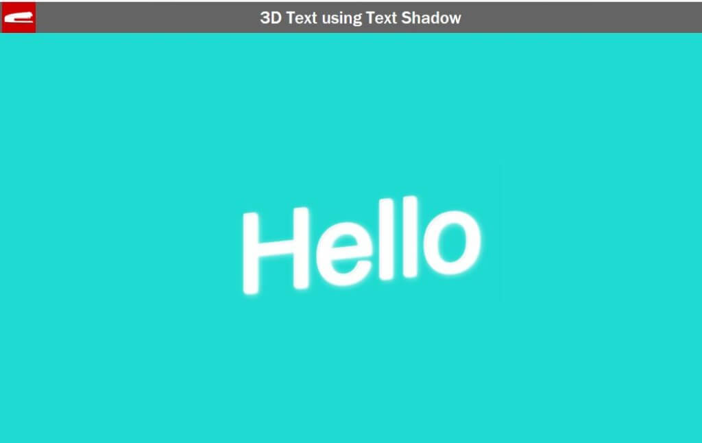
To create depth to the text, we’re going to use the same technique with previous tutorial by using multiple layers of text-shadow. We’ll place each layer diagonally. Also we need to hide the original text as it stand out from the text shadow. We can do this by setting color to transparent.
.text-3d {
    color: transparent;
    text-shadow:

     /* This set has more blur distance to create glowing effect */
     1px -1px 10px rgba(255, 255, 255, 0.4),
     0px -1px 10px rgba(255, 255, 255, 0.4),
    -1px -1px 10px rgba(255, 255, 255, 0.4),

     0px -2px 3px #fff,
    -1px -2px 3px #fff,
    -2px -2px 3px #fff,

     /* This set has darken color to create depth */
    -1px -3px 2px #ddd,
    -2px -3px 2px #ddd,
    -3px -3px 2px #ddd,

    -2px -4px 2px #fff,
    -3px -4px 2px #fff,
    -4px -4px 2px #fff,

    -3px -5px 1px #fff,
    -4px -5px 1px #fff,
    -5px -5px 1px #fff;
}
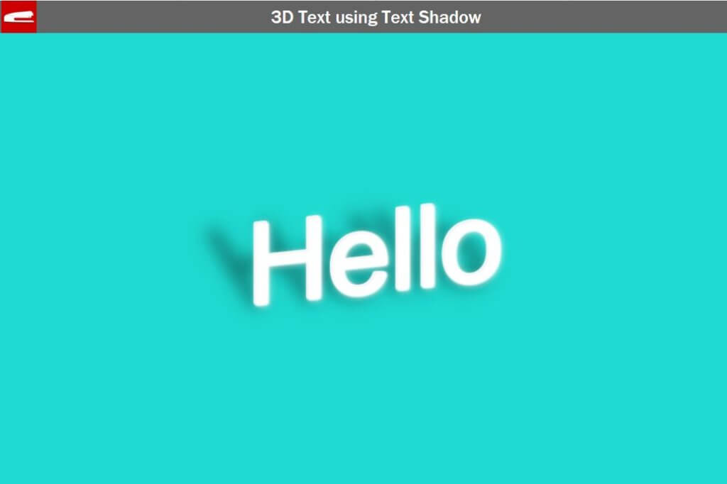
The Shadow
Next, we’re going to work on the shadow.
.text-3d:before {
    content: "Hello";
    position: absolute;
    left: 0;
    right: 0;
    top: 0;
    transform: skewX(30deg);
    transform-origin: bottom left;
}
Start by creating a pseudo element with the same text. I’ll use absolute position with zero top/left. This will make the text overlay the original one. Then skew it by 30 degrees using bottom/left transform origin.
.text-3d:before {
    z-index: -1;
    color: transparent;
    text-shadow:
    15px 0px 20px rgba(0, 0, 0, 0.25),
    15px 0px 25px rgba(0, 0, 0, 0.2),
    15px 0px 35px rgba(0, 0, 0, 0.15),
    15px 0px 45px rgba(0, 0, 0, 0.1);
}
Now I’ll set z-index to -1 to put the shadow under. And then we’ll use the text-shadow property again but this time with black color and more blur distance. Finally set the color to transparent since we want to display only the text-shadow property, not the text itself.
That’s it let’s see the result!
So that’s all for this tutorial. Any comments or questions, let me know. And if you love this tutorial. don’t forget to Like our Facebook page and subscribe to our Youtube Channel to stay connected 
Source Code
HTML
<!DOCTYPE html>
<html>
    <head>
    <meta http-equiv="content-type" content="text/html; charset=UTF-8" />
    <link rel="stylesheet" type="text/css" href="styles.css">
    </head>
    <body>
        <div class="text-3d">Hello</div>
    </body>
</html>
CSS
html,body {
    width: 100vw;
    height: 100vh;
    margin: 0;
}
body {
    font-family: sans-serif;
    color: #fff;
    background: #1edad0;
}
.text-3d {
    font-size: 8rem;
    position: absolute;
    top: 50%;
    left: 50%;
    transform: translate(-50%, -50%) skewY(-6deg);
    transform-origin: bottom left;
    color: transparent;
    text-shadow:
     1px -1px 10px rgba(255, 255, 255, 0.4),
     0px -1px 10px rgba(255, 255, 255, 0.4),
    -1px -1px 10px rgba(255, 255, 255, 0.4),
     0px -2px 3px #fff,
    -1px -2px 3px #fff,
    -2px -2px 3px #fff,
    -1px -3px 2px #ddd,
    -2px -3px 2px #ddd,
    -3px -3px 2px #ddd,
    -2px -4px 2px #fff,
    -3px -4px 2px #fff,
    -4px -4px 2px #fff,
    -3px -5px 1px #fff,
    -4px -5px 1px #fff,
    -5px -5px 1px #fff;
}
.text-3d:before {
    content: "Hello";
    position: absolute;
    left: 0;
    top: 0;
    transform: skewX(30deg);
    transform-origin: bottom left;
    z-index: -1;
    color: transparent;
    text-shadow:
    15px 0px 20px rgba(0, 0, 0, 0.25),
    15px 0px 25px rgba(0, 0, 0, 0.2),
    15px 0px 35px rgba(0, 0, 0, 0.15),
    15px 0px 45px rgba(0, 0, 0, 0.1);
}