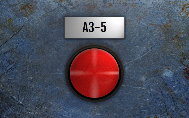
Recreate Chernobyl AZ-5 Button with CSS/HTML
In this tutorial, we’re going to recreate the famous Chernobyl AZ-5 button with CSS and a little bit of JavaScript. Let’s check it out!
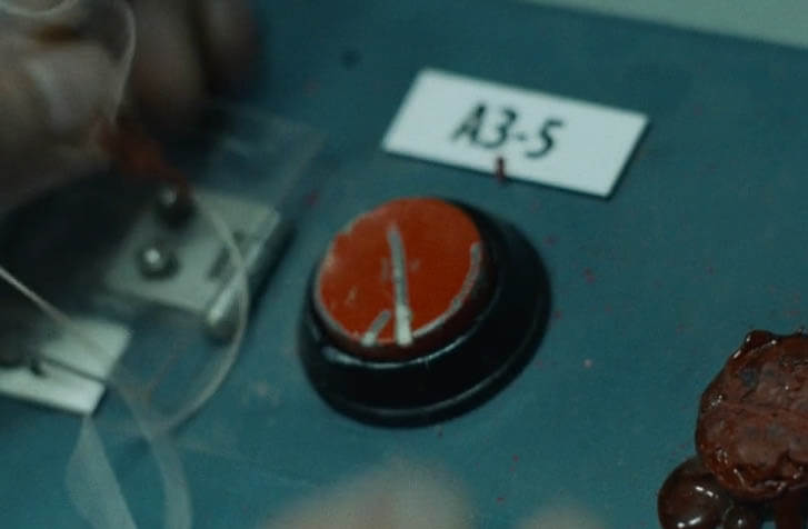
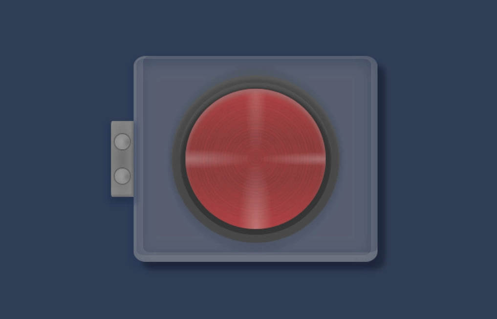
The AZ-5 Button
Here is the button in the movie.
I set background color to dark blue with the flex layout to center everything on the screen.
body {
width: 100vw;
height: 100vh;
margin: 0;
padding: 0;
background: #303e55;
display: flex;
align-items: center;
justify-content: center;
flex-direction: column;
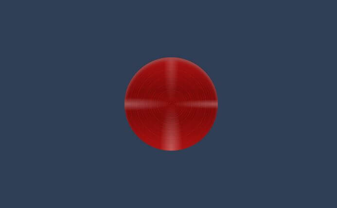
}First, we’ll create div for button and another divs for button inner-frame. Then we’ll create a red background using radial-gradient and repeat-radial-gradient to create brushed aluminum effect. Finally add a light reflection using four directions of white radial gradient and inset box-shadow.
<div class="frame">
     <div class="inner-frame">
          <div class="button"></div>
     </div>
</div>
.button {
width: 9.2em;
height: 9.2em;
border-radius: 50%;
background-image:
-webkit-radial-gradient(50% 0%, 8% 50%, rgba(255,255,255,0.2) 0%,rgba(255,255,255,0) 100%),
-webkit-radial-gradient(50% 100%, 12% 50%, rgba(255,255,255,0.3) 0%,rgba(255,255,255,0) 100%),
-webkit-radial-gradient(0% 50%, 50% 7%, rgba(255,255,255,0.3) 0%,rgba(255,255,255,0) 100%),
-webkit-radial-gradient(100% 50%, 50% 5%, rgba(255,255,255,0.3) 0%,rgba(255,255,255,0) 100%),
-webkit-repeating-radial-gradient(50% 50%, 100% 100%, rgba(44,0,0,0) 0%, rgba(44,0,0,0) 3%,rgba(44,0,0,0) 3.5%),
-webkit-repeating-radial-gradient(50% 50%, 100% 100%, rgba(255,30,30,0) 0%, rgba(255,30,30,0) 6%,rgba(255,30,30,0.1) 7.5%),
-webkit-repeating-radial-gradient(50% 50%, 100% 100%, rgba(210,25,25,0) 0%, rgba(210,25,25,0) 1.2%,rgba(210,25,25,0.2) 2.2%),
-webkit-radial-gradient(50% 50%, 200% 50%, rgb(130,10,10) 5%,rgb(120,10,10) 30%, rgb(170,17,17) 100%);
box-shadow: inset 0 0.25rem 0.3rem rgb(153,76,76);
}
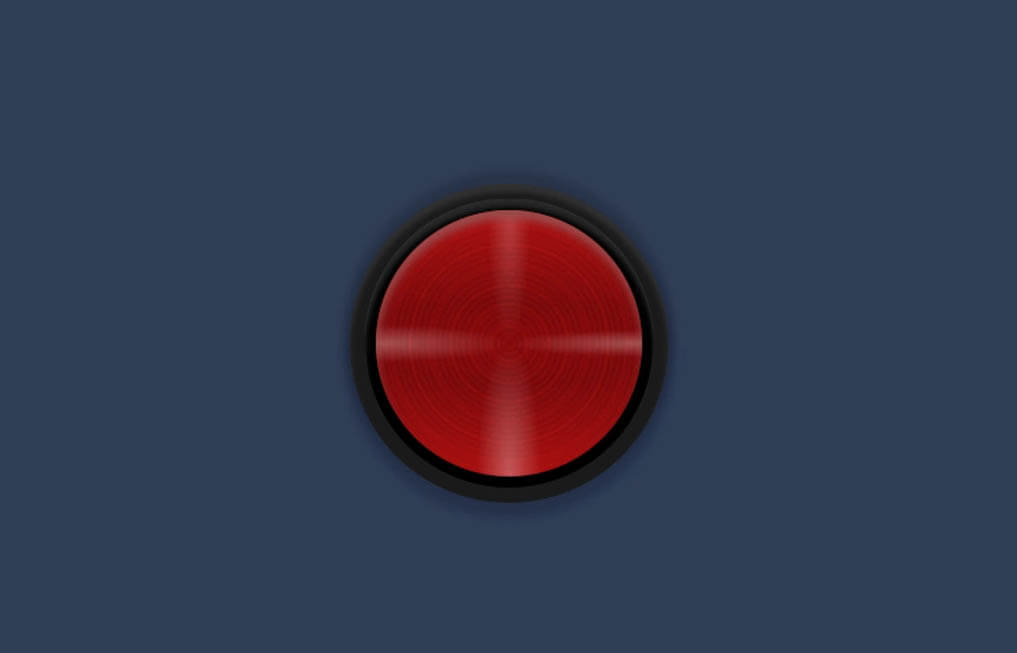
For the button frame, we’ll set size a little bit bigger than the button with 50% border-radius. Set the background color to black and add inset white box-shadow to create light reflection. Then use flex layout to center the button. We’ll do the same for outer-frame.
.inner-frame {
  width: 10rem;
  height: 10rem;
  border-radius: 50%;
  background-color: rgb(0,0,0);
  box-shadow: inset 0 0.25rem 0.15rem rgba(199,199,199,0.2);
  display: flex;
  align-items: center;
  justify-content: center;
  cursor: pointer;
}
.frame {
  width: 11rem;
  height: 11rem;
  border-radius: 50%;
  background-color: rgb(27,27,27);
  display: flex;
  align-items: center;
  justify-content: center;
  box-shadow:  rgba(0,0,0,0.15) 0 -5px 5px 3px,
  rgba(0,0,0,0.15) 0 5px 5px 3px,
  rgba(30,50,90,0.3) 0 5px 6px 4px,
  inset 0 0.25rem 0.15rem rgba(138,138,138,0.2);
}
Next create a click effect by adding active selector. I’ll lower the size, brightness and rotate the button a little bit. Also redefine box-shadow to remove the light reflection.
.button:active {
  width: 9rem;
  height: 9rem;
  filter: brightness(97%);
  transform: rotate(0.5deg);
  box-shadow: inset rgba(61,0,0,0.7) 0 2px 2px 2px,
  inset rgba(61,0,0,0.15) 0 2px 2px 5px;
}
The Glass Cover
Now I’m going to create a glass cover. we’ll need to create two divs. One for the glass cover and one as a wrapper.
<div class="cover-wrap">
  <div class="hinge">
    <div class="bolt"></div>
    <div class="bolt"></div>
  </div>
  <div class="glass-wrap">
    <div class="glass"></div>
  </div>
</div>
For the glass div, I’ll set the 100% size and grey background and apply a blur filter. For the wrapper, I’ll set the actual cover size that we need and add overflow hidden to hide the excess part from the blur filter.
.glass-wrap {
  width: 16rem;
  height: 13.5rem;
  border-radius: 5%;
  overflow:hidden;
}
.glass {
  width: 100%;
  height: 100%;
  left: 4px;
  top: 4px;
  background: rgba(180,180,180,0.3);
  filter: blur(10px);
}
We’ll use absolute position and -50% translate to center it. Then add box-shadow to create depth.
.cover-wrap {
  position: absolute;
  top:50%;
  left:50%;
  transform: translate(-50%,-50%);
  box-shadow: 8px 8px 5px rgba(0,0,0,0.3),
  0px 5px 6px 4px rgba(29,50,90,0.3),
  inset 5px -5px 0px 5px rgba(200,200,200,0.15),
  inset -2px -2px 0px 5px rgba(195,195,195,0.15);
  z-index: 3;
  border-radius: 5%;
  cursor: pointer;
}
I’ll set the hinge size and absolute position to put the hinge on the left side of the cover. Then add border radius, background and box-shadow.
.hinge {
  width: 1.5rem;
  height: 5rem;
  position: absolute;
  top:50%;
  left:0%;
  transform: translate(-100%,-50%);
  border-radius: 6% 1% 1% 6%;
  background: radial-gradient(rgb(112,112,112), rgb(139,139,139));
  box-shadow: 0px 5px 5px rgba(0,0,0,0.1),
  0px 5px 5px 5px rgba(29,50,90,0.3),
  inset rgba(44,44,44,0.25) -1px -1px 1px 1px;
  z-index: 1;
  display:flex;
  justify-content: center;
  align-items: center;
  flex-direction: column;
}
.bolt {
  width: 1rem;
  height: 1rem;
  border-radius: 50%;
  background: radial-gradient(rgb(120,120,120), rgb(80,80,80));
  margin: 10px 0px 10px 0px;
  box-shadow: 0px 0px 1px rgba(0,0,0,1),
  inset rgba(200,200,200,0.45) 5px 0px 5px 5px;
  z-index: 2;
}
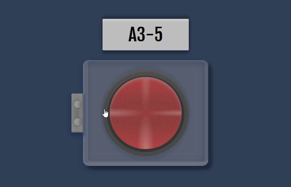
The Label
Now I’m going to add a label above the button. I find Fjalla One font is quite suitable so let’s load it to our page.
<link href="https://fonts.googleapis.com/css?family=Fjalla+One&display=swap" rel="stylesheet">
Then I’ll create a div for the label. I’ll also need to create a wrapper div to wrap the button to separate it from the label. Here is the final HTML structure.
<div class="label">A3-5</div>
<div class="button-wrap">
  <div class="cover-wrap">
    <div class="hinge">
      <div class="bolt"></div>
      <div class="bolt"></div>
    </div>
    <div class="glass-wrap">
      <div class="glass"></div>
    </div>
  </div>
  <div class="frame">
    <div class="inner-frame">
        <div class="button"></div>
    </div>
  </div>
</div>
I’ll set the size, small border-radius, background and margin. Then set the font properties and center it using flex layout. Also box shadow to create depth.
.label {
  width: 11rem;
  height: 4rem;
  border-radius: 2%;
  background:rgb(190,190,190);
  margin-bottom: 2.5rem;
  font-size: 36px;
  font-family: 'Fjalla One', sans-serif;
  display: flex;
  justify-content: center;
  align-items: center;
  box-shadow: rgba(0,0,0,0.25) 0 -5px 5px 1px,
  rgba(0,0,0,0.25) 0 5px 5px 1px,
  rgba(30,50,90,0.3) 0 5px 5px 2px,
  inset 0 0.25rem 0.125rem rgba(255,255,255,0.2);
}
Finally, I’ll set the position relative to the button wrapper. This is important or all the child elements that have absolute position will mess up.
.button-wrap {
  position: relative;
}
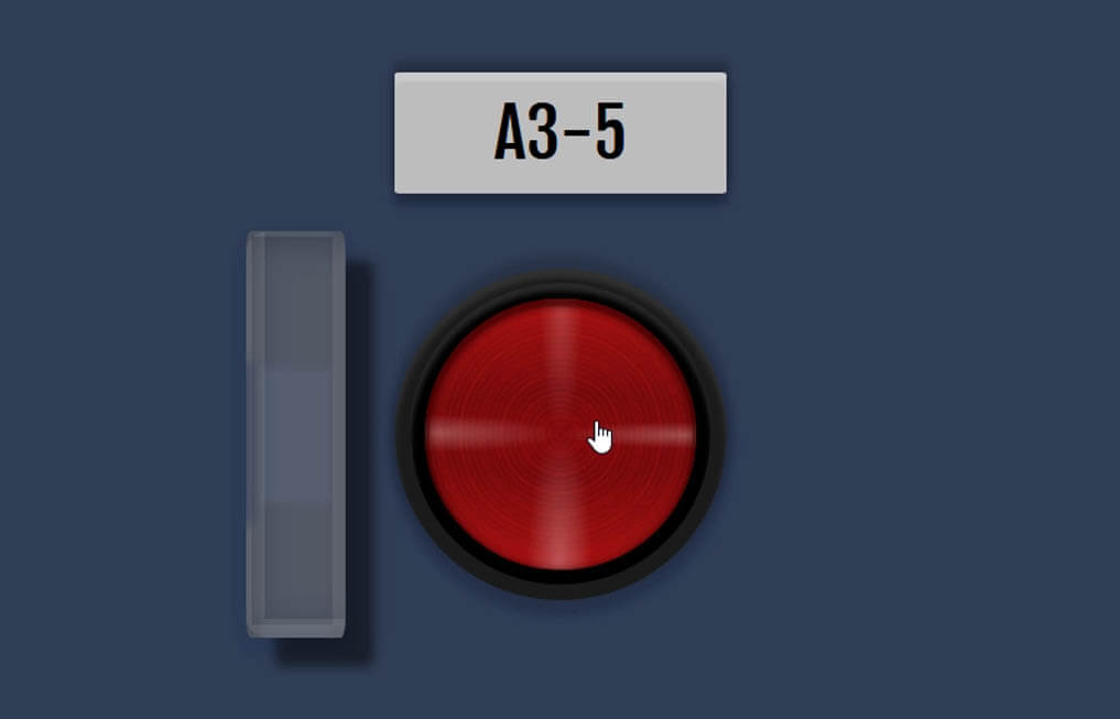
Cover Open/Closed State
We’ll need to track the open/closed state of the cover to apply the correct style.
I’ll add a small JavaScript to add an “active” class to the cover when clicked and remove it when click again.
document.getElementsByClassName("cover-wrap")[0].addEventListener("click", function(){
  if(this.classList.contains("active")) {
    this.classList.remove("active");
  }
  else this.classList.add("active");
});
For the CSS, I’ll reduce the wrapper width to 30% and move it to the left. Then add overflow hidden to hide any excess part and increase the box-shadow;
.cover-wrap.active {
  width: 30%;
  left:-30%;
  overflow:hidden;
  box-shadow: 15px 15px 6px rgba(0,0,0,0.5),
  0px 5px 6px 4px rgba(29,50,90,0.3),
  inset 5px -5px 0px 5px rgba(200,200,200,0.15),
  inset -2px -2px 0px 5px rgba(195,195,195,0.15),
  inset 0px -65px 5px 7px rgba(0,0,0,0.2),
  inset 0px 65px 5px 7px rgba(0,0,0,0.2);
}
See the tutorial video and final result in this video.
That’s all for this tutorial! Hope you guys like it. If you love to see more of these. Please like our Facebook and subscribe our Youtube Channel for weekly tutorial. Thanks for visiting and see you next time!
Source Code – Download here
Really awesome man
How much time it took to create az-5?